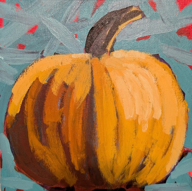
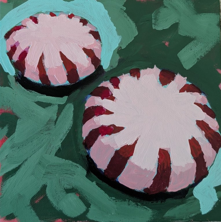
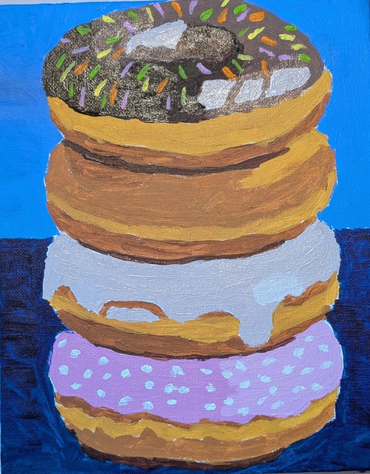
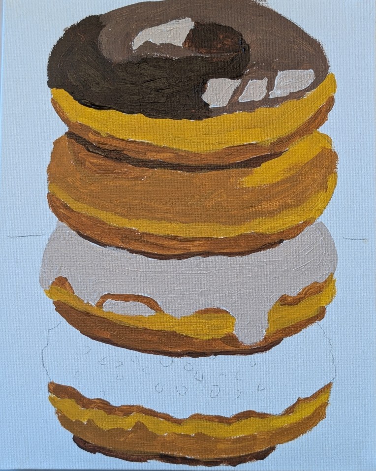
Stack of Doughnuts

I got this reference from a January 2026 Open Studio Hours Session for Fresh Paint VIP members. I didn’t attend the session, and went my own way with the colors. This was painted on an 8×10 canvas panel.

I painted glazing medium on top of the dark paint after it was dry — turns out that’s a mistake. (Hence the weird blur on the finished painting on the left.] It’s better to mix in the glazing medium with the paint so that it ends up shiny and glossy like frosting. Live and learn! I may redo when I have more time.
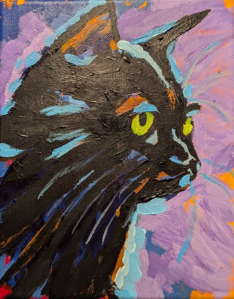
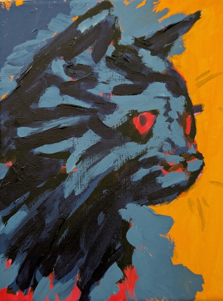
Black Cat… All Done… Painting #300

This is my 300th painting, for better or worse, since I started painting in February 2023.

I’m only posting the final photo, as I spent a lot of time between my last Fresh Paint black cat post and this one painting interim colors that ended up getting covered up by the black that I had to repaint. Altogether too much layering, in my opinion. That might work for fluid acrylics, but it’s a waste with heavy body. We started out as a black cat, then went blue and red, then brown and purple, and then finally black again.

But, hey, to each their own in style. Live and learn. And I am learning it’s my style. (Though I think the instructor’s version looks totally cool.)

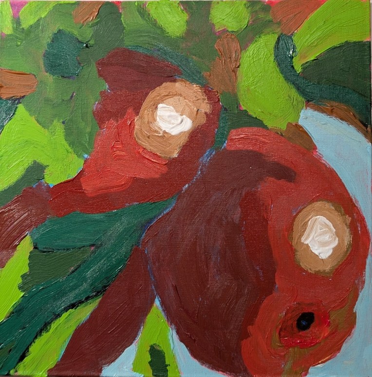
Apples in a Tree… I just got lost!

Well, I finished it. I’m satisfied with my choice of colors, but I just got lost in the shapes. Likely due to how I traced the image. I’m not sure the value mapping helped me, meaning at first I followed along with the Fresh Paint class (video), but then I broke away and just used the reference image. I should have stuck with one method. Maybe.

All in all, this looks better in a thumbnail. I’m calling it done, though, and moving on.

Black Cat… Halfway Done!

Yes, it’s another WIP from a Fresh Paint lesson (although I’m diverging from the color choices of the instructor to some degree.) For one thing, I went pack and painted over the Quinacridone Magenta with my Naphthol Red, as my magenta looked magenta pink, while the instructor’s video shows what to my eyes is plain ol’ red.

And I skipped the instructor’s Phthalo Blue/Quinacridone Magenta combo for my favorite Anthraquinone Blue (PB60) (which reads as a black-blue straight out of the tube).

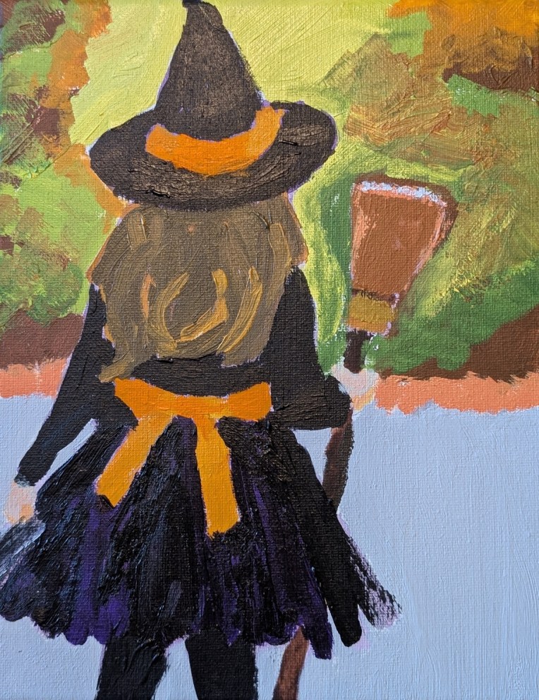
Little Witch… A Halloween Painting

This painting, which I mentioned in this post, is from a reference in Ali Kay’s Fresh Paint VIP membership.

One of the perks of the VIP membership is getting seasonal reference images / classes. I did not “attend” the video class, just using the reference image.

I highlighted the black outfit with dioxazine purple (PV23). I dry-brushed the sides of the skirt to get a tulle effect (as the dress in the reference image appears to have some tulle layers).

What I would change were I to do paint this again — the trees and sunlight (substantially blurred in the ref image) as it’s too busy. The hat needs purple highlights; it looks like I painted black on black. AND I need to work on making hair more realistic!

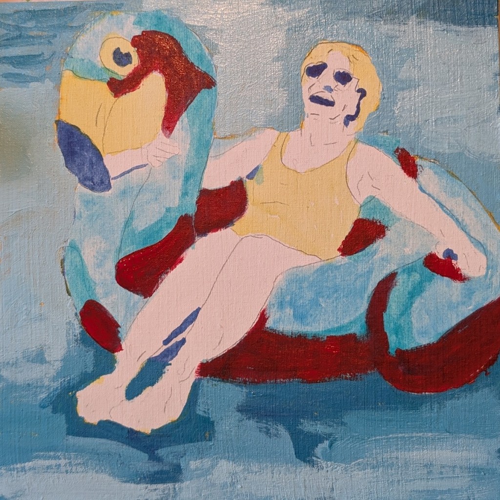
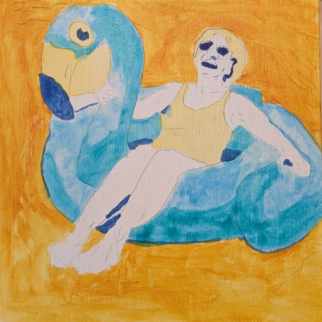
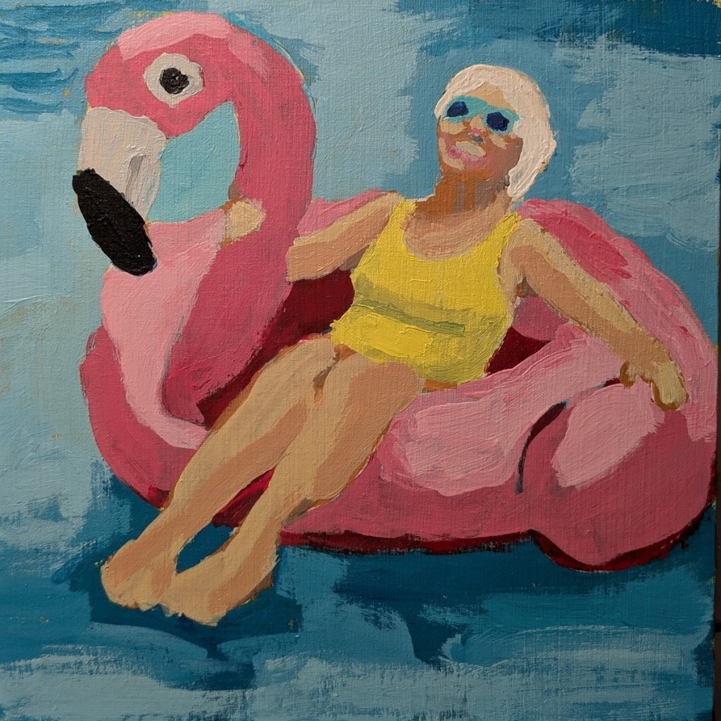
Granny’s Flamingo Float… from Fresh Paint

I really liked the vivid colors in the reference image from Ali Kay‘s Fresh Paint class, but there are a few things I learned from this process.

First, I just loathe Phthalo Blue and Phthalo Green — both are way too intense, which just irritates the heck out of me. Plus, I just couldn’t get a good mix of the two for the swimming pool water. (Perhaps I’ll try Cobalt Teal next time, although it’s quite expensive.)

Second, I ruined a beautiful velvety canvas panel by using clear gesso on it after doing the trace. I won’t do that again — it was like painting on sandpaper.

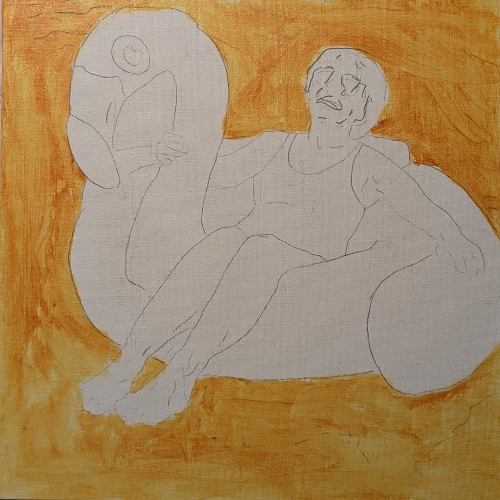
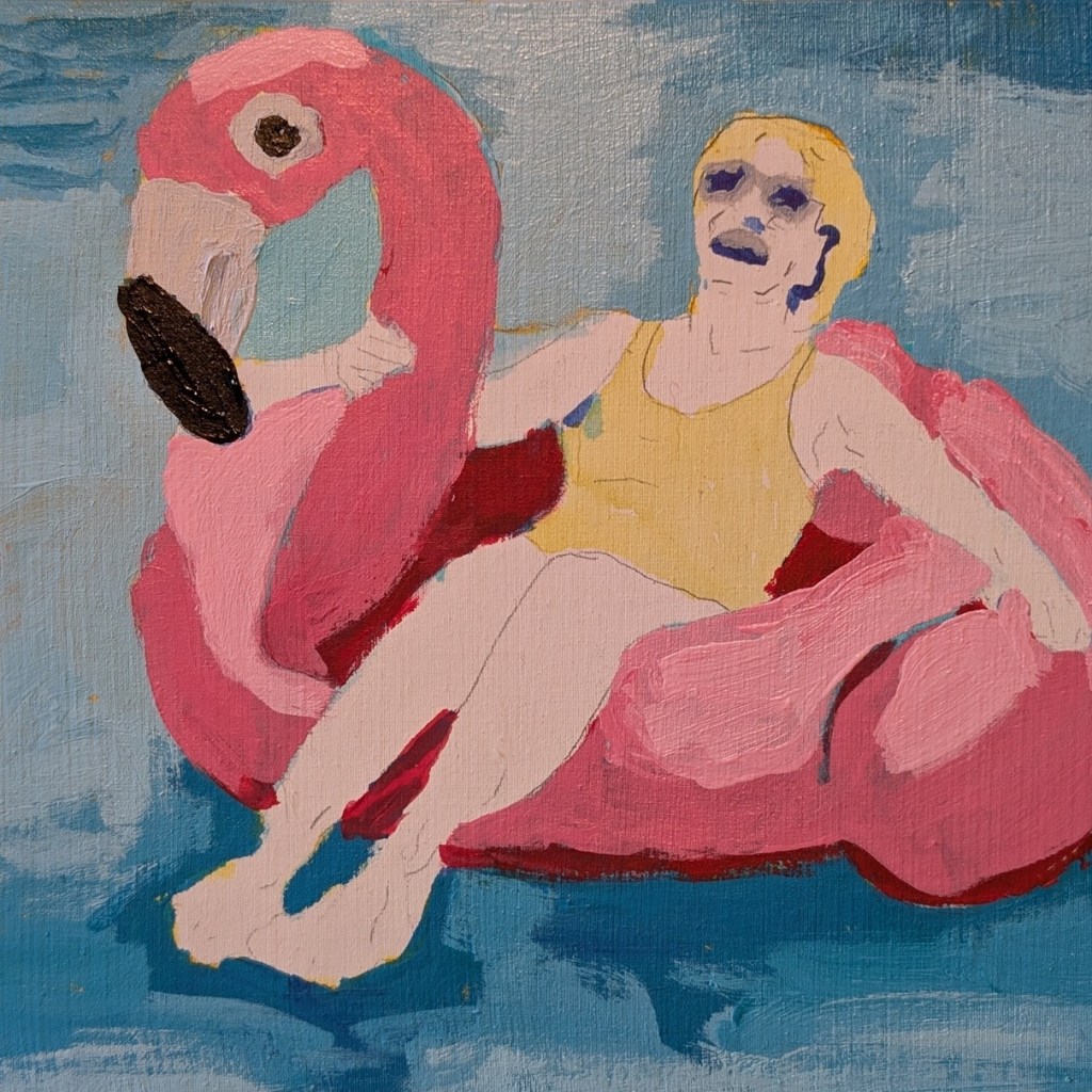
Third, if I paint more figures I need to use a panel larger than 8×8 so I can get the detail properly painted. Once I’m more skilled, maybe I can go small, but right now, it felt like I needed a toothpick to paint the lady’s facial features. Ugh! Her left leg looks deformed at the ankle — I didn’t catch that until now — but her torso looks realistic.

I’m including the entire line-up of WIP photos below.