Sunflowers: #PAINTCOACH Patreon

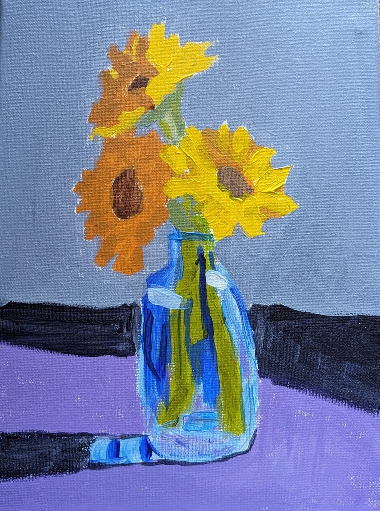
This 9×12 painting of a vase of sunflowers is from one of the PaintCoach Patreon lessons. I’m on a sunflower roll…

For the stems, I used my Liquitex BASICS Green Gray, my new Green Earth, and Phthalo Green (Yellow Shade) with Liquitex Cad-Free Yellow.

For the petals, I used Cad-Free Yellow, Yellow Ochre, and Cad-Free Orange desaturated with Ultramarine Blue.

The vase was done with Ultramarine Blue, Cerulean Blue and Titanium White.
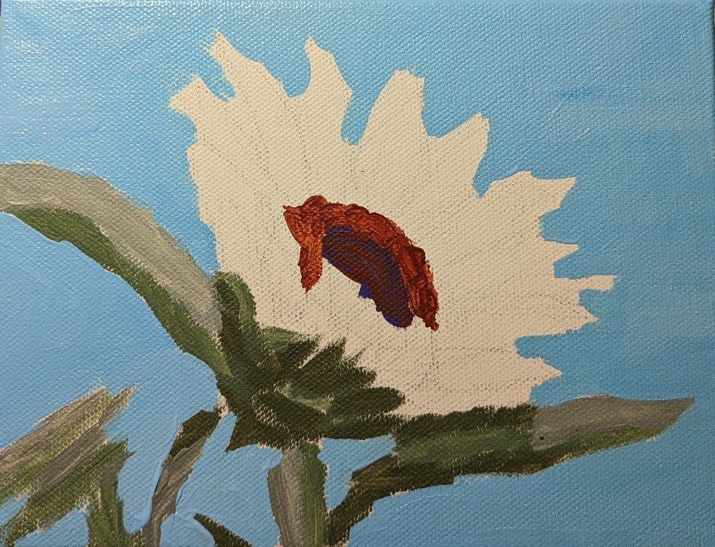
Sunflower #2: Work-in-Progress

This 6×8 sunflower painting was based on an image by Couleur from Pixabay.

The green I used was one of my favorites — Chromium Oxide Green (PG 17) Liquitex Heavy Body. For the darkest green, I mixed it with Alizarin Crimson. The medium green is straight from the tube. And the lightest silvery green is Liquitex BASICS Green Gray.

This time for the sky I used Phthalo Blue from Golden Fluid, mixing it with the Golden Fluid Titanium White.

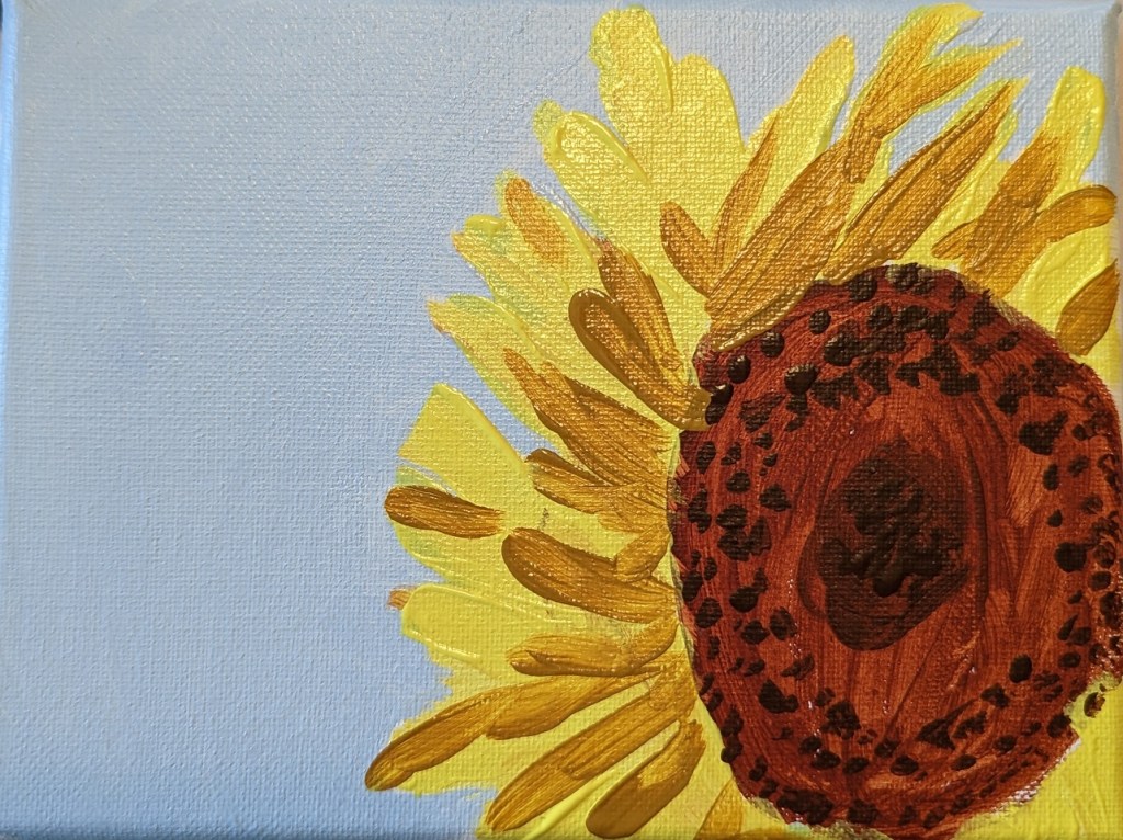
Sunflower #1

This sunflower painting was based on an image by Engin Akyurt from Pixabay. For the sky, I used Utrecht Fluid Cerulean Blue and Golden Fluid Titanium White — which works better for tinting as it doesn’t get so chalky looking as the Heavy Body. My camera doesn’t quite capture the color, but it’s close.

Painted on a 6×8 canvas.

Red Poppies: Adventures in Acrylic

The next-up item in the Marla Baggetta Adventures in Acrylic course was these red poppies. She suggested we use fluorescent orange spray paint for our background; instead, I used my perinone orange paint by Chroma Atelier Interactive, which I find wildly fluorescent!

Using the reference photo, I drew the poppies in pencil over the painted canvas, and then watched her video, closed up my laptop, and did my best from-memory version. At the very end, you use a white gel pen to outline as you see fit; here, I reviewed the image of her final work, and then just winged it.

This was fun!

Drawing A Rose

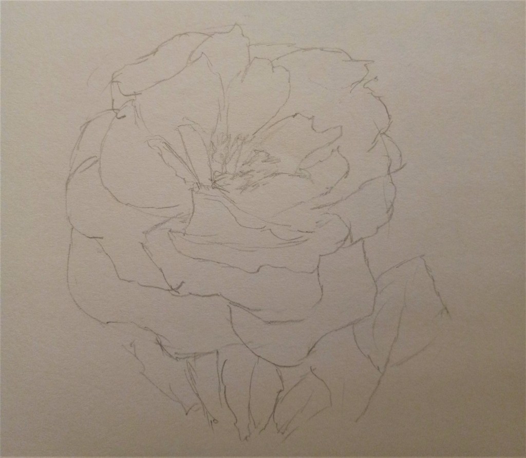
I had so much fun drawing this rose from life (“en plein air”) that I ended up drawing it a second time, in willow charcoal, and then using my NuPastels. This is the original drawing, done in graphite (2B) on ordinary drawing paper. (Pencil marks are terrible to view on the website).

Sometimes I get dissatisfied with the pastel landscapes I’m doing. There’s not a lot of drawing involved, and these fat sticks are irritating. I’m more and more inclined to draw and perhaps “color in” (as needed) with, say, watercolor.