The painting below — on 6×8 300-lb. watercolor paper — is based on a photo by Shannon Baldwin on Unsplash; my painted rose leans red as opposed to a peachy coral.


The painting below — on 6×8 300-lb. watercolor paper — is based on a photo by Shannon Baldwin on Unsplash; my painted rose leans red as opposed to a peachy coral.
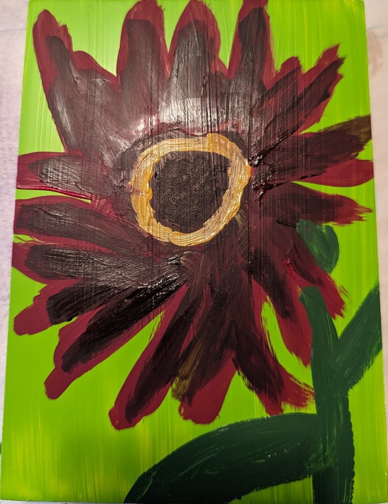
Yes, this IS a type of sunflower! Since it’s different, I decided to paint it on a 5×7 gessoboard.
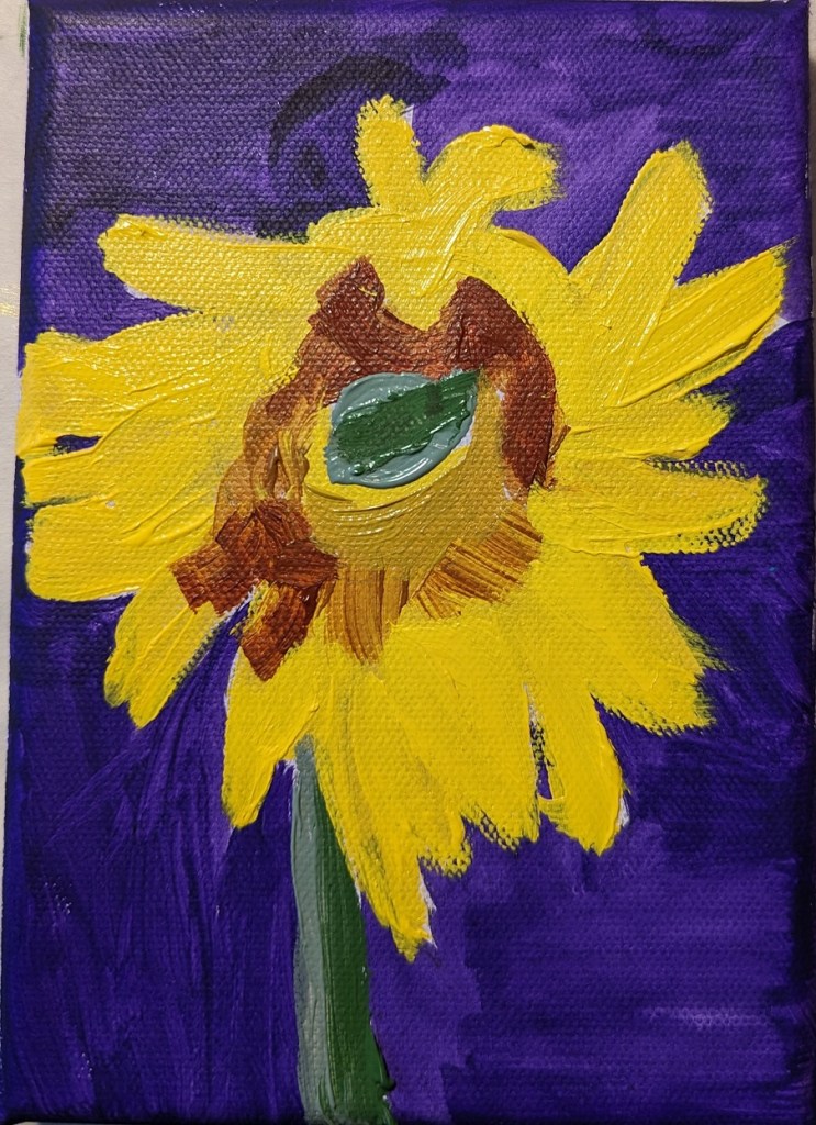
This painting was done by “winging it” — meaning, no specific reference photo. I wanted to try building out my sunflower with a base of green petals. Below is the result. I’ve layered the petals with Liquitex cadmium-free lemon, and cadmium-free yellow medium, as well as yellow ochre and dioxazine purple.
I did this on a piece of 6×8 300-lb. watercolor paper.

I’ve been unsatisfied with my sunflower painting so the other day I googled “how to paint sunflowers in acrylics”. The search results were a bounty of different YouTube videos. Well, naturally, some sunflower paintings appealed to me more than others so I watched about half a dozen.
What I found was, naturally, everyone has their own way of painting sunflowers. Some start with the background, some start with the dark center of the flower. However, the colors they chose for painting the flower were largely in sync across the board — and with my own paintings: yellow, yellow ochre, burnt sienna, burnt umber, etc. etc.
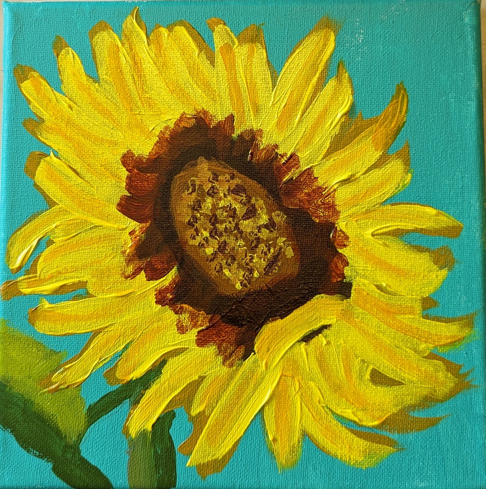
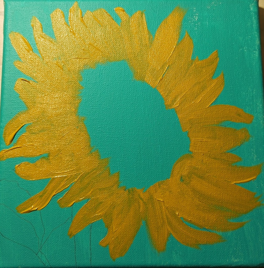
One process I decided to try, though, was to do more layering of the petals, and start with a round of yellow ochre first, applying the brighter yellow afterwards. This painting on an 8×8 canvas was just from my imagination, and the mix of all the sunflower pictures I’ve been looking at lately.
I wasn’t particularly satisfied with my pink and white roses in the vase a few posts back so I tried winging this one (on 6×8 watercolor paper). I like the colors, but this is a pretty abstract “symbolic” rose.

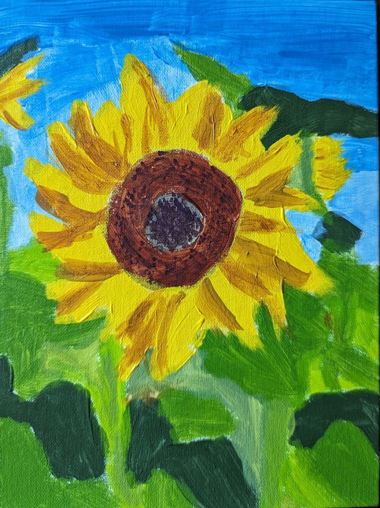
I’m still fired up about sunflowers, and trying to improve. This work was based off the image by Nadine Doerlé from Pixabay.
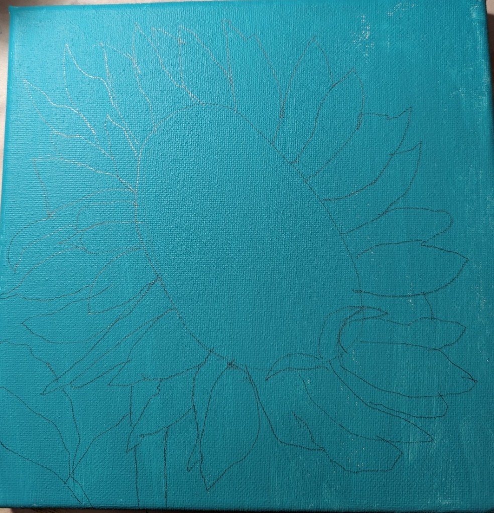
I did the background is dioxazine purple, a complementary of the yellow. (I think I’m better at drawing out the sunflower than painting it!)
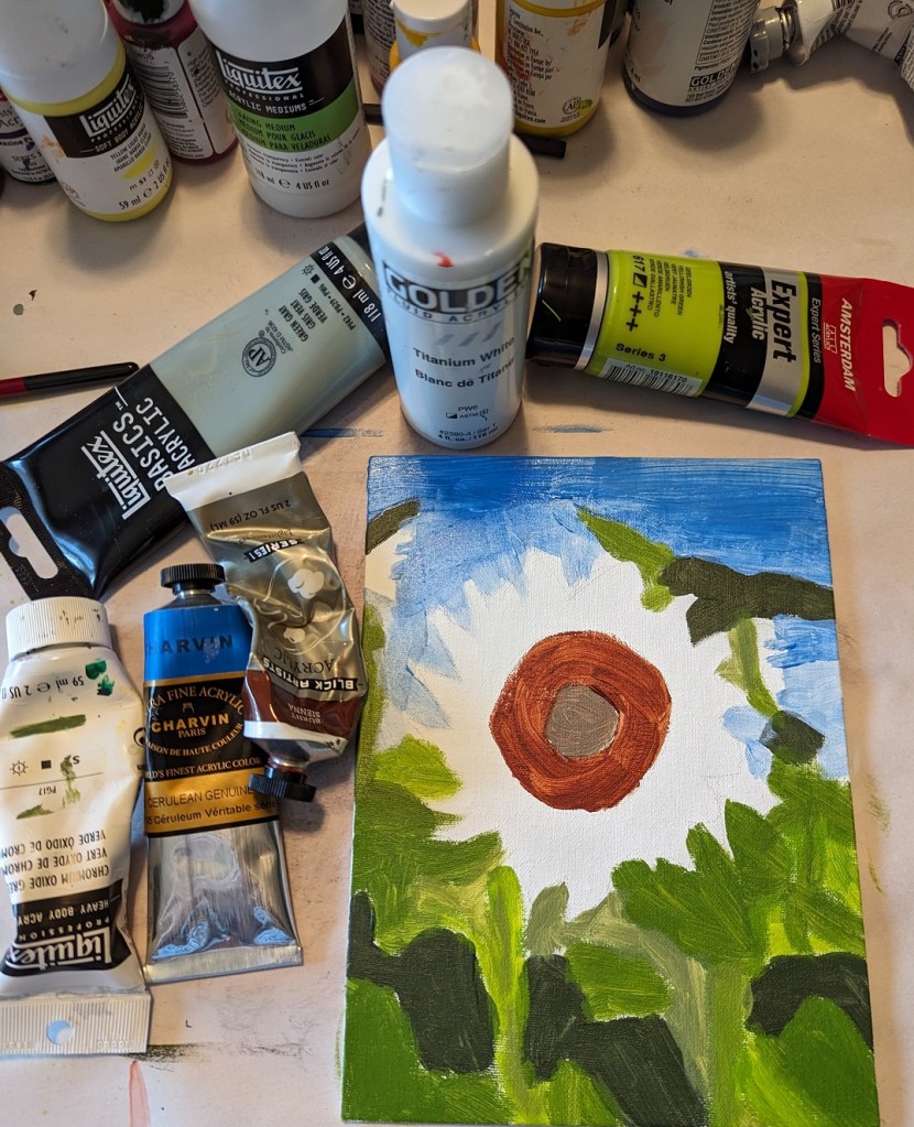
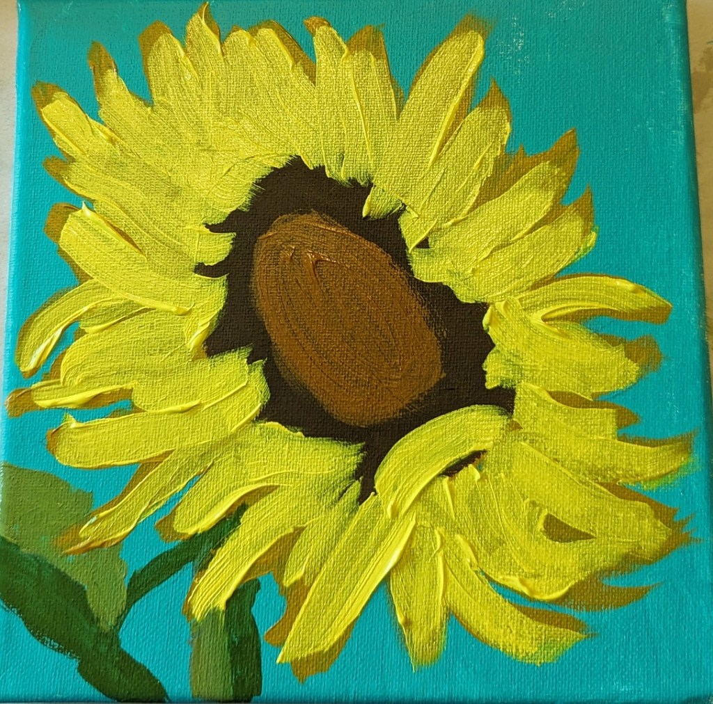
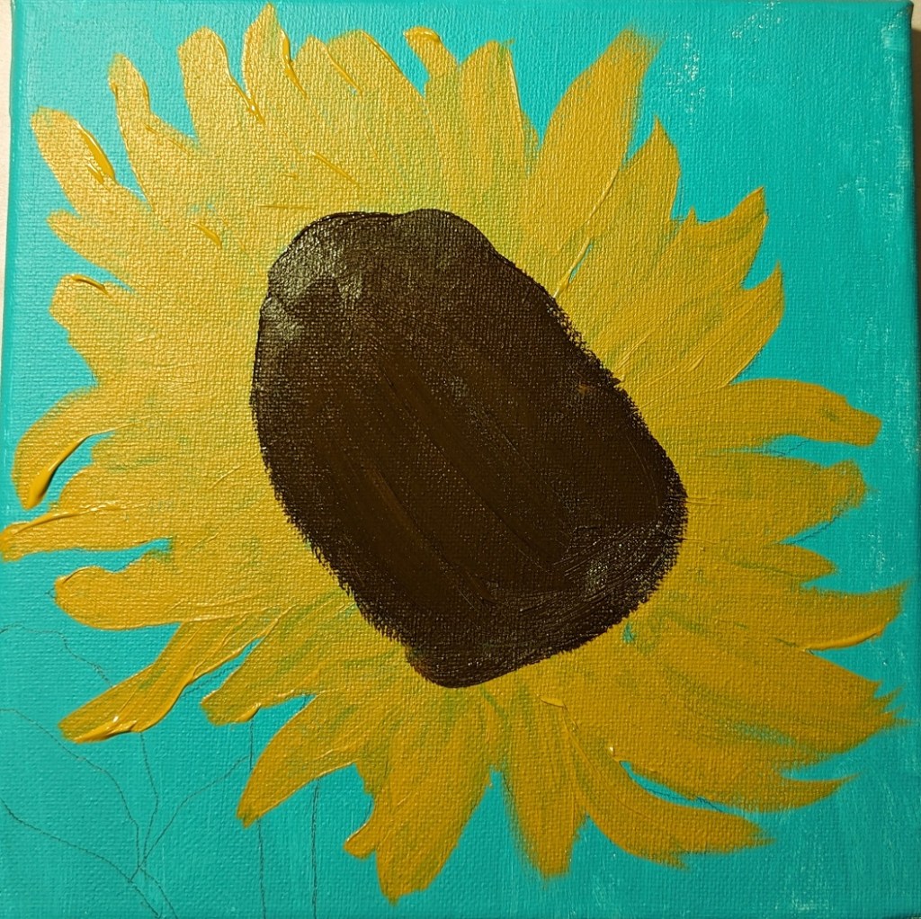
Step 1 – draw out the flower; Step 2 – paint the background

Then I painted the flower petals and the center.
And, last steps.

I updated the flowers because I felt like they were too washed out. Still need to update the cloth the vase is sitting on — LATER.
The revised painting is on the left; the former version is on the right.


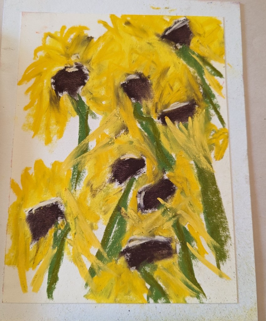
This was just a quickie because I didn’t have a lot of time, yet I wanted to paint something. It was done on a 6×8 white Pastel Premier 4-ply board (from a sampler set I got at Dakota Pastels a few years back).
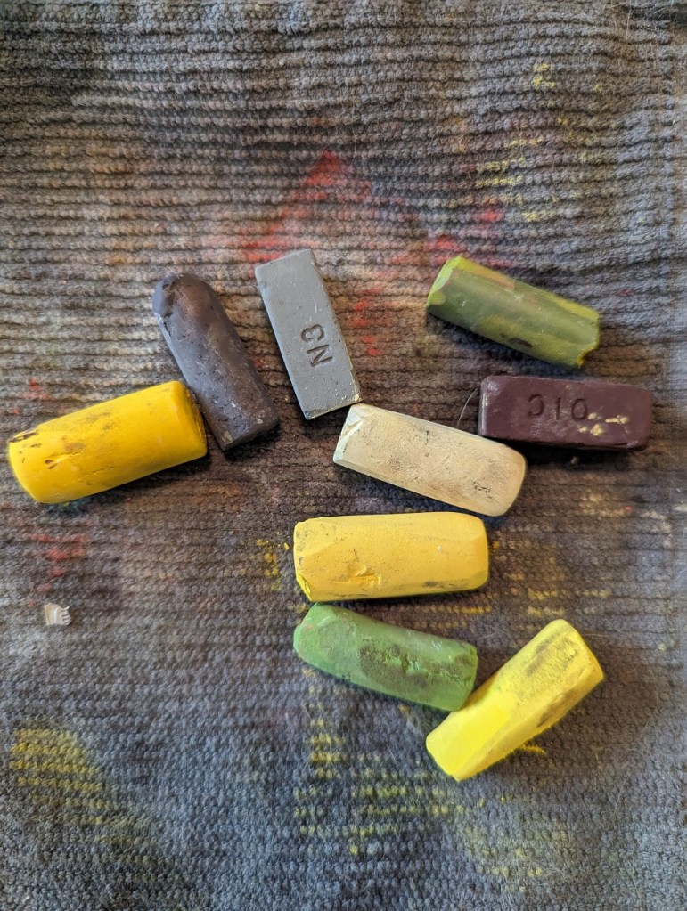
I didn’t even use all the pastel sticks shown below — but one thing I would do differently would be to paint the centers last so as not to smear the yellow shades with the darker brown.