Color Study with the Color Grab App

I was uneasy about my color selection for the little boy’s rubber boots — the part in shadow. The color constancy illusion would lead one to think the entire boot is yellow, but if you squint and then look at the photo, the boot in shadow is clearly not the same yellow as the boot in sunlight. So, at first I used a bluish-gray for the boot in shadow.

Then I remembered, I have the “Color Grab” app on my Android phone! I can check the suggested color, and then see if I have a pastel to match.

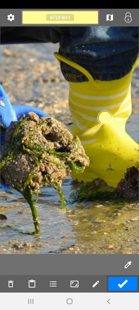
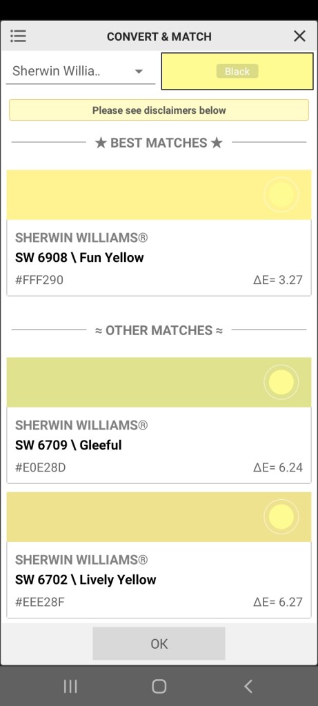
“Color Grab” showed the shadowed boot to be a yellow green, as shown in the first screen grab (see the small and larger white circles). Then you click on the Hex code for the color, and, if a listing of approximate paint colors is available, they will be listed. That display is what I used to approximate a pastel stick color.

I then added the yellow green color to the boot, but I need to blend it in.
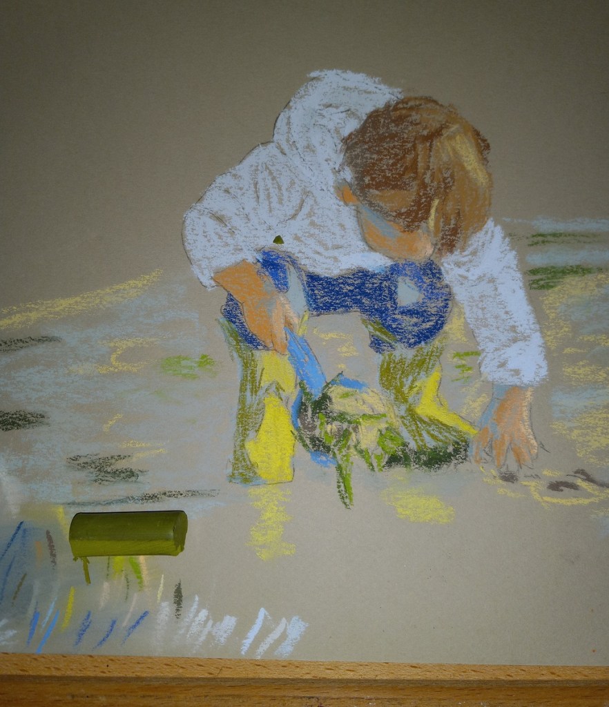
In addition, the sunlit part of the boot is actually a whiter (paler) yellow, as shown by the screen grab, so I will need to adjust as appropriate there.
Christmas ornaments: Follow-along with Marla Baggetta

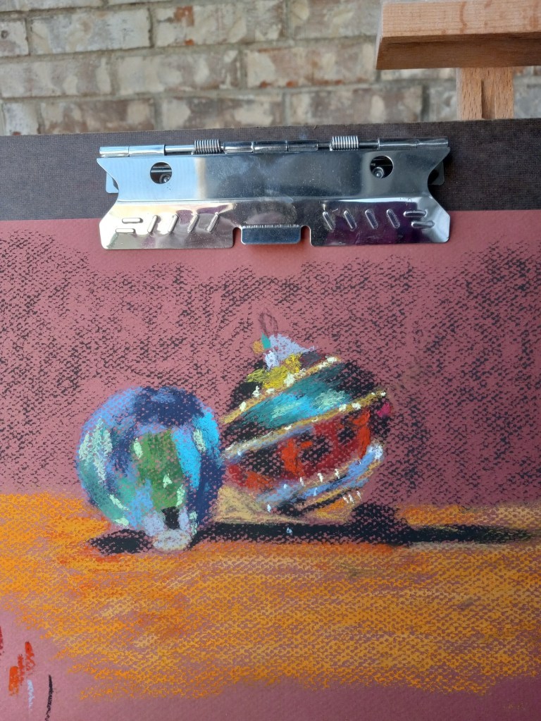
I watched Marla Baggetta’s YouTube video from December 2019 in which she did a pastel painting of Christmas tree ornaments. I then attempted to copy her work to get a feel for how she laid colors for each ornament.

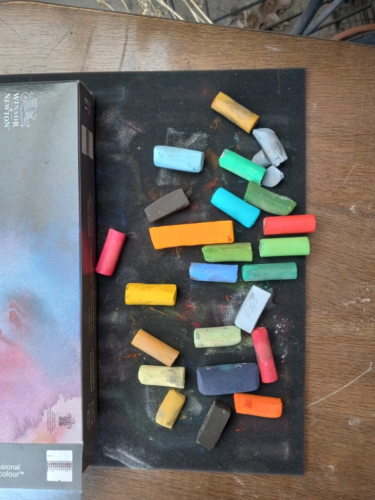
My copied work was done on Canson Mi-Teintes (the Red Earth shade) on the “honeycomb” textured side because I messed up the initial drawing on the smooth side. The initial drawing was done using vine charcoal, and then I used the sticks shown below for color. It looks best from far away!

Next up is trying a painting using some of my own ornaments.

More Studies: Using Canson Mi-Teintes

Today I used some of my pieces of Canson Mi-Teintes paper, after reading some of Karen Margulis’ blog posts about loving the paper.

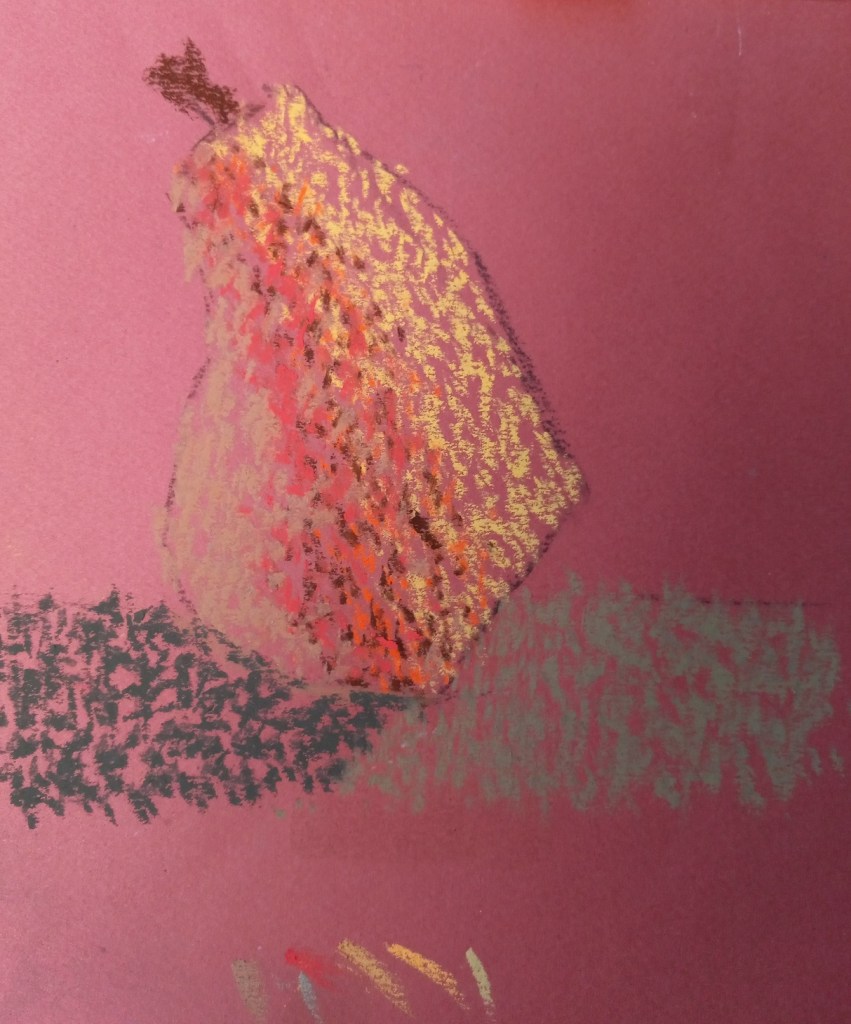
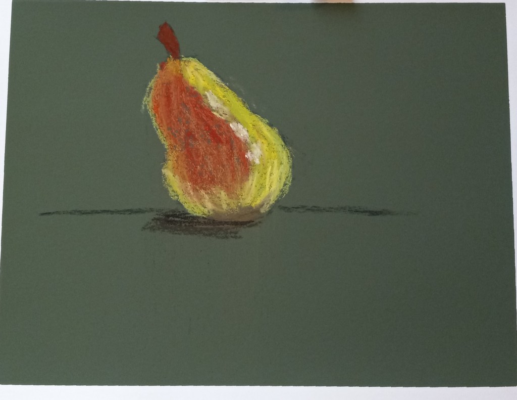
Since I’m still focused on pears and different mark-making styles, I decided to use stippling on a sheet of Terracotta tinted Mi-Teintes paper.

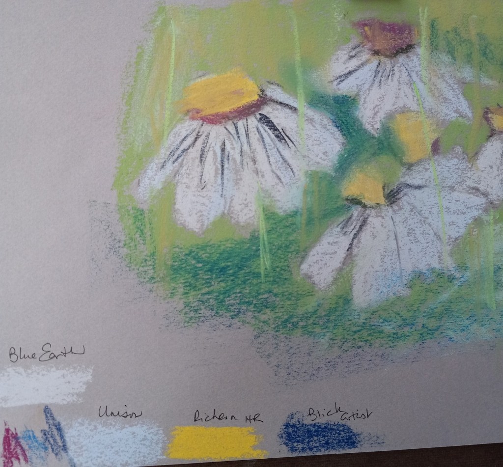
Then, after admiring the way Margulis makes her daisies, I attempted to copy her style (also on a piece of Mi-Teintes). I took Margulis’ advice to use a light touch, but I also did not do too much layering.

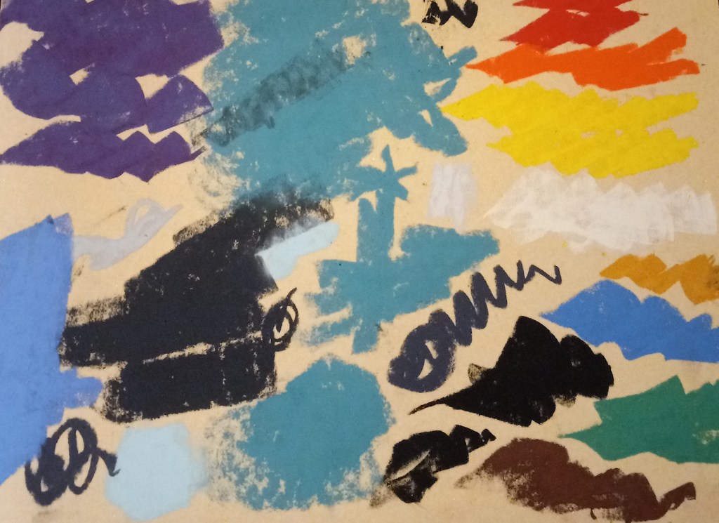
My experiment was largely to see which pastels work best on this paper. I noted the results at the bottom — Blue Earth and Richeson Hand-Rolled covered the paper much better than Unison or Blick Artists’ Soft Pastels. (Of course, that may also be the function of my skill level.)

Using Water on Canson Touch

I decided not to entirely give up on the Canson Touch paper — after all, I have 9 more 20×30 sheets of it! I need to learn how best to use it.!

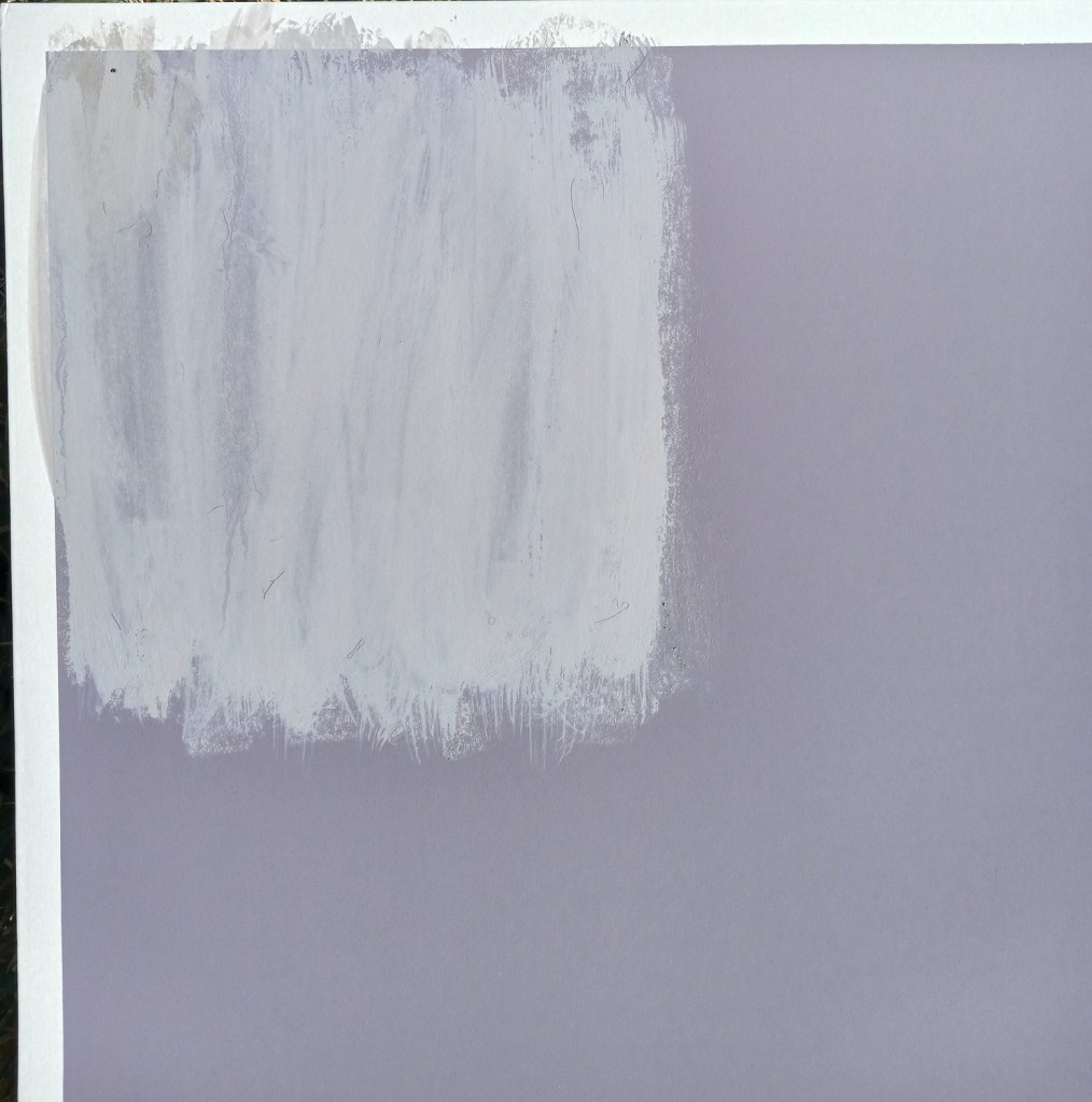
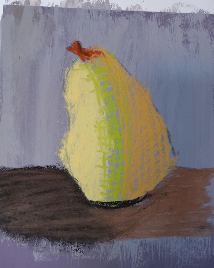
After reading more blog posts by Karen Margulis, and the online workshop PDFs by Marla Baggetta, I decided to try using water on the pastel. I laid down some gray pastel, and then used an older watercolor brush to lightly wet down the pastel and mix it into the paper.

After letting it fully dry — which was at least 30 minutes — I painted the pear below. The dark brown cast shadow is from a Blue Earth pastel; the lighter brown is a NuPastel, the yellow and the orange are Richeson Hand-rolled pastels. I’m delighted with how the color laid down on the modified surface of the Canson Touch paper.

I will be doing more experiments with this!

Pear Study

This study was done on Canson Mi-Tientes Touch paper, one from my Jackson’s Art sampler.

I like the contrast of the blue background with the orangey-yellow highlighted side of the pear. I don’t particularly care for the way the pastel doesn’t “fill in” the paper.

And since I did this study, I’ve learned that the pros often do underpainting for numerous reasons, one of which is coverage and a unified tone. I had thought that using toned paper in itself might be enough. It’s okay but it looks more like a drawing than a painting.