Rethinking the Reedy Lake

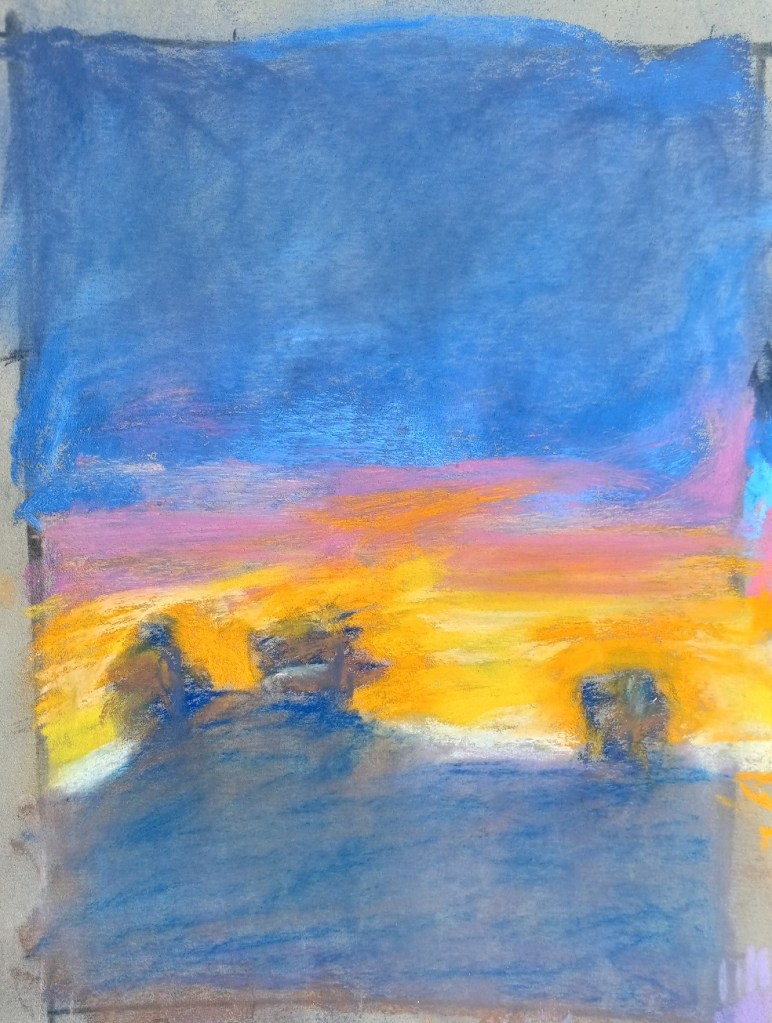
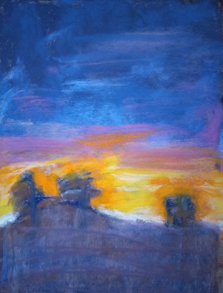
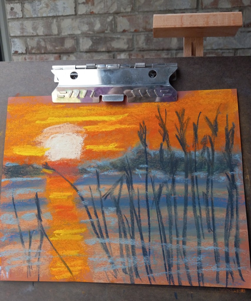
There are so many things wrong with this picture — where do I begin?

underpainting on Canson
finished painting on Canson

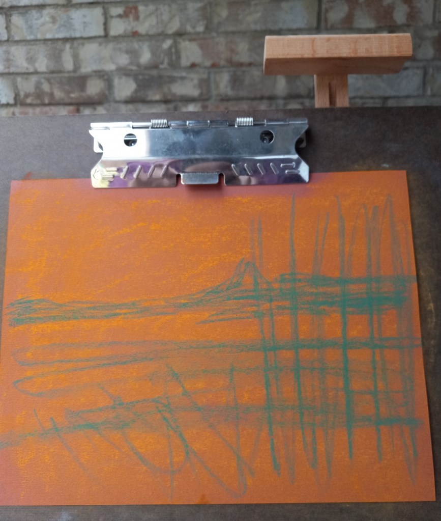
First of all, were I to do this again — IF I did the NuPastel underpainting — I would blend it in to the paper more effectively. I think I’d stick with the orange, but am undecided about the blue. I might try a medium green since green complements the red of the paper, and would blend in with the orange NuPastel and with the dark blue reeds.

The second, more obvious, item is the sun’s reflection on the water. That should have been a vertical line straight down the paper using the side of my pastel stick. And the water should have been painted in smoother, broader strokes. In fact, it might be better, compositionally, to assume still quiet water rather than the rippling water seen in the reference image.

I will have to redo this work and see what develops — hopefully, a better picture!

Rethinking Composition: Poppies at Lake Louise

Okay, I think I’ve figured it out! The composition in the color study from the last post is utterly BORING!! Not to mention the dark mountain shapes looming over the scene… they just distract. The dark shapes take the viewer’s eye completely away from what I wanted to be the focus — the poppies against the lake. Worse, they look so forbidding and foreboding that it is completely off-putting — I just want to look away at something else entirely!

I’m cropping the photo further so that only the poppies, the foreground grasses (for the yellow-green counter-balance to the red flowers), and the teal blue lake show.

As with the color study, the tree at the right of the photo will be excluded in the painting I do.

UPDATE (next day): Now that I look at the photo again, I might just leave the tree. It occurs to me that what I know to be the lake might instead be seen as a smaller pond with distant mountains (the darker blue water current) and a blue sky (the lighter blue at the top of the photo). Hmmm. Something to think about.

Evaluating the Follow-along Sunset

Two of the things I recognized as being at issue with my follow-along painting from Marla Baggetta’s Sunsets in Pastel course are: my heavy touch (which led to “mud”) and my poor job at the underpainting.
The original picture is below on the right. To counteract the muddiness, I experimented with removing excess pastel in the ground area as well as the upper sky by using an inexpensive bristle brush.

The brush-off showed yet another problem — the underpainting which amounted to nothing more than a scribble. I should have done a wet wash, or a dry wash and not leave the scribbles!

That said, another thing was that I used the Blue Spruce NuPastel on Pastel Premier paper (320 grit); I had difficulty moving the hard pastel around.

So I decided to make a second attempt at the scene, being careful to keep a LIGHT touch.

After brushing off excess pastel