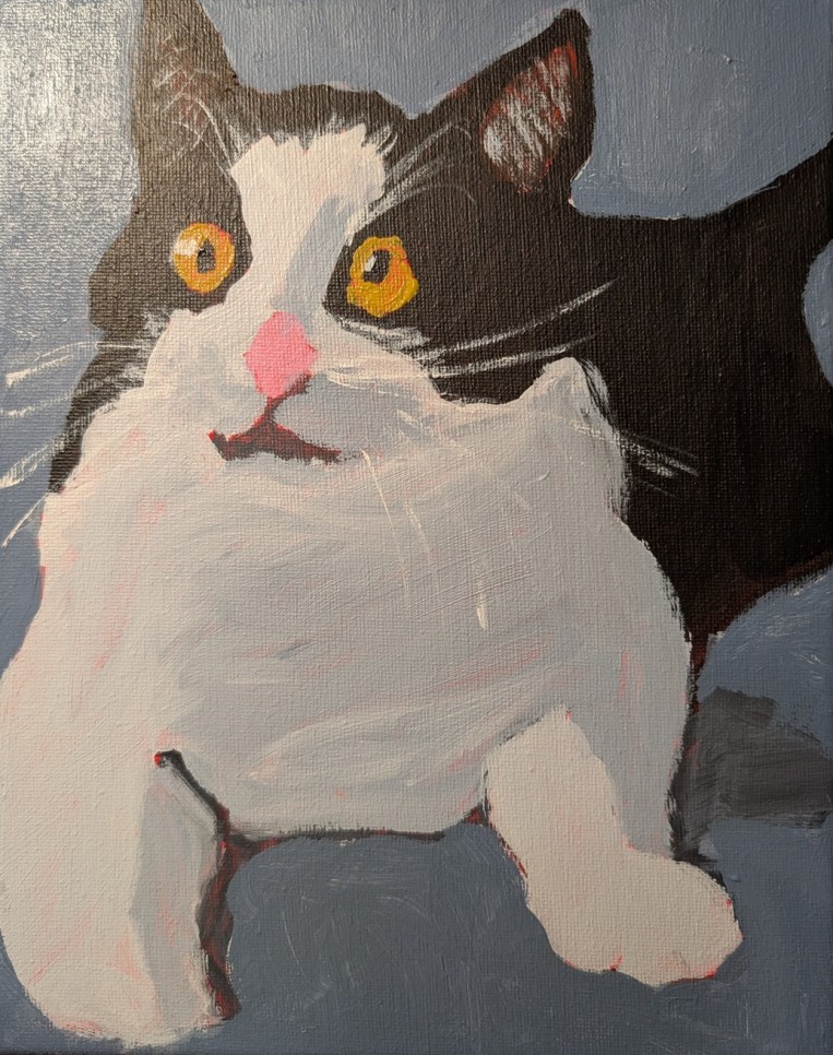
Okay, I’m done with this. I revised the background, modified the eyes and nose, and added whiskers, and ear fur (dry brush). I wish I hadn’t used the red for the undertone, but it is what it is.
Reference photo by Milada Vigerova on Unsplash

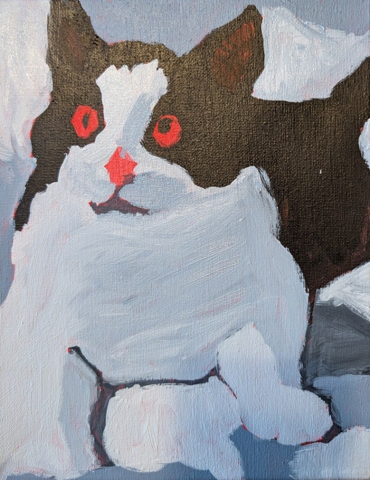
Okay, I’m done with this. I revised the background, modified the eyes and nose, and added whiskers, and ear fur (dry brush). I wish I hadn’t used the red for the undertone, but it is what it is.
Reference photo by Milada Vigerova on Unsplash
I am painting this on an 8×10 canvas which I toned in a cadmium red hue over a year ago. It’s based off a photo on Unsplash that was then enhanced (eyes yellower, shadows bluer, etc. etc.) by Ali Kay of Fresh Paint. (I’m enrolled at that virtual classroom for some of Ali Kay’s lessons.)
Photo by Milada Vigerova on Unsplash
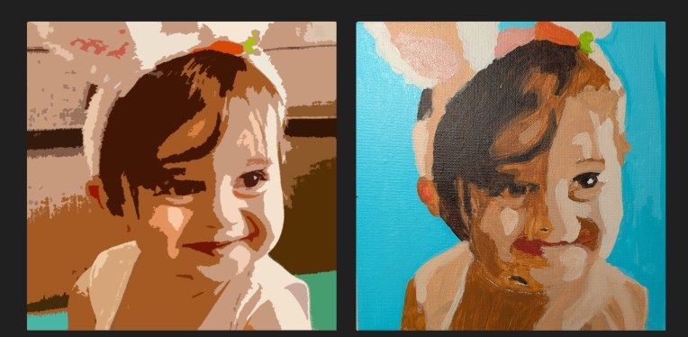
This was done on an 8×8 canvas panel in shades of Golden’s Burnt Umber and Liquitex Raw Sienna. The actual color of the background is not turquoise, but rather a mint green (Phthalo Green Blue Shade and Titanium White) along the lines of the green color in the Adobe “Cutouts” image below.
I cropped the original photo to focus on the face, then used the Cutouts option within Adobe Photo Essentials, and then transferred the image to the canvas panel. What is most off from the photo is the nose and mouth; I’ll have to redo that and see if I can make it more exact to the contours of the child’s face.
Photo by Zena Ghosn on Unsplash
This is painted on an 8×8 canvas panel. I found the image on Pixabay and really liked it.
Image by Peggychoucair from Pixabay
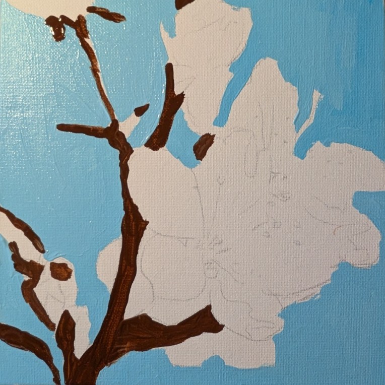
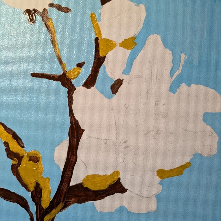
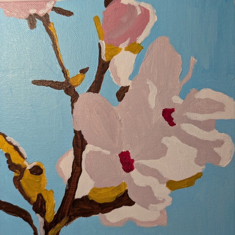
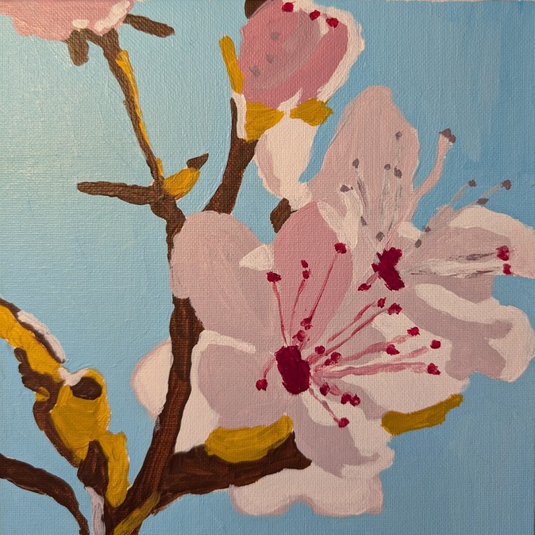
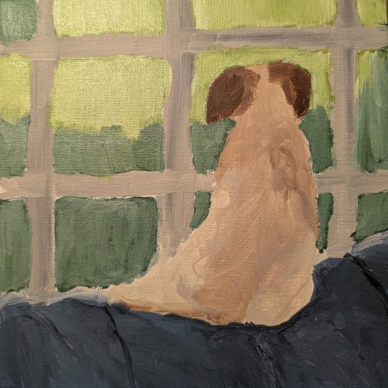
I painted this dog on the sofa based on a reference photo by Alyssa Fleischer, part of a January 2022 “painting party” at Acrylic University. It is also viewable on YouTube here.
This was painted on an 8×8 canvas panel. The dog was done in Titanium Buff (aka Unbleached Titanium (PW 6:1) and Burnt Umber. For the window panes I used the same — but added a touch of Mars Black. (I am going to go back and redo the panes, painting with a straight-edge 🙂
The greenery base was Chromium Green with some Ultramarine Blue, Titanium White, and Cad-free Yellow Light. The sofa I painted using Liquitex BASICS blue-gray and since it’s a “student” color, it darkened a whole lot after drying, but I think I’ll leave it as is.
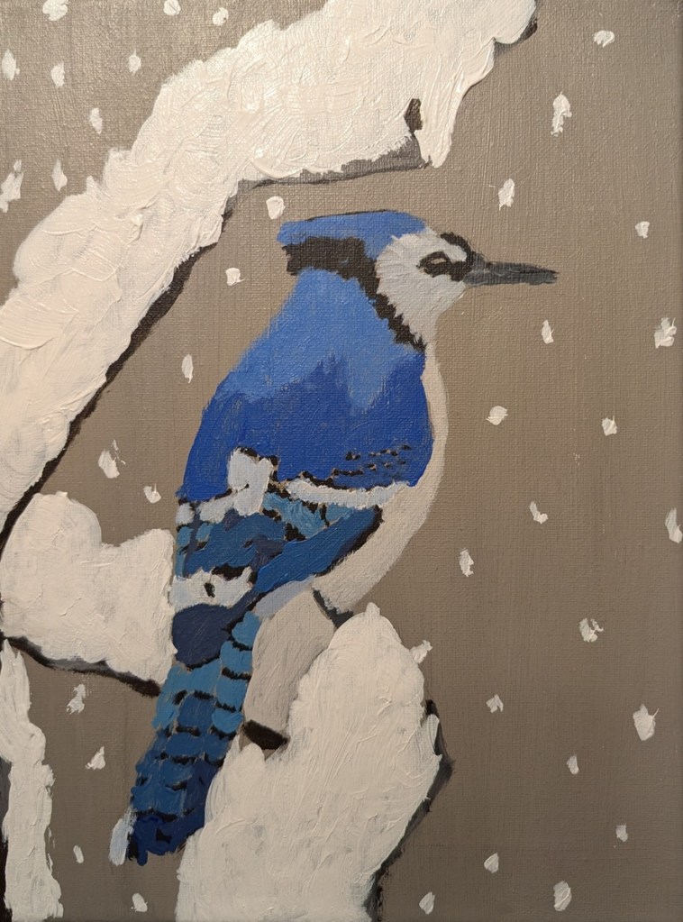
I was drawn to this photo of a blue jay on a snowy branch over a year ago, and the 9×12 canvas has sat toned and drawn out waiting for me to paint it. That day was today.
The bird colors are Ultramarine Blue, Phthalo Blue Green Shade, Burnt Umber, Titanium White, and Mars Black.
Image by Naturelady from Pixabay
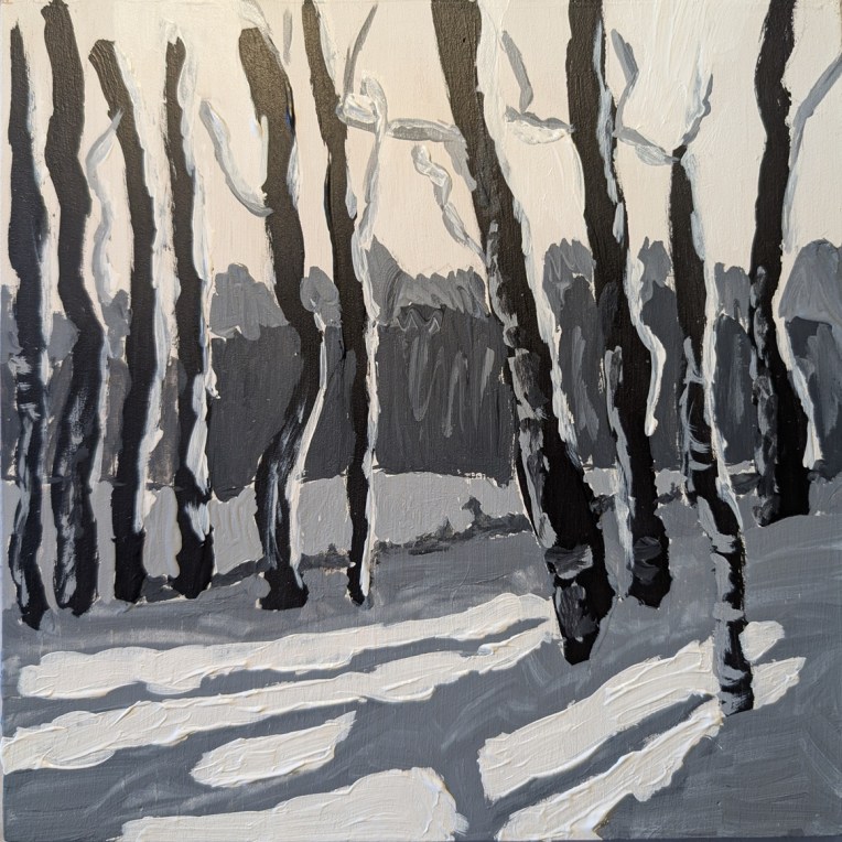
Earlier in January I watched a paint-along by Jed Dorsey of Acrylic University for their Bloom Membership level. He painted this scene from one of his own photos, and his painting was striking in its use of color, reflecting a golden sky from the sun setting behind the trees in the distance.
I was all set to try that myself. But when I downloaded the reference photo and a photo of his painting, on a whim, I set the saturation to zero — and found I absolutely LOVED the black and white version. So I decided to try painting it to play with the values.
This was done strictly as a study, on an 8×8 wood panel that I had gessoed a while back. The sky, in fact, is simply the white gesso. (It’s more yellow here in the photo than it is in real life.) I deliberately painted the snow thick just for the heck of it.
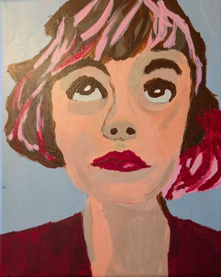
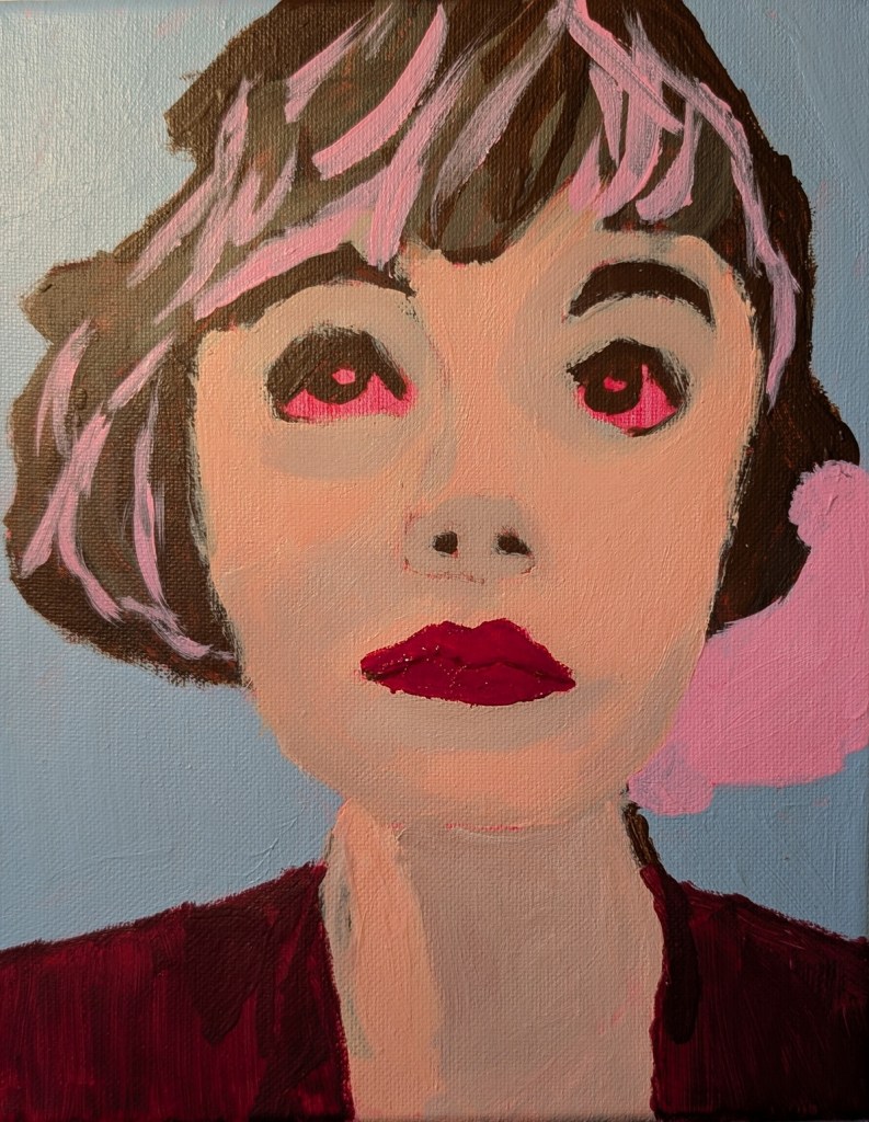
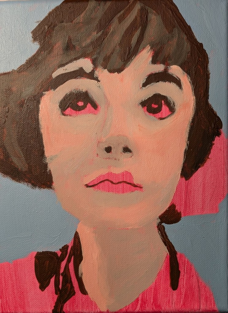
A year ago I signed up for Let’s Face It 2025, a 52-week series of portrait lessons which you can either follow along with or use as inspiration for your own fully original art, but I never did a single exercise. This was Week One and it was taught by Kara Bullock.
I have yet to complete any of the years I bought (2023 through 2025) although I just signed up for the 2026 version, but there are actually only a few weeks in each of the years which interest me, and they’re on my to-do list.
This one was done on an 8×10 canvas toned in quinacridone rose (PV 19), and I don’t have the photo credit information, but am guessing it’s on Unsplash or Pixabay. “In progress” photos are below. I used a lot of Burnt Umber, Raw Umber, Titanium White, and a crimson color (PR 264).
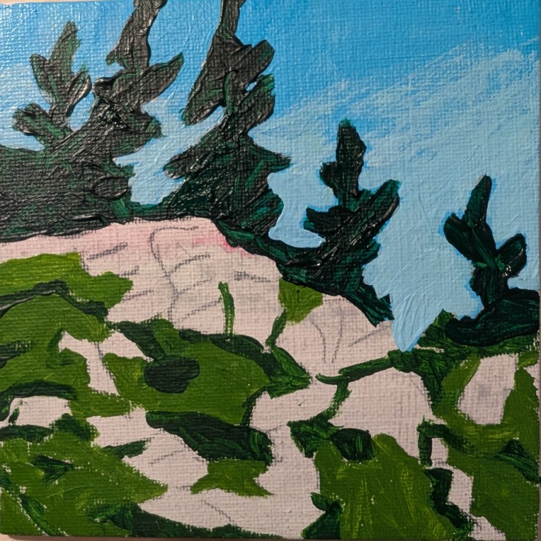
This is a redo of the week 12 painting for Jed Dorsey’s Mini Painting Challenge at Acrylic University, based on my observations of mistakes I made in the original painting. The idea was to get the proportions more accurate, the perspective/distance more accurate, and to convey a better sense of form (namely, that the trees were at the top of and behind a hill).
I painted it on a 5×5 canvas panel. For the sky I used Liquitex Soft Body Light Blue Permanent (PB15, PG7, PW6) and mixed the lower latitudes with more white. The pine trees were painted with Atelier’s Forest Green (PY74, PB15.3, PR101) mixed with Phthalo Green (Blue Shade) and Ultramarine Blue. The darker grass was a mix of Atelier’s Forest Green with Cad-free Yellow Medium by Liquitex, and the lighter grass was a mix of Winsor’s Sap Green (PY74, PG7, PBk7, PW6) and Cad-free Yellow Medium.
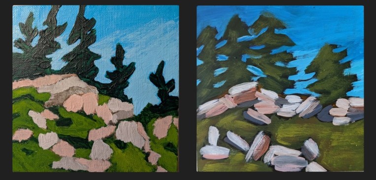
Here is a comparison between the original I two years ago, and the one I did today. The newer painting is far from perfect — the trees are still wonky, the paint is gloppy on the trees and I think the grass should be lighter in value — but at least you can tell the trees are on a hill, and the rocks no longer “float”.
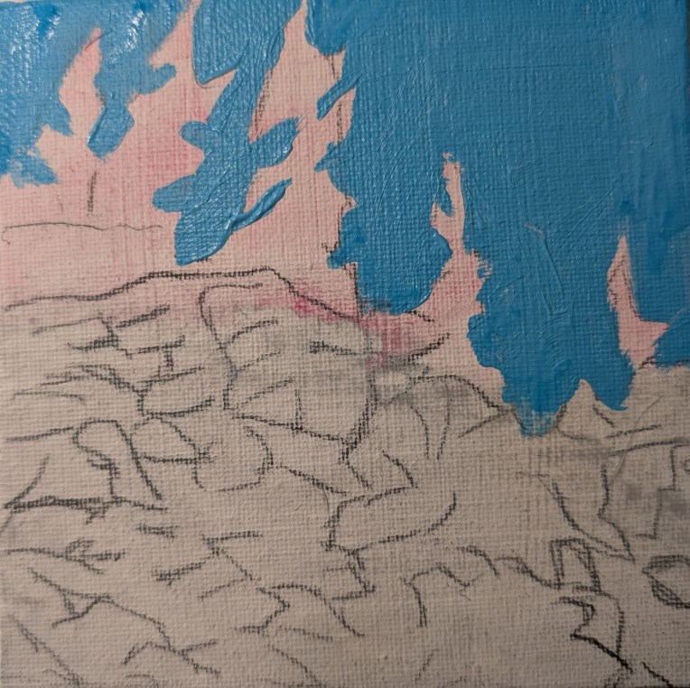
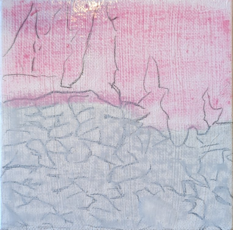
Here are some in-process photos of the redo:
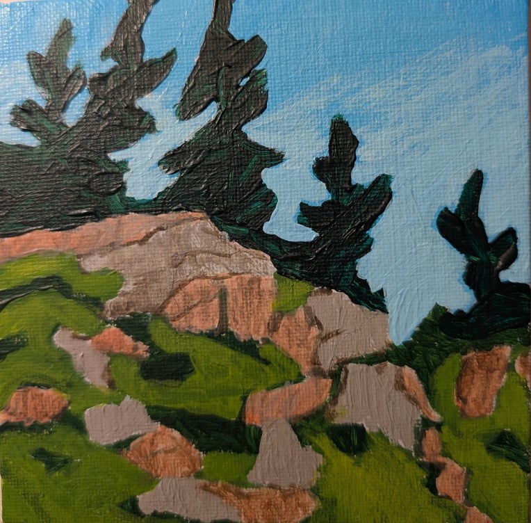
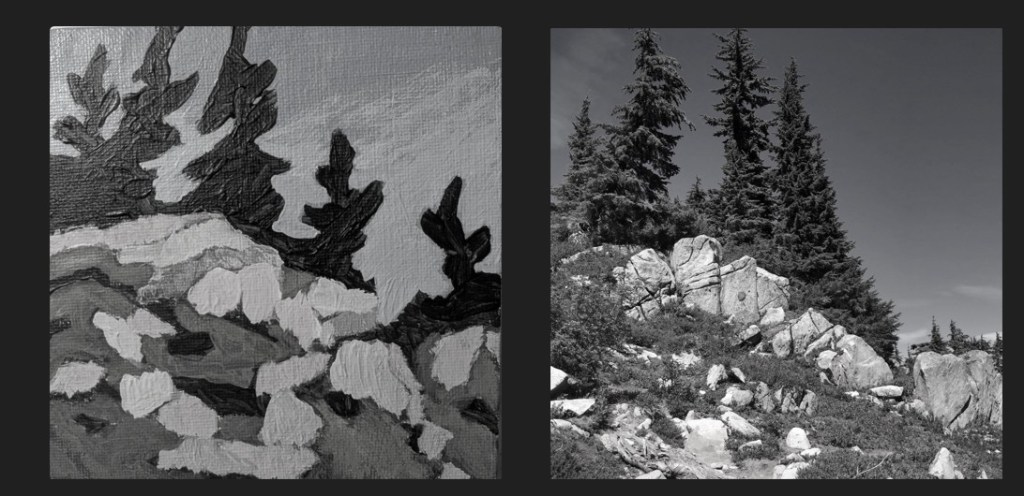
Here’s a value comparison between the reference photo [credit: Mark Hadland] and my painting.