Small Seascapes Project

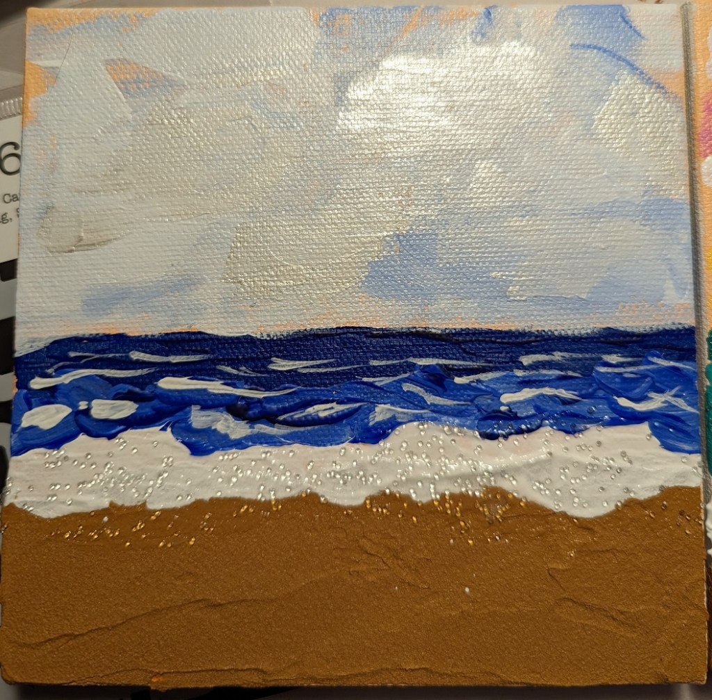
Using the Mixed Media Color Studio book by Kellee Wynne Conrad, I followed along with the seascape project. The author used 4×4 wood panels, but I used 6×6 blocks. The author used only paint, but I used Liquitex Basic Coarse Texture Medium from my sister’s stash to mix in with my burnt sienna/yellow ochre paint as “sand”. I also finished off the foamy waves with Liquitex Glass Beads, painting over the dried paint.

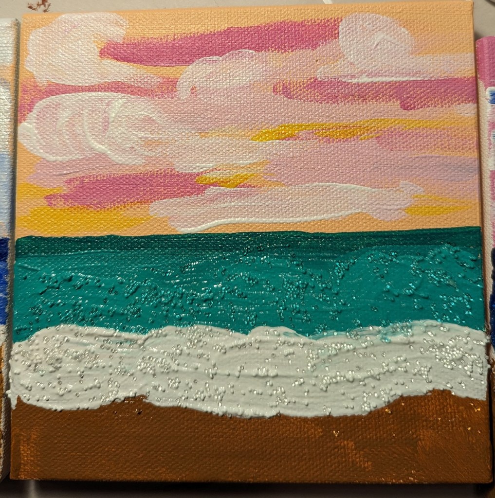
(I also tried mixing paint with the glass beads, as you can see below with the green sea scene; unfortunately, you lose the light effects with the glass — didn’t care for that.)

The upper-right photo also includes the clouds painted with Golden Heavy Body Iridescent paint. Not sure how useful that paint is, but couldn’t resist buying some to try it out.

Cherry Tree Dropping Blossoms

I got the idea for this cherry tree painting from the Feeling Nifty website. I didn’t care for the example of the black/gray background, or the black tree — it looked too much like Halloween to me. (Halloween is a great holiday, but it doesn’t mix with blossoming cherry trees!) Also, I didn’t have Q-tips, nor did I want to use them — it would’ve been too close to copying the artist. I wanted to do things my way.

This was done on a 5×7 canvas; the background is ultramarine blue with black (“Payne’s Gray”). The predominant color of the blossoms is Quinacridone Magenta (pigment color PR 122) dark and tinted with Titanium White, with some Cadmium Red Hue (PR 112).

Notans — Based on Pixabay & Unsplash

I downloaded a few photos of women’s faces from Pixabay and Unsplash, set them to grayscale, applied the gaussian blur filter, and then posterized the image down to 2 values: black and white.

I used these notans to paint.

The top-most picture was done on wood covered with gesso painted with an old brush (hence, the ridges.) Some folks say to sand your gesso application, but I didn’t want to hassle with that. Below is a comparison between the actual notan (posterized photo) on the computer screen, and my painted image on the right. Close but not exact.

Fir Trees with snow: 1st Attempt

I used a turquoise NuPastel for the underpainting of the fir trees, and the fact that it peeks through is about the only thing satisfying about this effort. The photo doesn’t show the snow well, but I used yellows, pinks and light blues as the snow rather than straight white. The snow on the branches was actually a very pale yellow color — almost white — and a Blue Earth pastel.

Snowy Fir Trees

And these are the pastel sticks I used.

Snowscape in Color

Here is my snowscape done in color. The snow is partly pink, blue and yellow, and very nearly white where the small bushes are. I removed the little pine tree at the suggestion of a member of Karen Margulis’ Patreon group for pastel classes. Most of the pastels used were Richeson hand-rolled, which is fast becoming my favorite brand.

(I have the comparison between the value study and the color version below. The original image was by Alain Audet from Pixabay.)

This is how the two versions compare:

original value study

Value Study for Snowscape

Today, on Karen Margulis Patreon page, she challenged us to do a painting using only hard pastels like NuPastels, Rembrandts, Cretacolor, etc. Well, my Dick Blick Artist’s Soft Pastels are roughly the hardness of Rembrandts, so I chose to use those.

Then I decided to do a value study for a snowscape based off a Pixabay image by Alain Audet from Pixabay. I may end up using this as an underpainting for that snowscape, but I suppose it could stand alone. I did this on Sand-colored Pastelmat, 9×12.

value study

And these are the sticks I used.