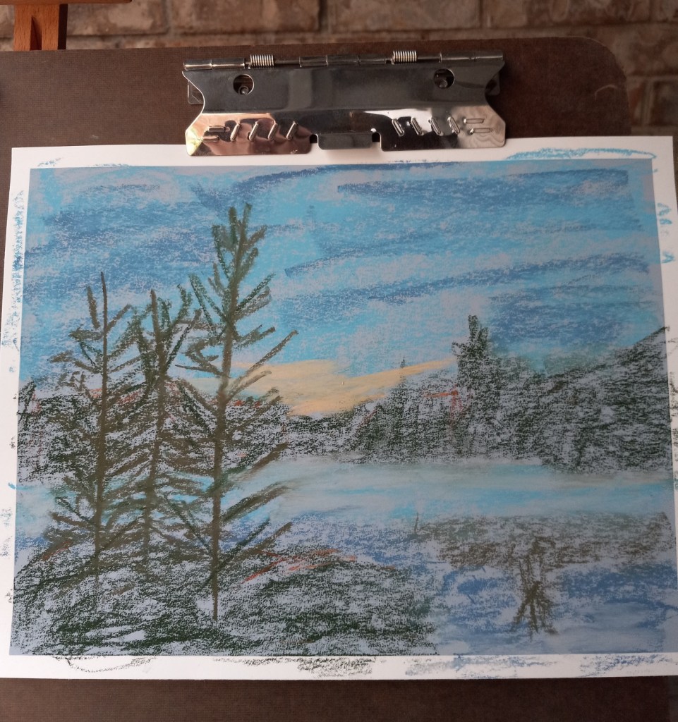
I decided to skip including the mountains around Lake Louise, and focus in on the poppies. The result is that what is actually the lake looks like sky. But maybe that’s okay. This study was done on Colourfix Smooth in Blue Haze.
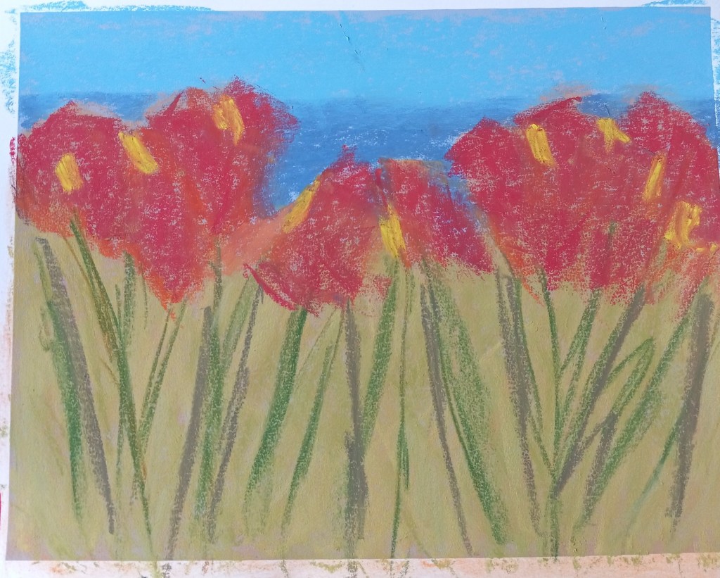

I decided to skip including the mountains around Lake Louise, and focus in on the poppies. The result is that what is actually the lake looks like sky. But maybe that’s okay. This study was done on Colourfix Smooth in Blue Haze.

This project was based on an image by MustangJoe from Pixabay. I used Colourfix Smooth in Blue Haze all three times, as well as using the same palette.
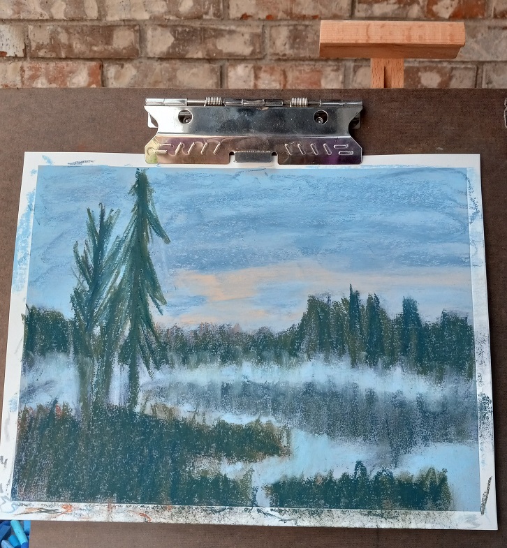
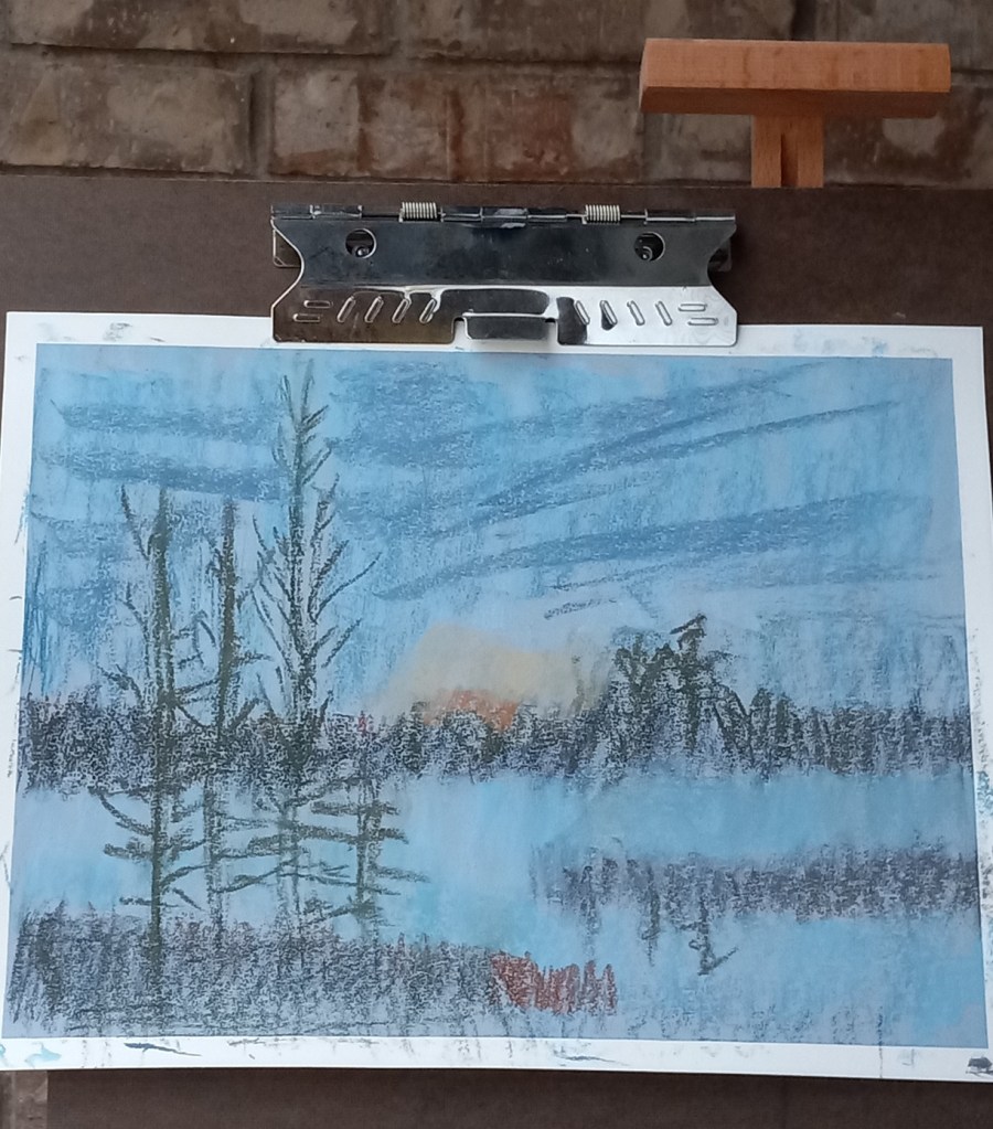
All three efforts were failures, but at least I learned a few things.
Attempt #1
First time around, I did an underpainting (of the dark areas only) using a Blue Violet NuPastel. Using this color was a BAD idea! Why? Because I would later add a dark gray-green, and a reddish brown on top of that blue violet, which made mud. Ugh!
First time around, I also used too heavy a hand, in effect scribbling with the pastels trying to cover the paper. Bad idea — too heavy a hand can ALSO create mud.
First time around, the pine trees were cartoonish. But I was so frustrated with the mud mess I didn’t care at that point!
Attempt #2
Attempt #3
I need to try colors with more purple and less green and brown. I may need to experiment with papers which have more grit.
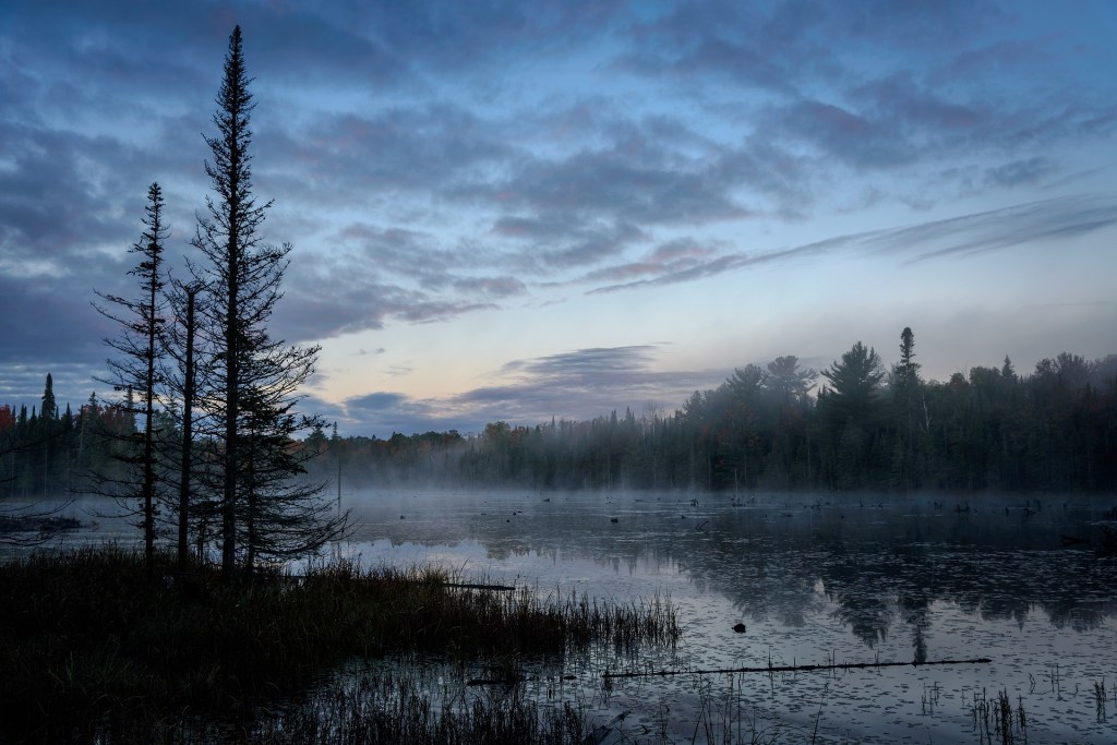


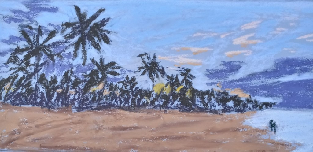
This pastel painting is based off an image by MustangJoe from Pixabay.
I used ArtSpectrum Colourfix Smooth in Blue Haze. My underpainting was done with willow charcoal, and I used Blue Earth, Blick, Richeson Hand-rolled and Sennelier pastel half-sticks.

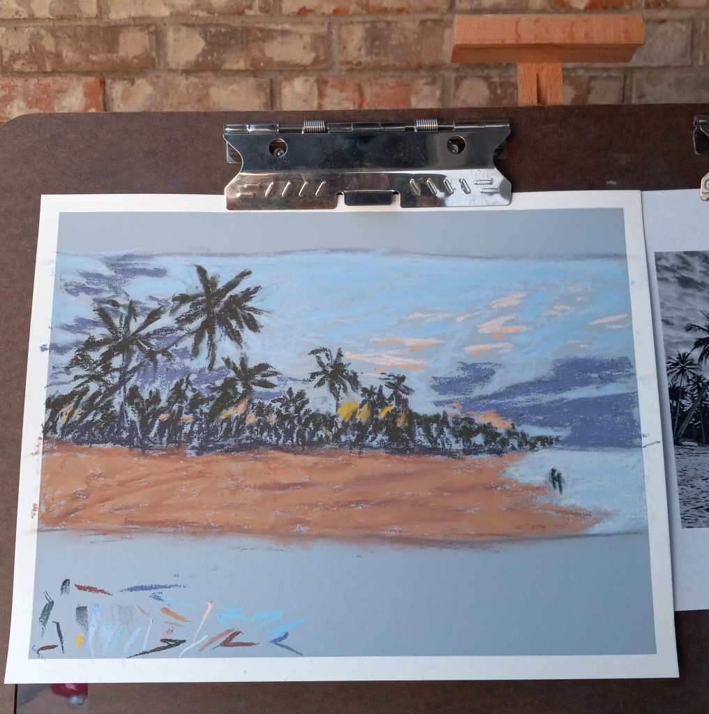
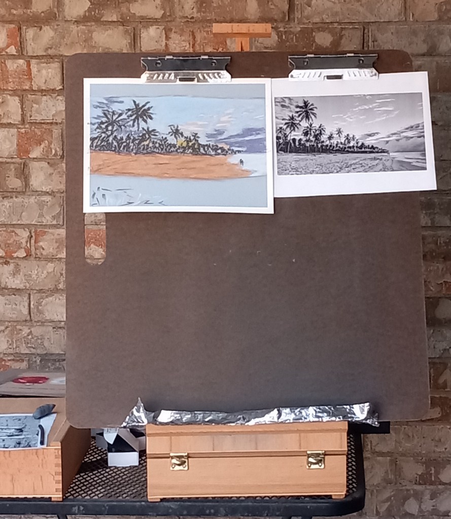
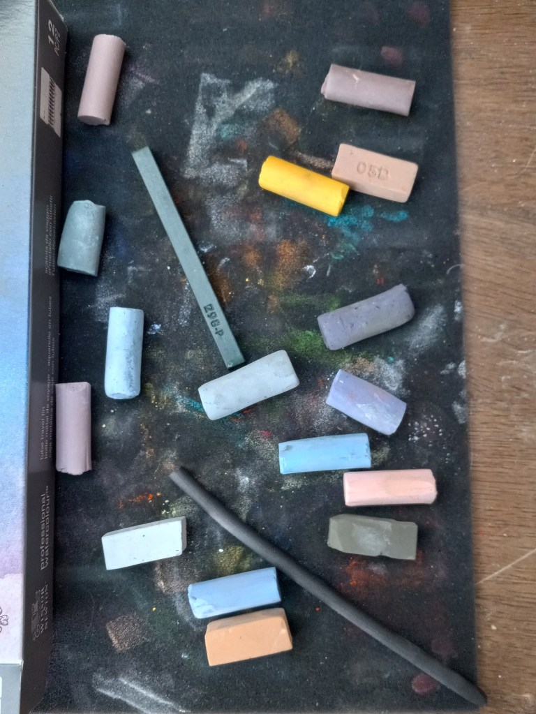
This study was done on Colorfix Smooth “Blue Haze” paper.
