(Acrylic University) Primary Palette 101: Exercise, Part 2

These paintings are from Part 2 of an color-study exercise I’m doing on the Acrylic University site. The class is taught by Jed Dorsey; it is his reference photo and his follow-along painting vids I am using for my own studies below.

Part 2 features different versions of the primary hues; I am using Liquitex Cad-Free Yellow Light (cool), Ultramarine Blue (warm), and Anthraquinone Red (cool).

(Acrylic University) Primary Palette 101: Exercise

These paintings are from Part 1 of an color-study exercise I’m doing on the Acrylic University site. The class is taught by Jed Dorsey; it is his reference photo and his follow-along painting vids I am using for my own studies below.

Part 1 focuses on a warm yellow (I used Liquitex Cad-Free Yellow Medium), a cool blue (Phthalo) and a warm red (I used Pyrrole Red). 

Part 2 will feature different versions of the primary hues; I’ll be using Liquitex Cad-Free Yellow Light (cool), Ultramarine Blue (warm), and Anthraquinone Red (cool).

Testing Out My New Watercolor Pencils

I’ve been enjoying my graphite Aquarelle pencils so well that I bought some watercolor pencils to try them out.

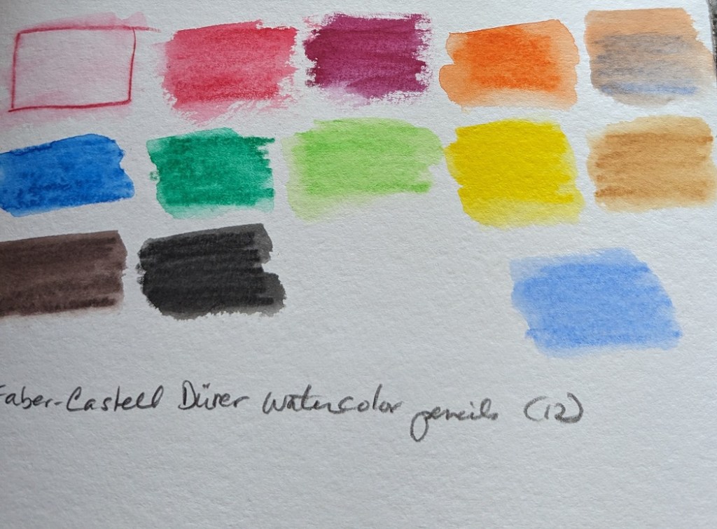
I purchased 3 different sets of 12 pencils: Faber-Castell Albrecht Durer; Caran d’Ache Museum Aquarelle, and Derwent Inktense Pencil Set.

I used the pencils on my 300-lb watercolor paper, applying water afterwards. One thing I noticed is that each 12-pencil set has relatively similar colors. The Albrecht Durer set includes a white pencil which I don’t see a lot of use for — unless you’re using it on toned sketch paper? My initial thought is I was gypped, lol.

The Derwent Inktense pencils, once wetted, are clearly more intense than either the Faber-Castell or Caran d’Ache pencils. On the other hand, the Faber-Castells seem to wash more smoothly (for lack of a better term) in that my back-and-forth pencil lines are less obvious than the Caran d’Ache or the Inktense pencils.

Now I need to try them out on some drawings to see how I really like them.

Metallic Acrylic Paints!

I got some Lascaux Metallic paints, and haven’t used them yet. (When DO you use metallic paint in an acrylic painting?) I painted samples, and photographed them indoors under an overhead light [left], outdoors in a shaded area [right], and outdoors in the sun [bottom].

Don’t they look cool?

Testing New Paint Colors

The other day I bought some new acrylic paints from brands I haven’t used before. I needed some more yellow azo medium, so I tried Matisse Flow. I am perfectly happy with the color and the paint itself, but a negative for me is this brand has a foil covering once you take off the cap. I couldn’t pull it off by hand; had to use a knife — and found the whole thing unnecessary.

I got Green Earth and Payne’s Gray made by Old Holland. I like both colors — in particular the Payne’s Gray which would be great for a night sky. It surprised me that the Green Earth was so transparent. It would be good in a floral still life or a landscape.

The Cerulean Blue is made by Charvin. I think it’s a single pigment color. And I love the color!

Watercolor Color Wheels

I was playing with my new watercolor travel kit and made two color wheels — one Warm, one Cool. The Warm wheel was mixed from French Ultramarine, Cadmium Yellow and Cadmium Red (all Winsor-Newton). I love the orange, but the “purple” and “green” are unappealing. (This was done on 300 lb. paper.)

The Cool color wheel was made up of Winsor (Phthalo) Blue (Green Shade), Winsor Lemon and Alizarin Crimson. The “orange” is unappealing to me, but l love the vivid green. The purple is not too bad.