I have a bad habit of signing up for online classes (Jed Dorsey’s Mini Challenge, Ali Kay’s VIP Fresh Paint class, Sktchy’s 30 Faces in 30 Days, Kara Bullock’s Let’s Face It 2024 (and 2023) and now 2025) and then letting the classes languish. The only good thing is that they’re all “lifetime” (or at least until they go out of biz!)
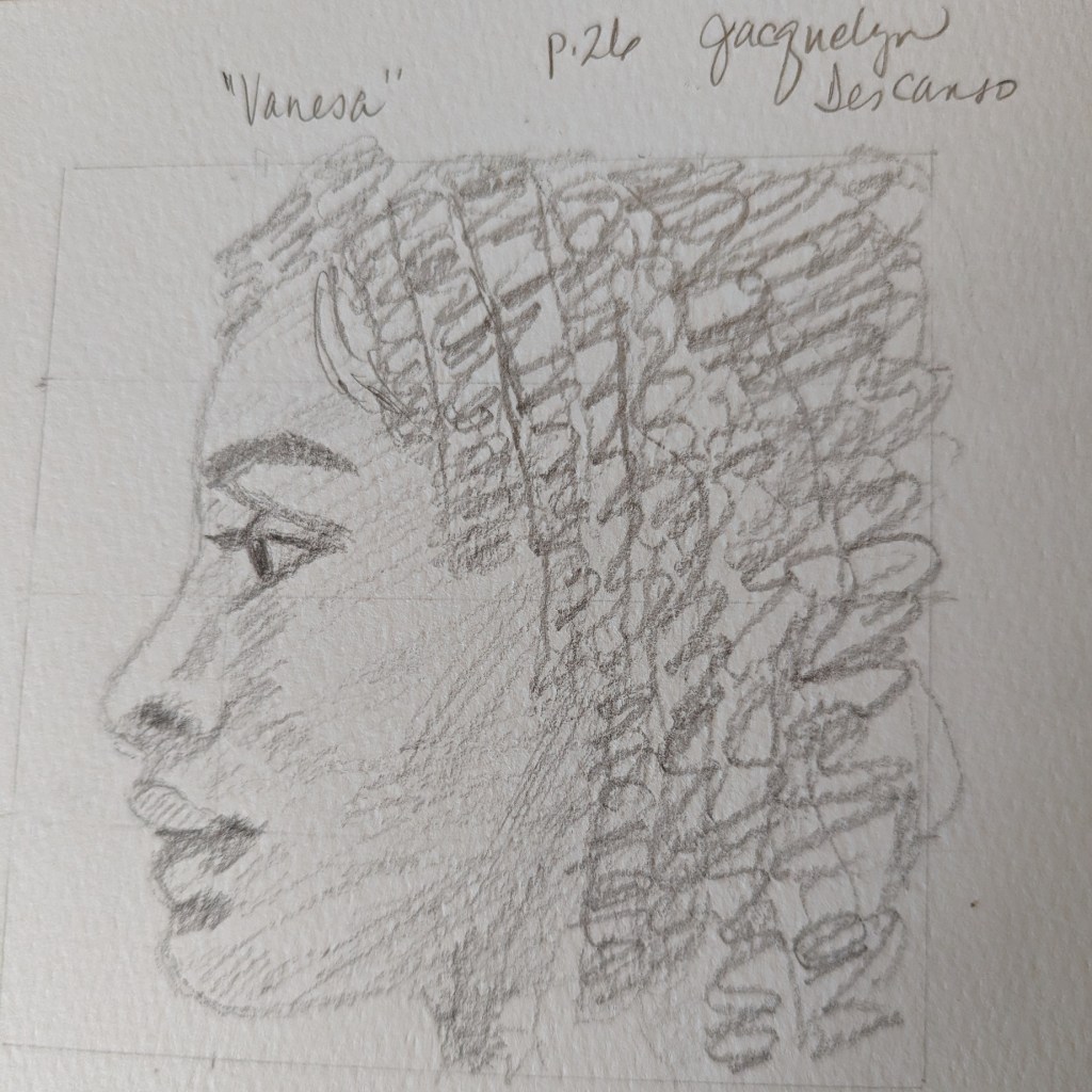
Anyhow, I suddenly got fired up to draw more portraits, so I went back to Phil Davies’ Sketch Awesome class and looked up week 4 which was about drawing portraits based on the Loomis Method.
Below is the result of doing the head in profile via the Loomis method. I don’t have a credit on the author of the reference photo, which comes with the class.
The class covers basic suggested supplies, brushstrokes, values, the grayscale, color mixing, and 3 small paintings.
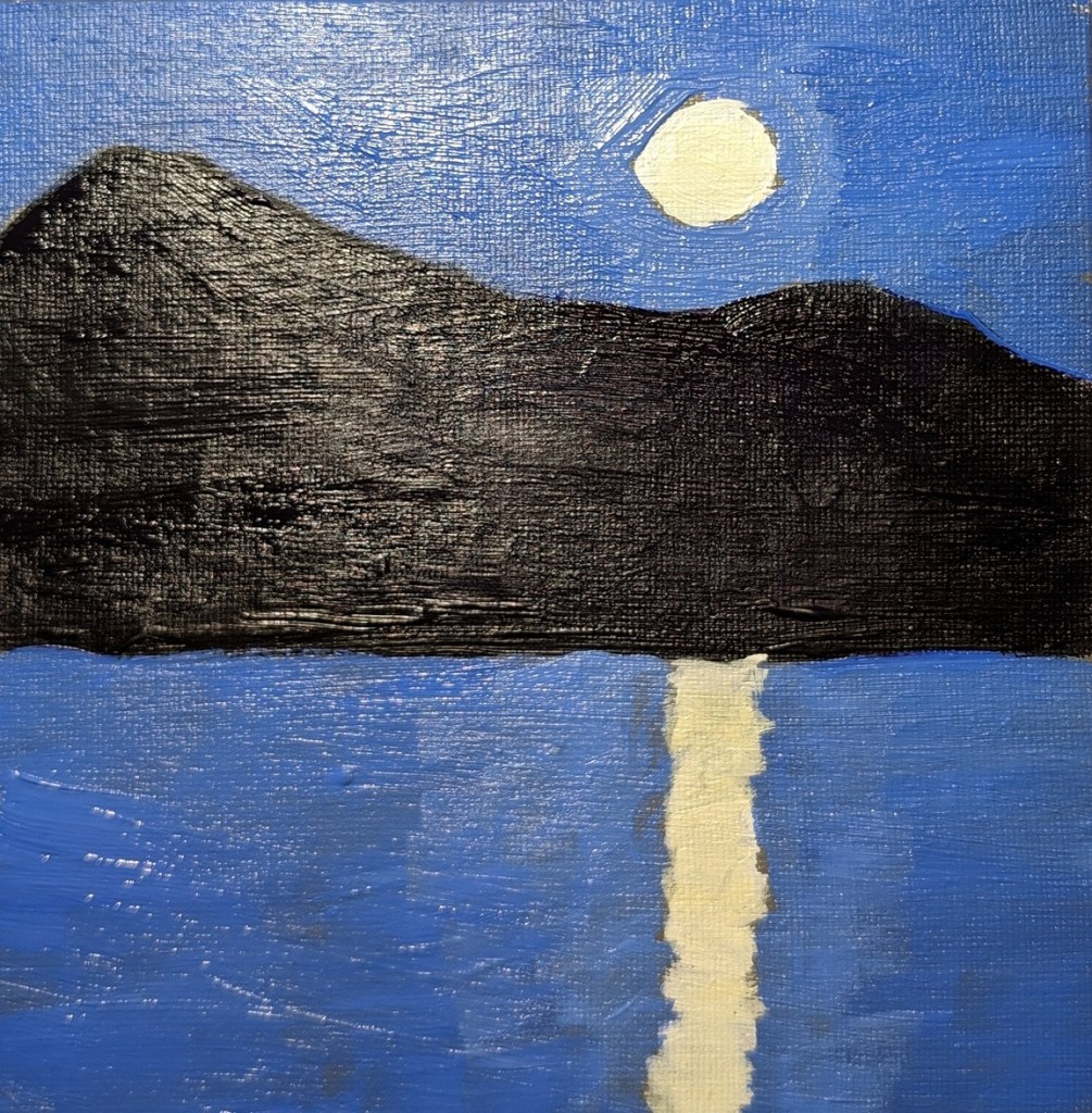
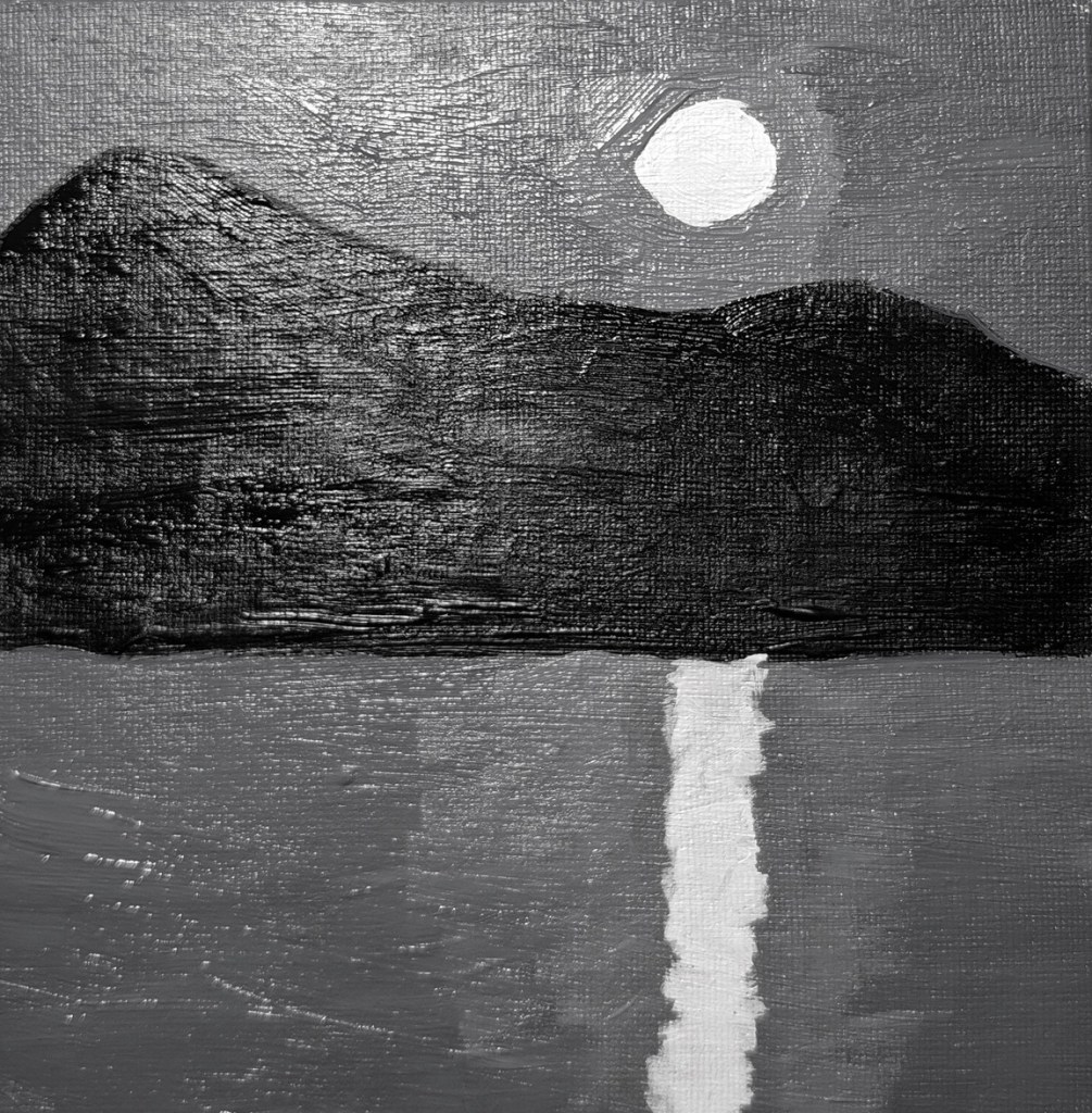
The first two paintings from the class are below. You paint the moon scene in grayscale first, and then paint color over it, keeping with the value map. The last photo is of the color painting, but in black & white to validate the value map.
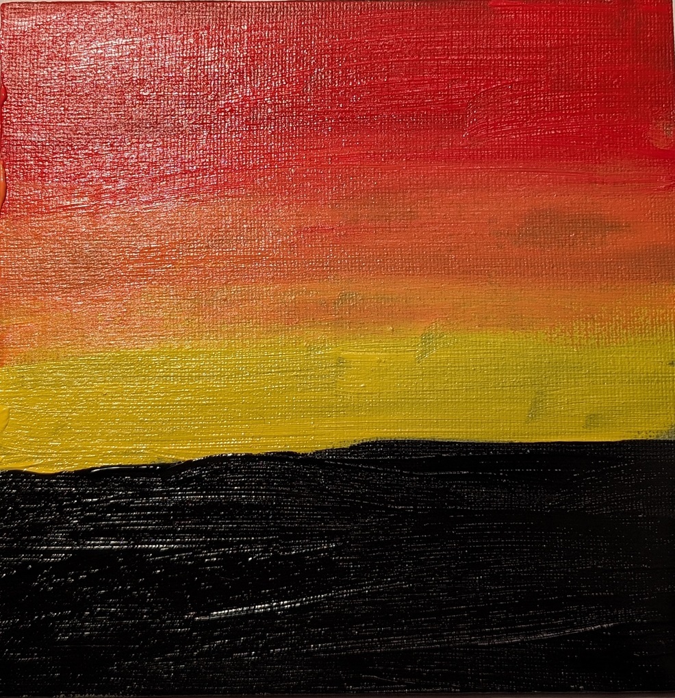
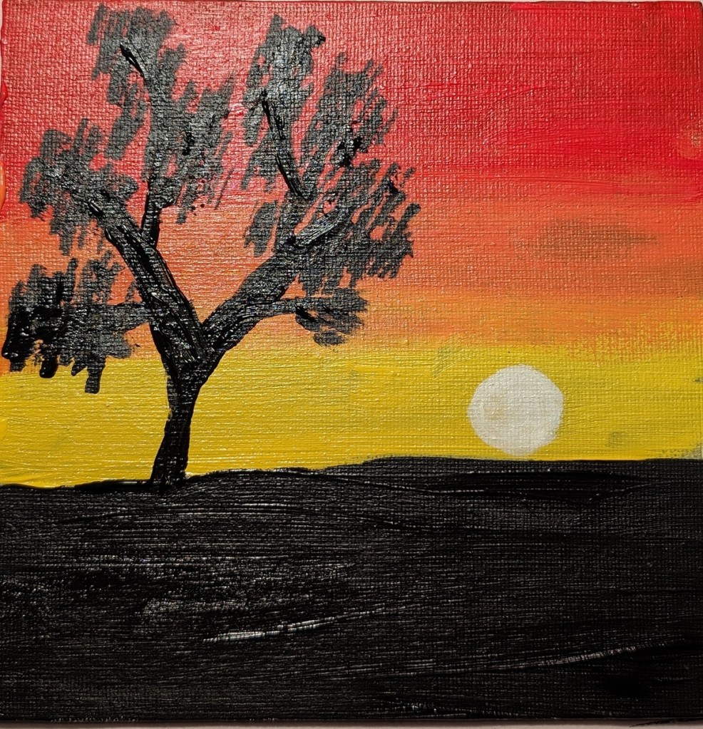
The second set of paintings is a sunset, and the last one (not yet completed) will be roses.
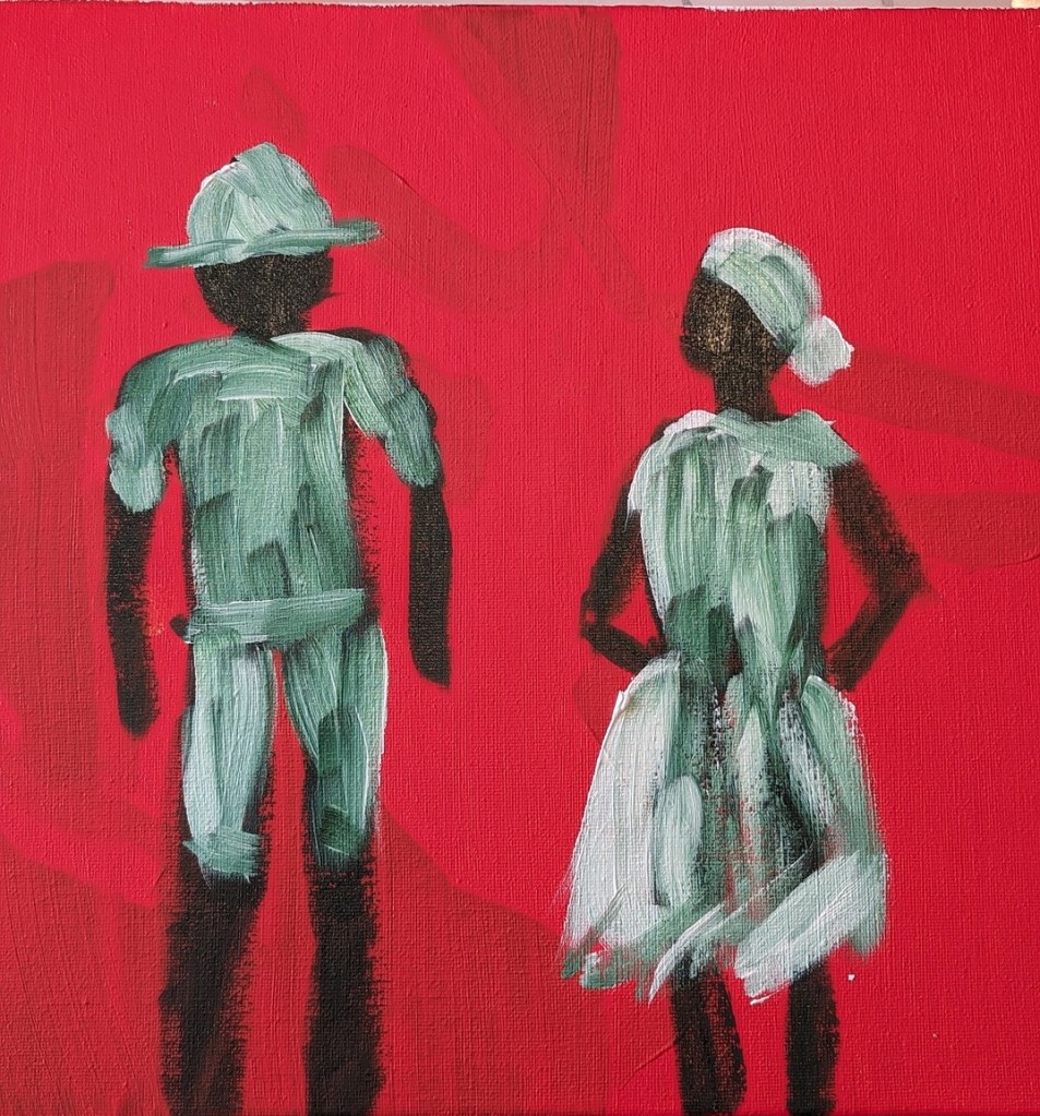
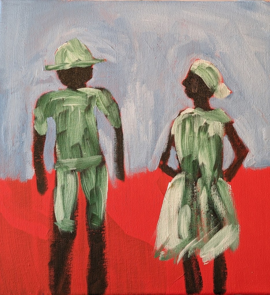
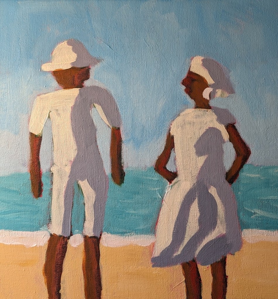
But today I decided to use repurpose an old 12×12 canvas, and paint along with the video I watched last night. It was fun!
So, Slivka started out with an orangey underpainting, and then painted the forms in either Sap Green (which I used) or Hooker’s Green. For my background, I used Pyrrole Red (PR 254) mixed with Cadmium Yellow Hue (Liquitex Basics). (The blotchy look in the background is from my original unfinished painting.)
Then, while the figures were not yet dry, I followed along, painting their clothing in Titanium White, as Slivka did.
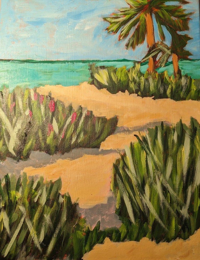
Painting the sky came next. I used Cerulean Blue (Utrecht Fluid brand) with some Titanium White.
Next was the ocean and the sand. Slivka uses some aqua green and Naples Yellow, respectively. I used Liquitex Basics Turquoise Green and created a kind of “Naples Yellow” by mixing Yellow Ochre with Titanium White. The sun-bright clothing was Titanium White softened with Cadmium Yellow Light Hue.
Slivka used Raw Sienna and Cadmium Red for the skin; I used Raw Sienna and Red Oxide. For the clothing shadows, Slivka used a violet with white. I used Liquitex Basics Gray Blue with some white.
I repainted the sky from Cerulean to Light Blue Permanent (Liquitex brand) mixed with additional Titanium White. I may repaint the ocean, and get the horizon line straighter; regardless, this exercise was just a lot of fun!
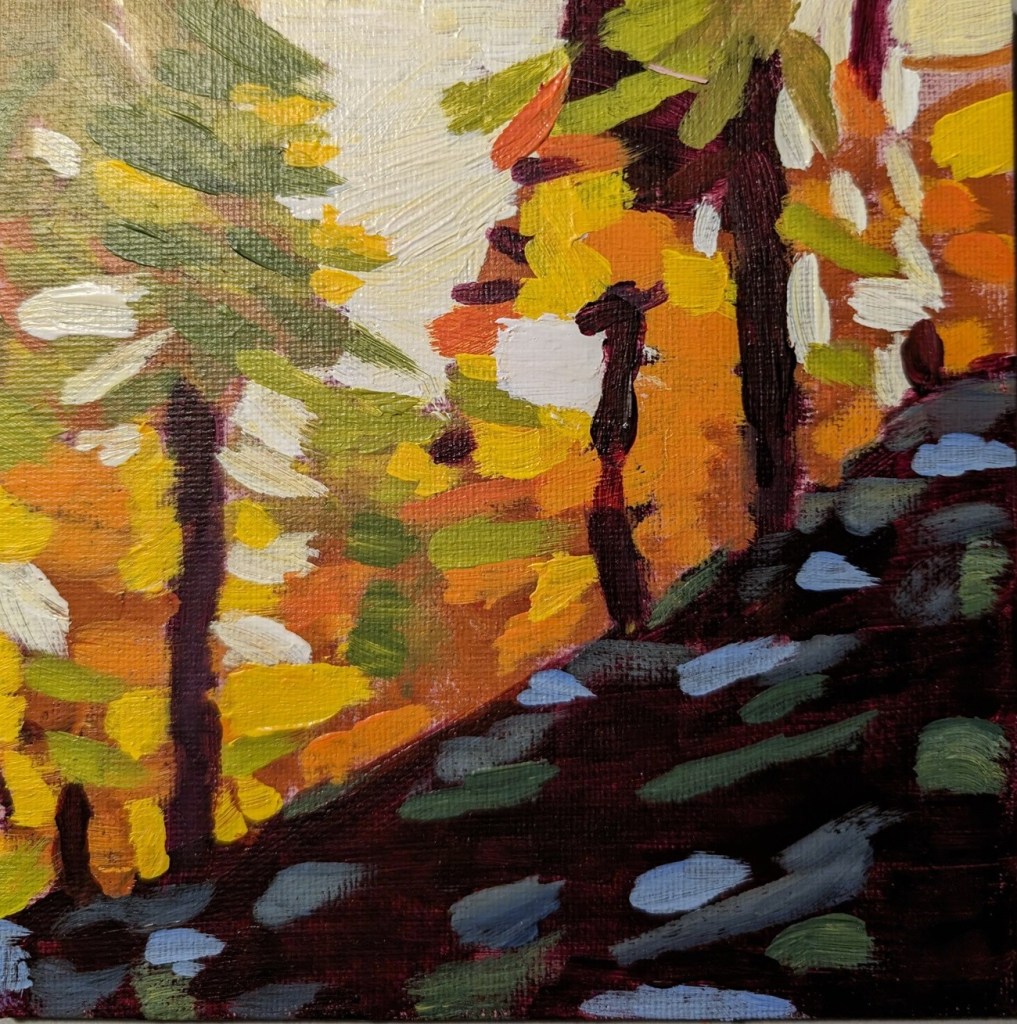
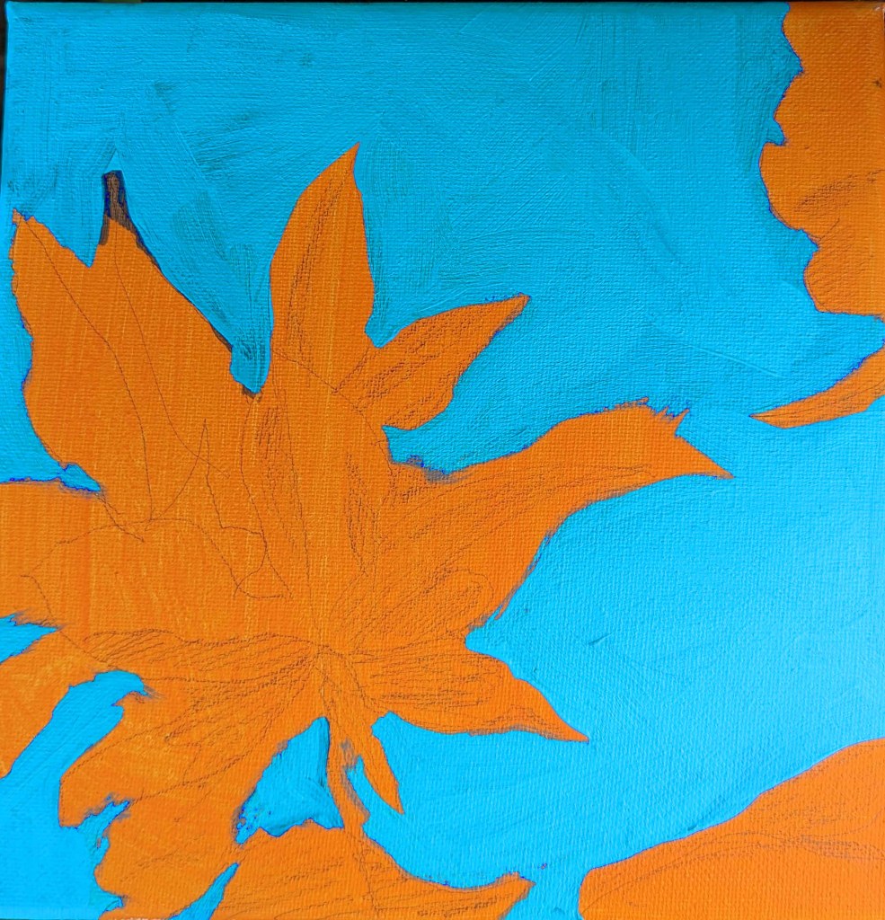
One more study I’ve done in the Adventures in Acrylic class. I did not do the fluorescent orange spray paint, and this time, instead of using my Perinone Orange (a close substitute), I went with Liquitex’s Cad-Free Orange paint, more soothing to my eyes.
Then I did a free-hand drawing in pencil of some of the orange leaves from the reference photo provided in the class, and did some light shading of the shadow areas as I saw them.
My blue was a mix of Utrecht’s cerulean blue (fluid) and Liquitex’s soft-body Light Blue Permanent (I think it is). I used a long-handled small bright brush to paint in the negative spaces.
This is really an in-progress painting, but I’m tempted to leave it as it is and go on to something else. We’ll see!
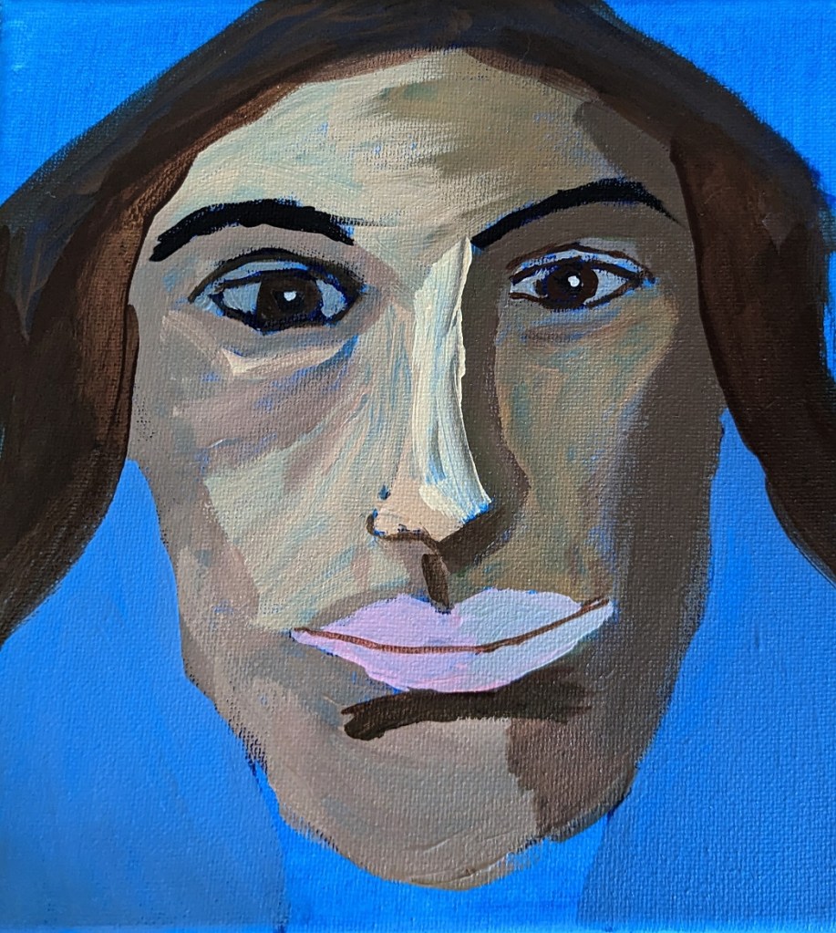
This is another work from Marla Baggetta’sAdventures in Acrylic class I’m taking. I have to say I’m NOT a big fan of phthalo blue, at least as a background. Especially a portrait background! That blue just shines through in an aggravating fashion! And, obviously, it affects the look of the other paint colors used. All in all, she looks greener than I had wanted her to be. Until I get portraits down well, I don’t see the purpose of using wacky colors. 🙂
Anyway, painting a portrait — though this was supposed to be “expressive” and “fun” not an absolute likeness — is one thing, drawing is another. I fiddled with the proportional divider I bought for sketching, and the drawing was pretty decent. But once I started painting over my pencil lines, the drawing went out the window. Ugh!
I AM reasonably satisfied with the facial planes and the shadows — for a first attempt.