This is a sketch of one of my cats which I did with compressed charcoal last fall.
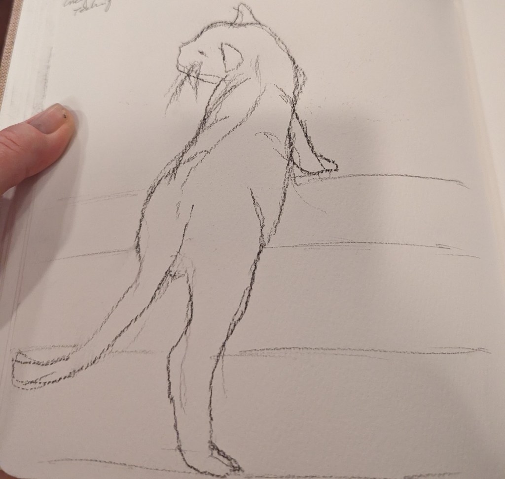

This is a sketch of one of my cats which I did with compressed charcoal last fall.
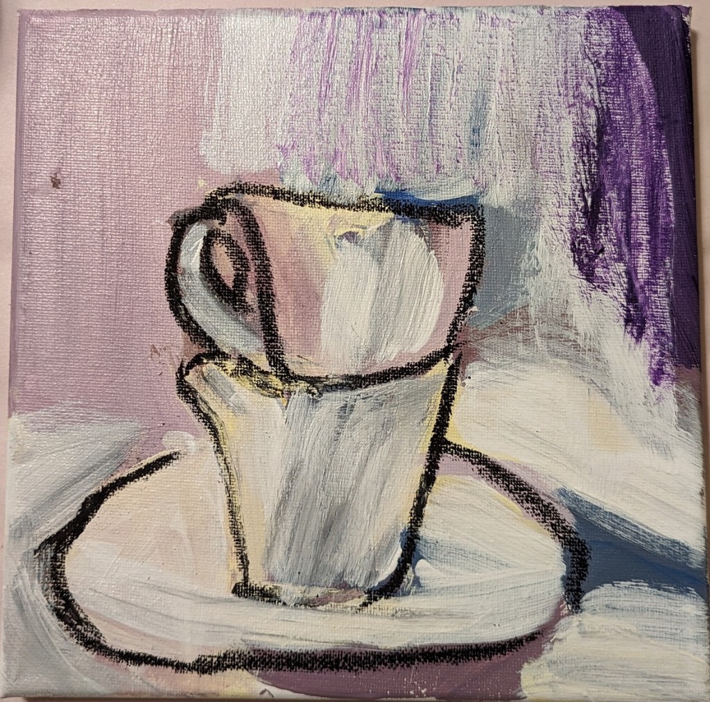
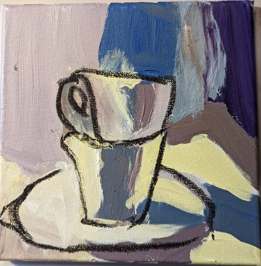
Today I was actually painting from a demo painting of martinis in How to Paint Fast Loose & Bold by Patti Mollica. But I don’t want to risk copyright issues so I’m not posting it. (Besides, you can check out the real deal in the book, which I can assure you is much better than my effort, lol!)
So I’m posting a charcoal drawing I did last year while I get to painting based on my own stuff.

I love the idea of painting white objects because I know you’re not supposed to use, say, Titanium White to indicate snow, sand, white dishware, white linen, white flowers, clouds, etc. Instead that “white” will have greyed blues, greyed lavenders (light purple), perhaps some yellows and/or oranges.
So, when I saw the reprint of “White Cups” in How to Paint Fast, Loose and Bold: Simple Techniques for Expressive Painting, I thought I would give it a try. Can I come close to matching these colors?
When I look at the reprint of Mollica’s work, I see light shades of yellow, shades of yellow ochre, lavender, greyed purple, maroon, an olive green, a desaturated orange, a dark purple “black” that might be a mix of ultramarine blue and burnt sienna or a Payne’s gray. I see greyed blue, and even a rich brown that might be burnt umber or might be a mix of red, blue and yellow. At best, there might be two small highlights of a pure white on the lip of each cup.
Sounds good, but I failed at color mixing. Ugh. I drew over the dried big splotches of paint (see right)with compressed charcoal because it wasn’t even obvious what the object was! Then I ended up deciding to heck with it, I’ll use a glaze of titanium white — and glazes, I’m told, are not successful with opaque pigments like titanium white.
Since the painting was a fail anyway, I went ahead and did the glaze, careful to keep my compressed charcoal lines. (left most photo)
Afterwards, I used a color picker app to get a sense of the colors in the photo, which all tend toward brown. I suspect that is partly an artifact of the photo, which is quite probably not an accurate reproduction as far as the colors are concerned.


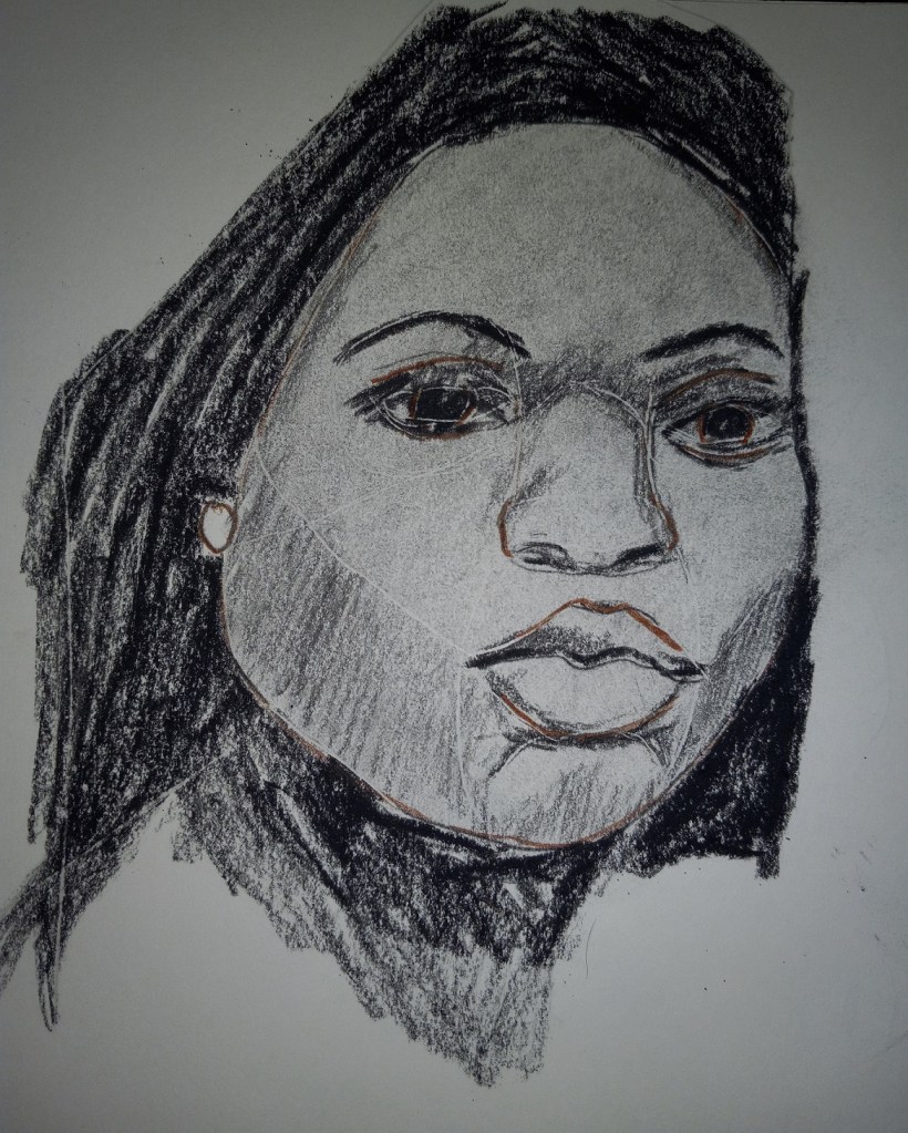
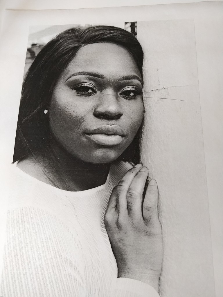
Lesson 1 of Charcoal Like Mad (by Kara Bullock) was to draw a portrait on cardboard (!) using the reference photo provided, and compressed charcoal (black and white), and charcoal pencils (black and white).
I only had corrugated cardboard available so I used that. Not crazy about the ridges, but hey, it was just play! This was fun — but I pressed too hard on the nose and busted a hole in the cardboard!

The main difference between this portrait and the one I posted a few days ago — besides the color of the paper and the lack of sticker residue — is that rather than using the white “charcoal” pencil, I used the eraser to lift the color for the highlights in the eyes, and the earring.
The image is from Anastasia Gepp on Pixabay.
It’s been some time since I’ve posted to this blog, but I’ve been doing a fair amount of sketching by copying from illustrations in childhood favorite books, and from some of the example drawings in art instruction books by Barrington Barber. Something best kept in a sketchbook and not posted to social media.
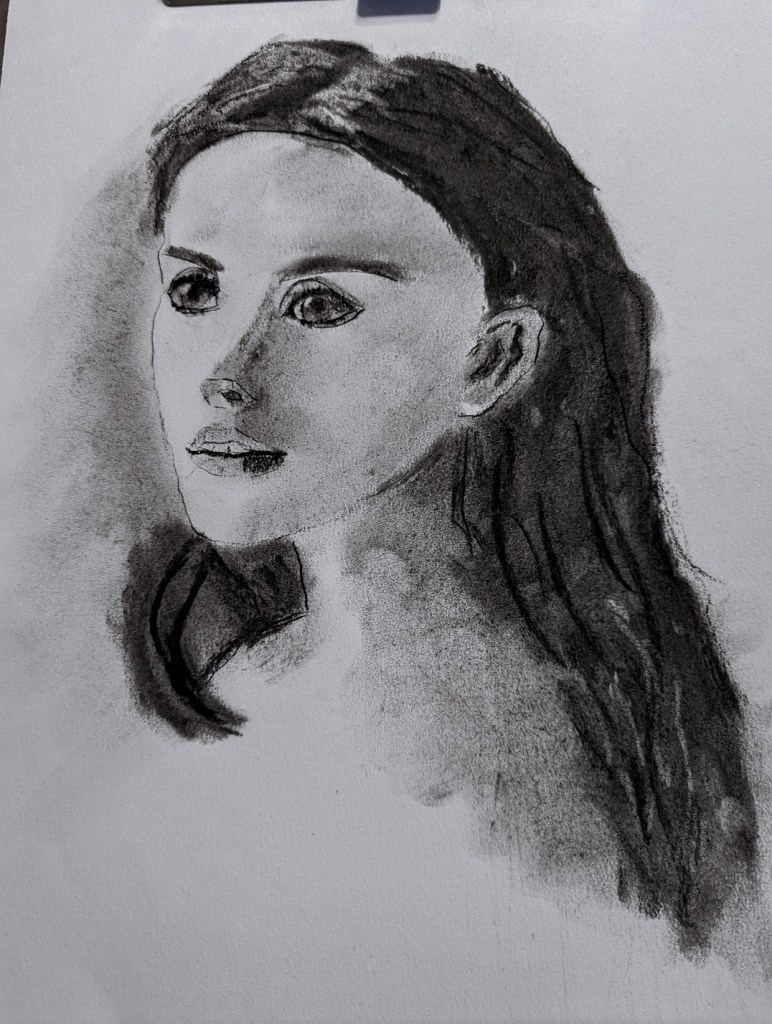
Of course, like every other beginning artist who does some copying, I eventually got bored! So, now I’m back to charcoal (from graphite) and starting to work on more portraits. With the portrait below, I used charcoal pencils, willow sticks, compressed sticks, and white “charcoal”. I’m about to start taking the learn-at-your-own-pace online course Charcoal Like Mad taught by Kara Bullock.
That ugly outline of a rectangle crossing the eyebrow and nose on the image is actually from the gummy tag identifying the color of this Canson Mi-Teintes paper (cinnamon). Ugh! But the paper has sat in my closet for about 2 years now, and the closet is the warmest room in the house in summer, coldest in winter. Time to use the stuff up.
In the meantime, this is just a warm-up to get back in the flow, and playing with charcoal.
My work is based on a Pixabay image by Anastasia Gepp.

So this is the completion.. I used charcoal pencils (2B and 6B) — over graphite and the colored pencil, so that was a fail — and willow charcoal.
Photo by Clarke Sanders on Unsplash
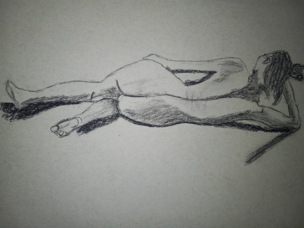
This is a 20 minute charcoal sketch based off Degas’ Nude Combing her Hair, which he did in pastels.
You can see where I had to restate lines to get the shapes (somewhat!) closer to the original.
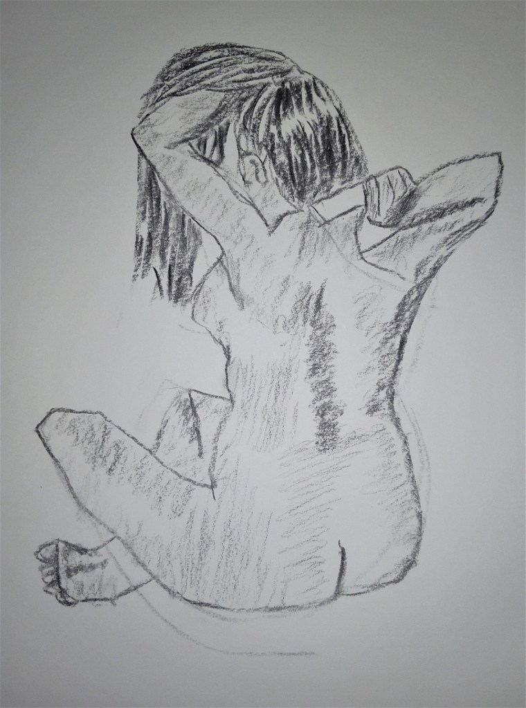
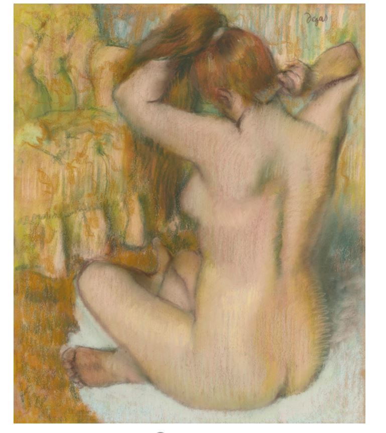
This was done in charcoal pencil (2B and 6B) on gray-toned paper. The reference photo was from the Life Drawing Techniques class on ArtTutor.com