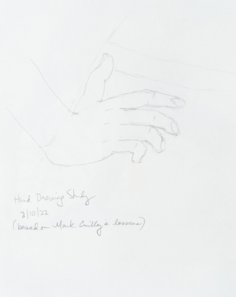
These sketches are based on lessons in the book I bought a few weeks ago (Mark Crilley’s Ultimate Book of Drawing Hands).


These sketches are based on lessons in the book I bought a few weeks ago (Mark Crilley’s Ultimate Book of Drawing Hands).
Just practicing drawing hands…

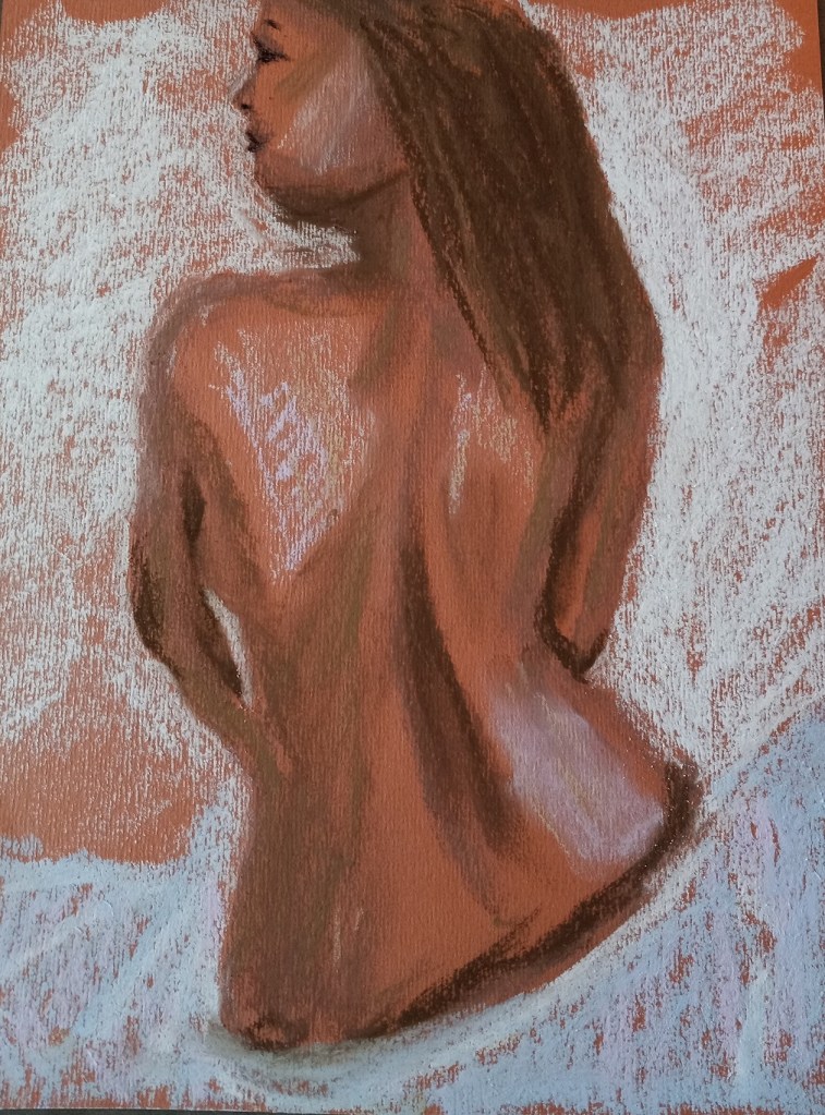
This study was done on “Cinnamon” Canson Mi-Teintes (smooth side) in charcoal, soft pastel and pastel pencil. It was based on a demo in Sarah Hoggett’s Drawing & Painting Portraits & Figures: A complete step-by-step course, with 35 projects and 800 photographs.
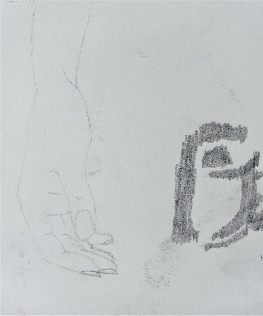
Another hand based on the Crilley book…

This speaks for itself, and is based from the awesome book Mark Crilley’s Ultimate Book of Drawing Hands.

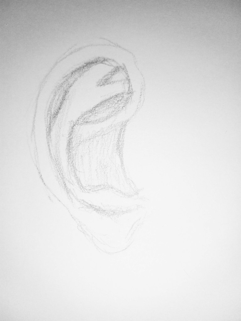
Ears are something I need to practice as well, mostly because I want to get the inner shapes right on a profile-view.
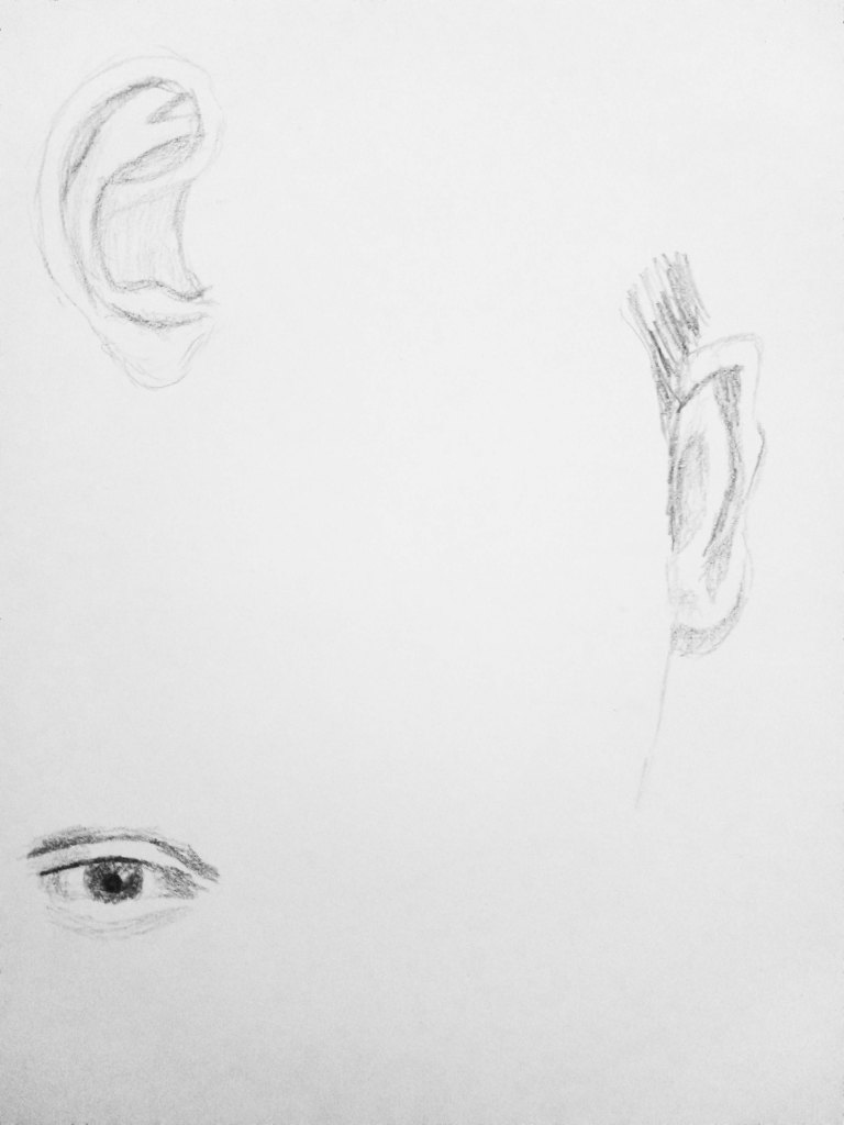
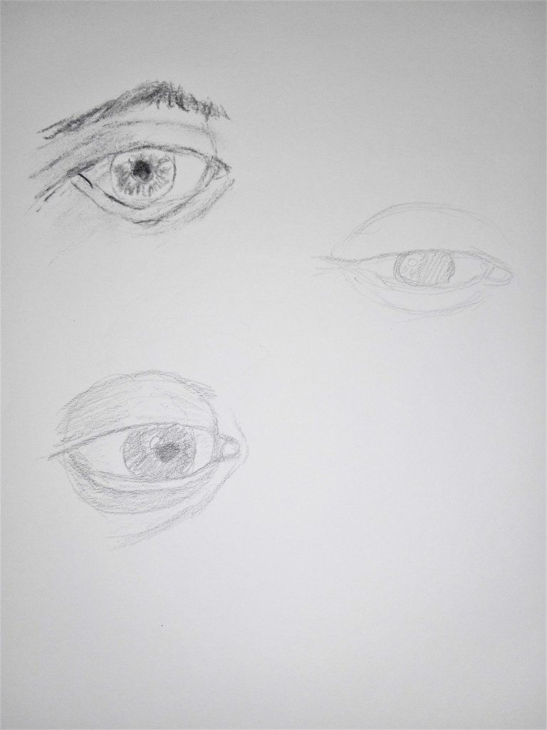
I have several books on portrait drawing, and drawing facial features. This is practice drawing eyes, and remembering that eye is actually a ball. The eyelids wrap around the spherical shape of the eyeball.
I recently purchased the book Mark Crilley’s Ultimate Book of Drawing Hands, because I have such difficulty drawing hands, particularly fingers. I can look at my left hand and draw it, palm down or palm up, but things like a hand at rest, a hand holding a spoon, a hand on the hip are more challenging.
I think this book will help me — assuming I practice daily.
Here are my first attempts.
I just got The Landscape Painter’s Workbook: Essential Studies in Shape, Composition, and Color by Mitchell Albala. I really don’t know much about painting, although I’ve wanted to do it most all my life. I figured I had to learn how to draw before I painted. (Turns out, maybe, maybe not.)
In any case, the first chapter is about shape interpretation, and the first exercise is to “simplify and differentiate with limited values”. Albala has you do a painting in black and white, using 5 values (so the 3 mid-values are grays). He has you to choose a photo, and then put it in grayscale, squint and determine the no more than 5 values (to simplify). So, I used his photo example first without turning the page to see his proposed value study.
Here is my attempt, and then below it is my copy of how he did the 5 values from his photo in the book. The first thing I realized, after looking at his examples and his comments, is that i totally focus on trying to match the photo. The sky in the example photo is fairly overcast and looks like a “2” value (on a scale of 1 to 5, with 1 being the brightest), whereas the ground at the bottom of the photo looks brightest. But in reality the sky should be the lightest brightest value, so you have to adjust the proposed painting and not necessarily match the photo!
This realization also enforces another idea — there’s a reason landscape painters do paintings “en plein air”. If I were outside doing a value study (or painting) from life, it would be obvious that the sky is the lightest value and you don’t want the ground “fighting” the sky! This can be a downside of photographs.
Below that example, I used my own photo — taken in Sonoma County at a winery (I forget which one) — and my attempt at the 5 values the way I would paint it.
I used NuPastels on toned drawing paper.
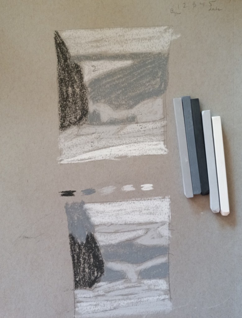
Below is my photo and my idea of a value study.


