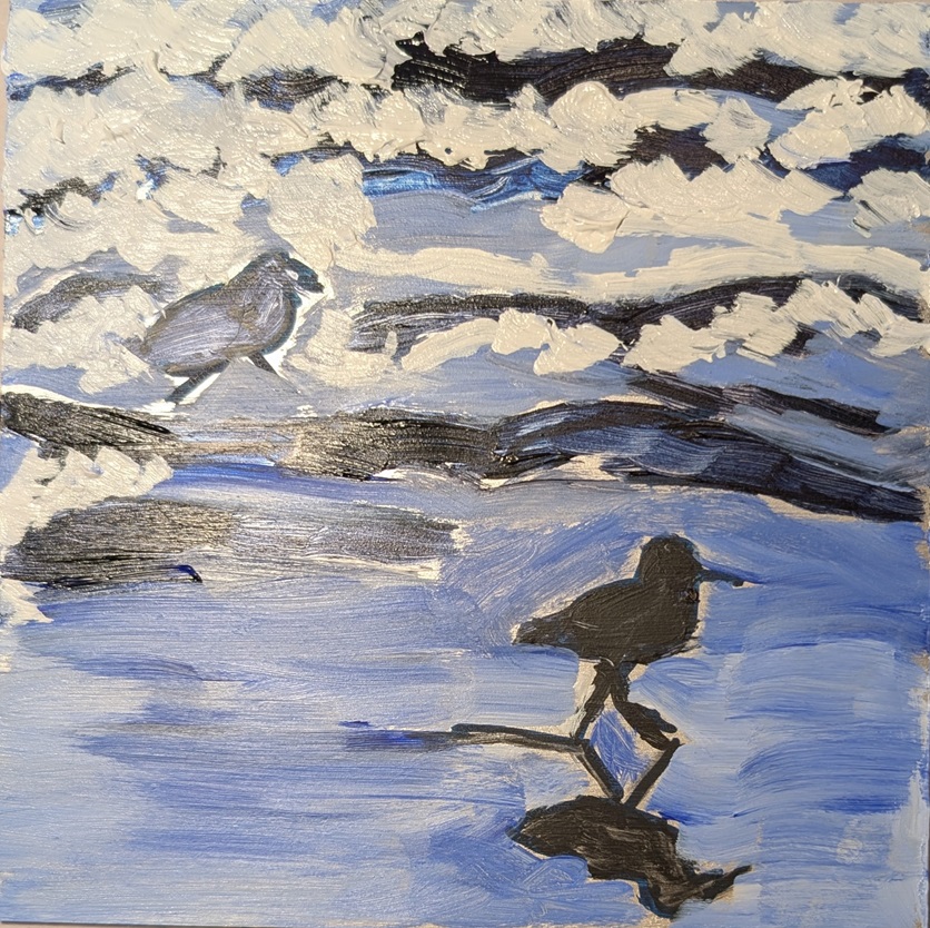
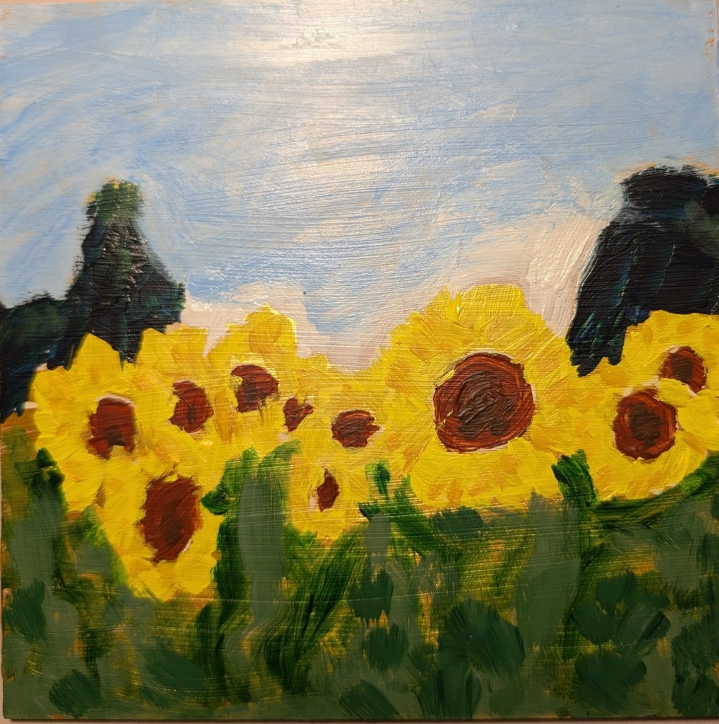
This was painted on a 12×12 canvas panel, and is based on a paint-along work done by Dianna Shyne in Acrylic University for a winter challenge back in December 2023 (before I had joined AU as a member).
I started out following her, but then I gave up and focused just on the reference photo for guidance.
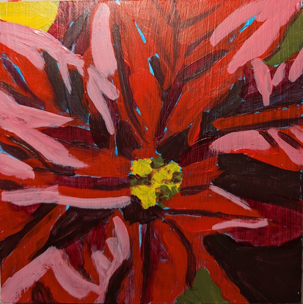
My husband thought they were Christmas lights until I had completed the tags. (That said, I’m now working on a piece that IS of Christmas lights, part of this year’s winter challenge. Hopefully, I’ll have it done before Dianna’s paint-along this Friday.)