I’ve never really considered digital painting before because I don’t have an iPad or an iPhone. Instead, I have an Android phone, and a Kindle Fire 10. However, one of my favorite artists on Instagram (Teddi Parker) has posted occasionally some work she’s done using ArtRage Vitae. So I decided to check it out — and to my surprise it’s available not only for Apple products, but Android and desktops (Windows, MacOS).
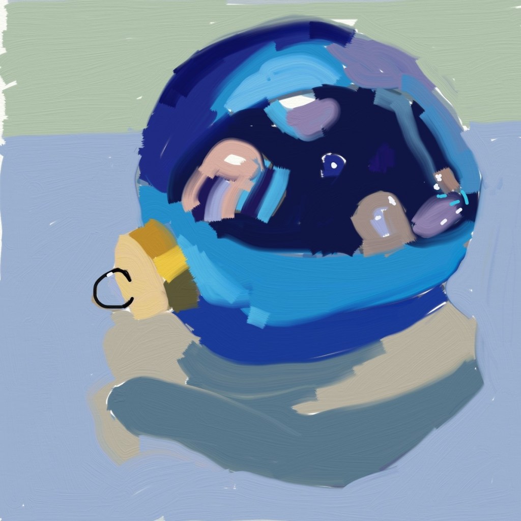
Okay, then. I bought it for $2.99 on Google Play and loaded it on both my phone (can’t see using it there, though!) and my tablet. Below is my first work.. a sketch of my cat, Simba, based on a photo I took of him some time back when he was on my lap. I saved it before I finished his long white whiskers (well, really I messed up with layering and had to start all over again.)
Not bad, for a first attempt. I used my finger, and am debating purchasing a stylus to see if that helps.