
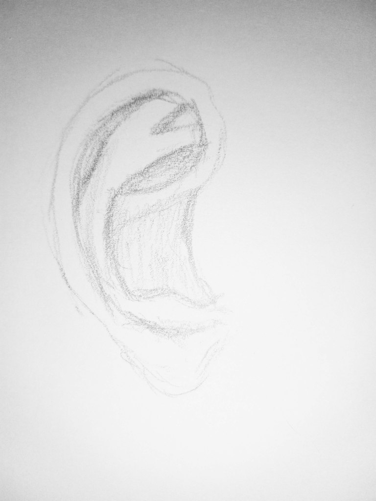
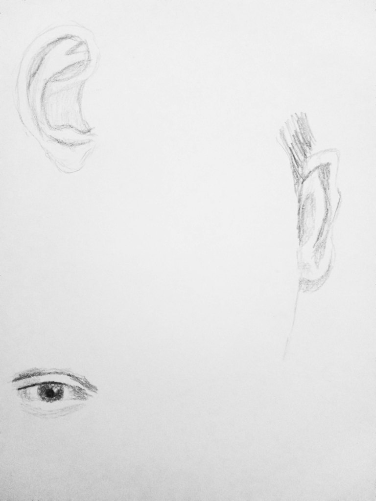
Ears are something I need to practice as well, mostly because I want to get the inner shapes right on a profile-view.
beginner
A Pair of Apples
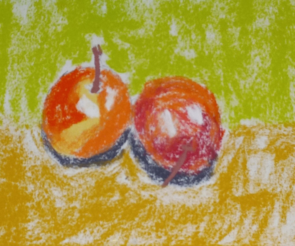
This was done on 6×8 white Pastelmat, sketched first using an H pencil. I did not do an underpainting.
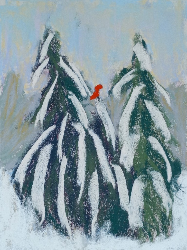
Fir Trees in Snow: attempt #2
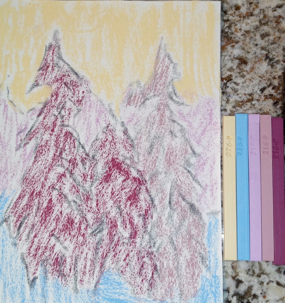
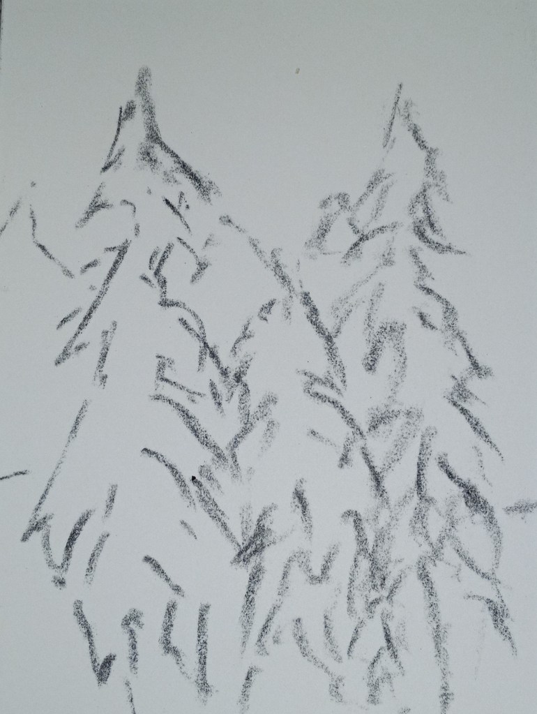
This study was inspired by an image by Yann Allegre on Unsplash. I used the same pastels as I used for my previous effort, but I added a more detailed underpainting using NuPastels, after sketching the trees with vine charcoal.
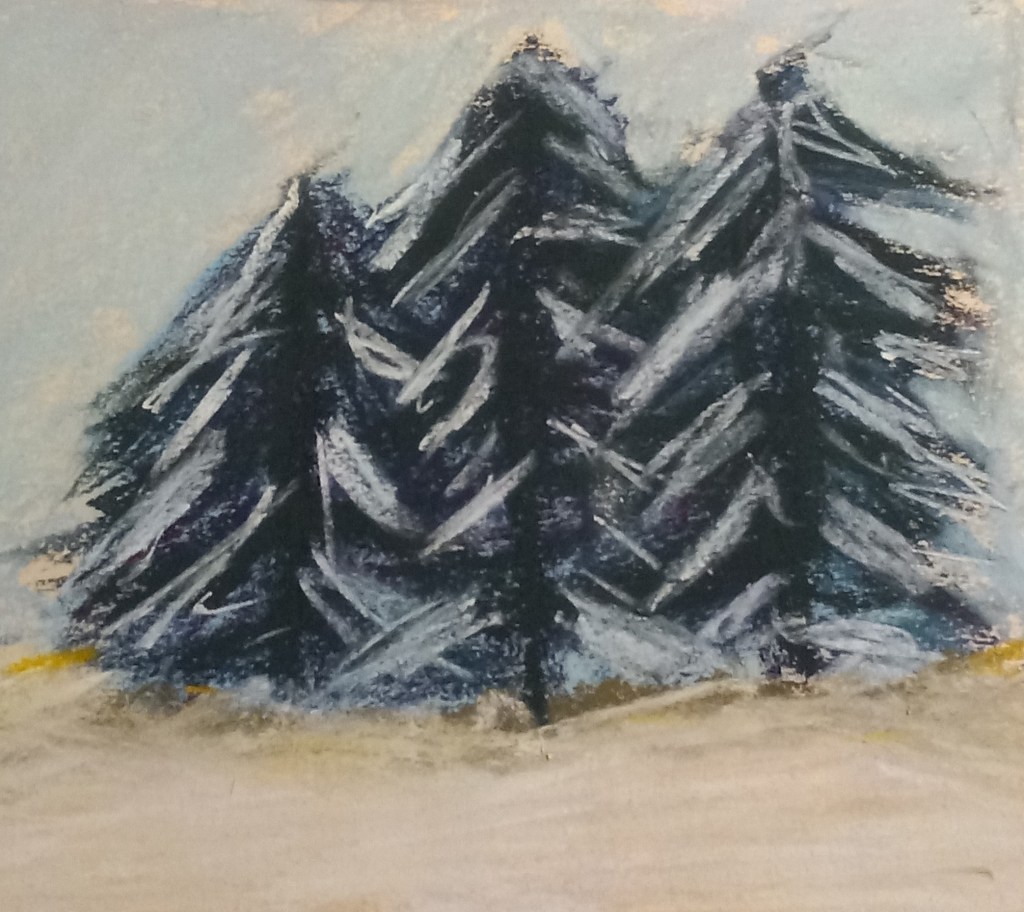
Fir Trees with snow: 1st Attempt
I used a turquoise NuPastel for the underpainting of the fir trees, and the fact that it peeks through is about the only thing satisfying about this effort. The photo doesn’t show the snow well, but I used yellows, pinks and light blues as the snow rather than straight white. The snow on the branches was actually a very pale yellow color — almost white — and a Blue Earth pastel.
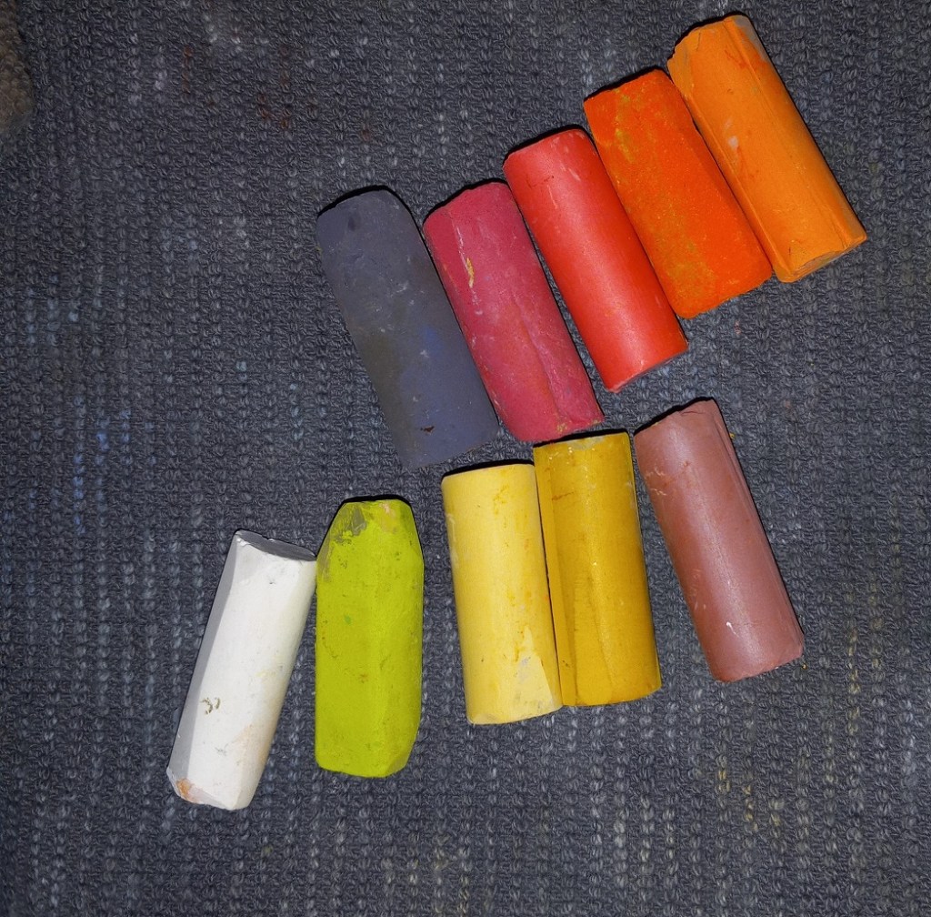
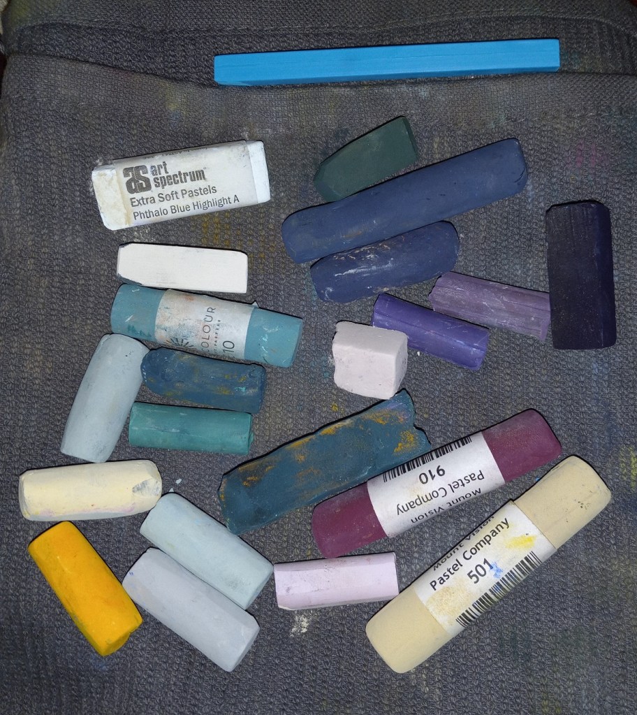
And these are the pastel sticks I used.
Snowscape in Color
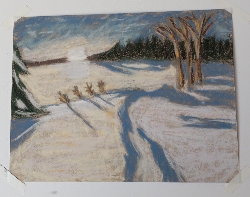
Here is my snowscape done in color. The snow is partly pink, blue and yellow, and very nearly white where the small bushes are. I removed the little pine tree at the suggestion of a member of Karen Margulis’ Patreon group for pastel classes. Most of the pastels used were Richeson hand-rolled, which is fast becoming my favorite brand.
(I have the comparison between the value study and the color version below. The original image was by Alain Audet from Pixabay.)
This is how the two versions compare:
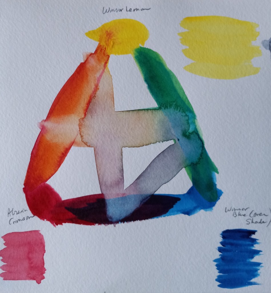
Watercolor Color Wheels
I was playing with my new watercolor travel kit and made two color wheels — one Warm, one Cool. The Warm wheel was mixed from French Ultramarine, Cadmium Yellow and Cadmium Red (all Winsor-Newton). I love the orange, but the “purple” and “green” are unappealing. (This was done on 300 lb. paper.)
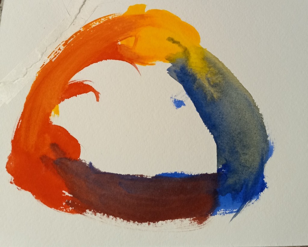
The Cool color wheel was made up of Winsor (Phthalo) Blue (Green Shade), Winsor Lemon and Alizarin Crimson. The “orange” is unappealing to me, but l love the vivid green. The purple is not too bad.
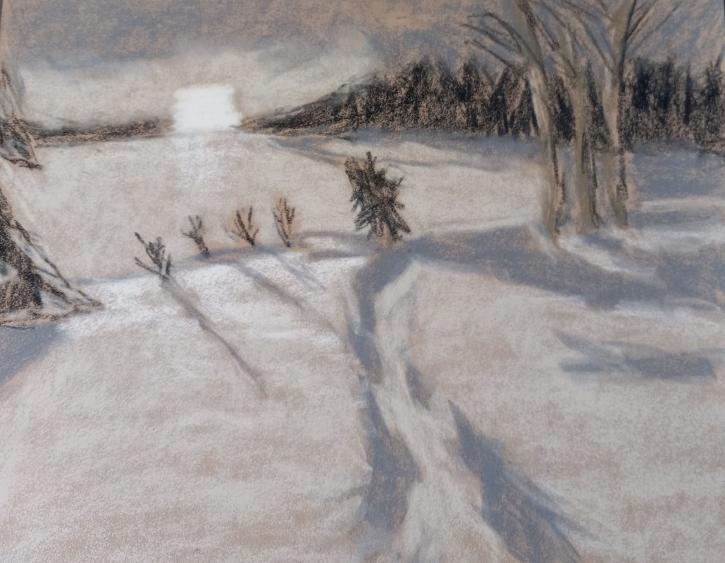
Value Study for Snowscape
Today, on Karen Margulis‘ Patreon page, she challenged us to do a painting using only hard pastels like NuPastels, Rembrandts, Cretacolor, etc. Well, my Dick Blick Artist’s Soft Pastels are roughly the hardness of Rembrandts, so I chose to use those.
Then I decided to do a value study for a snowscape based off a Pixabay image by Alain Audet from Pixabay. I may end up using this as an underpainting for that snowscape, but I suppose it could stand alone. I did this on Sand-colored Pastelmat, 9×12.
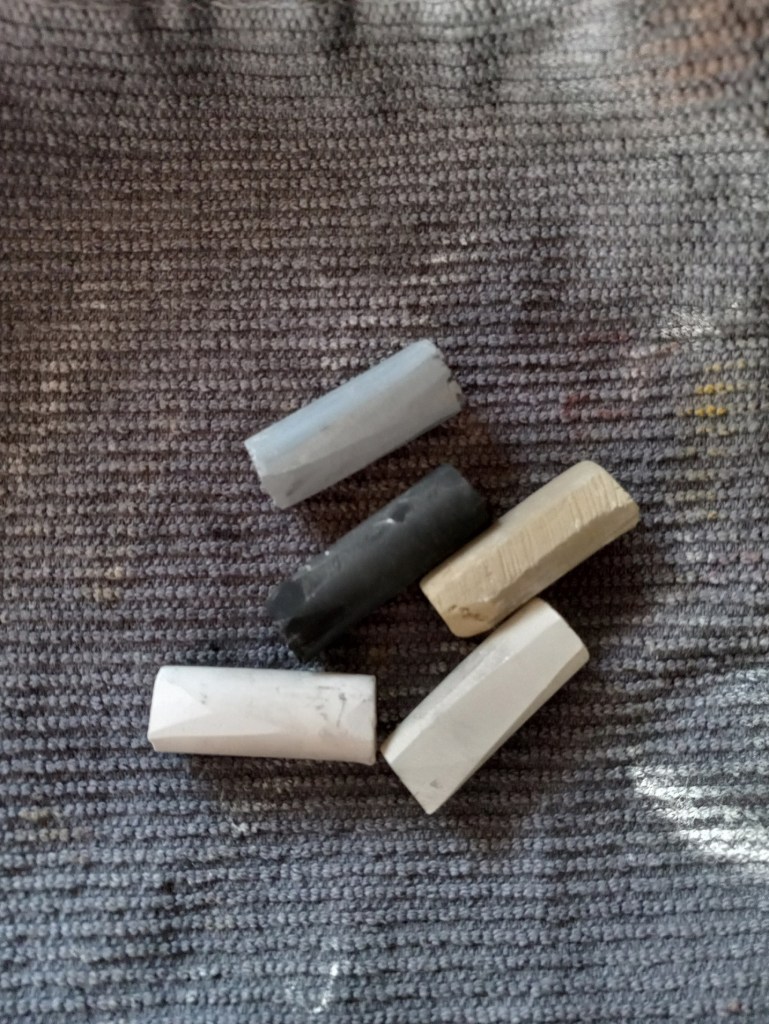
And these are the sticks I used.
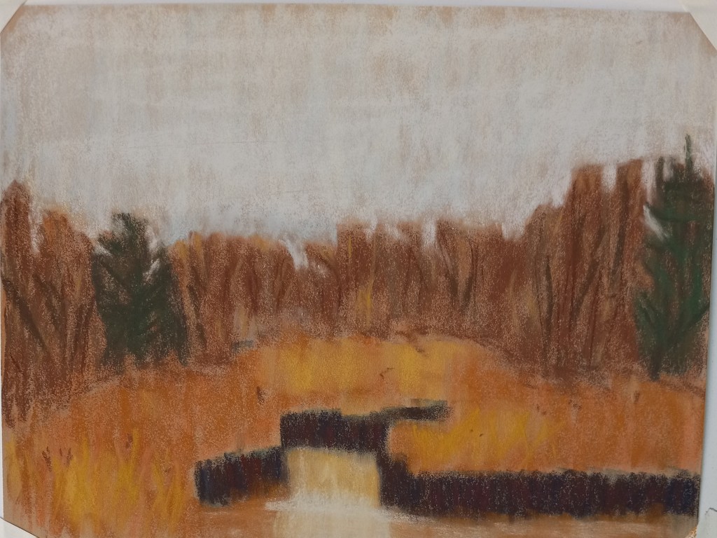
Bog in Winter
This work is based off a photo by Pexels from Pixabay. I did it on a 9×12 piece of Pastelmat in sand color. I did an alcohol wash underpainting, using NuPastels in orange, rust and deep dark blue. Most of my pastels were Blue Earths and Richeson Hand-rolled, the latter quickly becoming my go-to pastel sticks.
Trying out UART 400 Paper
Today I painted the same scene as yesterday, using the same pastels, but using UART 400 paper (again from my Jackson’s Art sampler set). This paper was easier to use, and I enjoyed it very much. The marks I made were much bolder — automatically — on the UART 400 paper.
Image by Evgeni Tcherkasski from Pixabay
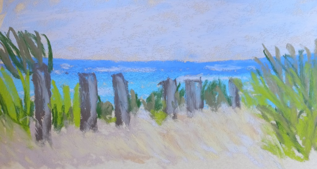

And here are the two paintings side by side. The velour version appears much softer, almost as if the image is blurry.


