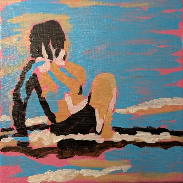
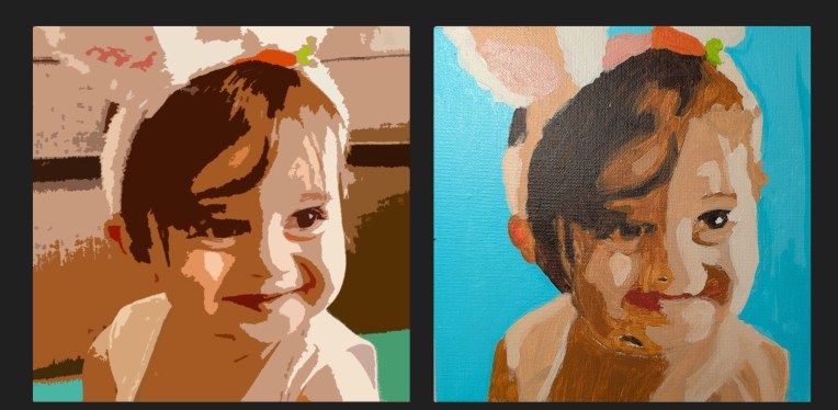
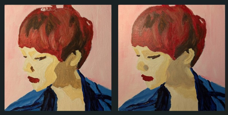
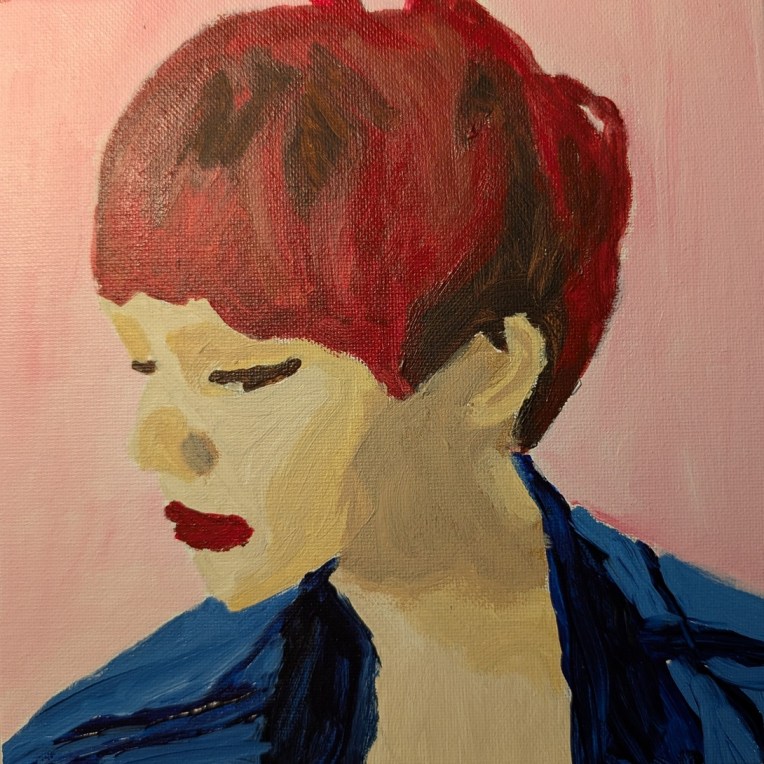
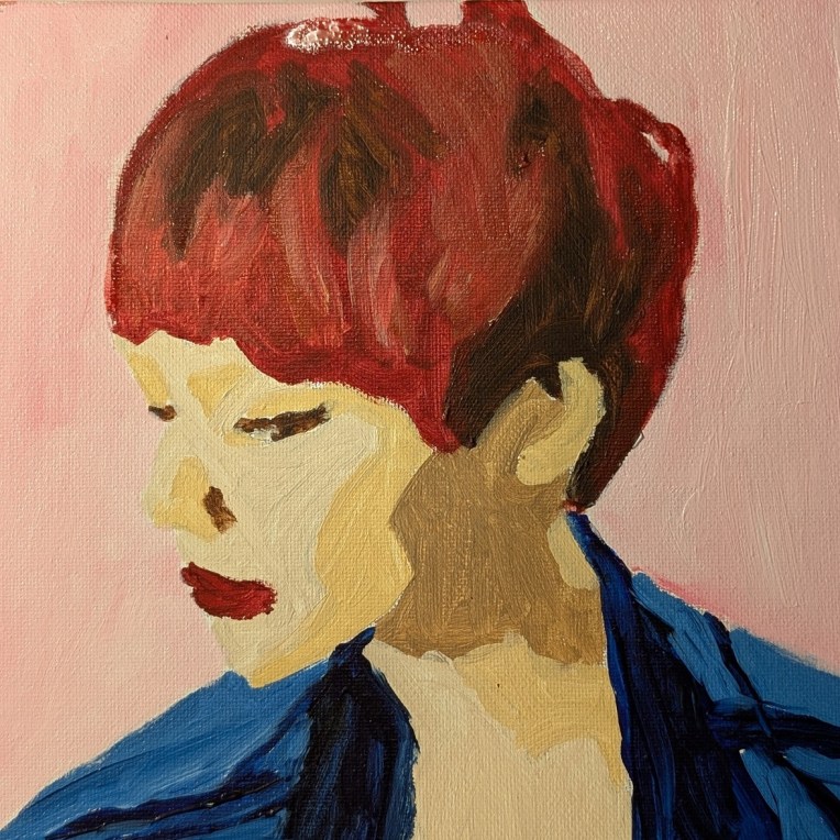
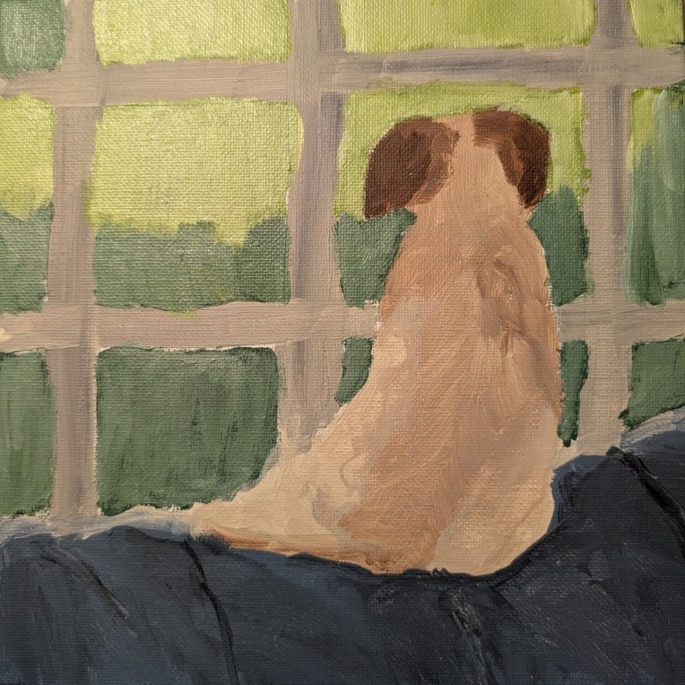
I think I’ve mentioned before that I’m a VIP member of Fresh Paint, an online art class/community led and taught by Ali Kay. This painting, which I did on an 8×8 canvas, is based off a template and black & white reference photo that I downloaded from the Fresh Paint site in December 2024. (I can no longer find it on that site!)
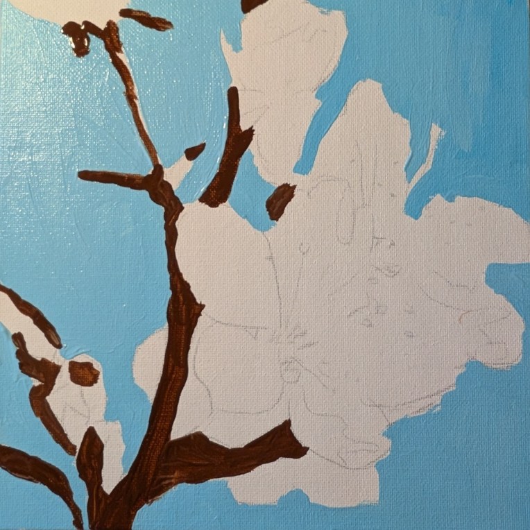
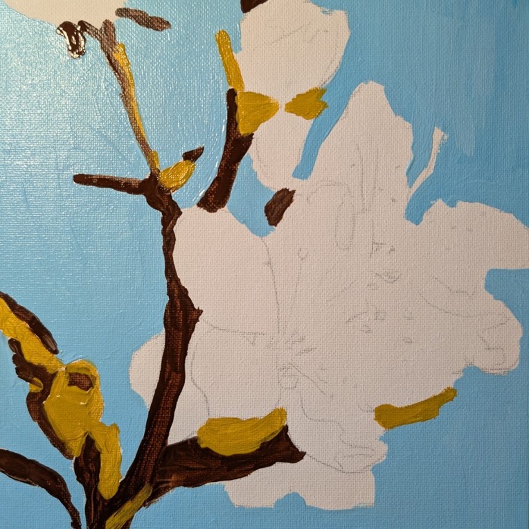
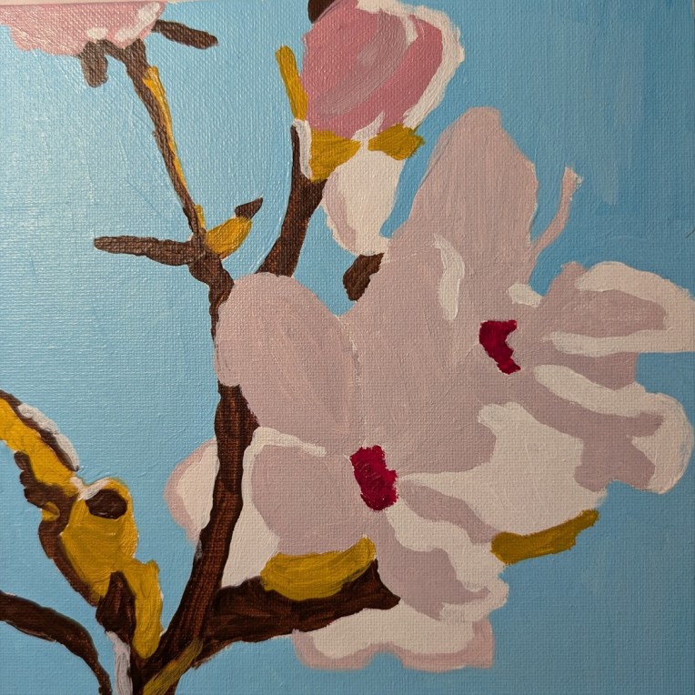
In any case, I had already toned this canvas with an orangey pink; Ali Kay uses a magenta as her background. Basically, I copied her painting as far colors are concerned. For the skin color, I used Raw Sienna by Liquitex, mixed with Titanium White. The blue is Light Blue Permanent, in Liquitex Soft Body format.