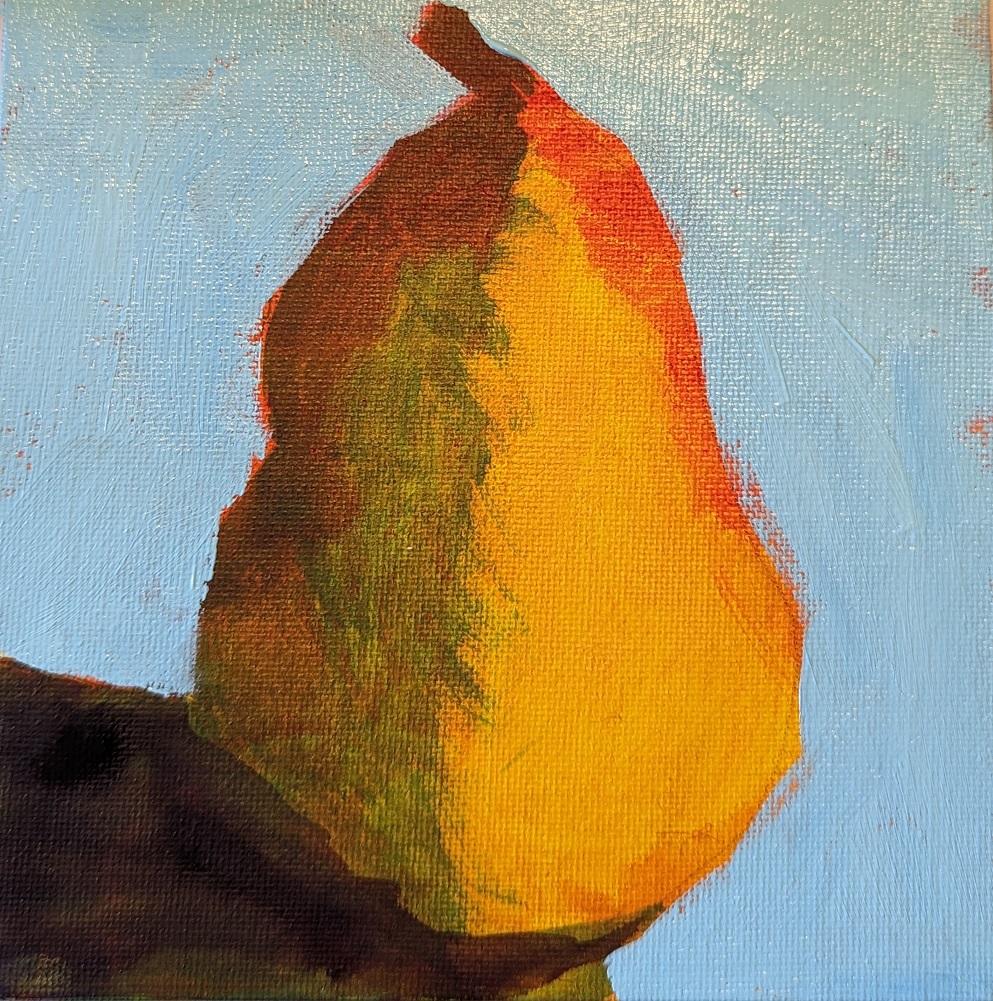
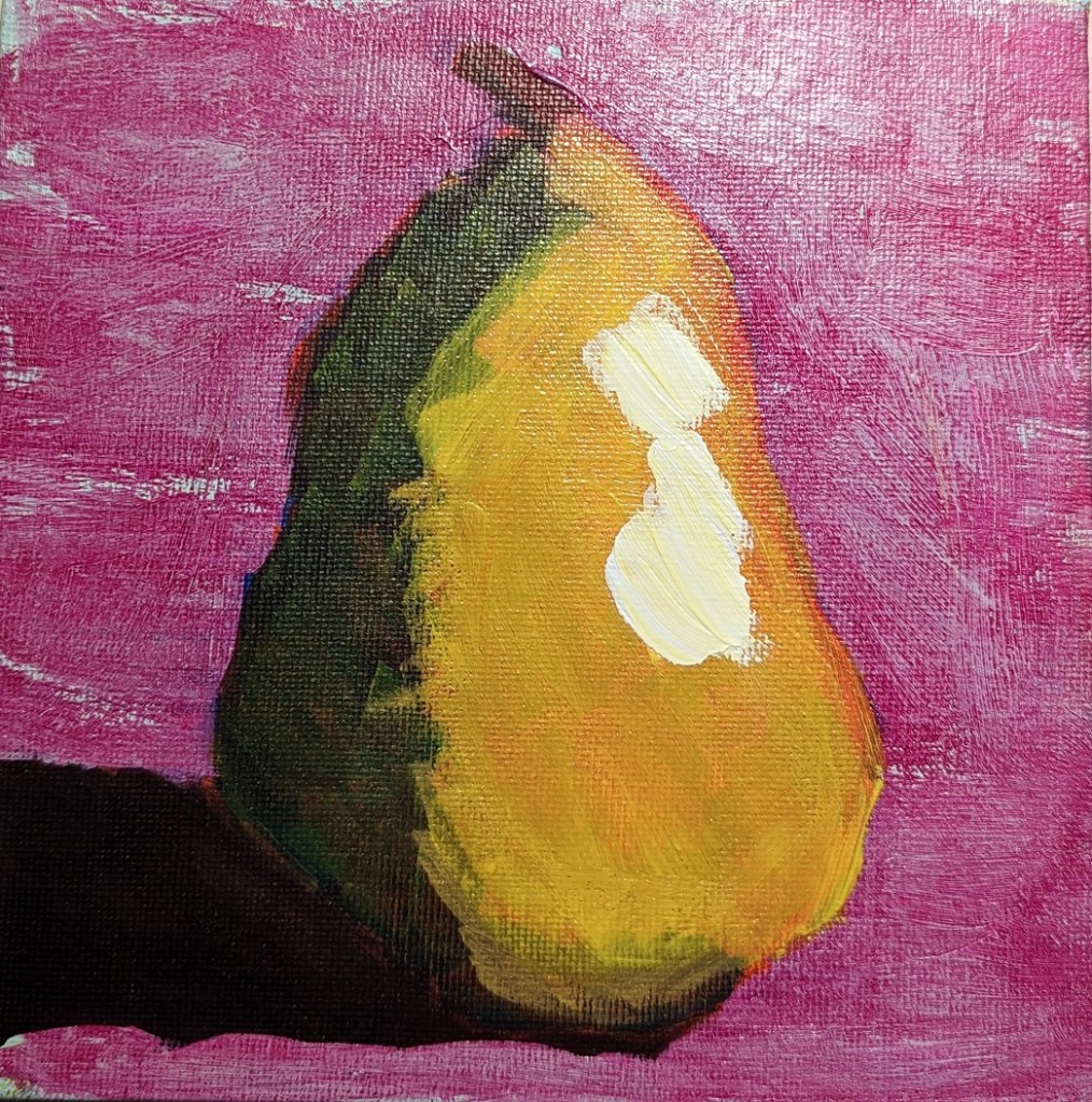
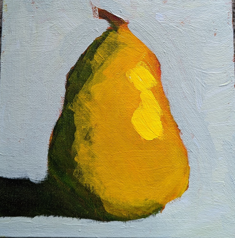
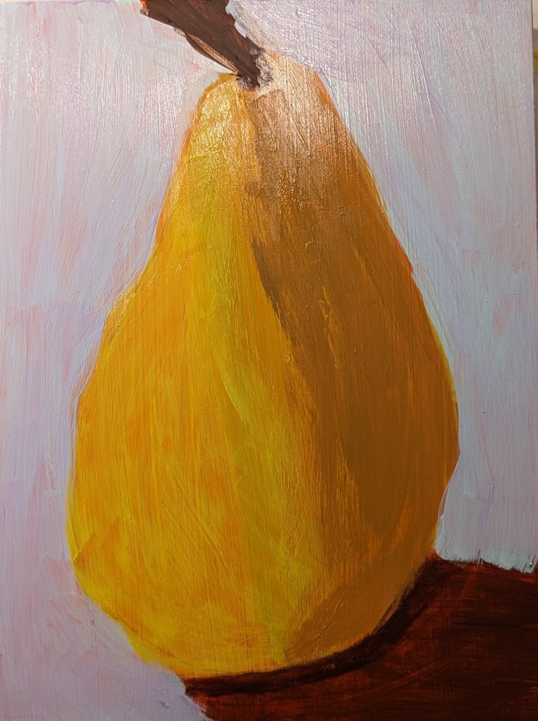
This is work from the Marla Baggetta class I mentioned the other day. These pears were done after I watched the video provided, so they’re closer to how she did it, but not entirely. I took a series of in-progress photos; sometimes we’re glazing, sometimes we’re painting. The very bottom photo at the end is the final result; everything skews yellow because a yellow glaze was the last step.
I’m not entirely sold on the layering and layering of glazes; seems like a lot of extra work. It seems to me to make more sense when using pastels than when using acrylics,
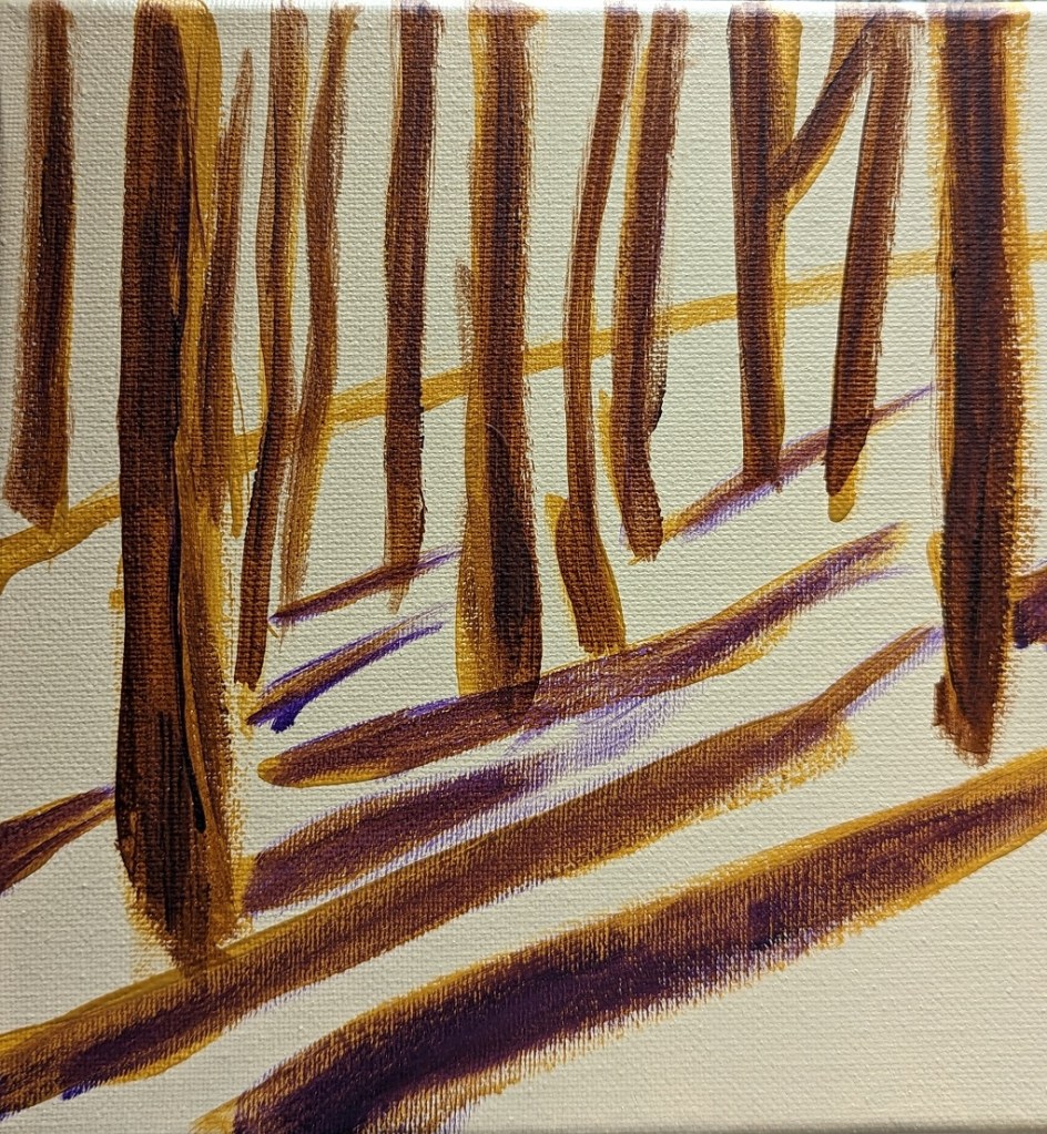
This was done on an 8×8 canvas.