
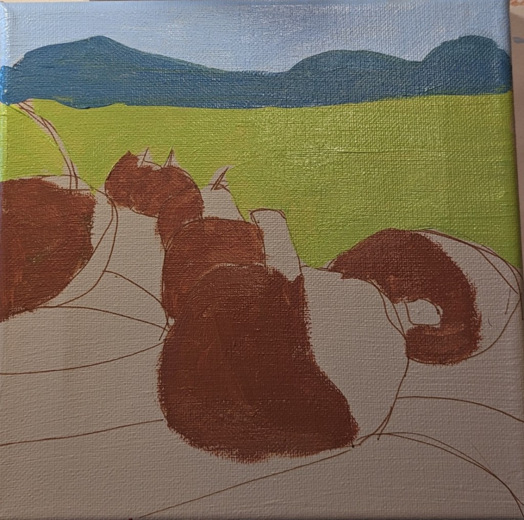
After I completed today’s work, I realized that the center pumpkins were all in a line, and I decided I didn’t like that. Bad composition. (See left image.) So I removed one of the pumpkins, and I think it looks a bit more natural.
beginner
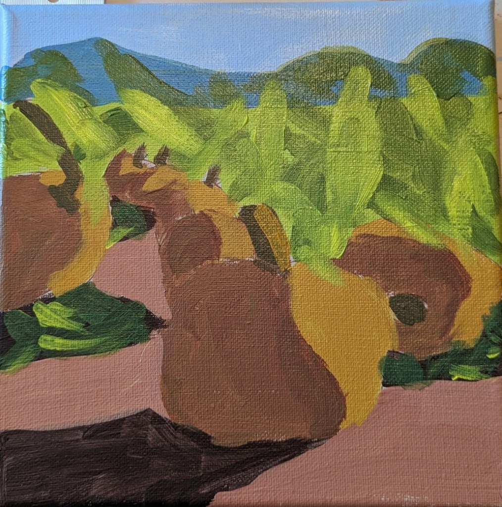
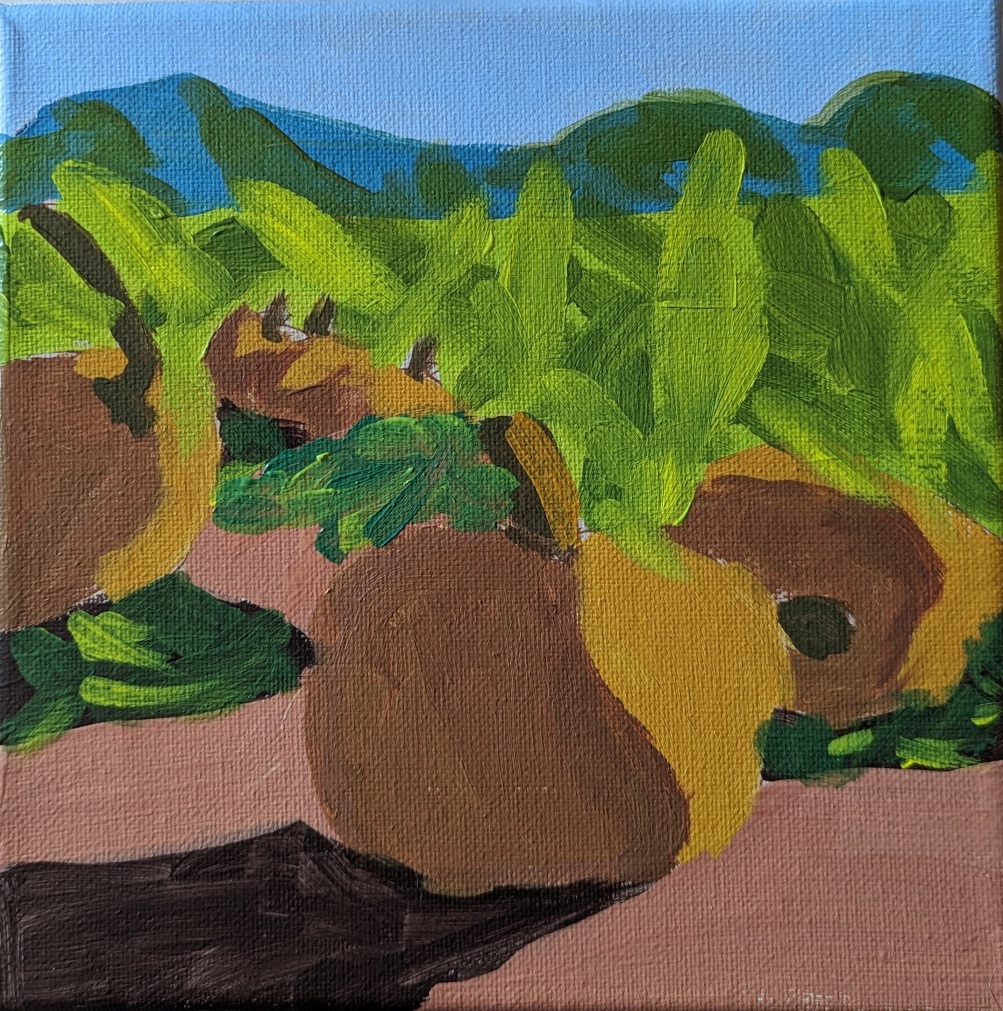
Pumpkin Harvest.. Work in Progress
It’s finally starting to feel like fall here after a long, hot summer. So, I’m in the mood for fall-themed paintings. This one is from a lesson for patrons of PaintCoach. The idea is to map out the large shapes first, and get the values set before filling in the detail.
I’m doing this on an 8×8 canvas, which I painted with Winsor & Newton Galeria in Pale Umber, drawing out the lines with an acrylic paint pen. (Some of the lines are “wrong”, but I’ll be painting over them anyway.)

Christmas Tree
I did these paintings based on a lesson from PaintCoach on Patreon. The first one I did, I barely looked at the photo, and instead was following along with the video. The scene ended up being excessively abstract (top right). The second effort is marginally better, but I’m still not satisfied.


Sunflower 10: Playing with Yellows
Some time back I had painted this 6×6 canvas panel with cerulean blue, so today I used that for my sunflower. The petals are layered with cadmium-free orange as the base (although it looks like yellow ochre now that it’s painted on the blue). Then I mixed azo yellow with some yellow ochre. Finally, the top layer is cadmium-free yellow. The center is burnt umber light, with some yellow ochre, and then purple and yellow denoting the seeds.

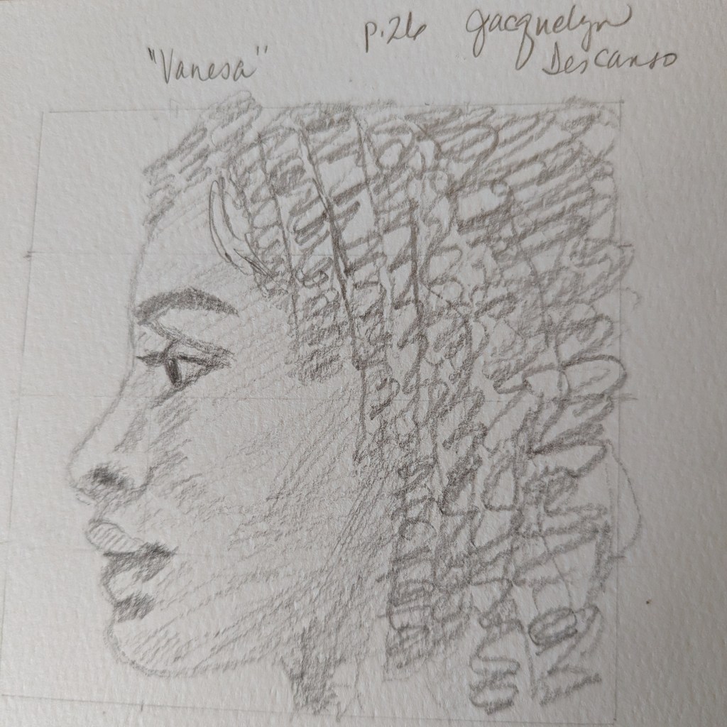
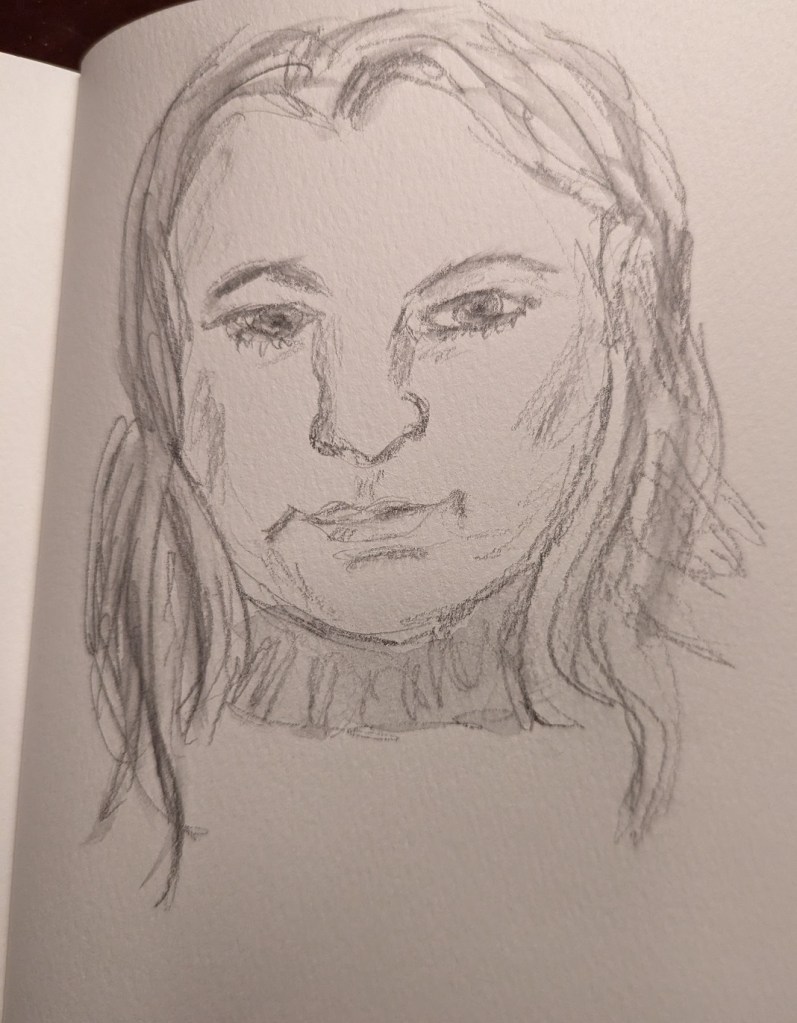
Portrait in Pencil – Practice
Some time ago I bought the Kindle book Skill-Building for the Beginner Artist: How to Draw the Portrait in Pencil by Jacquelyn Descanso. She does hatching and cross-hatching rather than blending. One of practice exercises early in the book is to copy her graphite portrait of ‘Vanesa”. Below is the result of my drawing of her drawing.
Quickie Sketch: A Face
I’ve been away from drawing and painting for a few weeks now… must be the summer heat. Finally picked up my Aquarelle pencils and sketch book to do this quickie face.
Human Figure – Value Study
As I mentioned in this post, I’m taking the online course by Peggi Kroll-Roberts, and the assignment is to do 2-value and then 3-value studies painting the figure. In this effort, I am using the figure I sketched out in charcoal here, as prep for a future painting.
I drew out the figure first, using a 6×8 piece of 300-lb watercolor paper. For comparison’s sake, I’ve included the charcoal figure.
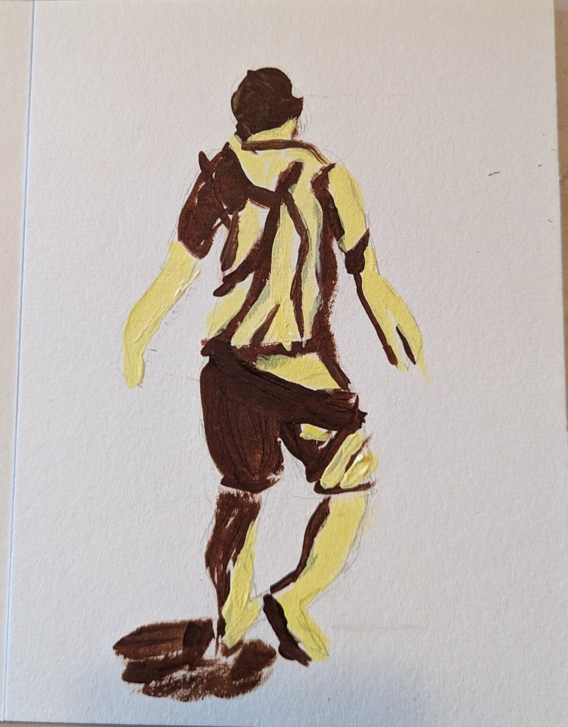

Based on an image by sarahbernier3140 from Pixabay
Yellow Rose
I wasn’t particularly satisfied with my pink and white roses in the vase a few posts back so I tried winging this one (on 6×8 watercolor paper). I like the colors, but this is a pretty abstract “symbolic” rose.

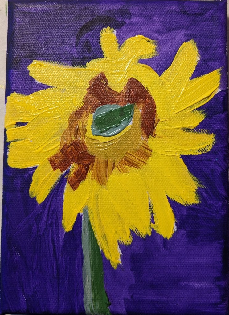
Sunflower #5
I’m still fired up about sunflowers, and trying to improve. This work was based off the image by Nadine Doerlé from Pixabay.
I did the background is dioxazine purple, a complementary of the yellow. (I think I’m better at drawing out the sunflower than painting it!)
Step 1 – draw out the flower; Step 2 – paint the background

Then I painted the flower petals and the center.
And, last steps.

