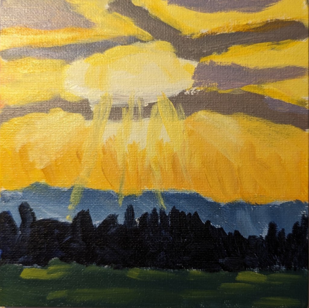
I’m way behind on this series of mini paintings, as week #6 just dropped on Friday. So, this is the week 4 painting for Jed Dorsey’s Mini Painting Challenge at Acrylic University. It’s based on a picture he took in the Canadian Rockies. To me it’s similar to week #1.
This was done on a 6×6 canvas panel. As with the other weeks, I used the 3 primaries, plus black and white.
This portrait is from a black and white reference photo that, unfortunately, I cannot remember where I downloaded it from — possibly from the curated Unsplash photos here. In any case, I actually drew this one out entirely by hand (in willow charcoal). Not sure why I chose a yellow ochre-clear gesso background, but I did.
I’m reasonably satisfied with this one — at least she looks fairly human. I can list at least half a dozen things I would want to do differently next time, but calling this done for now.
I did this charcoal work as a part of the 4th weekly exercise of Let’s Face It 2024. It was taught by Jim Bentley. (He does a demo of this face on his Instagram account.) For the class he used Bristol paper — which I believe is fairly smooth — and also carbon powder applied with brushes, none of which I had. I did my charcoal piece with some willow charcoal, compressed charcoal sticks, and blending stumps. And on Strathmore Charcoal paper, tinted green.
Today I got the email that Week 6’s cloud lesson is available… so I hustled to paint Week 4’s painting! So here is Week 4’s effort for Dianna Shyne’s “Cloud Challenge” at Acrylic University. The reference photo was for the setting sun’s rays breaking through the clouds. (I wish I could share, for comparison sake, but it’s a copyrighted photo by the artist.)
I’m getting behind on the cloud paintings, and remembering to post them! Here, for Week 3 of Dianna Shyne’s “Cloud Challenge” at Acrylic University, is my effort. The reference photo for this class was a sunset over a body of water.
This monochrome work is the painted sketch on 300-lb. watercolor paper which I already posted about. I used Anthraquinone Blue (PB60) aka Indanthrone Blue. It’s semi-transparent, which works well for the technique I was using: treating my acrylics more like watercolors.
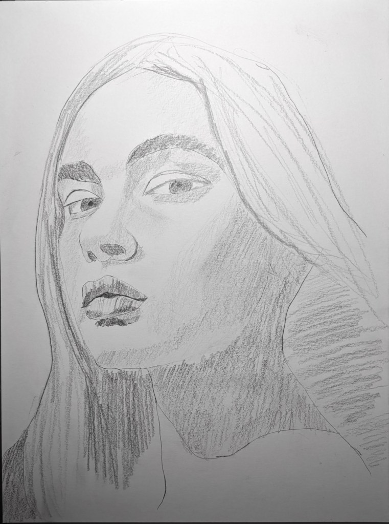
One of the many (!) online art classes I’m taking is called “Bringing the Portrait to Life” by Lauren Rudolph via KaraBullockArt.com. This sketch was done on smooth Bristol paper, based on the reference photo provided in the class. Next steps will be to trace the sketch, and then transfer it to a 9×12 canvas, do an underpainting, and then paint the portrait. I won’t be using oil paint, but acrylics — when I get to it, with all my other projects.
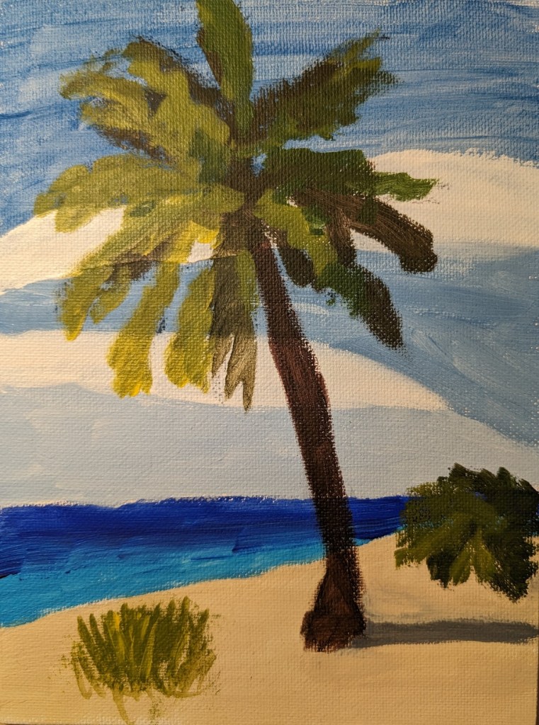
For a brief change of pace, I decided to paint this 6×8 palm tree on the beach which I found on Pixabay months ago. I used a fan brush for the first time to paint the plant at the bottom left. (Hadn’t even realize I bought a fan brush!)
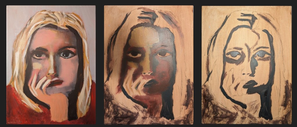
The portrait comes from the week 43 exercise of Kara Bullock Art‘s Let’s Face It 2018 portrait art experience/class. While I am participating in the 2024 version, and (sort of) participated in the 2023 version, I bought the 2018 set of classes (52 weeks in all) last year. This was one that interested me.
I drew out most of the face last June with pencil, finished it earlier this week with willow charcoal and decided just to get it painted for the practice. (Even though I’m not crazy about parts of my drawing.)
Here’s the completed version, and below I have a set of photos of the in-between phases. (Too often we only see the final work people do, not the messy/ugly intermediate stages. 🙂 )
Here’s the in-progress stages. She looks more than a little sickly, and then I revised all the colors, not following the instructor at all.