A few weeks ago, Paint Coach posted a new grayscale exercise on Patreon for his subscribers. This is my effort, after viewing his video. Done on a 6×8 canvas panel in acrylic, initially drawn out with willow charcoal.
beginner

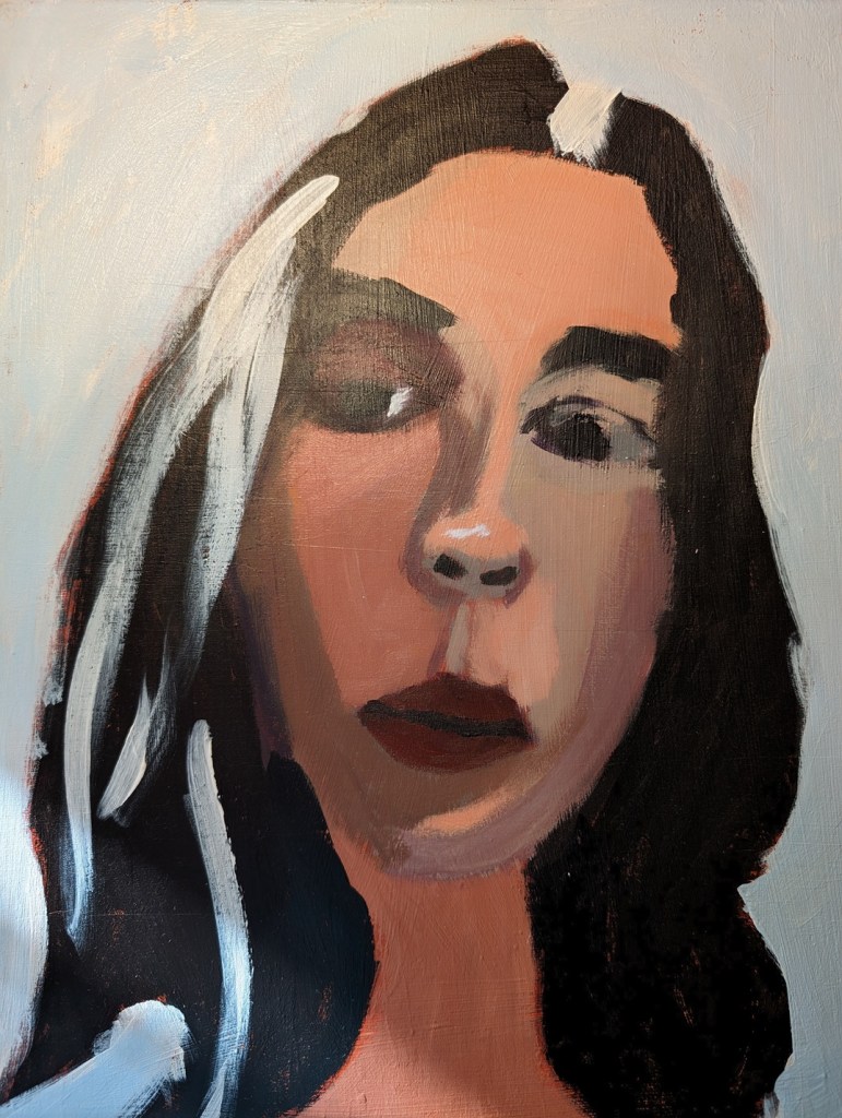
Let’s Face It 2024 — Week 1
Last year I signed up and paid for Let’s Face It 2023, a 52-week series of portrait lessons which you can either follow along with or use as inspiration for your own fully original art, but I never did a single exercise. This year I signed up for the 2024 version, and just completed the first week’s portrait. Week One was taught by Kara Bullock.

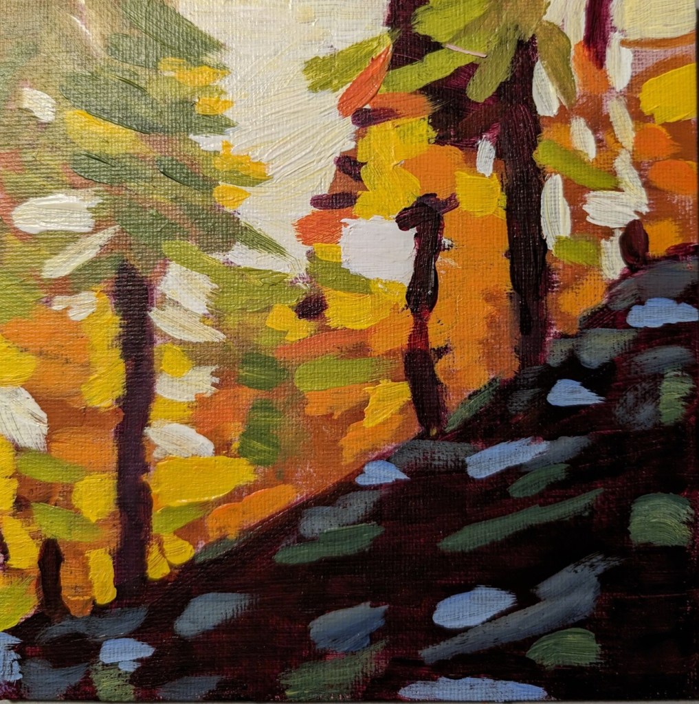
52 Mini Paintings Challenge: Week #1
This was week 1 for Jed Dorsey’s Mini Painting Challenge at Acrylic University. It’s a follow-along, using Dorsey’s reference photos and seeing how he paints from the reference. All paintings are done in 6×6 size.
Lesson 1 was called “Sunlight through the Trees”, and Dorsey uses an impressionistic style for the painting, which I attempted to imitate.
Cloud Challenge #2 – Acrylic University
Today, for Week 2 of Dianna Shyne’s “Cloud Challenge” at Acrylic University, the reference photo was a Tuscan sunset.
I repurposed a 6×6 canvas panel for this. My orange is a mixture of Pyrrole Red and Cad-Free Yellow Medium.

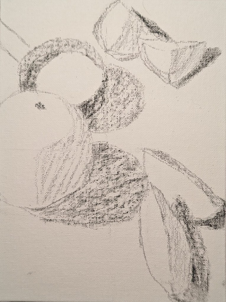
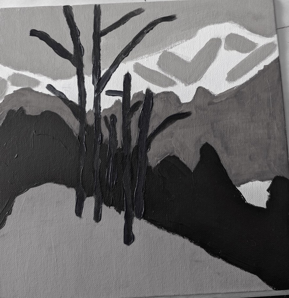
Exercise: Colors as Values
This is an exercise from one of the foundational courses (Acrylics 101) at Acrylic University wherein you do a value map of your painting using black, white and gray, and then applying color on top of the different value areas, using care to make sure your values — post-color — remain. It’s a more detailed version of the quickie free course I mentioned here.
Here’s my original painting done in grayscale, done as part of the Acrylics 101 online class, using their reference photo.

I did a value check on my primary colors and mixed secondaries.


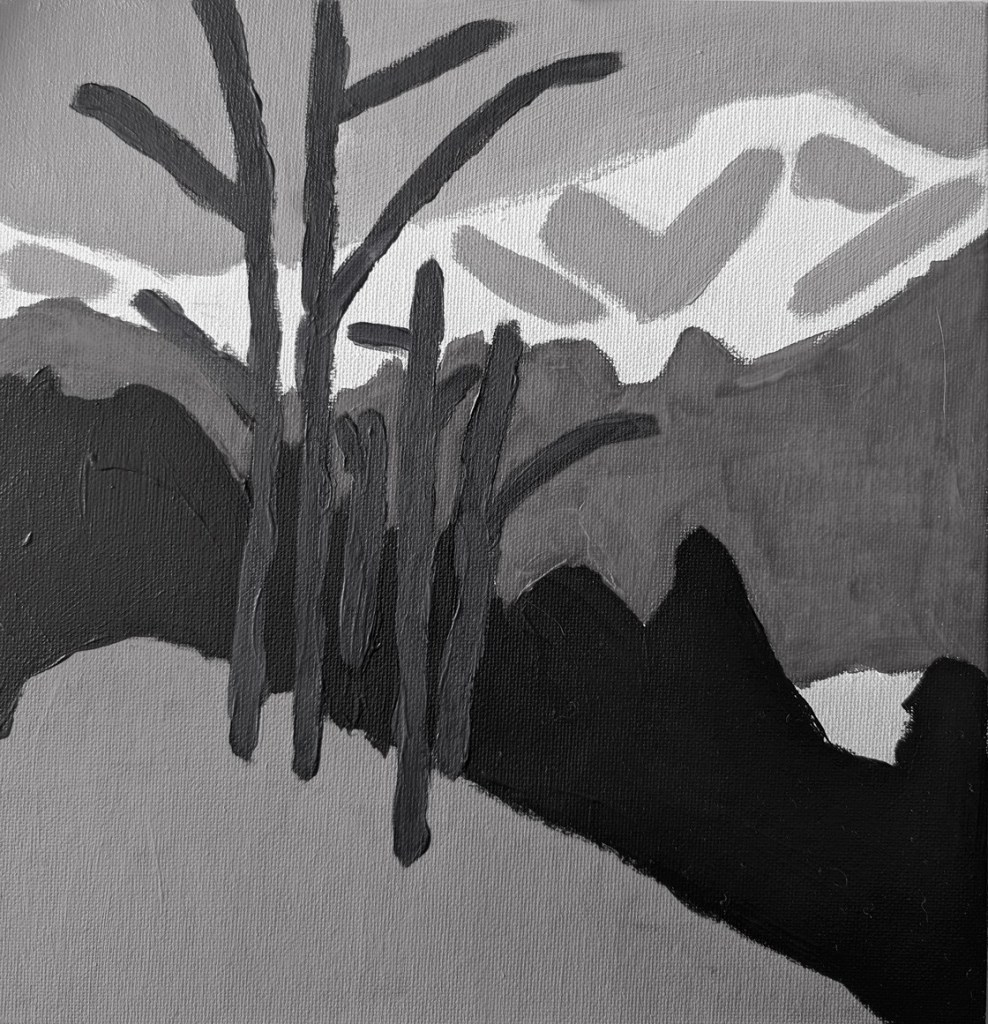
The next task was to choose colors that aligned to the value map/painting I already did. This was my first effort. The abstract trees were a bit too dark, compared to my original (above), pretty much the same as the (abstract) forest.
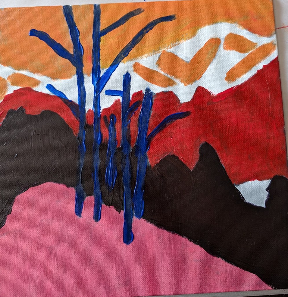
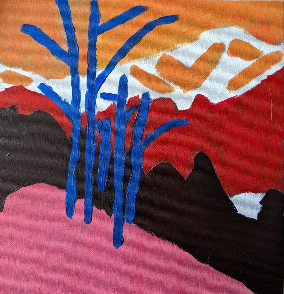
This was my next attempt, which I think is better. Also I turned on the grid function on my Pixel camera; it makes a real difference!
Acrylic University – Freebie class & Small Paintings
I mentioned the other day that I signed up for a Clouds Challenge on Acrylic University. I have since signed up for Jed Dorsey’s mini painting challenge which starts in January 2024. There’s also a freebie class: “Acrylic Painting for Total Beginners – Everything You Need to Know in Less Than 2 Hours” which I’m also doing. These days I’m not a total beginner, but a free class lets me check out the instructor, Jed Dorsey.
The class covers basic suggested supplies, brushstrokes, values, the grayscale, color mixing, and 3 small paintings.
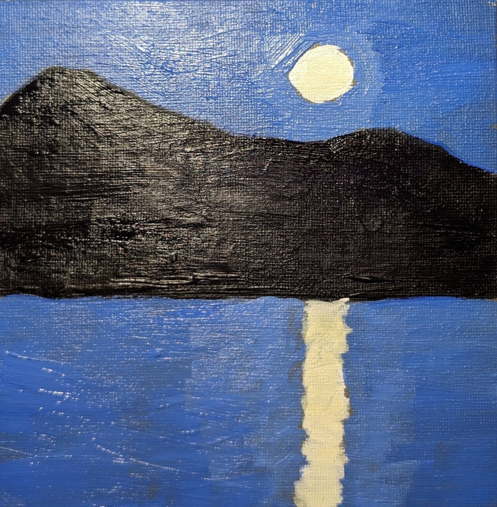
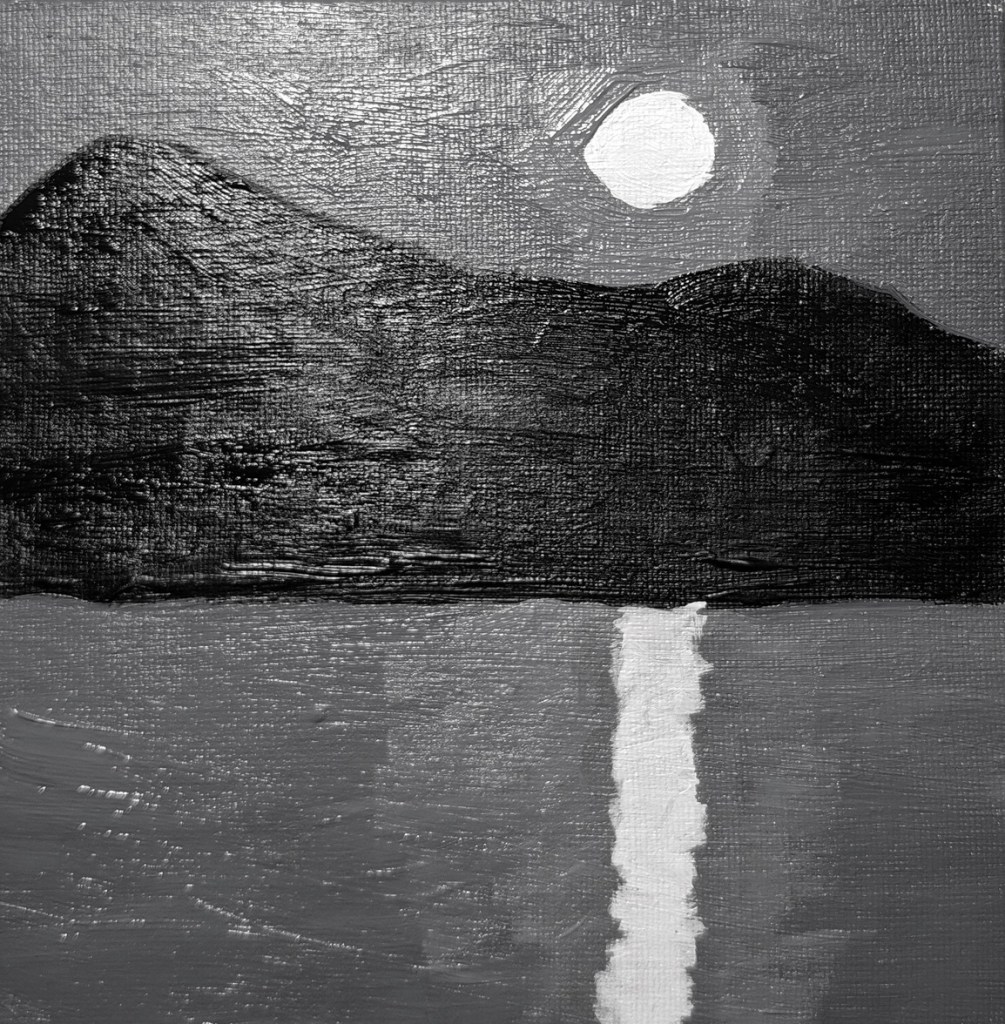
The first two paintings from the class are below. You paint the moon scene in grayscale first, and then paint color over it, keeping with the value map. The last photo is of the color painting, but in black & white to validate the value map.
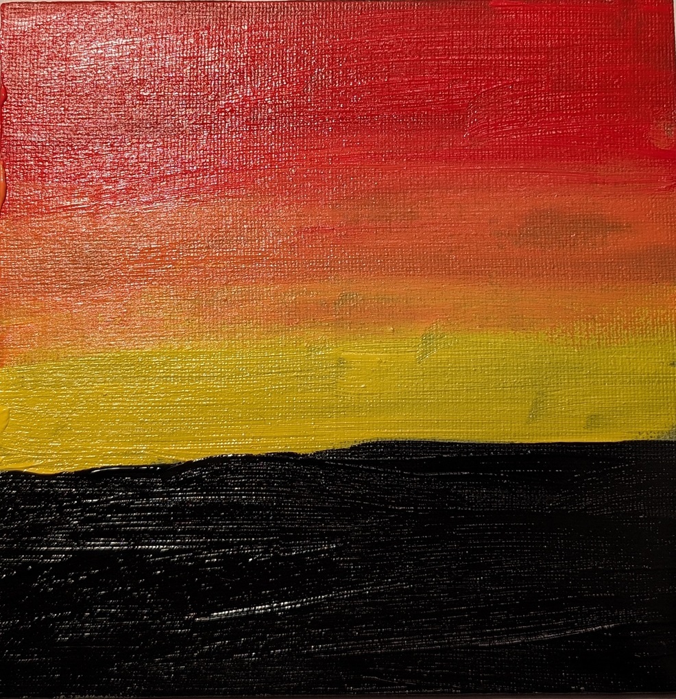
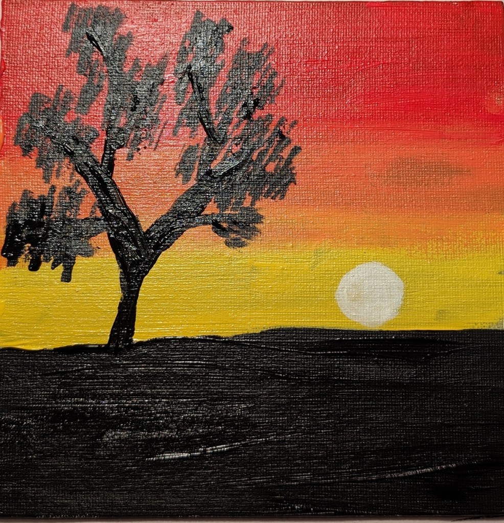
The second set of paintings is a sunset, and the last one (not yet completed) will be roses.

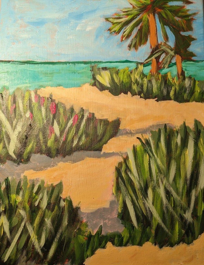
Master Copy: Jane Slivka & Painting a Tropical Landscape (Done)
Here’s the completed project. I’m dissatisfied with the sea grasses, but, oh well, on to the next!
I repainted the sea using Phthalo Green (Blue Shade) rather than Phthalo Green (Yellow Shade).
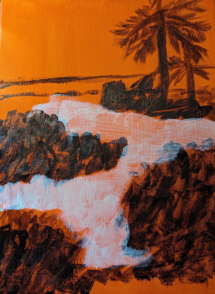
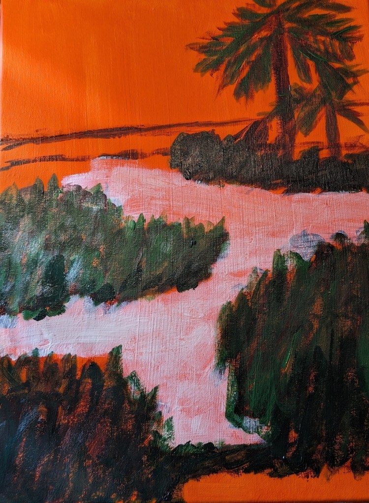
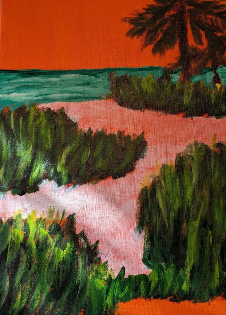
Master Copy: Jane Slivka & Painting a Tropical Landscape (In Progress)
After doing the human figures in the paint-along by the Florida artist named Jane Slivka, I bought two of her video classes, one of which was this Tropical Landscape.
I used Transparent Orange (PO 73) by Chroma Atelier as a background, then Sap Green mixed with Carmine (Amsterdam Acrylic) for blocking out the greenery. For the grasses, I used the Amsterdam’s Sap Green and Yellow Green, as well as Winsor Galeria’s Sap Green (much lighter than Amsterdam’s Sap Green). The sky is Light Blue Permanent by Liquitex Basic; the ocean is Phthalo Green mixed with Titanium White.
The sand has been blocked out with transparent Zinc White. I still need to paint the sand and its shadow colors, and add some color (sunlight and shadows) to the bark of the palm trees.

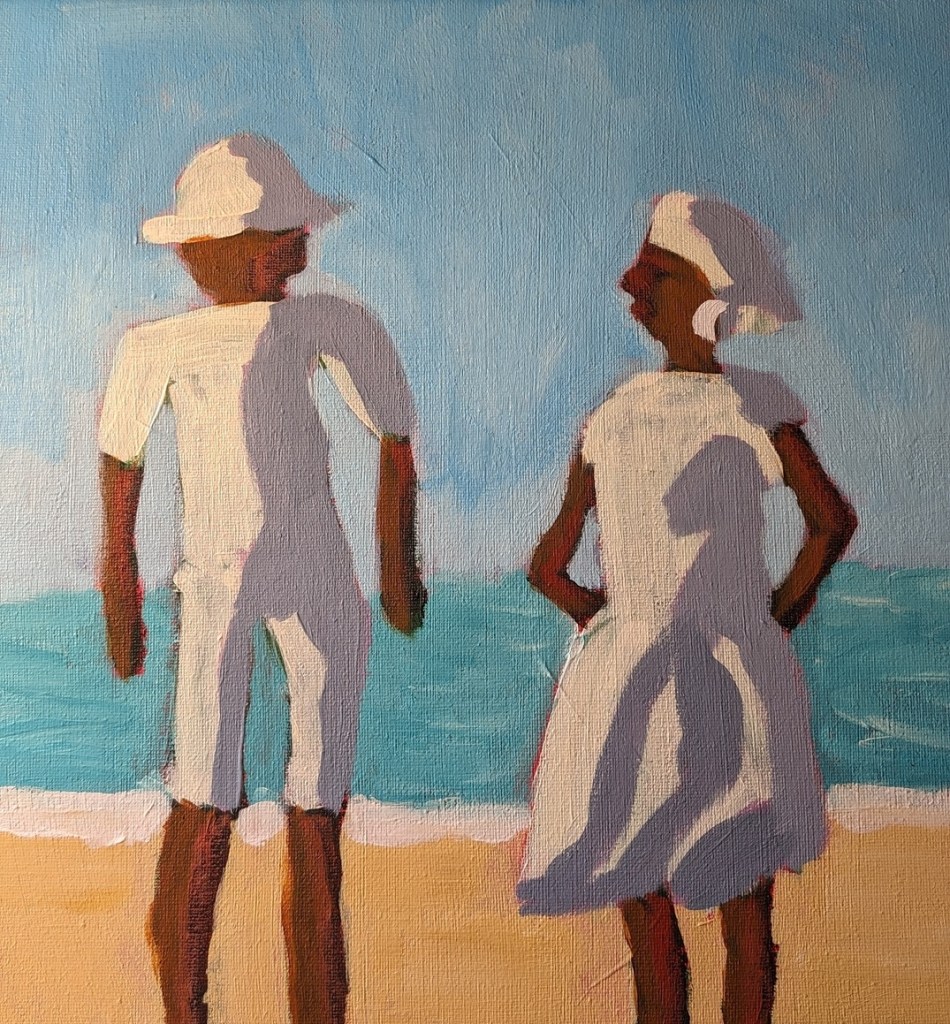
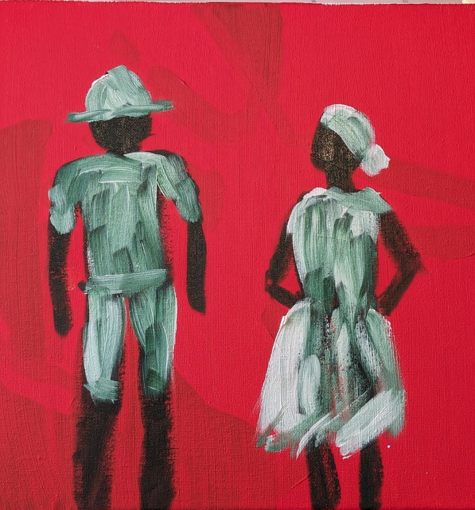
Master Copy: Jane Slivka & Painting the Human Form
Yesterday I was on YouTube watching some Acrylic University videos, and in the recommendations, I saw a clip from a Florida artist named Jane Slivka on painting the human form in acrylics. So, I checked it out. I liked the demo so much I ended up buying two of her video classes which I was able to download — so I’ll be doing those shortly.
But today I decided to use repurpose an old 12×12 canvas, and paint along with the video I watched last night. It was fun!
So, Slivka started out with an orangey underpainting, and then painted the forms in either Sap Green (which I used) or Hooker’s Green. For my background, I used Pyrrole Red (PR 254) mixed with Cadmium Yellow Hue (Liquitex Basics). (The blotchy look in the background is from my original unfinished painting.)
Then, while the figures were not yet dry, I followed along, painting their clothing in Titanium White, as Slivka did.
Painting the sky came next. I used Cerulean Blue (Utrecht Fluid brand) with some Titanium White.
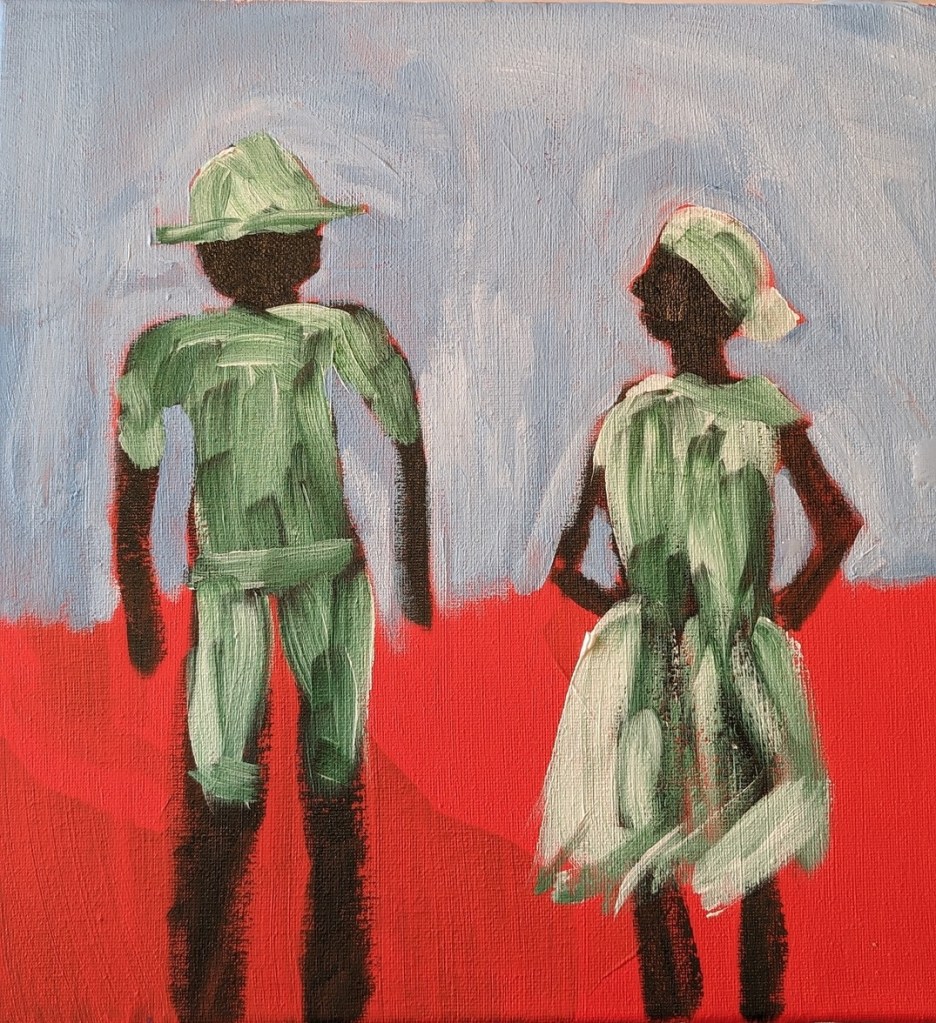
Next was the ocean and the sand. Slivka uses some aqua green and Naples Yellow, respectively. I used Liquitex Basics Turquoise Green and created a kind of “Naples Yellow” by mixing Yellow Ochre with Titanium White. The sun-bright clothing was Titanium White softened with Cadmium Yellow Light Hue.

Slivka used Raw Sienna and Cadmium Red for the skin; I used Raw Sienna and Red Oxide. For the clothing shadows, Slivka used a violet with white. I used Liquitex Basics Gray Blue with some white.
I repainted the sky from Cerulean to Light Blue Permanent (Liquitex brand) mixed with additional Titanium White. I may repaint the ocean, and get the horizon line straighter; regardless, this exercise was just a lot of fun!