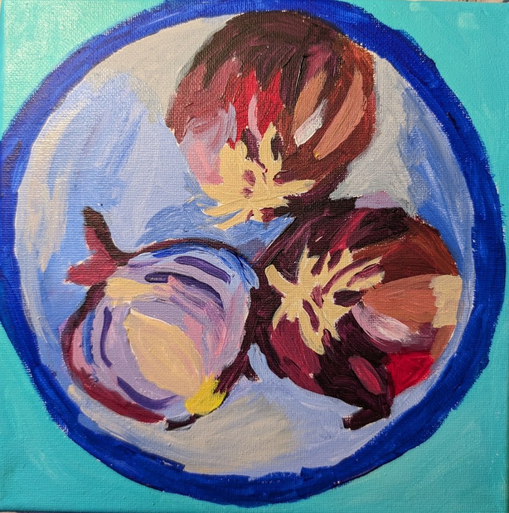
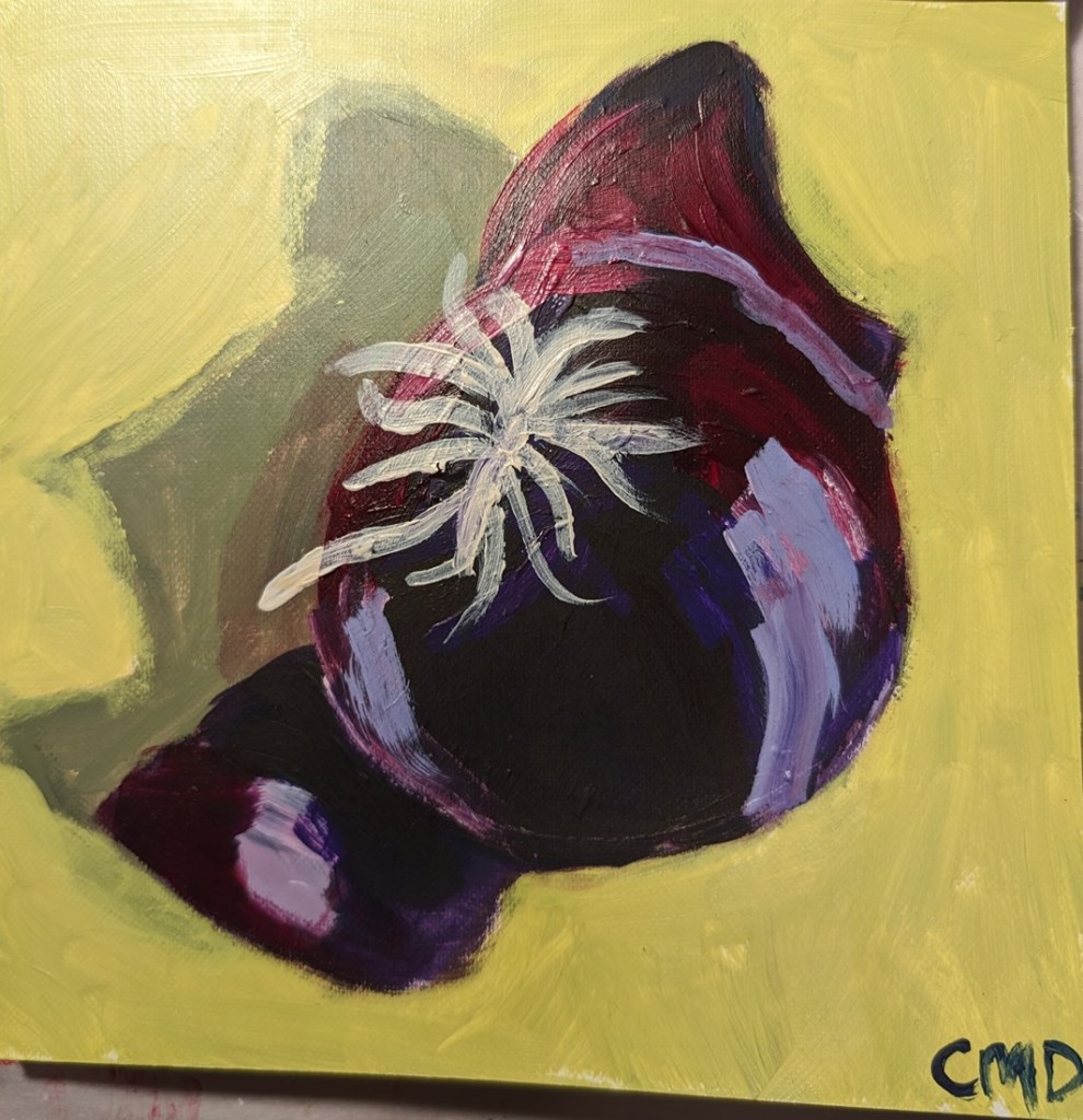
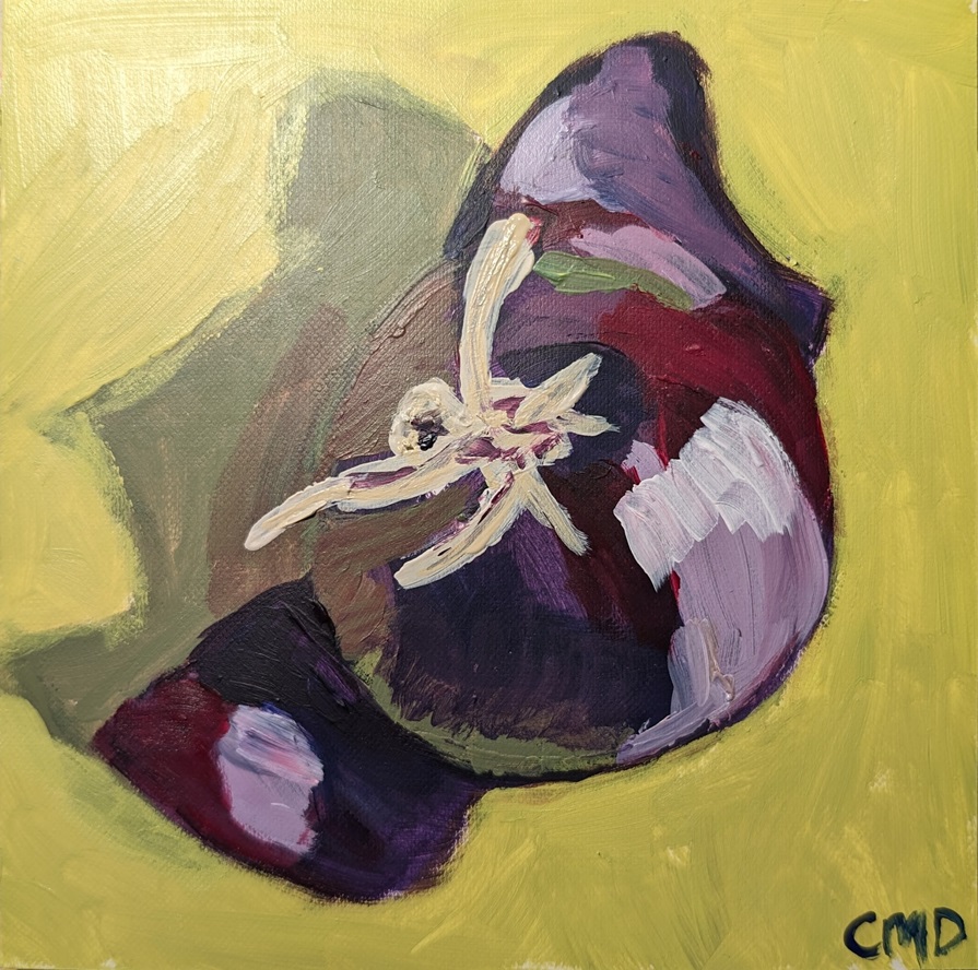
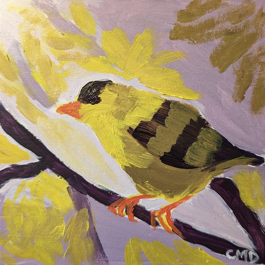
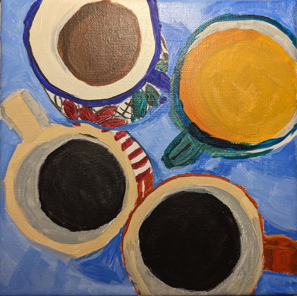
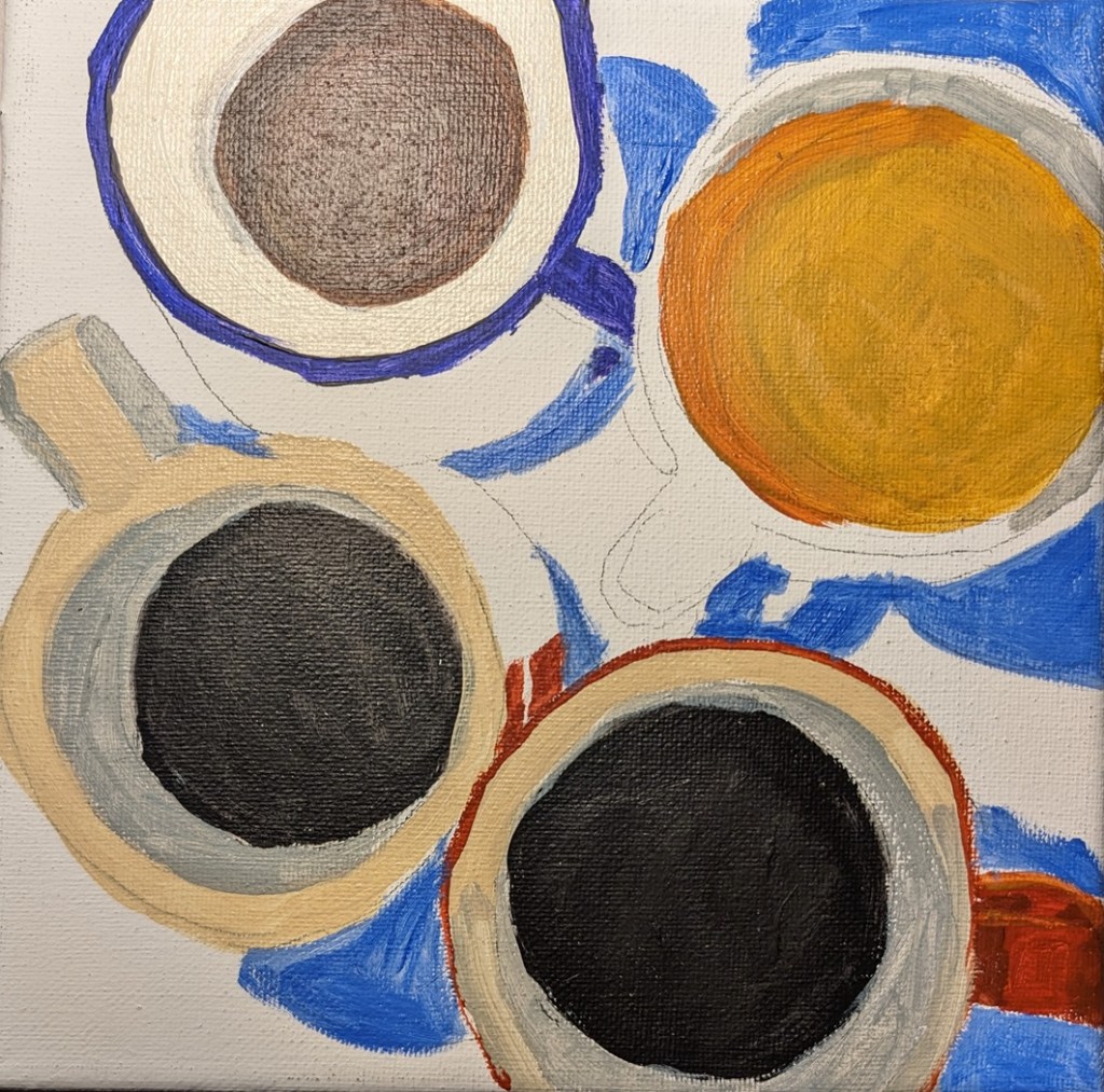
This painting is the final one of Dianna Shyne’s “Cloud Challenge” at Acrylic University. It’s called “Silver Lining”. The sky is a mix of Cerulean Blue (PB35), Ultramarine Blue (PB29) and white. I find the Cerulean Blue (at least by this brand — Charvin — to be quite transparent, which was unexpected. 6×6 canvas panel.
Acrylics
Cloud Challenge #7 – Acrylic University
This painting is called “Sunset Streaks” from Dianna Shyne’s “Cloud Challenge” at Acrylic University. I messed up because I spritzed the canvas panel ahead of time, and then I applied the blue over the wet orangey-yellow, which made a dark green rather than the blue I wanted. After it dried, though, the blue just didn’t work.. it needed to be a clean, clear blue.

Cloud Challenge #6 – Acrylic University
Catching up on Dianna Shyne’s “Cloud Challenge” at Acrylic University. After the stormy clouds, this one is of a summer day. I enjoyed painting this one, although I think that the clouds are a bit too uniform — my mistake, not a fault in the reference photo. 6×6 canvas panel.

Unfinished Self-Portrait
I got bored with this, so it’s not finished. Sketched on drawing paper based on a photo from 2013, then transferred on to 300-lb. cold-pressed watercolor paper. (At that point, I’m already bored, ha-ha!) I did a wash of an orange mix with matte medium, and then painted with Mars Black, messing up on the shadows.

Cloud Challenge #5 – Acrylic University
I haven’t been doing art for a few days now, as I’ve been under the weather. I’m still way behind on Dianna Shyne’s “Cloud Challenge” at Acrylic University. Today is a rainy day so it was perfect for painting the #5 cloud challenge, which is of storm clouds, and based on a photo the artist took. This was rather fun!

52 Mini Paintings Challenge: Week #6 REDO
Well, I couldn’t stand that last painting for Jed Dorsey’s Mini Painting Challenge at Acrylic University, so I redid it using a 6×6 white canvas panel, and sketching out the rocks with willow charcoal. Oh, and then I used (for the first time) acrylic gouache (an intro kit from Holbein). I love the matte effect.
The new painting is far from perfect, but on the whole, I consider it an improvement to the original (comparison below).

And here’s the comparison:

52 Mini Paintings Challenge: Week #6
This is the week 6 painting for Jed Dorsey’s Mini Painting Challenge at Acrylic University. It’s based on a photo Dorsey took of a rocky beach at sunset. I used one of my last few 8×8 black canvases because Dorsey paints his version on a black background. (I think I’ve said this before, but I really struggle with a black background; it throws the colors/values off, and you need several coats of paint to hide the black say, against the sky).
I also struggle with beach rocks, and have a couple of PaintCoach Patreon lessons earmarked which focus on beach rocks that I need to do for more practice.
That said, this is my effort, and frankly, it looks quite abstract. Which is not necessarily terrible.

52 Mini Paintings Challenge: Week #5
Trying to catch up with the series of mini paintings… This is the week 5 painting for Jed Dorsey’s Mini Painting Challenge at Acrylic University. It’s based on a photo Dorsey took in a local state park in, I believe, Washington. Take that back, while the original photo reference was provided, the lesson was actually based on the painting (called “Dappled Light”) he did based on the reference photo.
This was done on a 6×6 canvas panel, which was painted black. The only colors used were the 3 primaries.

Another Grayscale Portrait
This was drawn out and then transferred to an 8×10 canvas, based on a reference photo from a Kara Bullock Art drawing class called “Pushing the Values” taught by Lauren Rudolph.


