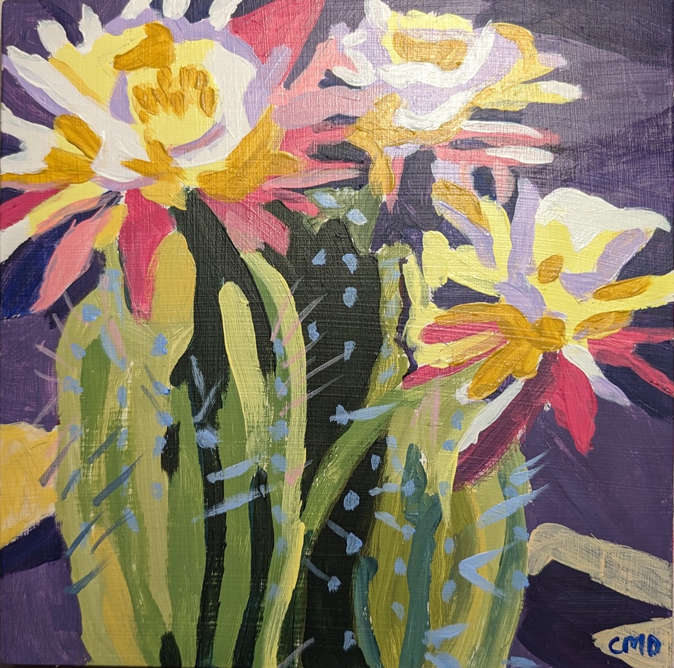
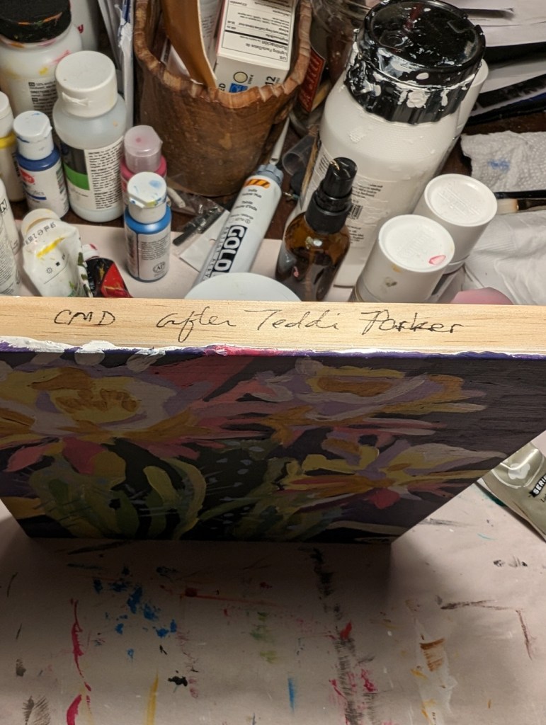
Back in March, I posted about painting a vase of purple tulips, from a one-off online class by Ali Kay. I had decided I would consider joining her “Fresh Paint” membership, which from what I can tell operates more or less like Jed Dorsey’s Acrylic University.
So, the doors opened for a limited time last week, and I joined for a year. We’ll see how it goes. I like the work she posts on Instagram, and I like her subject matter — a lot of people and animal portraits, as well as flowers.
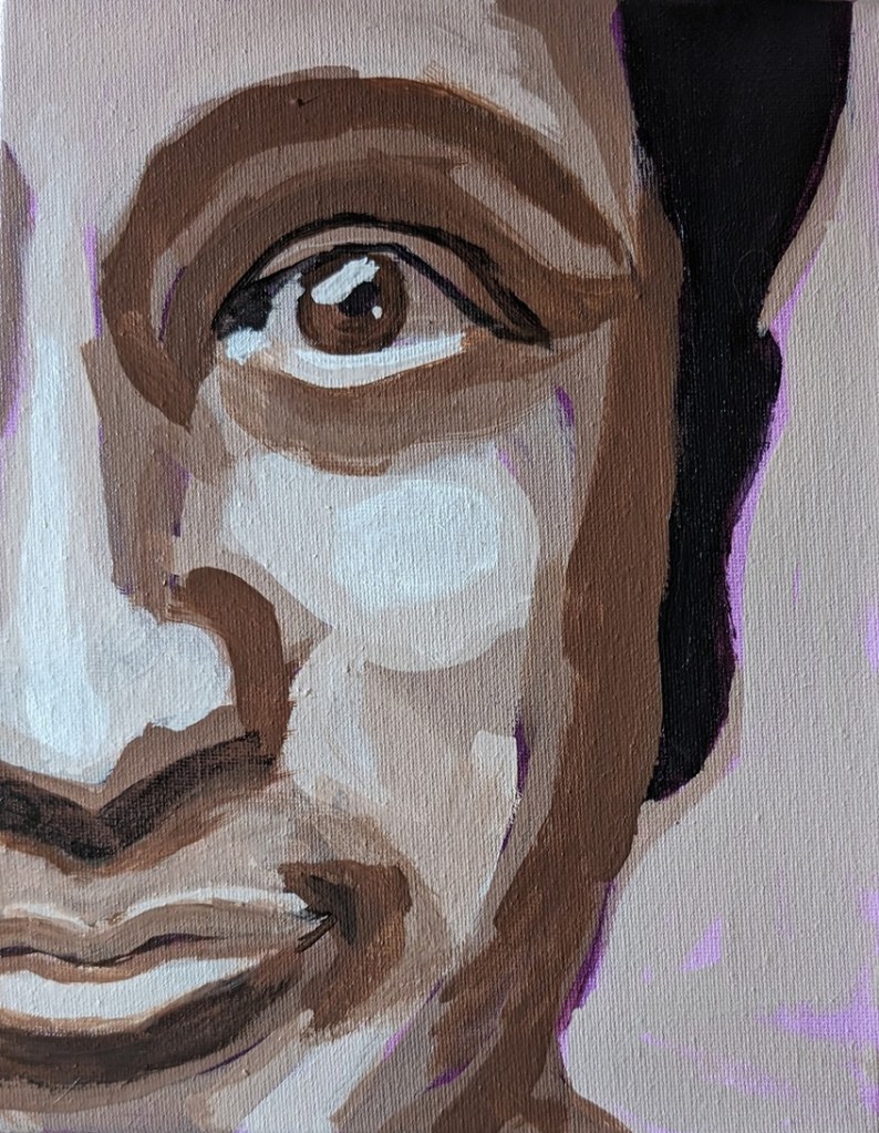
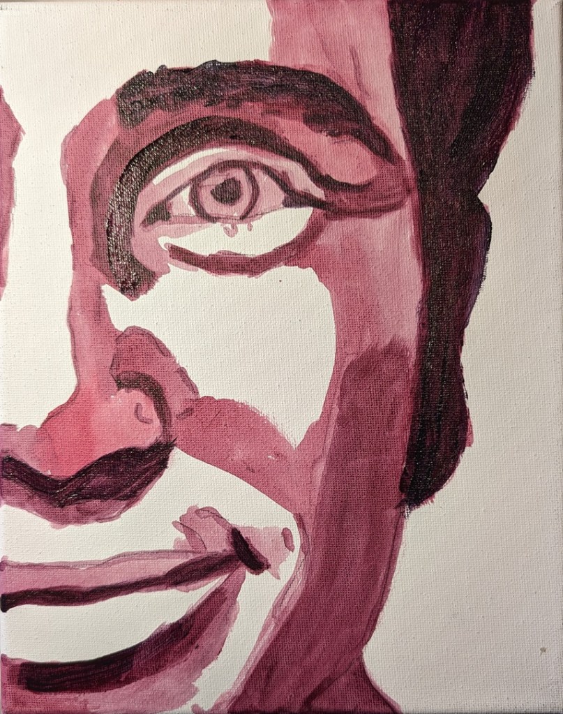
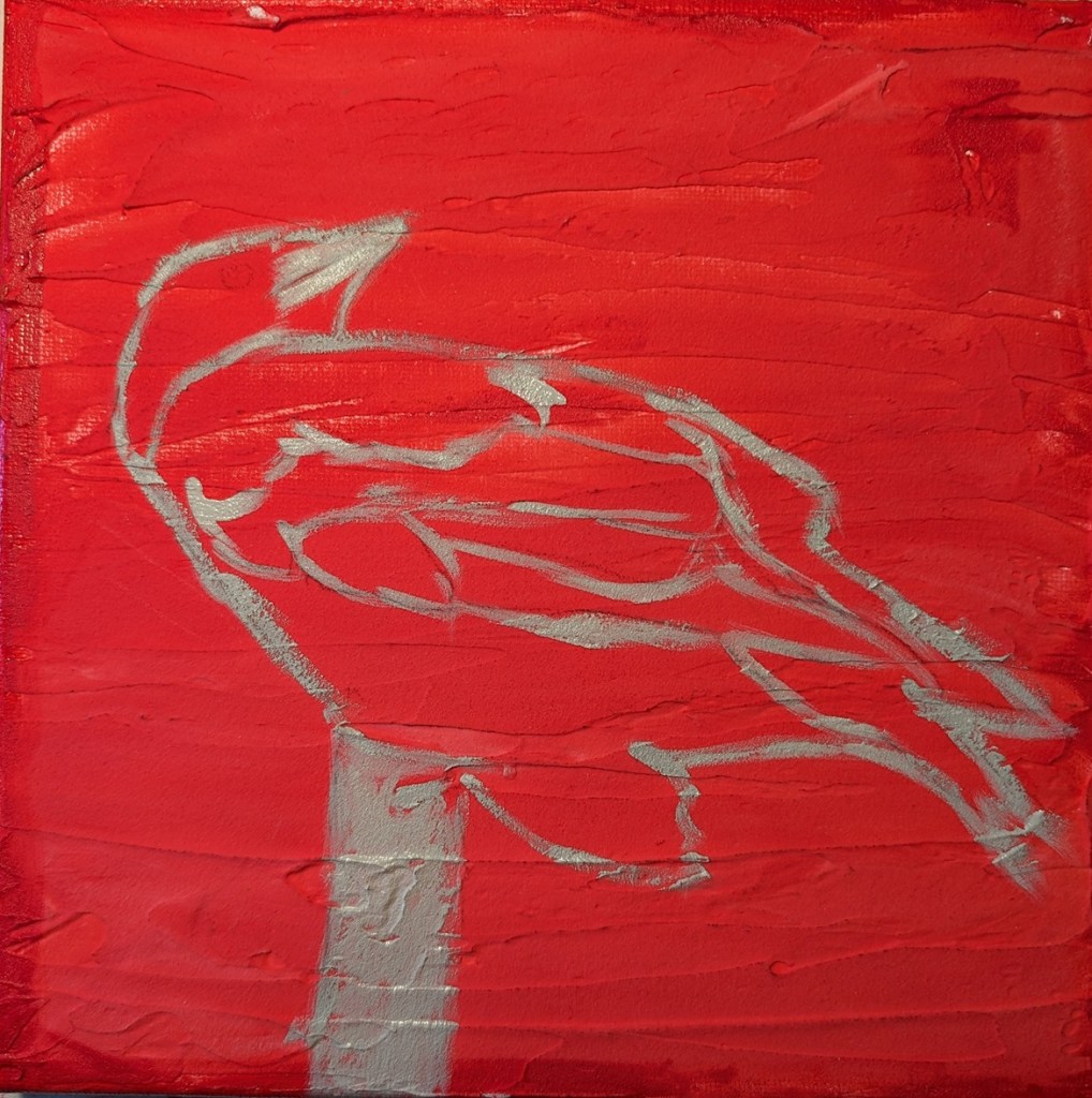
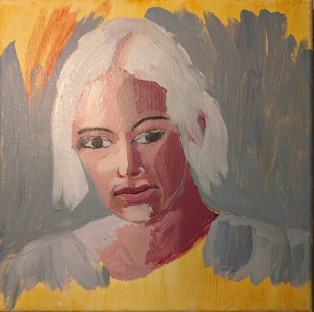
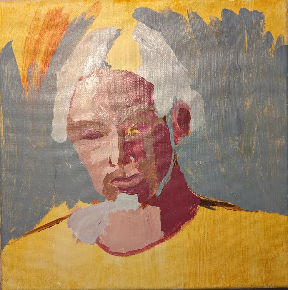
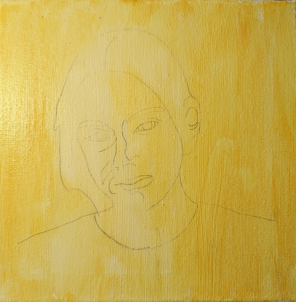
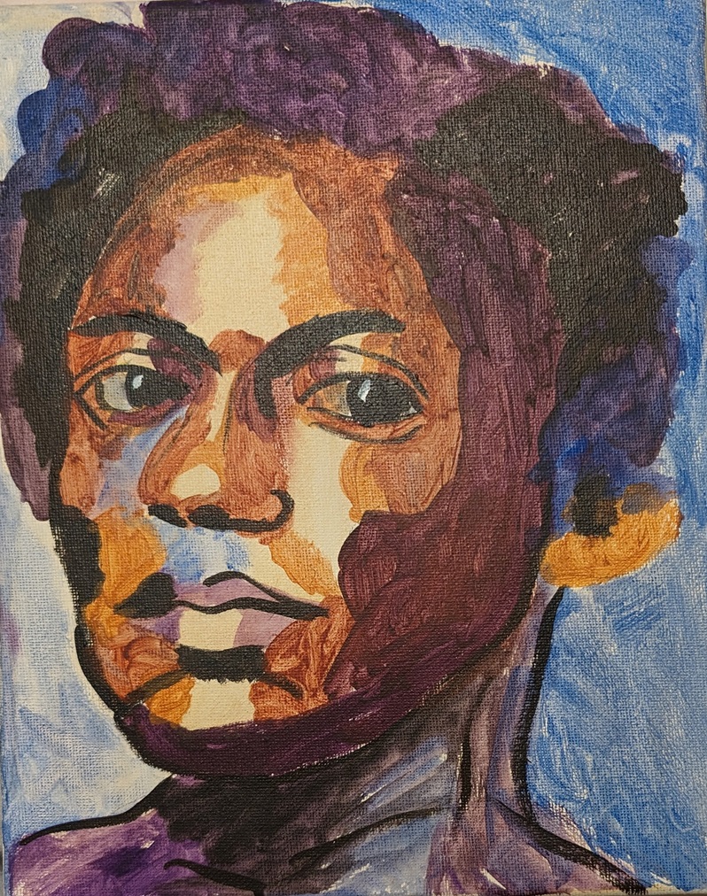
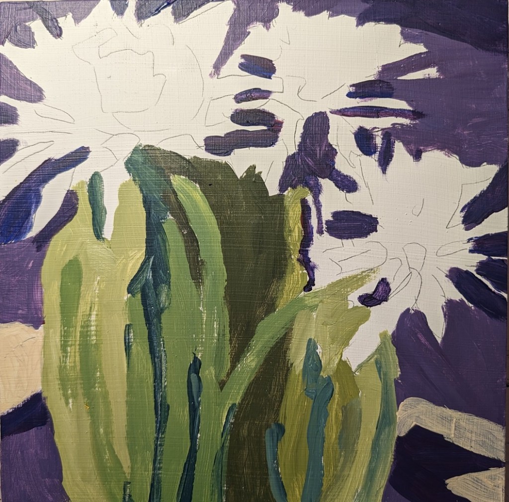
This painting is actually based off of an Unsplash photo. I struggled a bit with her process, which seemed a little bit paint-by-number to me, but I wanted to try it. Hardest for me is remembering to leave touches of the underpainting visible, as I’m used to often painting on white canvas and skipping the whole underpainting thing. Also I rarely layer to the extent she does — but perhaps I should.
She also primarily works from photographs, and transfers the key lines from the photo to the substrate so you focus on painting rather than drawing. Also, she works on gessoed wood panels, using fluid acrylics, while I’m working on canvas using heavy-body acrylics so the flow is obviously different. (It’s too hot where I live to use a lot of fluid acrylics — they dry in something like 2 minutes.)
I’d like to try doing this on a wood panel to see the effect; I might like it. But I’ve got a stash of canvas to work through first.