Short Stack of Doughnuts

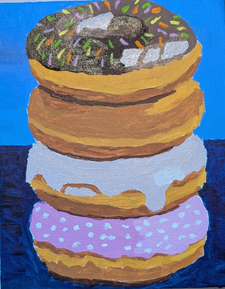
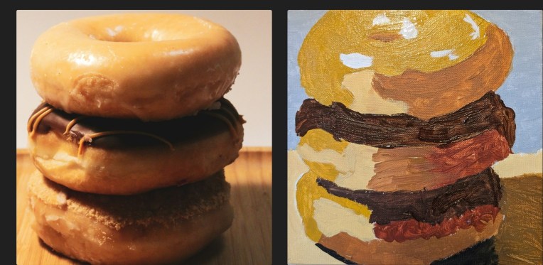
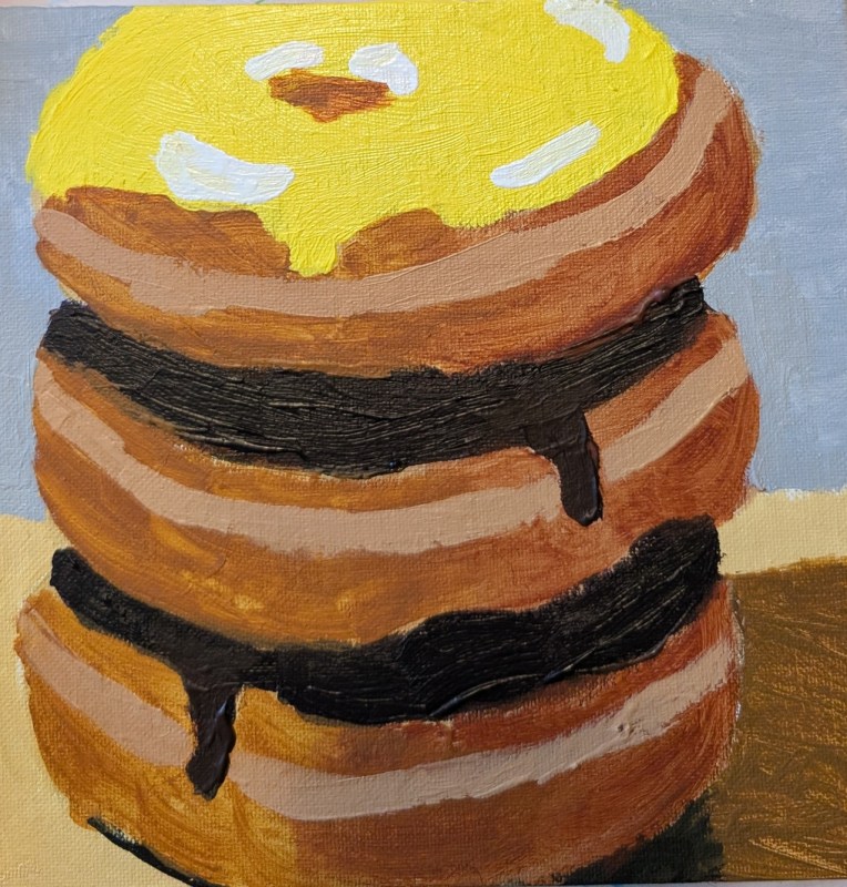
I struggled with this painting, and am going to show some of the struggle. It is based off a photo by Glen Carrie on Unsplash. My final painting is way down at the bottom of this post. I ended up essentially just using the shapes of the 3 doughnuts, and went off on my own, adding frosting to the top doughnut and ignoring the crumble topping of the bottom doughnut.

My first attempt in a side-by-side with the reference photo. This was just a fail — although I DID try the gloss medium mixed in with the yellow ochre paint on top. (Turns out you can’t mix it FAST; it will create air bubbles which then minimize the shine.)
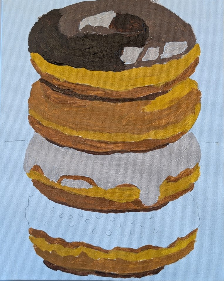
The second attempt is below and I used Yellow Ochre mixed with white, and Raw Sienna (by Golden) mixed with white for the more shaded parts. Ultimately, completely unexciting, but at least the transparency (see above) was gone due to a second layer of paint. Last night, I watched a YouTube video by Marla Baggetta called How to Paint Donuts in Acrylic (I took her online acrylic painting course a few years ago, plus some of her pastel classes). Anyway, for the chocolate frosting, she mixed a touch of Dioxazine Purple with Burnt Umber so I tried that for this version of the painting. (In HER reference photo, the purple cast of the chocolate is easily seen, but I like the deeper dark the mix brings.)
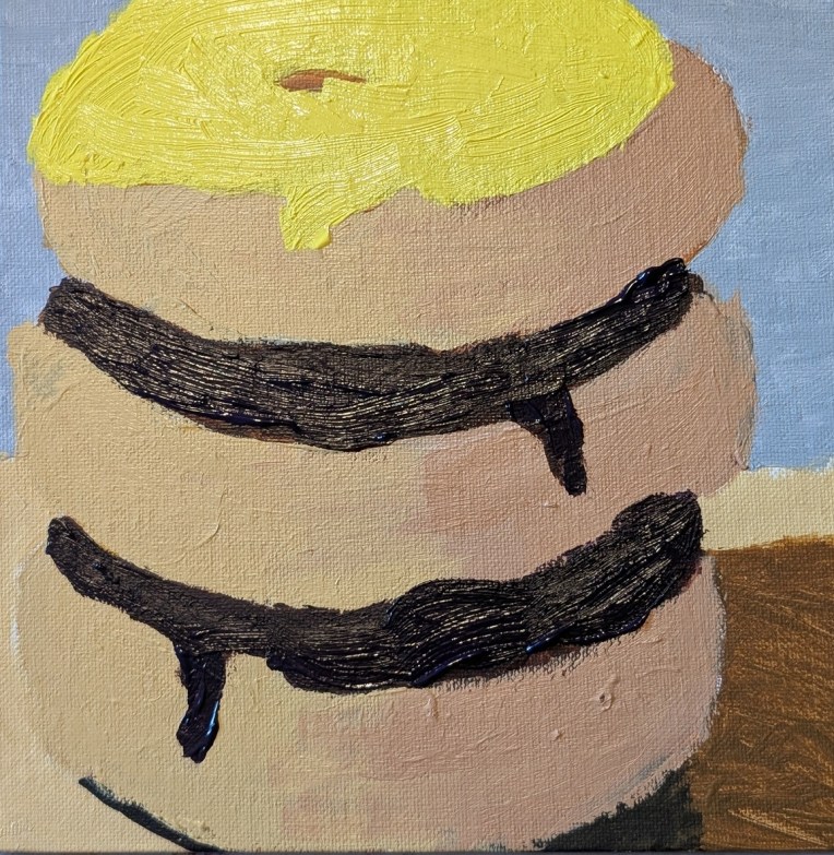
Finally, here is the painting I am calling done. I painted over the above painting, using Raw Sienna and Burnt Sienna without any white. I added another coat of yellow “frosting”, and added a middle seam to the doughnuts, touched up the chocolate frosting, and then the highlights.
White Doughnut

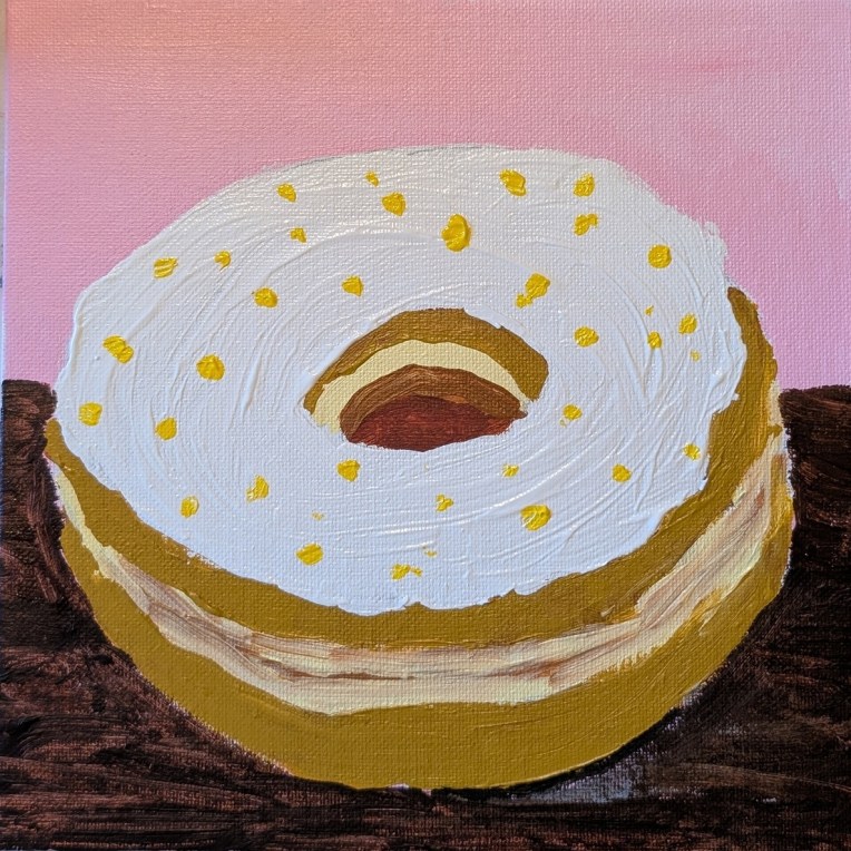
Here, I was experimenting with making my white paint (aka the frosting) glossy. It definitely painted on as very shiny, but now that it’s dry, much — but not all — of the shine is gone. It looks like I will need to continue to experiment with the ratio of glazing medium to paint. Or, I may need try some of the other mediums I have like matte medium.

(UPDATE: I just learned that the likely best candidate for making my paint look glossy is the gloss medium — NOT the glazing medium. I’ll have to purchase some and test it out.)

This doughnut was painted on an 8×8 canvas panel, and the image is by Ali4364 from Pixabay.

Stack of Doughnuts

I got this reference from a January 2026 Open Studio Hours Session for Fresh Paint VIP members. I didn’t attend the session, and went my own way with the colors. This was painted on an 8×10 canvas panel.

I painted glazing medium on top of the dark paint after it was dry — turns out that’s a mistake. (Hence the weird blur on the finished painting on the left.] It’s better to mix in the glazing medium with the paint so that it ends up shiny and glossy like frosting. Live and learn! I may redo when I have more time.

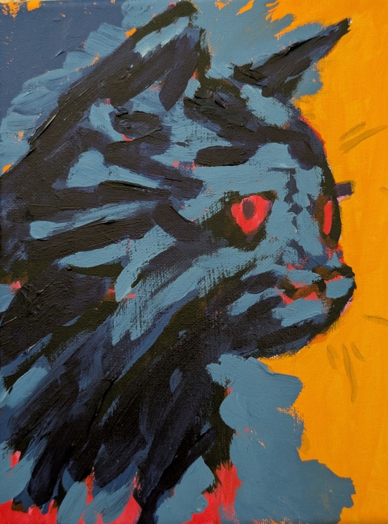
Black Cat… Halfway Done!

Yes, it’s another WIP from a Fresh Paint lesson (although I’m diverging from the color choices of the instructor to some degree.) For one thing, I went pack and painted over the Quinacridone Magenta with my Naphthol Red, as my magenta looked magenta pink, while the instructor’s video shows what to my eyes is plain ol’ red.

And I skipped the instructor’s Phthalo Blue/Quinacridone Magenta combo for my favorite Anthraquinone Blue (PB60) (which reads as a black-blue straight out of the tube).

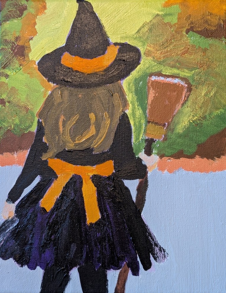
Little Witch… A Halloween Painting

This painting, which I mentioned in this post, is from a reference in Ali Kay’s Fresh Paint VIP membership.

One of the perks of the VIP membership is getting seasonal reference images / classes. I did not “attend” the video class, just using the reference image.

I highlighted the black outfit with dioxazine purple (PV23). I dry-brushed the sides of the skirt to get a tulle effect (as the dress in the reference image appears to have some tulle layers).

What I would change were I to do paint this again — the trees and sunlight (substantially blurred in the ref image) as it’s too busy. The hat needs purple highlights; it looks like I painted black on black. AND I need to work on making hair more realistic!

Bold Brushstrokes… Playing with Paint

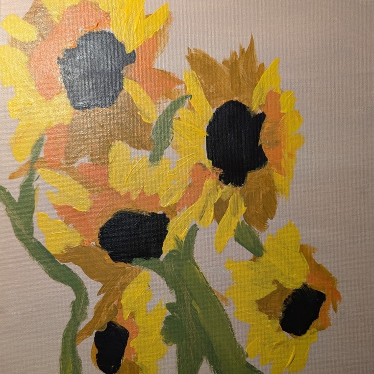
A few weeks ago I watched one of the videos on the Acrylic University site. Jed Dorsey was painting a vase of sunflowers from a reference photo (likely his own). So, tonight, I felt like painting more sunflowers and decided to just wing it mostly from memory, doing my own thing rather than copying Jed’s work, or copying the reference photo.

This is the result. 10×10 canvas panel toned in burnt umber and white. Colors used were naphthol crimson, cadmium yellow, ultramarine blue, and a bit of Mars Black.

This was fun! I wasn’t trying for realism or polish, just playing with paint.

Sunflowers in a Vase

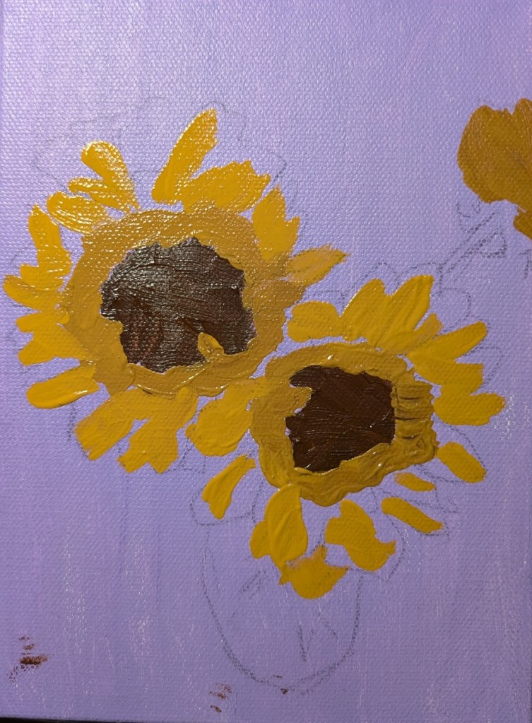
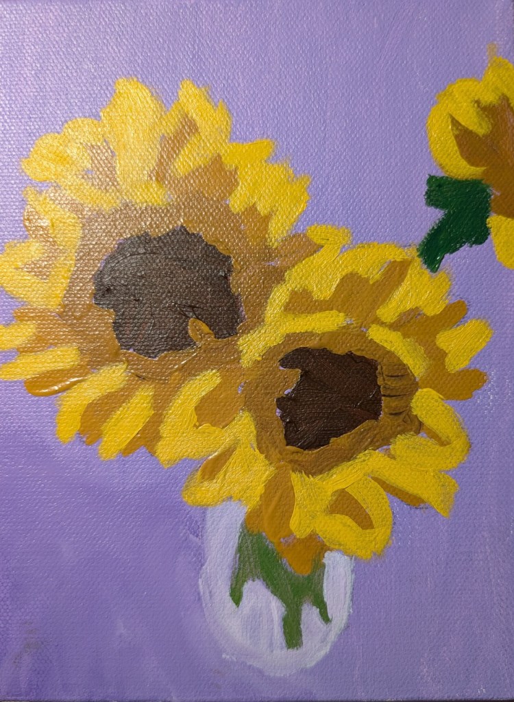
This painting was done on a 6×8 canvas (Blick Premier — I surprisingly liked it) and it’s based off of one of my own photos. The background is Dioxazine Purple (PV23) tinted with Titanium White, as a complementary color to the various tones of yellow (Yellow Ochre, and Cad Medium Yellow mixed with Yellow Ochre).

While I’m not entirely happy with this effort, on the whole, I think it’s one of my better sunflower paintings.

Pink Roses in a Vase

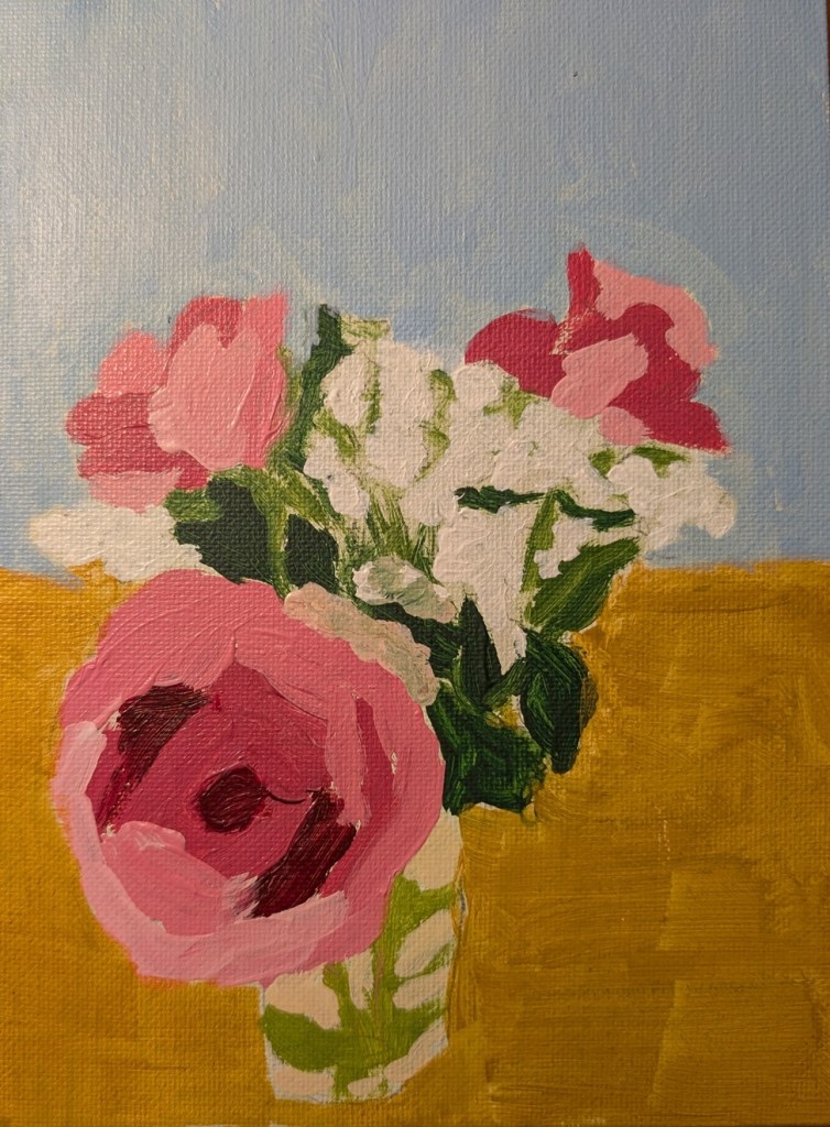
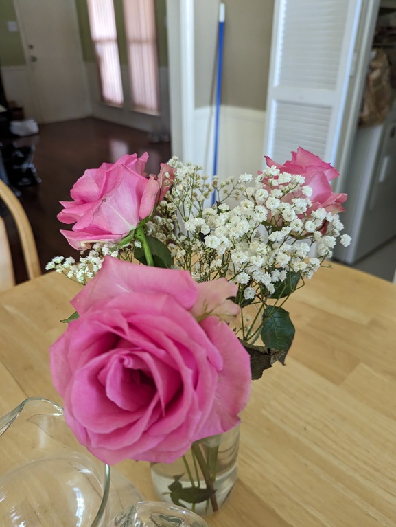
I took this photo back in the summer of 2023 and, as I was browsing through my pics of floral scenes, thought about painting it. Roses are difficult for me — but maybe I need to let go of that negative thought and tell myself roses are fun to paint! (Actually, this bouquet WAS fun to paint knowing I was doing it “solo”, and not copying someone else’s painting or using someone else’s reference photo.)

I used a 6×8 canvas panel for this one.