
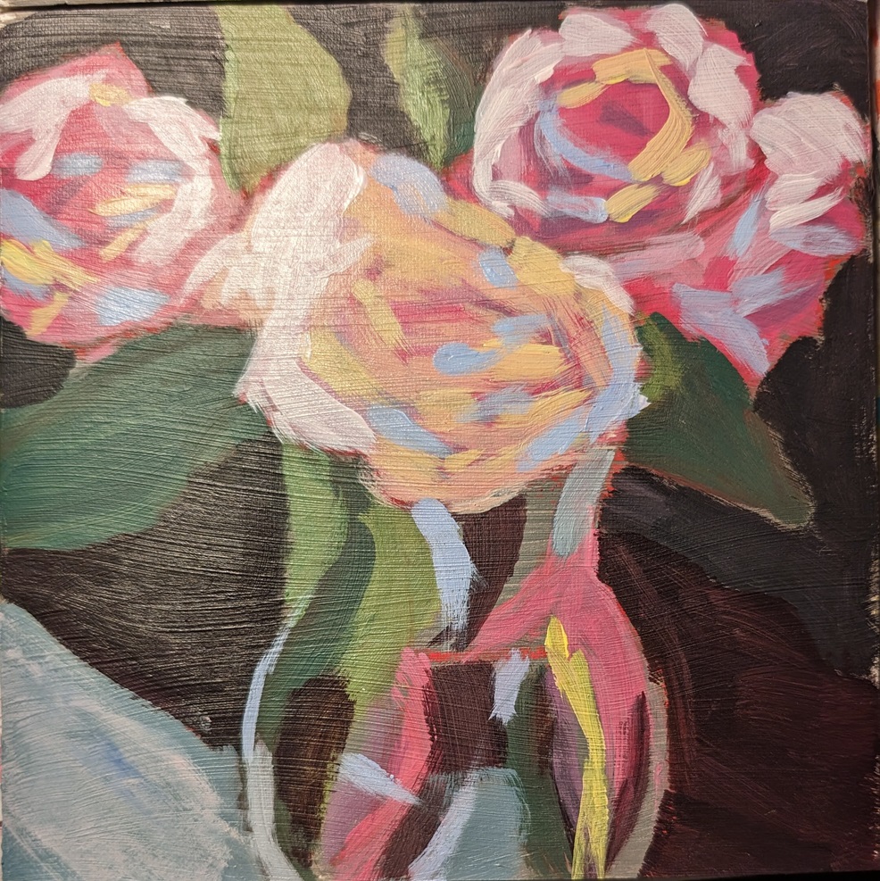
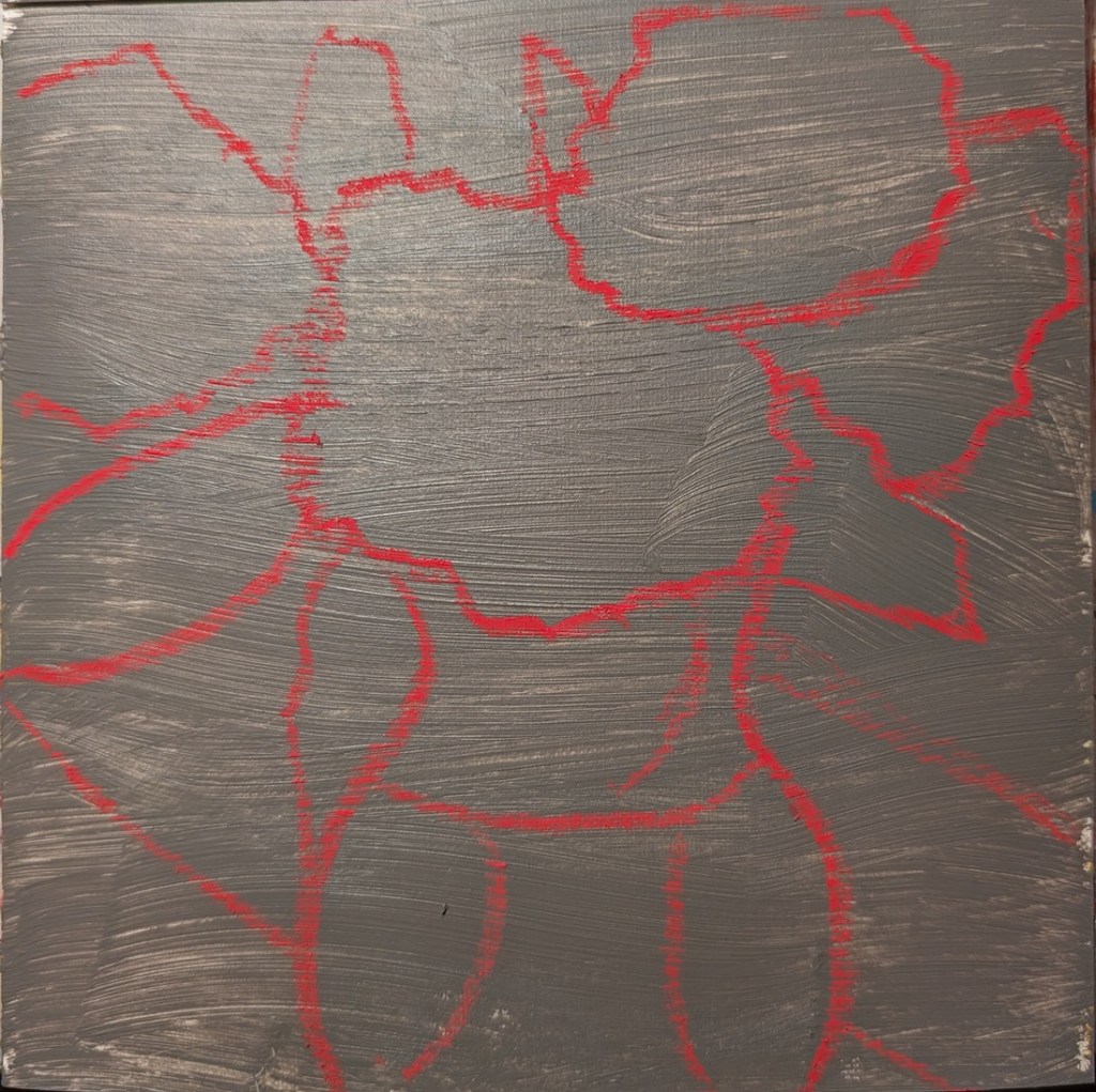
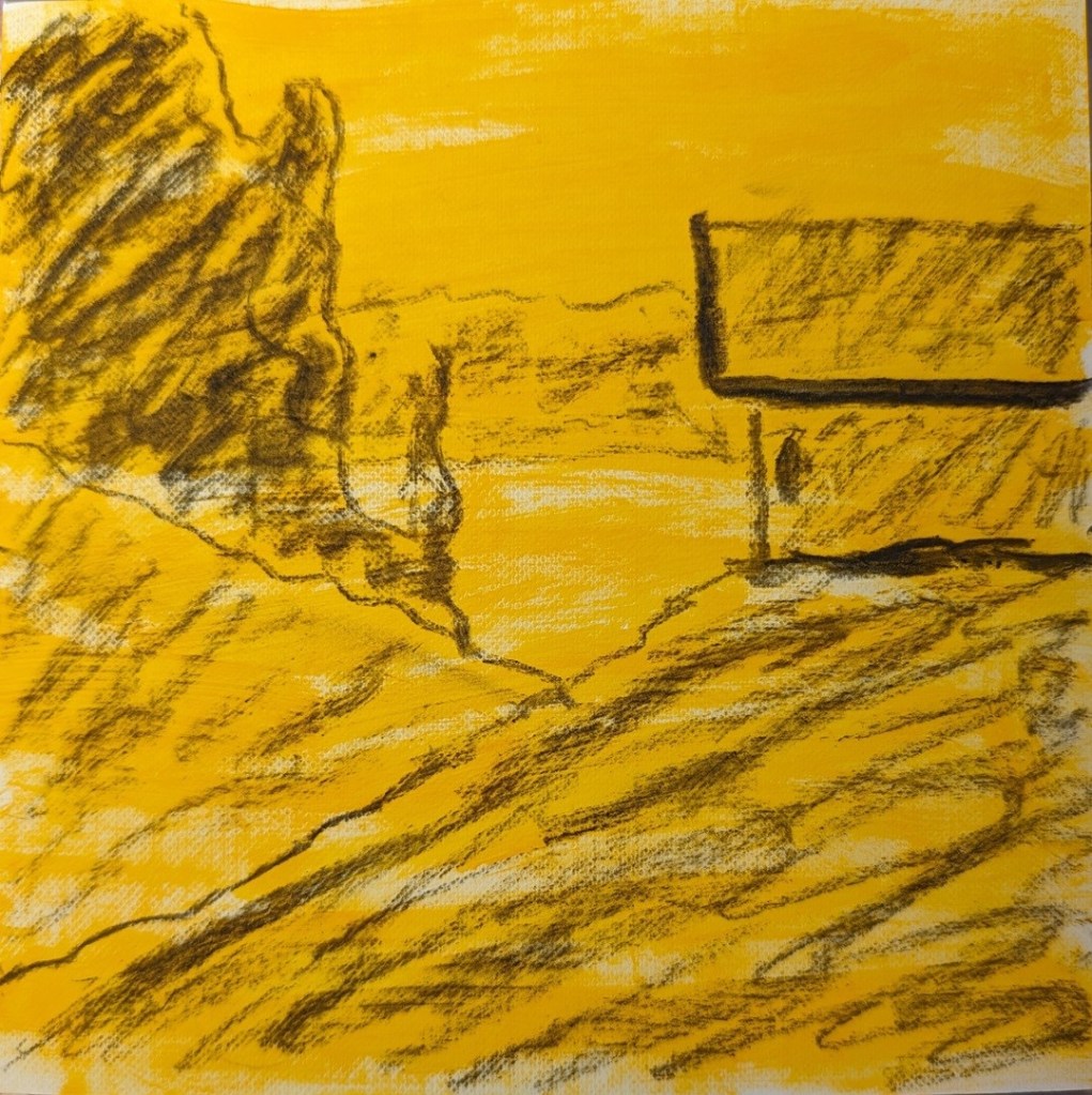
This is the second of 3 miniature paintings from the Acrylics 101 course at Acrylics University. (See also this post.) I used a medium neutral gray as the toning color, and a red soft pastel to draw out the design.
Acrylic University
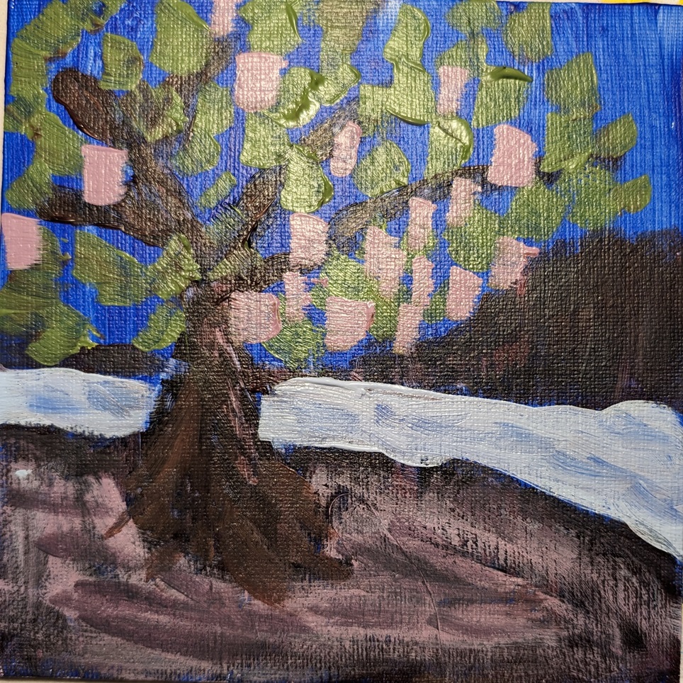
(Acrylic University) Acrylics 101: Mini Practice Paintings #1
So I’m going through the Foundations classes in the library of Acrylic University — basically the reason I paid for a year’s subscription. In Acrylics 101 we cover the basic tools (brushes, easels, types of acrylic paint), the importance of thumbnail sketches, values, color (opaque vs. transparent, color mixing, etc.) and then finally we do some practice paintings. Three are minis (6×6) and three are larger sized (up to 16×20).
Jed Dorsey, our instructor, says that he has found that beginners do better — and gain confidence more quickly — when they attempt to copy a painting rather than work with a reference photo (or plein air) primarily, I assume, because the artistic decisions have already been made. He demos painting a copy of his own painting, explaining why he did what he did.
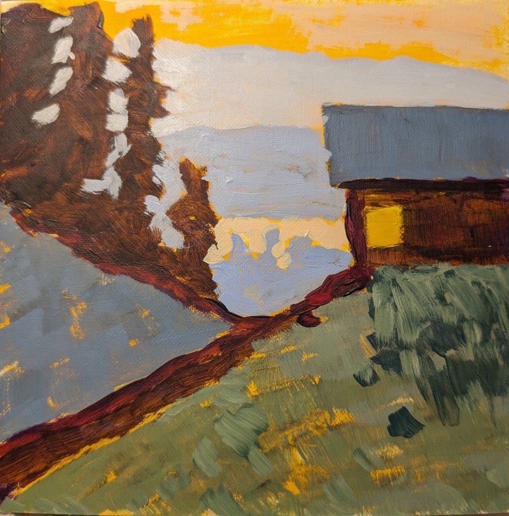
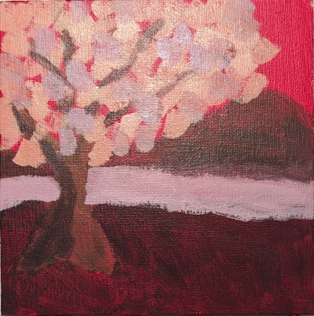
So, with that lead-in, here’s my painting of his painting. I used Diarylide Yellow as my toning color, and painted on 6×6 canvas paper using only a #8 flat brush.
(Acrylic University) Primary Palette 101: Exercise, Part 2
These paintings are from Part 2 of an color-study exercise I’m doing on the Acrylic University site. The class is taught by Jed Dorsey; it is his reference photo and his follow-along painting vids I am using for my own studies below.
Part 2 features different versions of the primary hues; I am using Liquitex Cad-Free Yellow Light (cool), Ultramarine Blue (warm), and Anthraquinone Red (cool).

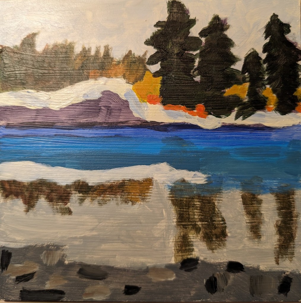
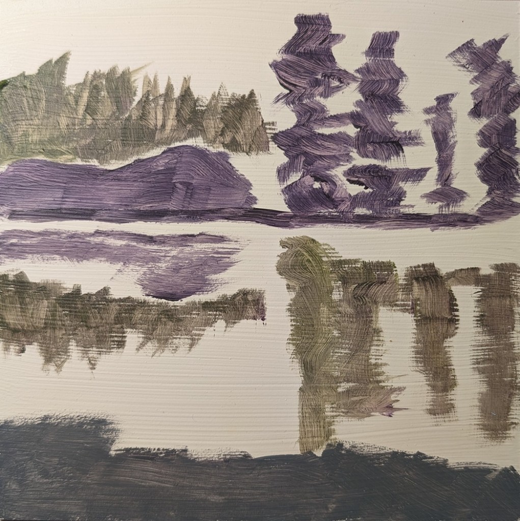
52 Mini Paintings Challenge: Week #2
This was week 2 for Jed Dorsey’s Mini Painting Challenge at Acrylic University. The focus was on the reflection of the trees and land in the lake.
I used an old Ampersand Gessobord panel which I re-gessoed numerous times to reduce the slickness. Unfortunately, that left brushstroke grooves, which are particularly obvious in the reflection of the trees.
Cloud Challenge #2 – Acrylic University
Today, for Week 2 of Dianna Shyne’s “Cloud Challenge” at Acrylic University, the reference photo was a Tuscan sunset.
I repurposed a 6×6 canvas panel for this. My orange is a mixture of Pyrrole Red and Cad-Free Yellow Medium.

Acrylic University – Freebie class & Small Paintings
I mentioned the other day that I signed up for a Clouds Challenge on Acrylic University. I have since signed up for Jed Dorsey’s mini painting challenge which starts in January 2024. There’s also a freebie class: “Acrylic Painting for Total Beginners – Everything You Need to Know in Less Than 2 Hours” which I’m also doing. These days I’m not a total beginner, but a free class lets me check out the instructor, Jed Dorsey.
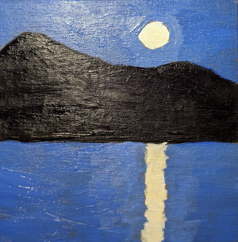
The class covers basic suggested supplies, brushstrokes, values, the grayscale, color mixing, and 3 small paintings.
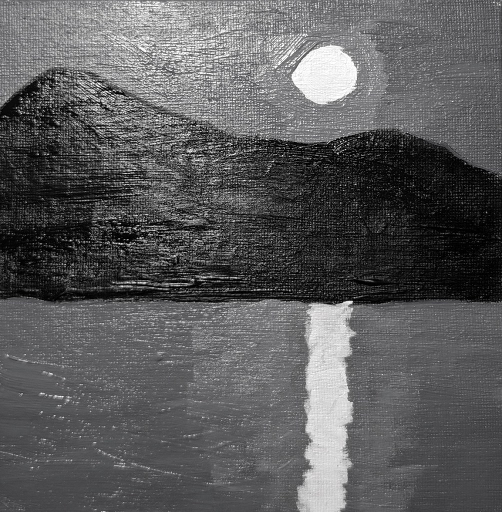
The first two paintings from the class are below. You paint the moon scene in grayscale first, and then paint color over it, keeping with the value map. The last photo is of the color painting, but in black & white to validate the value map.
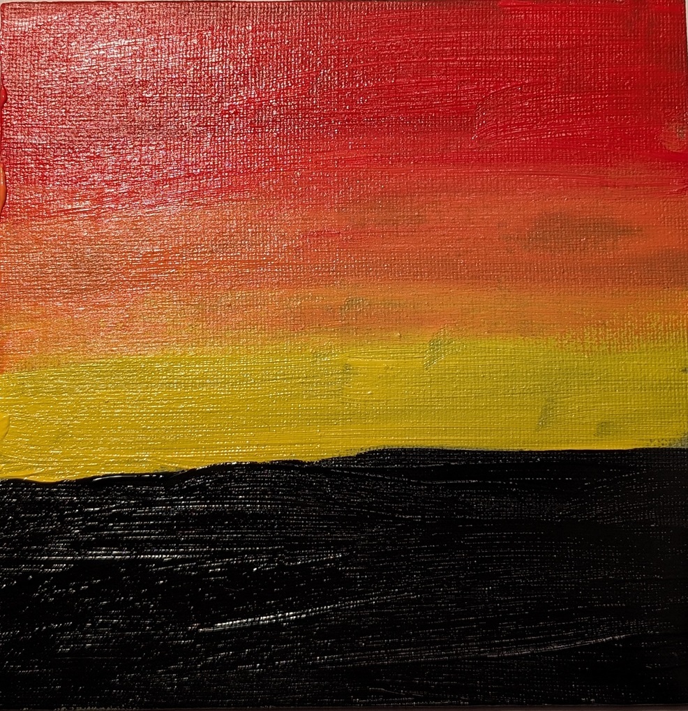
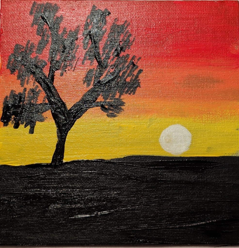
The second set of paintings is a sunset, and the last one (not yet completed) will be roses.

Cloud Challenge #1 – Acrylic University
The other day I was on Instagram, and something came up in my feed about Acrylic University, an art site I wasn’t aware of until that moment. I checked it out and signed up for an 8-week “Cloud Challenge” class taught by Dianna Shyne. This painting was done today in that class.
- I had fun!
- Clouds are more difficult to paint than they seem.
- I really do not like phthalo blue as a color — it’s much too intense, and much too much of a greenish blue.
- The “black” in this painting is a chromatic black — ultramarine blue, phthalo blue, Anthraquinone Red (marketed as alizarin crimson) and the merest touch of cad yellow hue.


Overall, I like the colors, but this looks more like a stained-glass abstract than puffy clouds.
