Field of Daffodils… After Dianna Shyne

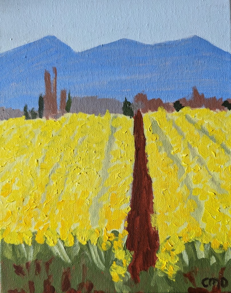
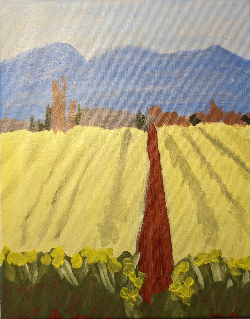
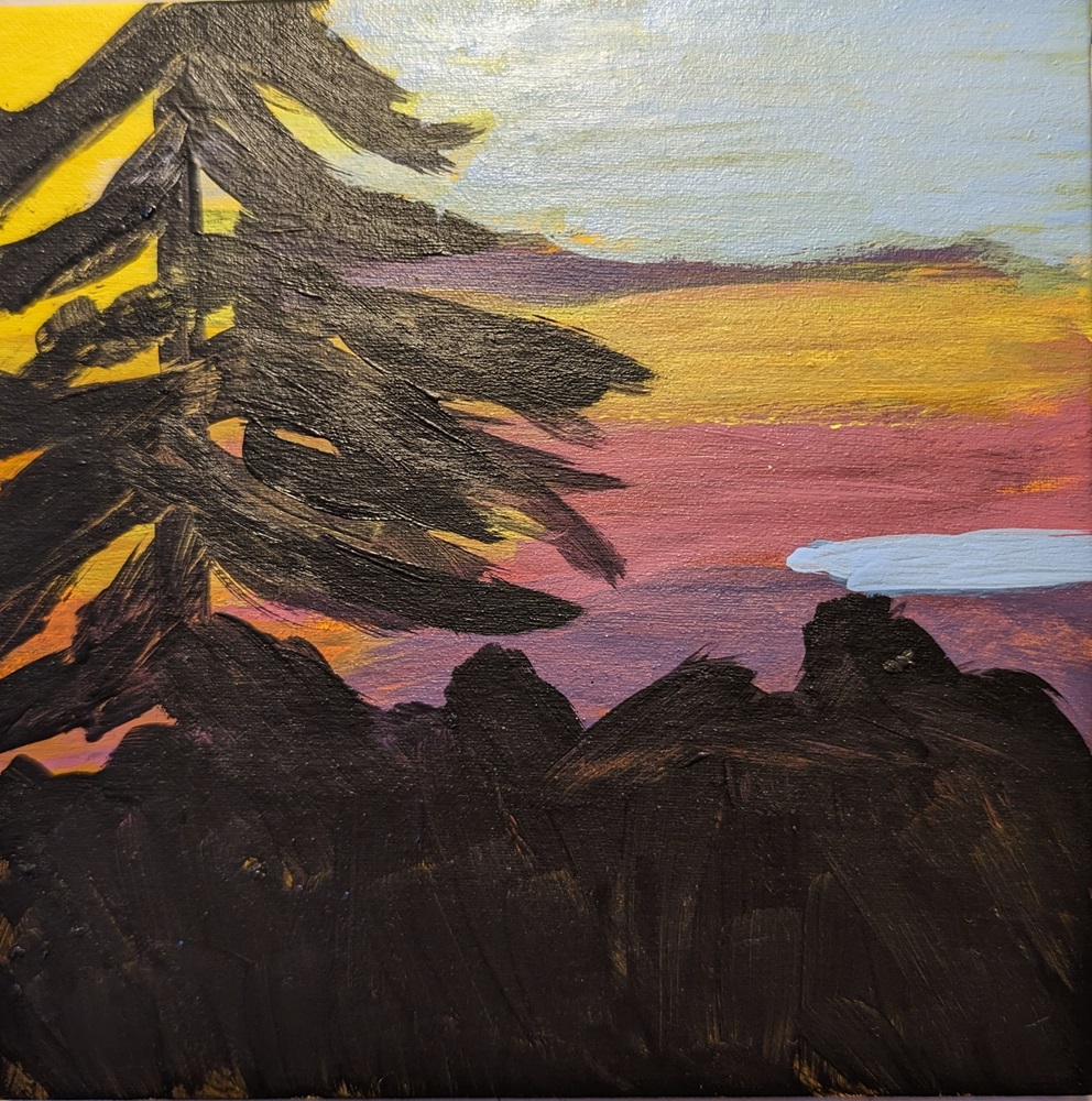
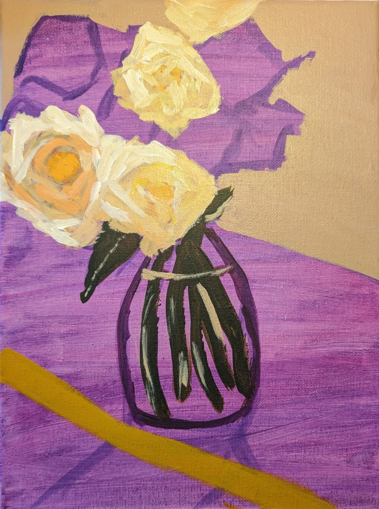
One of the perks of Acrylic University membership is weekly classes/workshops livestreamed on YouTube. Last Friday, the instructor Dianna Shyne led a workshop on the “Colors of Spring”, which included her painting four small studies of flowering trees and spring flowers. One was of a field of daffodils, and since daffs are my favorite flower, I tried my own version of the reference photo she used.

This was done on an 8×10 stretched canvas, and the yellow used is (mostly) Liquitex Cad-Free Yellow Light (Lemon), with some Cad-Free Yellow Medium in the foreground. All the various shades of green were mixed from Cad-Free Yellow Light and Mars Black.

52 Mini Paintings Challenge: Week #14

This is the week 14 painting for Jed Dorsey’s Mini Painting Challenge at Acrylic University. It’s from a reference painting by an artist named Bruno; a large lone pine is silhouetted against an evening sky. Dorsey’s process involved painting the tree and foreground first, and then the sky. I did the opposite, painting the sky in its entirety, and then painting the tree and foreground in a chromatic black (burnt sienna & ultramarine blue).

The reference photo did not really speak to me; I think this is reflected in my painting. Oh, and I started with a 6×6 canvas panel I had already painted in a diarylide yellow.

52 Mini Paintings Challenge: Week #13

This is the week 13 painting for Jed Dorsey’s Mini Painting Challenge at Acrylic University. I’m not certain where the reference photo was taken; it’s not one of Dorsey’s. The painting he did in the paint-along is called “Big Clouds” and he uses a magenta red underpainting. To be honest, his version of this painting is one of the reasons I signed up for this challenge. I’m not over-crazy about my own version; it’s just another study of clouds. I need more practice.

52 Mini Paintings Challenge: Week #12 – Value Adjustment

After I completed the week 12 painting for Jed Dorsey’s Mini Painting Challenge at Acrylic University, and compared it to a grayscale of the reference image, I realized the values were off. So I’ve lightened the trees and the grass.

Here’s the value comparison between the reference image and the original painting, and then the reference and this updated version. The updated pic is, obviously, on the left. My trees and my grass were much too dark in my first attempt.

52 Mini Paintings Challenge: Week #12

This is the week 12 painting for Jed Dorsey’s Mini Painting Challenge at Acrylic University. The reference photo [from Mark Hadland] is from somewhere in the Colorado Rockies, I believe, and the painting is called “Let’s Take a Hike”. It’s painted on a 6×6 Claybord panel, toned in black first. I liked the Claybord better than Gessobord; what I read online is folks beefing that is shows the brushstrokes. Which, yeah, it does. But, in my case, so what? I’m just practicing, not doing commissioned work.

One thing, though — I need to do the trees and sky “my way”. (Which is — do the sky FIRST and then paint in the trees.) Doing it Jed’s way is fine for him, but for me it just looks like c–p.

52 Mini Paintings Challenge: Week #10

This is the week 10 painting for Jed Dorsey’s Mini Painting Challenge at Acrylic University. The name is “Golden Vineyard”. I’m not sure where Dorsey got the photo, but he did his painting on a black canvas. I looked at the reference photo, and it seemed more golden to me, so I went with a yellow ochre background.

This is on a 6×6 canvas panel, a brand I haven’t used before (Yes! All Media cotton). I bought it at my local Jerry’s Artarama, and found it to be extraordinarily smooth, more similar to Ampersand’s Gessobord than the typical cotton panel. I’m undecided about it, as I certainly didn’t like Gessobord when I tried it last year. We’ll see.. I have 5 more panels to use.