This painting was done on an 8×8 canvas panel, and is based off a reference photo on Ali Kay‘s Fresh Paint site. I followed the reference, not Ali’s process. What I like the best is the decorative foam.
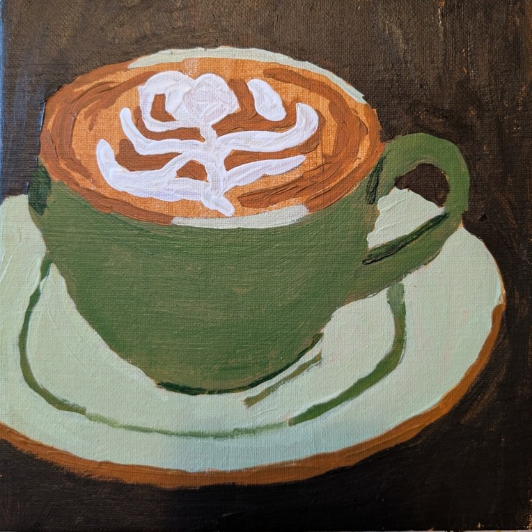

This painting was done on an 8×8 canvas panel, and is based off a reference photo on Ali Kay‘s Fresh Paint site. I followed the reference, not Ali’s process. What I like the best is the decorative foam.
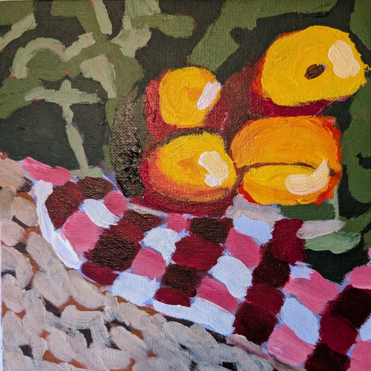
Okay, these don’t look too much like apples! This painting was done on an 8×8 canvas panel, and is based off a reference photo on Ali Kay‘s Fresh Paint site.
I got rather “lost” following Ali’s process layering multiple colors that really didn’t relate — in my opinion — to the actual reference. Oh well, moving on…
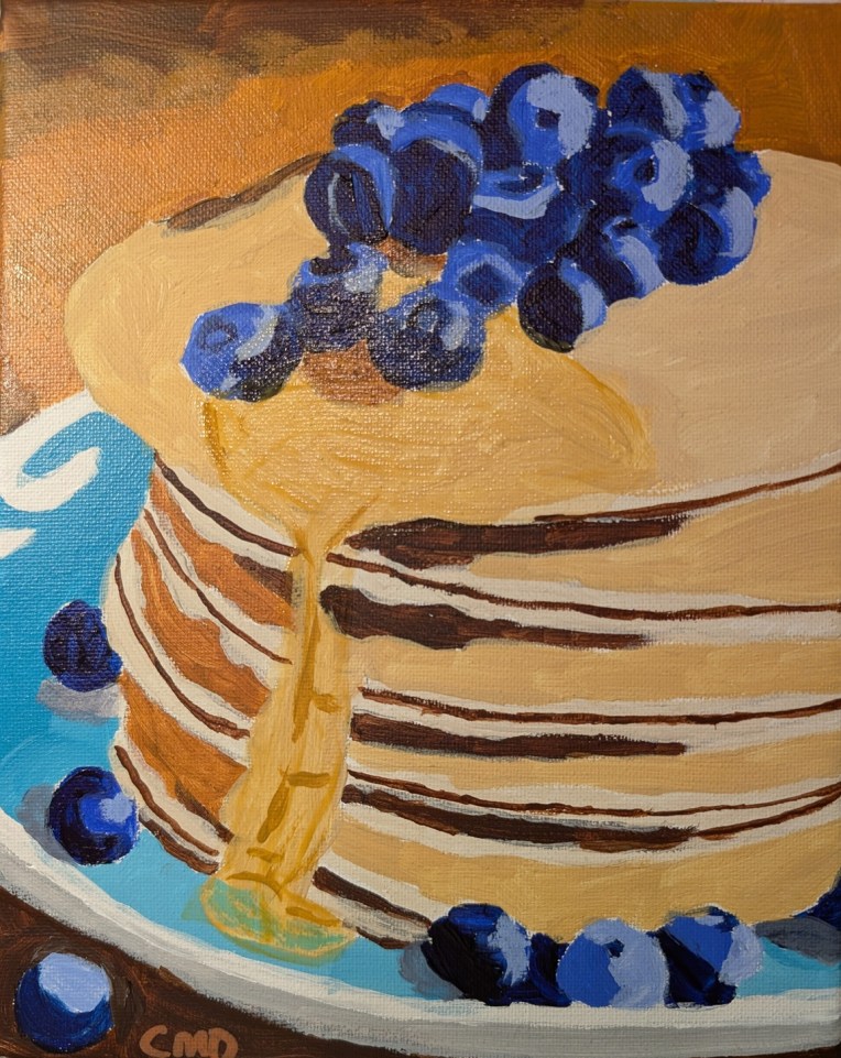
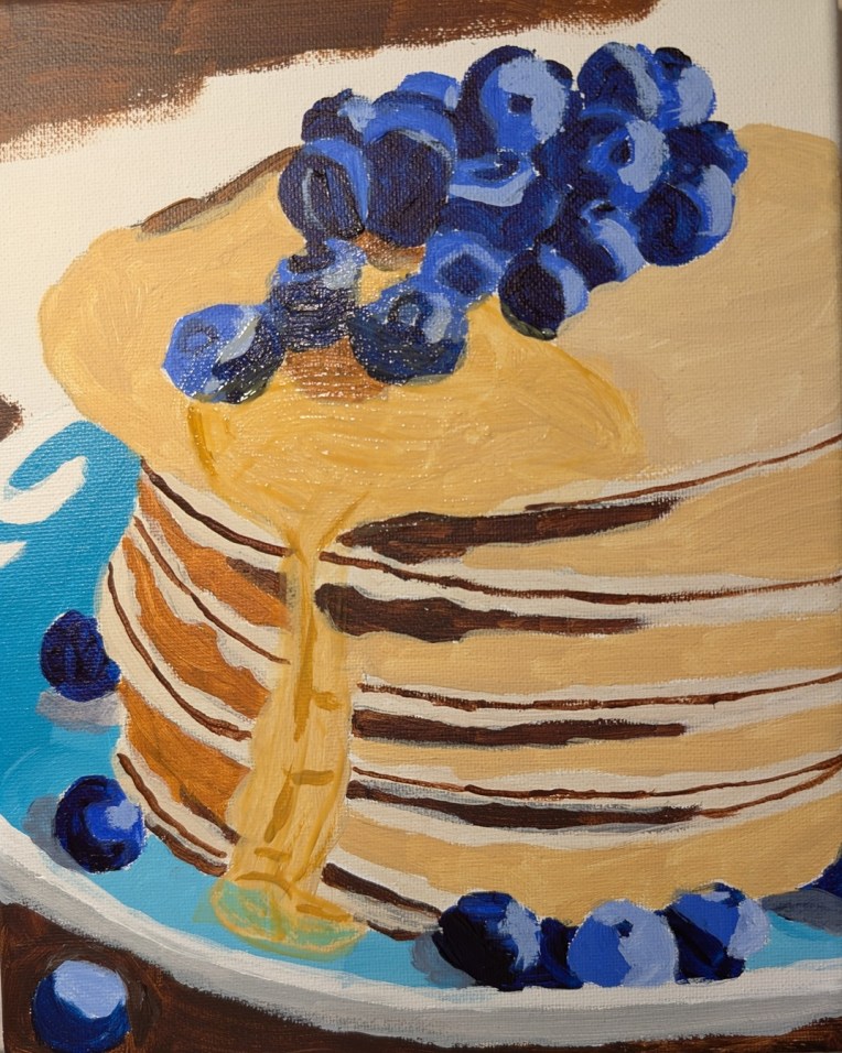
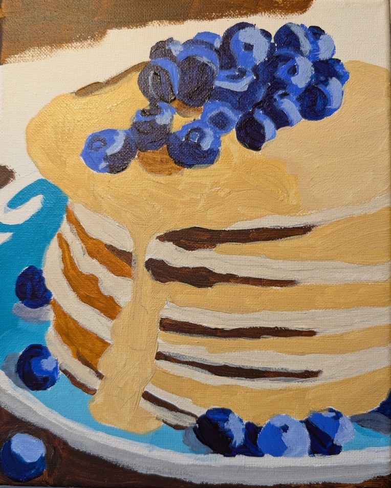
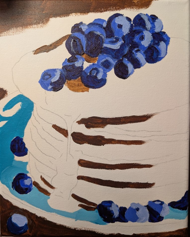
This painting was done on an 8×10 canvas, and is based off a reference photo on Ali Kay‘s Fresh Paint site. Ali will demo her version of this stack of pancakes and blueberries in a few days; I wanted to do my own version).
I’m happiest with the blueberries, which I painted with Anthraquinone Blue straight from the tube, Ultramarine Blue, and Ultramarine Blue with Titanium White. For the syrup, I used a glazing medium with Liquitex’s Raw Sienna.
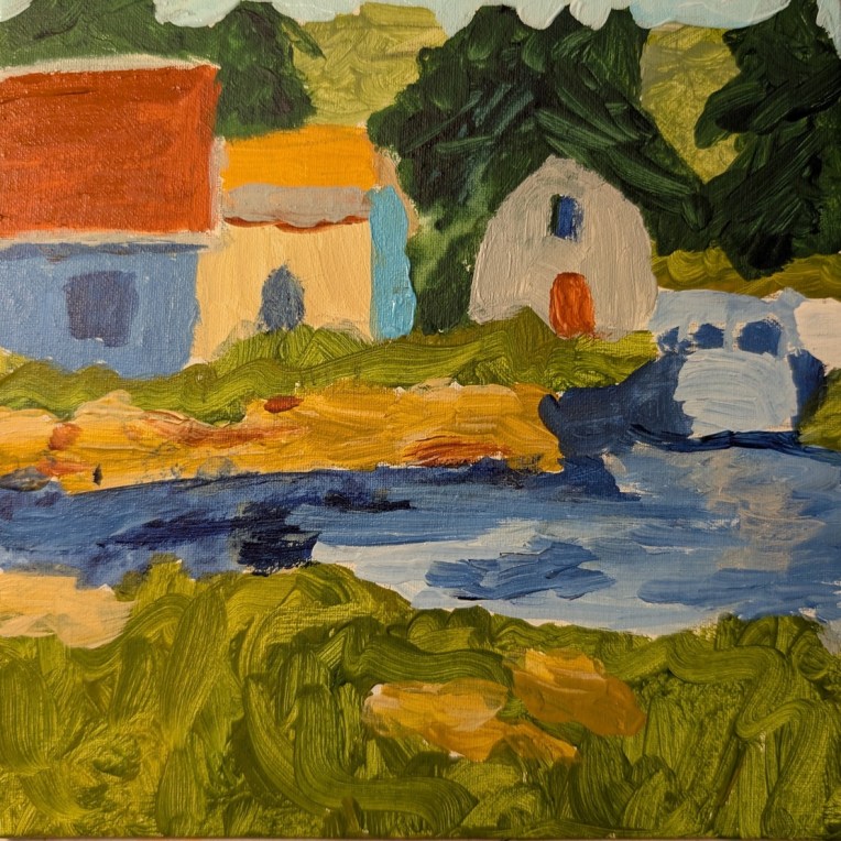
This is Week #7 (called “Boathouses”) of “Travels Near & Far” — a mini painting challenge at Acrylic University, and the artist is Dianna Shyne who also took the reference photo used. As with the week #1 work, the photo is of Prince Edward Island, Canada.
This was painted on a 6×6 canvas panel, and the swirly brushstrokes in green — meant to represent grass! — remind me of some of Van Gogh’s swirly painting (but not in good way, ha-ha!) To the right is supposed to be a boat, but since I painted it in the same colors as the water, it now appears “lost” or, rather, more like a bridge.
The thing is, I’m so focused on painting other things, I don’t care enough to paint it in, say, black and white so that it appears as a boat.
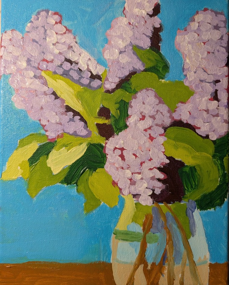
I outlined these lilacs on an 8×10 canvas over a year ago (based on a template found on Ali Kay‘s Fresh Paint site.) Finally got around to painting it — using the reference photo Ali Kay provided, and NOT copying her style at all.
Overall, I’m more satisfied with the lilacs — which put me in mind of spring in New England during my college years — than with the daffodils in the vase I did a while back.
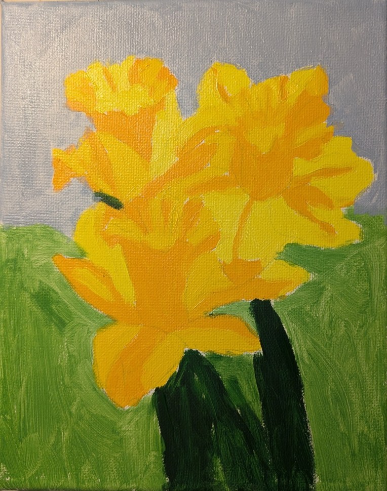
This painting was done on a 8×10 canvas, and is based on a photo I’m not sure where it came from — probably Pixabay, but possibly from my own collection, as I love daffs and photograph them when I can.
Even though I drew out the flowers on the canvas first, I still struggled a bit — but hopefully these look more like daffodils than some of the earlier paintings I posted a week or so ago.
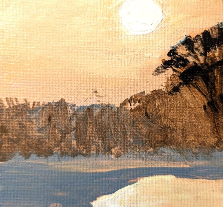
This painting was done on a 6×6 canvas panel, and is based on a photo I found on Pixabay. I’ve had this reference photo (significantly cropped from the original) for quite some time. I enjoyed painting it. However, my own photo of my painting is not that great, despite my fiddling with the properties. Around the white sun, I actually have more yellow blended into the orange of the sky. Ditto for the reflection at the bottom right.
Oh, and for the first time, I used my fan brush in painting the vegetation.
Based on an image by Larisa Koshkina from Pixabay
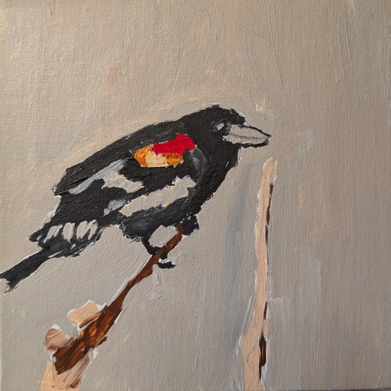
This painting was done on a 6×6 canvas panel, and is based on a photo I found on Pixabay. I’ve had this reference photo for seemingly forever, but it wasn’t as exciting to paint as I thought it would be. (I live near a creek with lots of reeds, where red-winged blackbirds hang out.)
Based on a photo on Pixabay.
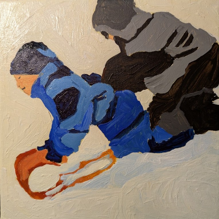
This is the last of three cute kids-playing-in-the-snow painting lessons on Ali Kay‘s Fresh Paint site. This one is called “Sledding Friends” and it, too, is painted on 8×8 canvas. I toned it with Golden’s “India Yellow Hue” and matte medium. As with the “Building a Snowman” painting, I referred only to the reference photo, and not to Ali’s painting or her online video.
I think I prefer the India Yellow Hue to the Yellow Ochre for toning; it’s more mellow. (It is also much more expensive than Yellow Ochre, unfortunately.) The Golden Paints website states that it is a mixture of Benzimidazolone Yellow (PY 175), Nickel Azo (PY 150) and a Quinacridone Red (PR 206). Weirdly, it is “modern mixture replacing the pigment originally produced in the early 1800’s by collecting urine from oxen fed only mango leaves”. (!)
The outfit of the boy in front is painted with Anthraquinone Blue and Ultramarine Blue, tinted with white. The boy in back is painted with Burnt Umber Light, Mars Black, and white as necessary. The snow is tinted with the India Yellow Hue, and, in places, with Ultramarine Blue.
I painted the snow quite thickly, which was fun!