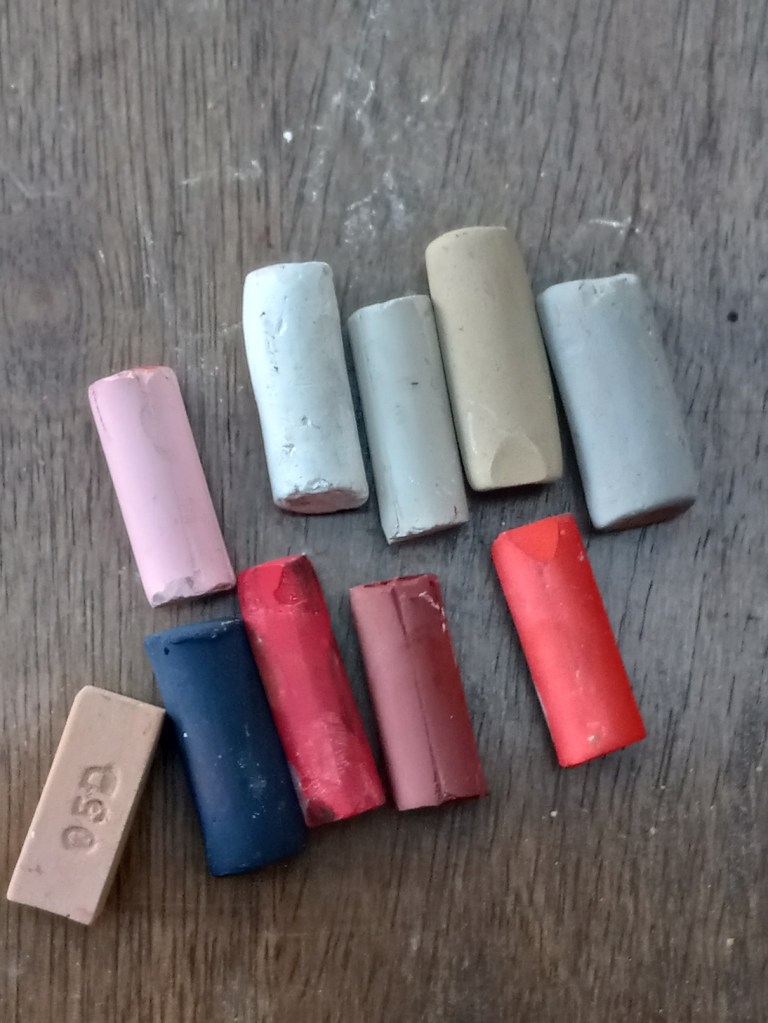
I ordered some of the cool red (aka Quinacridone Pink) pastels the other day, and they just arrived. I wasn’t expecting nearly fuchsia, How vivid! Will need to try these out. I am starting to really like the Blue Earth brand.


I ordered some of the cool red (aka Quinacridone Pink) pastels the other day, and they just arrived. I wasn’t expecting nearly fuchsia, How vivid! Will need to try these out. I am starting to really like the Blue Earth brand.
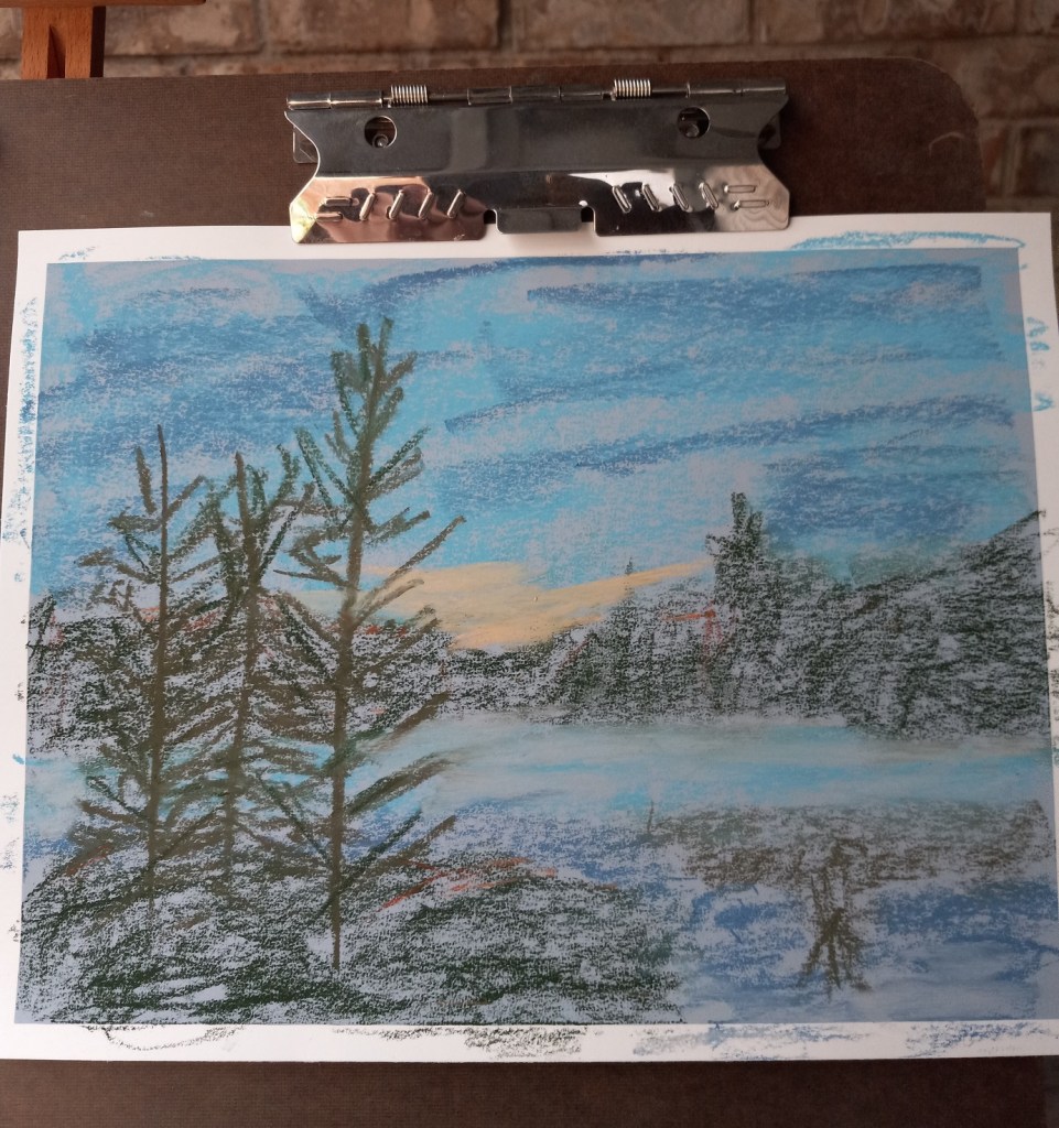
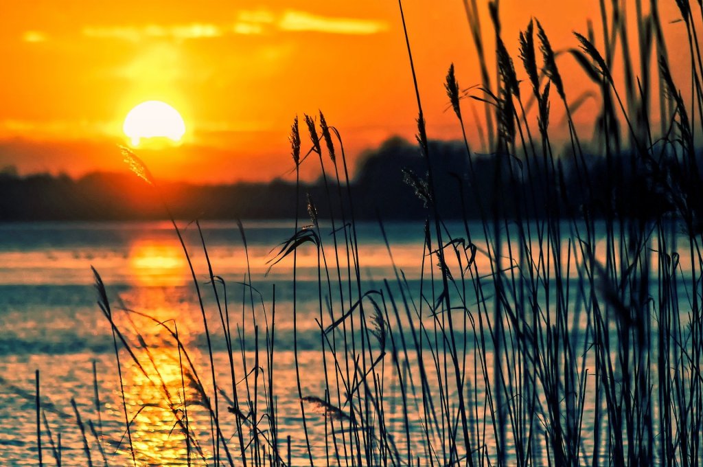
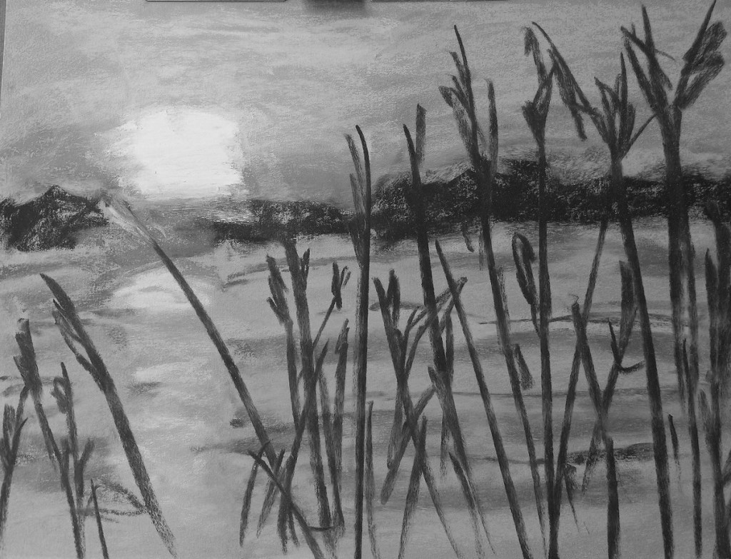
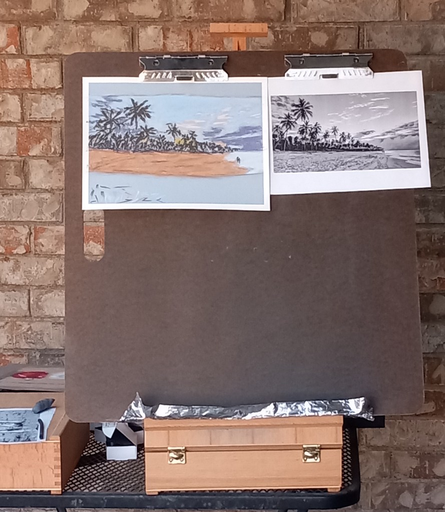
This project was based on an image by MustangJoe from Pixabay. I used Colourfix Smooth in Blue Haze all three times, as well as using the same palette.
All three efforts were failures, but at least I learned a few things.
Attempt #1
First time around, I did an underpainting (of the dark areas only) using a Blue Violet NuPastel. Using this color was a BAD idea! Why? Because I would later add a dark gray-green, and a reddish brown on top of that blue violet, which made mud. Ugh!
First time around, I also used too heavy a hand, in effect scribbling with the pastels trying to cover the paper. Bad idea — too heavy a hand can ALSO create mud.
First time around, the pine trees were cartoonish. But I was so frustrated with the mud mess I didn’t care at that point!
Attempt #2
Attempt #3
I need to try colors with more purple and less green and brown. I may need to experiment with papers which have more grit.
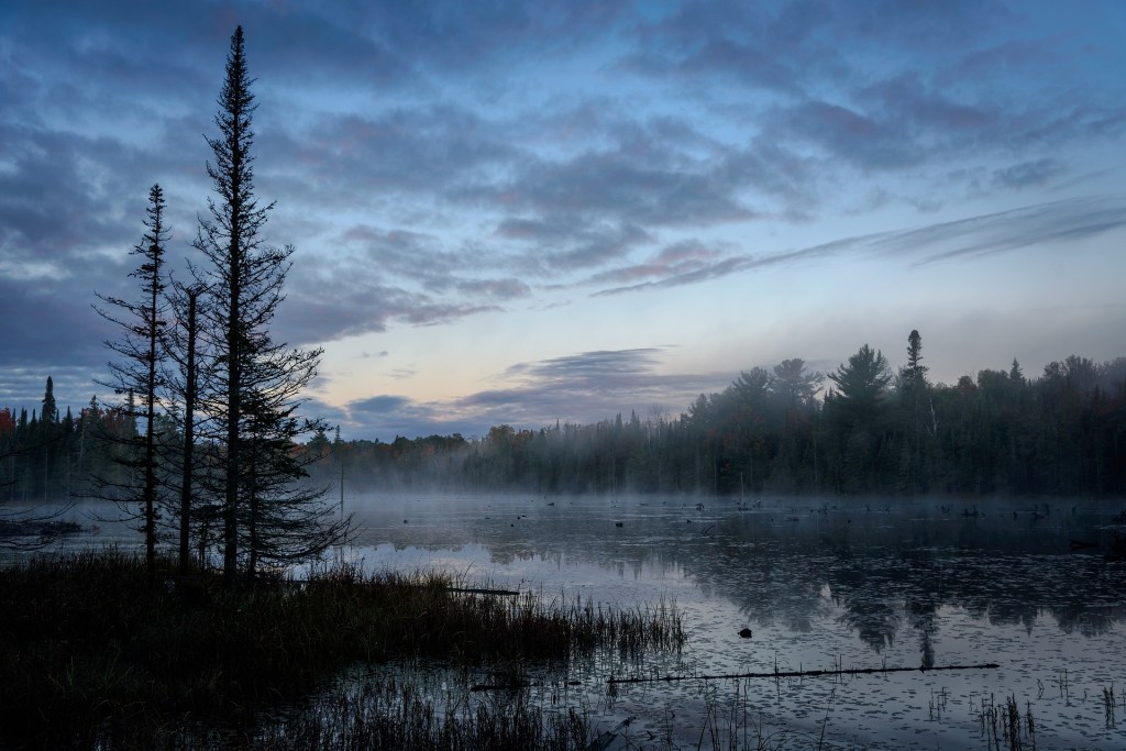


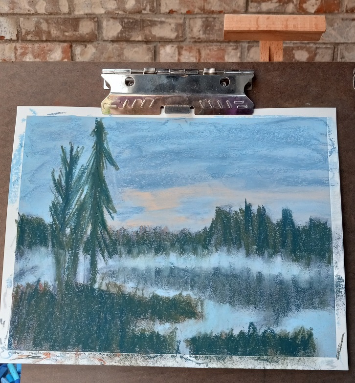
Today I did two landscapes using the same reference photo, and the same pastels, but two different papers and underpainting.
The reference photo was from an image by Tomasz Marciniak from Pixabay. I made it grayscale to verify there was sufficient difference in values.
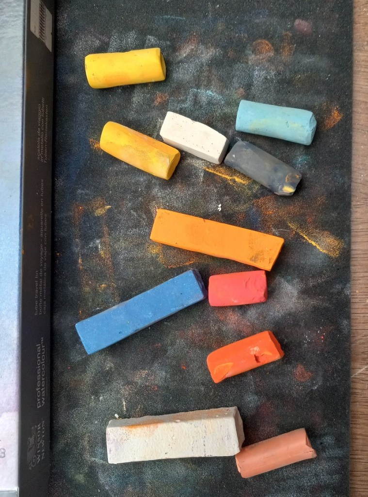
The pastels I used were Great American, Blick Artists’ Soft Pastels, Richeson Hand-rolled, and Blue Earth.
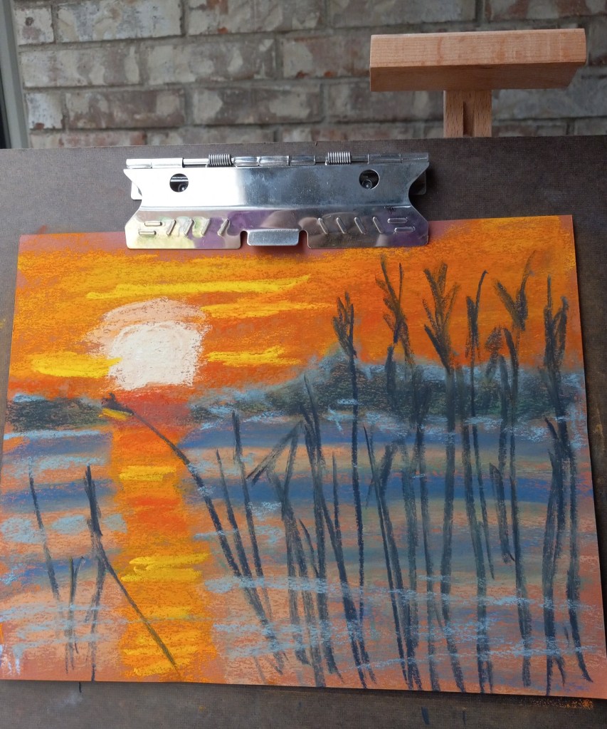
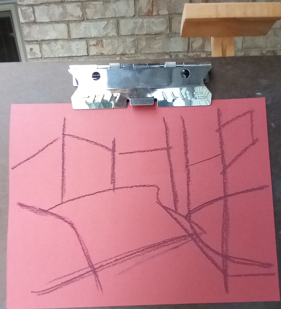
The first painting was done on Canson Mi-Teintes (smooth side) in the Red Earth tint. I did an underpainting with NuPastels (212 – Deep Orange, and 378 – Erin Green).
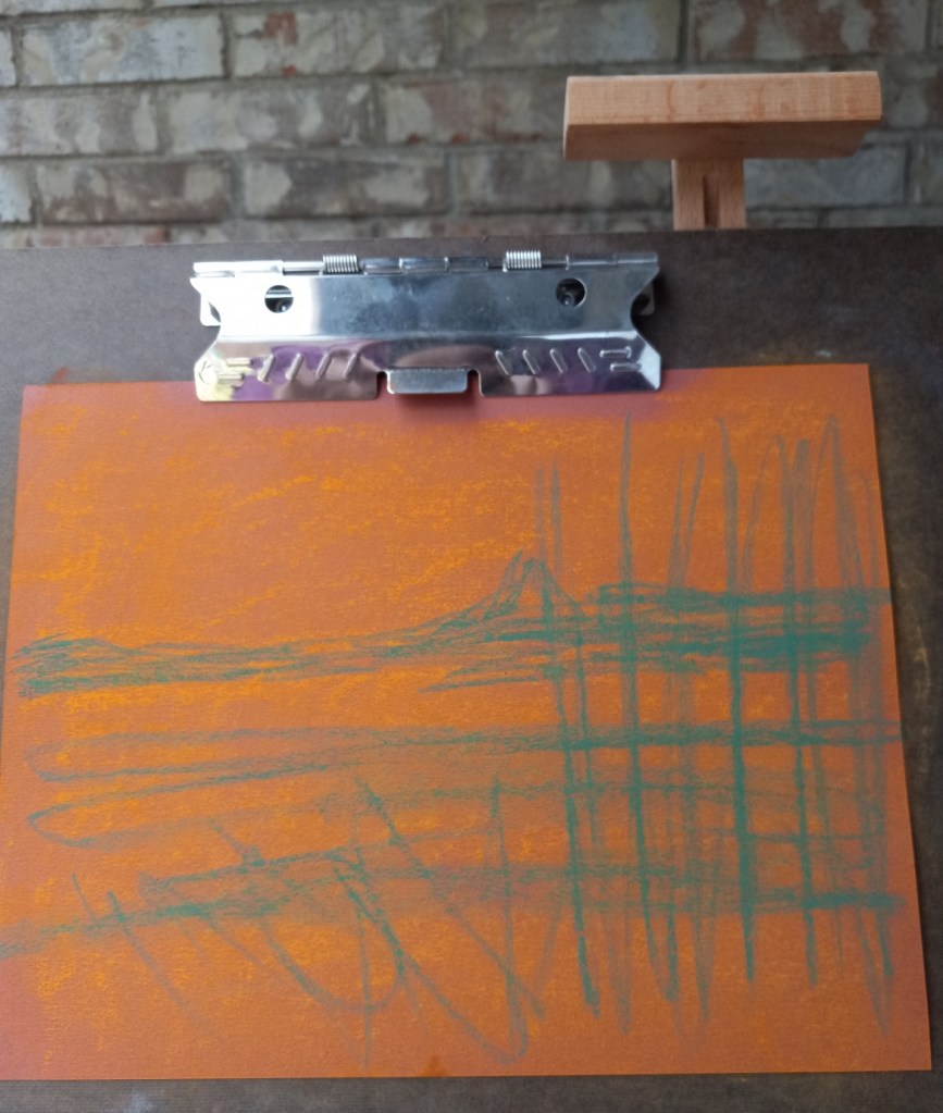
The second painting was done without any kind of underpainting, and using Pastel Premier paper in Italian Clay, a 320 grit sanded paper.
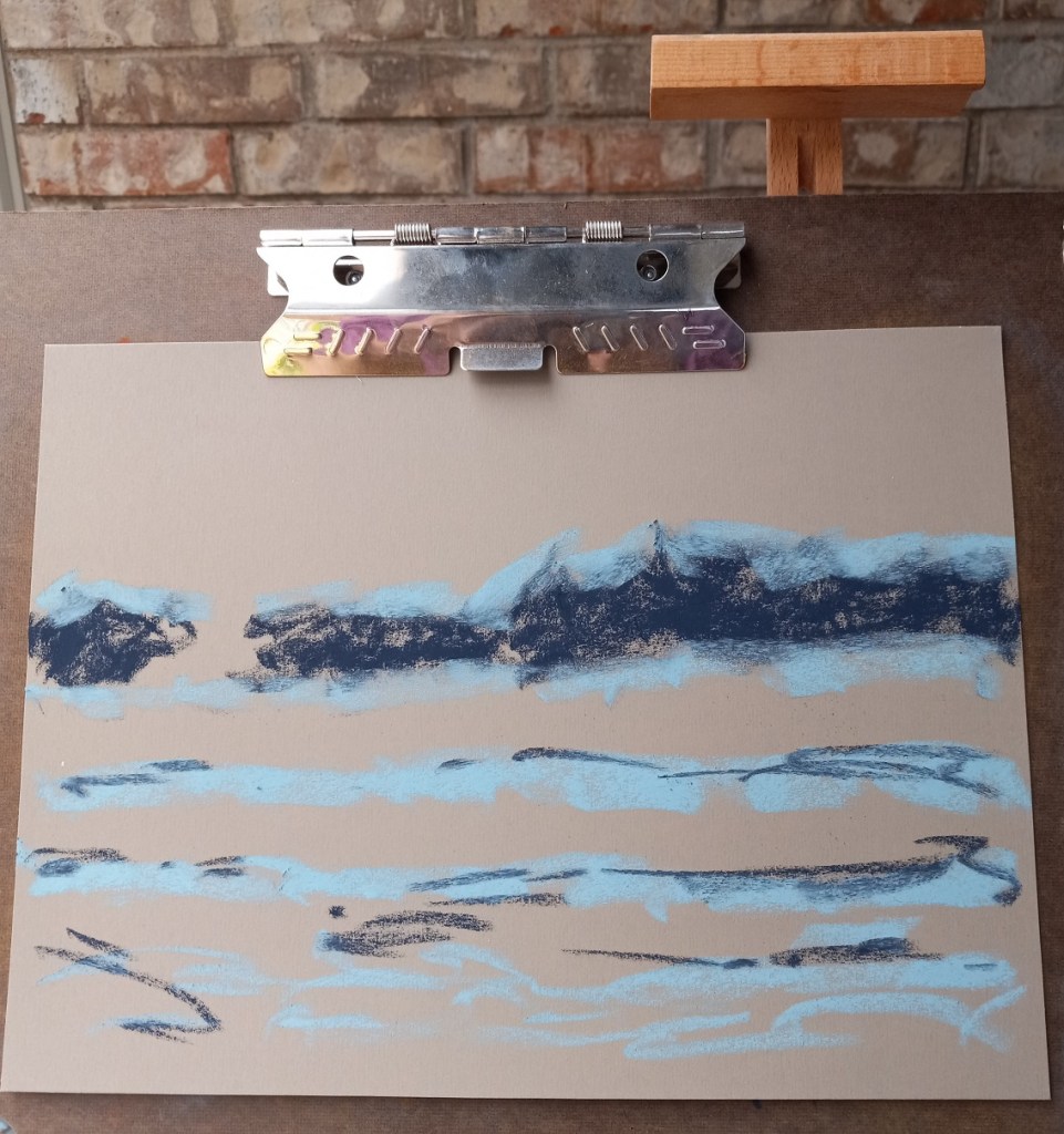
Here are the 3 pictures in grayscale: the original photo, the pastel on Canson paper, and the pastel on Pastel Premier.

Here are the three images in color (same order):
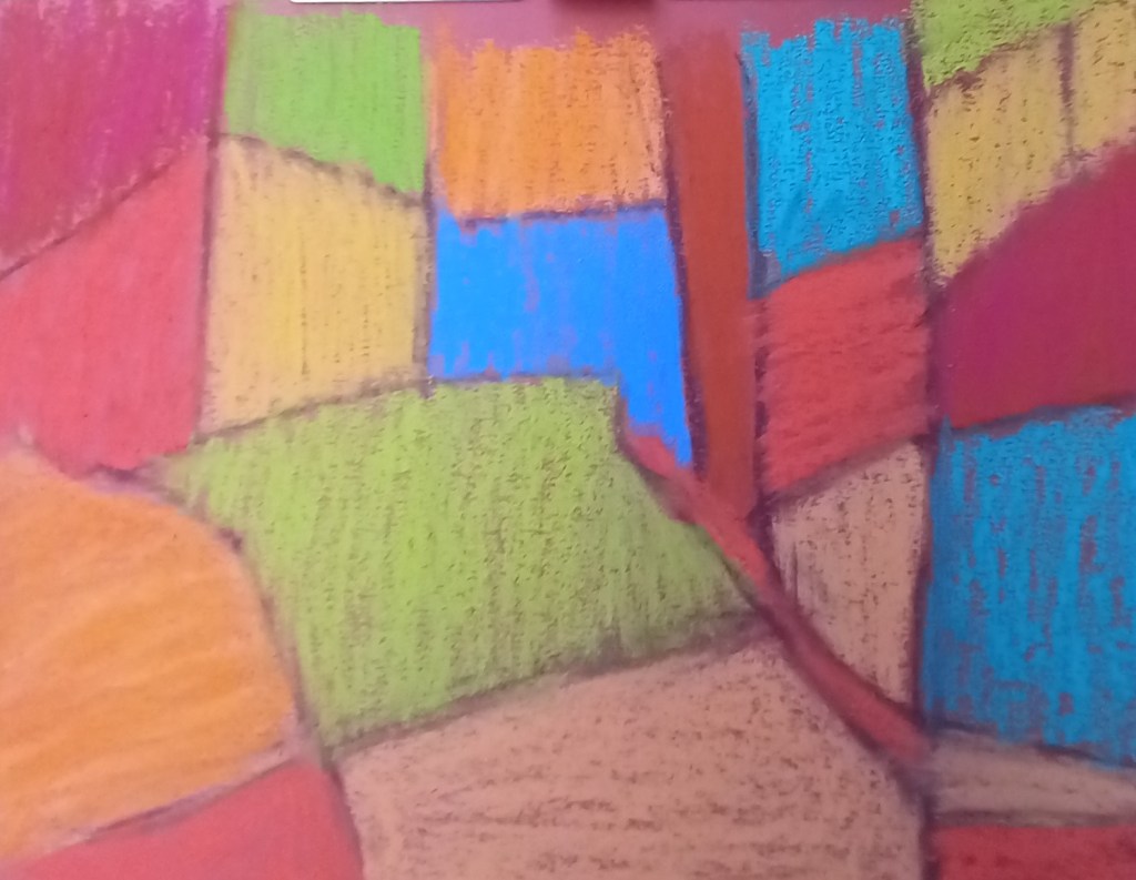
I did this work entirely in NuPastels, using Canson Mi-Teintes in “Red Earth”. I actually got the idea from a post by Karen Margulis, riffing off of her underpainting in preparation for a scene of trees and grass in summer.
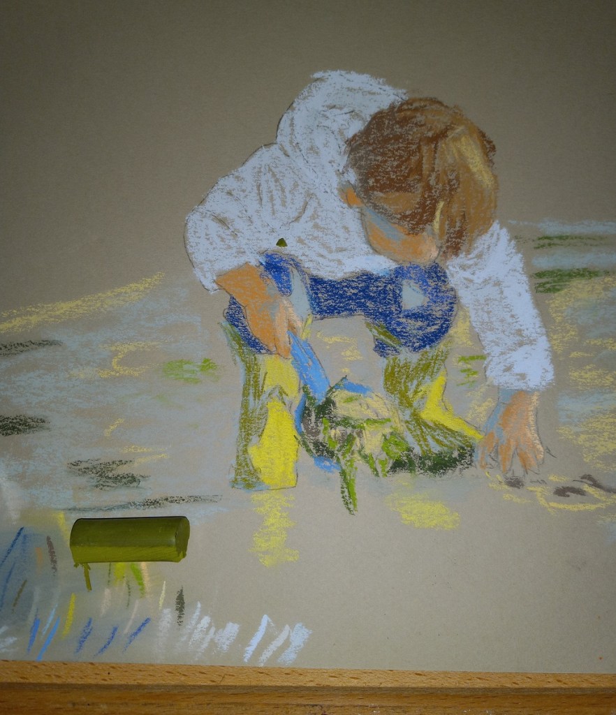
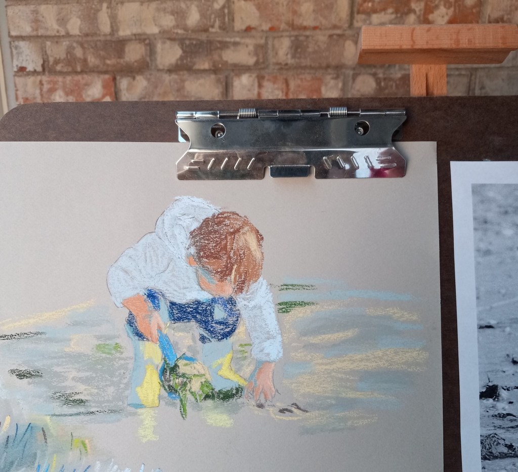
It was a warm Christmas Eve, quite spring-like, as I worked this, which got me thinking of gardens yet also of stained glass windows.

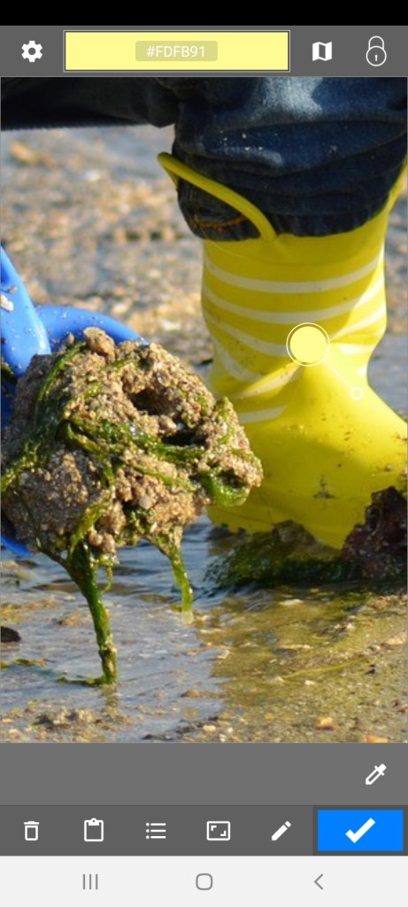
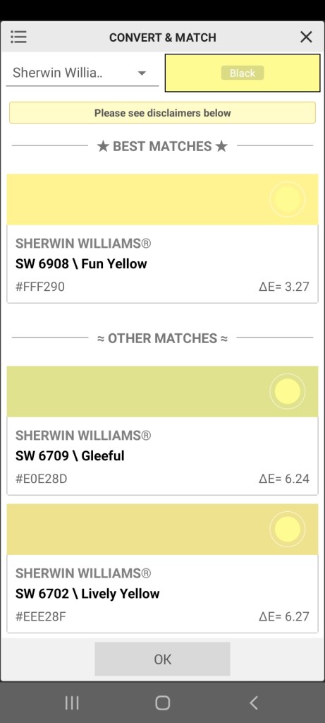
I was uneasy about my color selection for the little boy’s rubber boots — the part in shadow. The color constancy illusion would lead one to think the entire boot is yellow, but if you squint and then look at the photo, the boot in shadow is clearly not the same yellow as the boot in sunlight. So, at first I used a bluish-gray for the boot in shadow.
Then I remembered, I have the “Color Grab” app on my Android phone! I can check the suggested color, and then see if I have a pastel to match.
“Color Grab” showed the shadowed boot to be a yellow green, as shown in the first screen grab (see the small and larger white circles). Then you click on the Hex code for the color, and, if a listing of approximate paint colors is available, they will be listed. That display is what I used to approximate a pastel stick color.
I then added the yellow green color to the boot, but I need to blend it in.


In addition, the sunlit part of the boot is actually a whiter (paler) yellow, as shown by the screen grab, so I will need to adjust as appropriate there.
This pastel painting was based on an image by Nadine Doerlé from Pixabay.
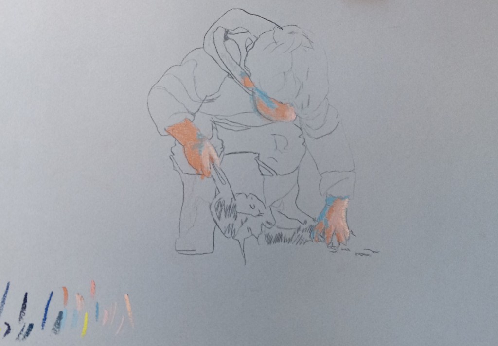
I used one of the assorted gray shades from my pack of Canson Mi-Teintes paper (the smooth side). I used graphite for the drawing, and pastel sticks from Blue Earth, Unison, Blick, and Sennelier.
This is the first time I’ve done a pastel of a human figure.


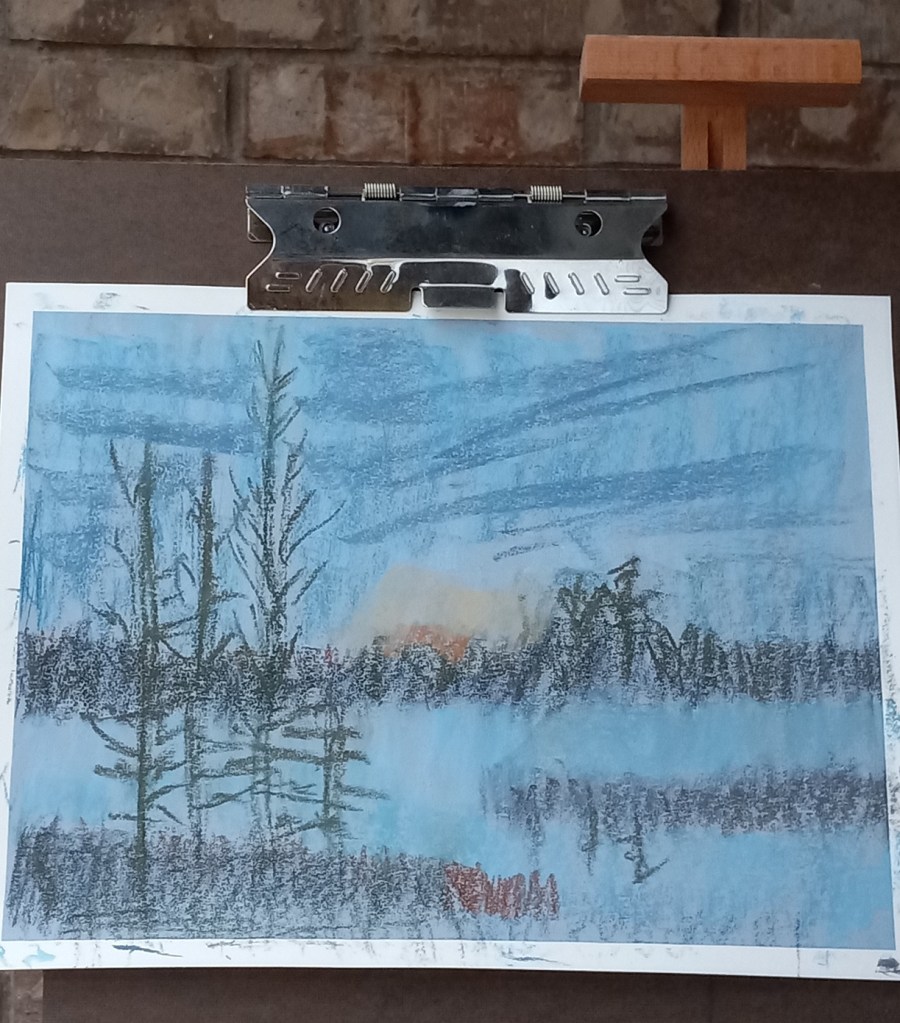
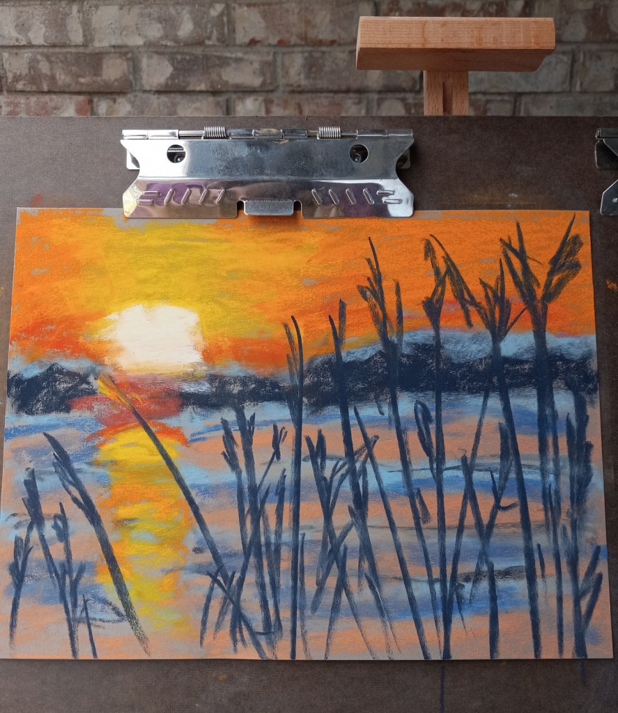
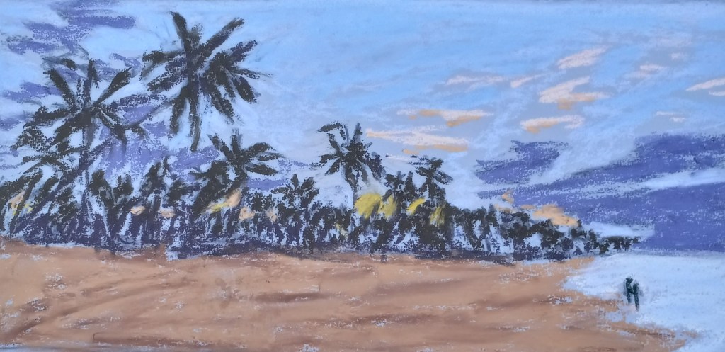
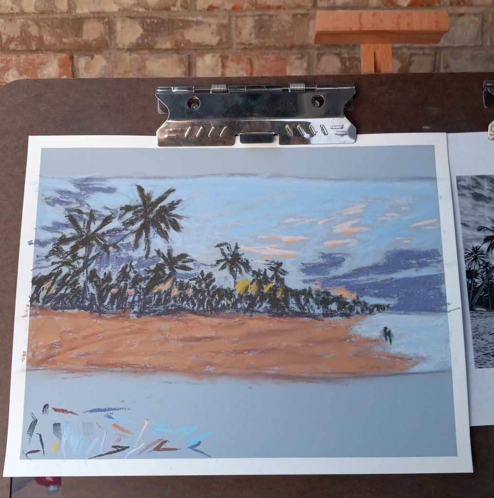
This pastel painting is based off an image by MustangJoe from Pixabay.
I used ArtSpectrum Colourfix Smooth in Blue Haze. My underpainting was done with willow charcoal, and I used Blue Earth, Blick, Richeson Hand-rolled and Sennelier pastel half-sticks.

Today I watched a “Drawing Together” ArtistsNetwork video on YouTube about drawing hair, which is something I have trouble with — I typically draw “spaghetti hair” which, of course, is totally wrong. Now I’m learning to more accurately draw hair by drawing the shapes and masses, then just adding striations.
The reference photo is here.
This study was done on Strathmore drawing paper, using only medium willow charcoal (Winsor & Newton) and my trusty kneadable eraser. I used a paper towel and my finger for blending. Willow charcoal, it turns out, is awesome! So easy to erase or rub out and start again!
I was not focused on replicating the profile, but rather getting a sense of the hair mass.

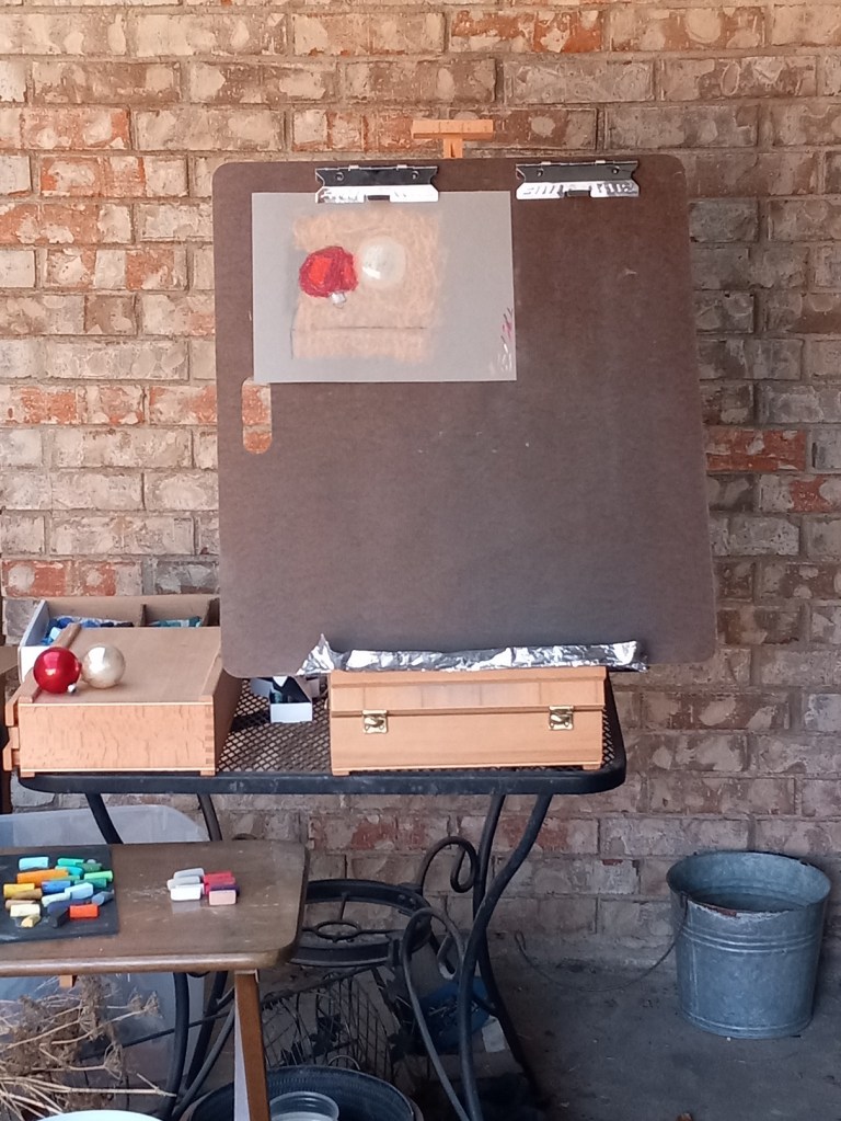
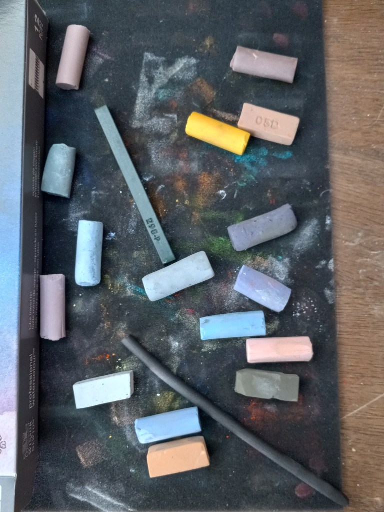
I used a Hahnemühle non-sanded pastel paper from my sampler set to draw the pair of ornaments taken from my fireplace decorations.
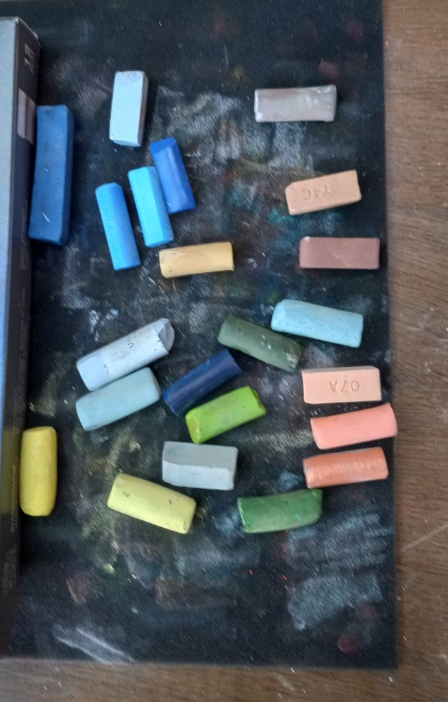
I took a photo of the entire easel scene; you can see the reference objects on the left. I also took a photo of the ornaments, and the color palette I used.
I was painting from life rather than the photo reference; the photo looks somewhat bluer and I was standing at a slightly different position taking the photo than when I was actually pasteling.