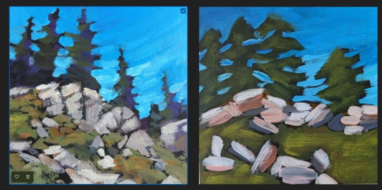
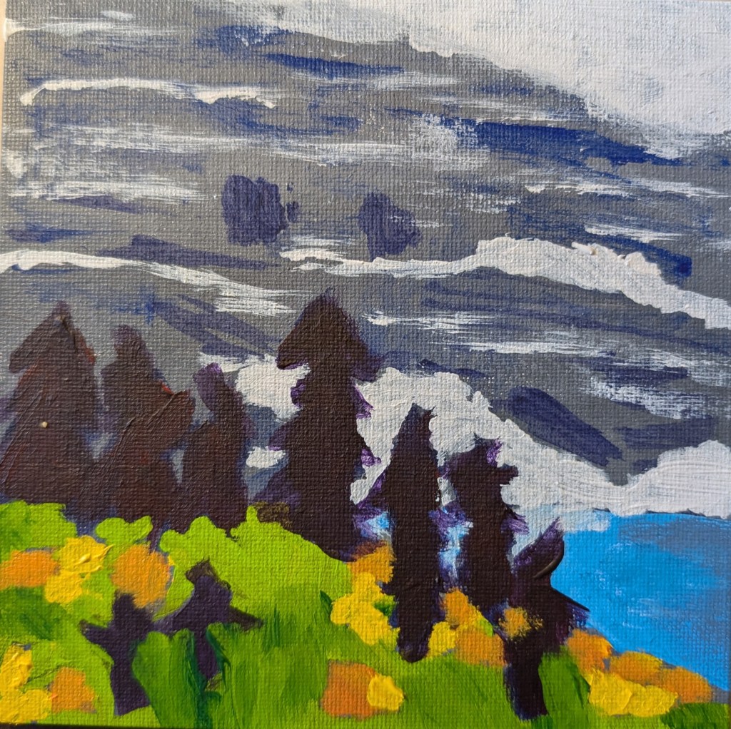
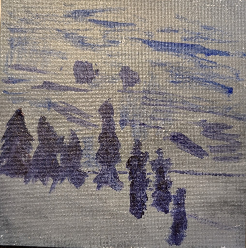
As with week 15 of Jed Dorsey’s Mini Painting Challenge at Acrylic University, many of the same flaws apply for the week 12 “Let’s Go Hiking” painting.
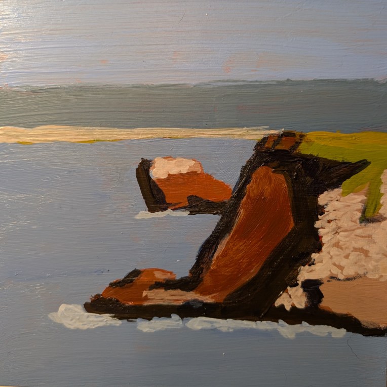
What I see is: 1) a lack of proportion which leads to 2) a lack of perspective. That tree at the right should obviously be smaller as it is farther away, for example. 3) Poor use of brush strokes in conveying form — for the rocks, they should have been vertical rather than horizontal which makes my rocks appear to be “floating” rather than grounded as boulders which comes across in Jed’s painting.
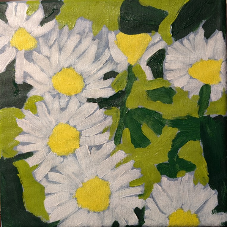
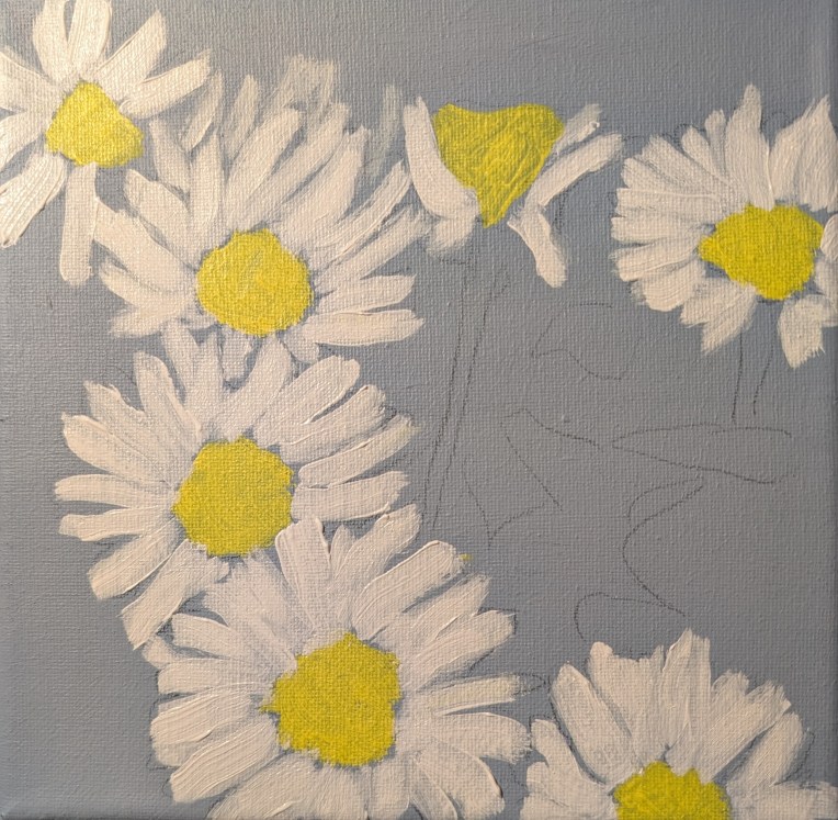
Positioning relative to the picture plane is not ideal in my painting, although in this one — compared to week 15 — my colors are not so saturated and, to my eye, are reasonably close to what Jed used. (Again, I don’t want to copy exactly, necessarily, and I DID go back and make a change to the values as indicated in this post. My first attempt at this painting is here.)
Finally, there is the difference in style between Jed’s and mine, which could just be related to my beginner status. But he has a preference for toning his canvases in black, which I did in this case — and I just can’t stand! I don’t have his painting ability so toning my canvas in black is discombobulating for me. In addition, Jed is gifted at painting the negative spaces, and that is NOT a skill I have at this point.
Also, in so many of these beginner lessons from various different painters I hear about using “big” brushes so that you don’t obsess over detail as many beginners do. I cannot argue with that, but I see in my paintings thus far TOO LITTLE attention to detail! It’s okay to use a smaller brush at times! 🙂
If I were to paint this again, I would stick with a white canvas or one toned a neutral gray, and I would probably trace key lines from his painting to get the proper sense of proportion as well as a sense of the boulders being rooted to the ground and forming the shape of the hill.