I got bored with this, so it’s not finished. Sketched on drawing paper based on a photo from 2013, then transferred on to 300-lb. cold-pressed watercolor paper. (At that point, I’m already bored, ha-ha!) I did a wash of an orange mix with matte medium, and then painted with Mars Black, messing up on the shadows.
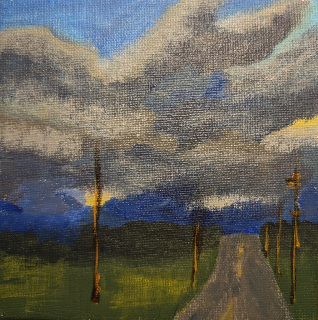
I haven’t been doing art for a few days now, as I’ve been under the weather. I’m still way behind on Dianna Shyne’s “Cloud Challenge” at Acrylic University. Today is a rainy day so it was perfect for painting the #5 cloud challenge, which is of storm clouds, and based on a photo the artist took. This was rather fun!
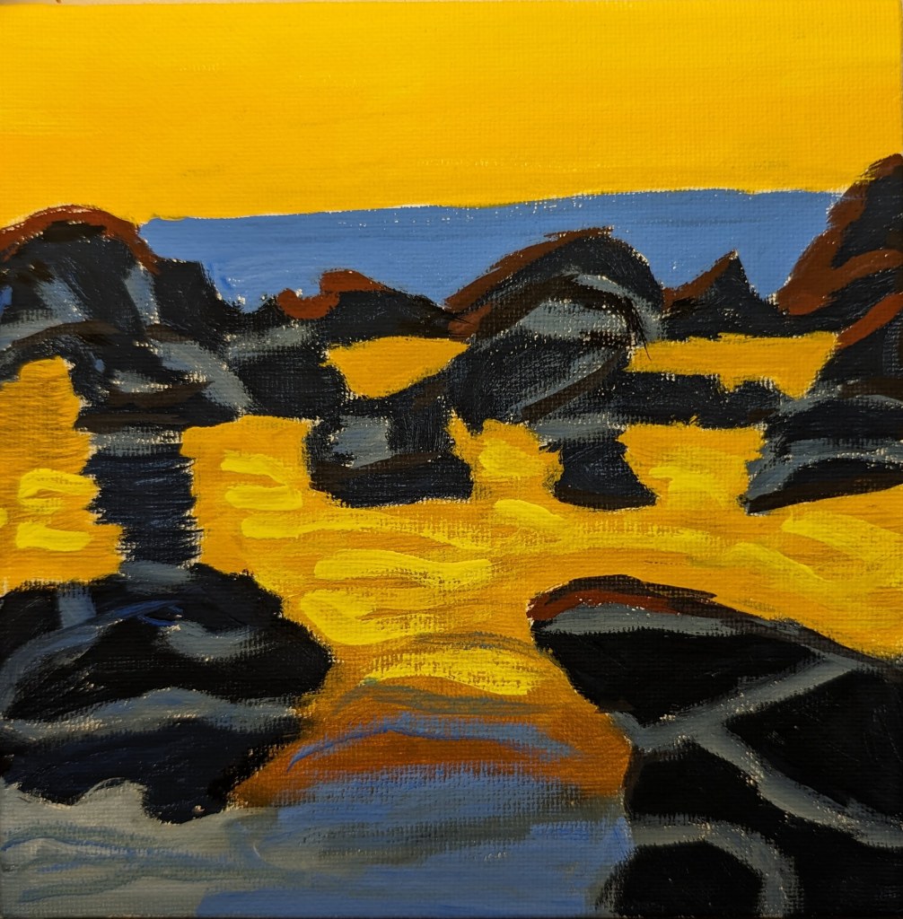
Well, I couldn’t stand that last painting for Jed Dorsey’s Mini Painting Challenge at Acrylic University, so I redid it using a 6×6 white canvas panel, and sketching out the rocks with willow charcoal. Oh, and then I used (for the first time) acrylic gouache (an intro kit from Holbein). I love the matte effect.
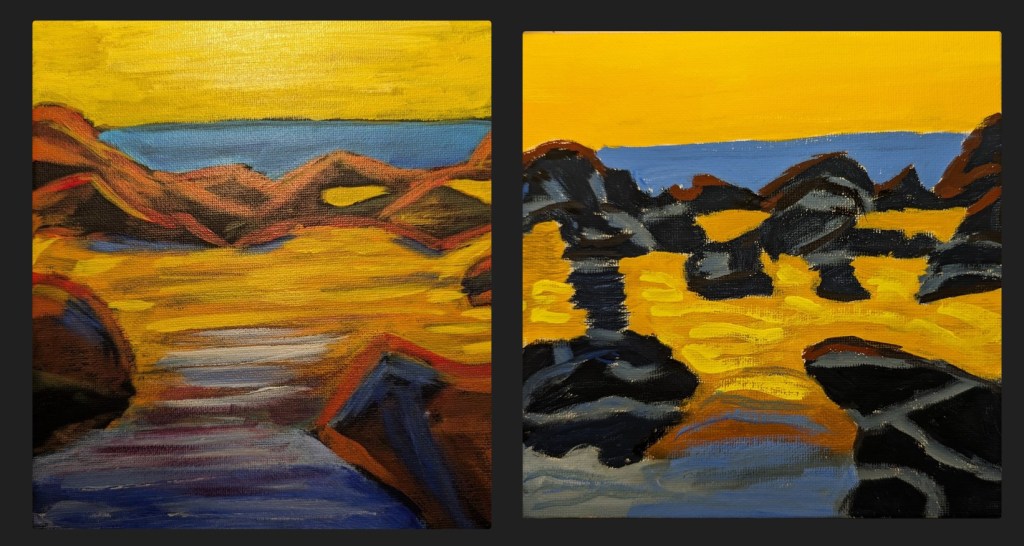
The new painting is far from perfect, but on the whole, I consider it an improvement to the original (comparison below).
This is the week 6 painting for Jed Dorsey’s Mini Painting Challenge at Acrylic University. It’s based on a photo Dorsey took of a rocky beach at sunset. I used one of my last few 8×8 black canvases because Dorsey paints his version on a black background. (I think I’ve said this before, but I really struggle with a black background; it throws the colors/values off, and you need several coats of paint to hide the black say, against the sky).
I also struggle with beach rocks, and have a couple of PaintCoach Patreon lessons earmarked which focus on beach rocks that I need to do for more practice.
That said, this is my effort, and frankly, it looks quite abstract. Which is not necessarily terrible.
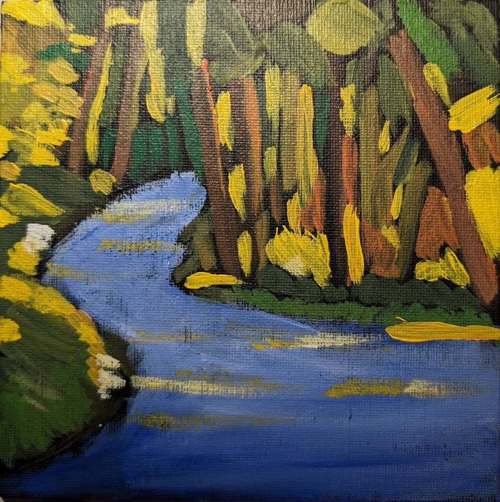
Trying to catch up with the series of mini paintings… This is the week 5 painting for Jed Dorsey’s Mini Painting Challenge at Acrylic University. It’s based on a photo Dorsey took in a local state park in, I believe, Washington. Take that back, while the original photo reference was provided, the lesson was actually based on the painting (called “Dappled Light”) he did based on the reference photo.
This was done on a 6×6 canvas panel, which was painted black. The only colors used were the 3 primaries.
I’m way behind on this series of mini paintings, as week #6 just dropped on Friday. So, this is the week 4 painting for Jed Dorsey’s Mini Painting Challenge at Acrylic University. It’s based on a picture he took in the Canadian Rockies. To me it’s similar to week #1.
This was done on a 6×6 canvas panel. As with the other weeks, I used the 3 primaries, plus black and white.
This portrait is from a black and white reference photo that, unfortunately, I cannot remember where I downloaded it from — possibly from the curated Unsplash photos here. In any case, I actually drew this one out entirely by hand (in willow charcoal). Not sure why I chose a yellow ochre-clear gesso background, but I did.
I’m reasonably satisfied with this one — at least she looks fairly human. I can list at least half a dozen things I would want to do differently next time, but calling this done for now.
I did this charcoal work as a part of the 4th weekly exercise of Let’s Face It 2024. It was taught by Jim Bentley. (He does a demo of this face on his Instagram account.) For the class he used Bristol paper — which I believe is fairly smooth — and also carbon powder applied with brushes, none of which I had. I did my charcoal piece with some willow charcoal, compressed charcoal sticks, and blending stumps. And on Strathmore Charcoal paper, tinted green.