Today’s painting is my own version of a “Desert Glow” sunset after I followed along in Assignment #1 of Marla Baggetta’s “Sunsets in Pastel” online workshop. (I’ve now signed up for 3 of her workshops — and then, with the Black Friday sales still on until this Friday, also signed up for a subscription to her monthly pastel workshops).
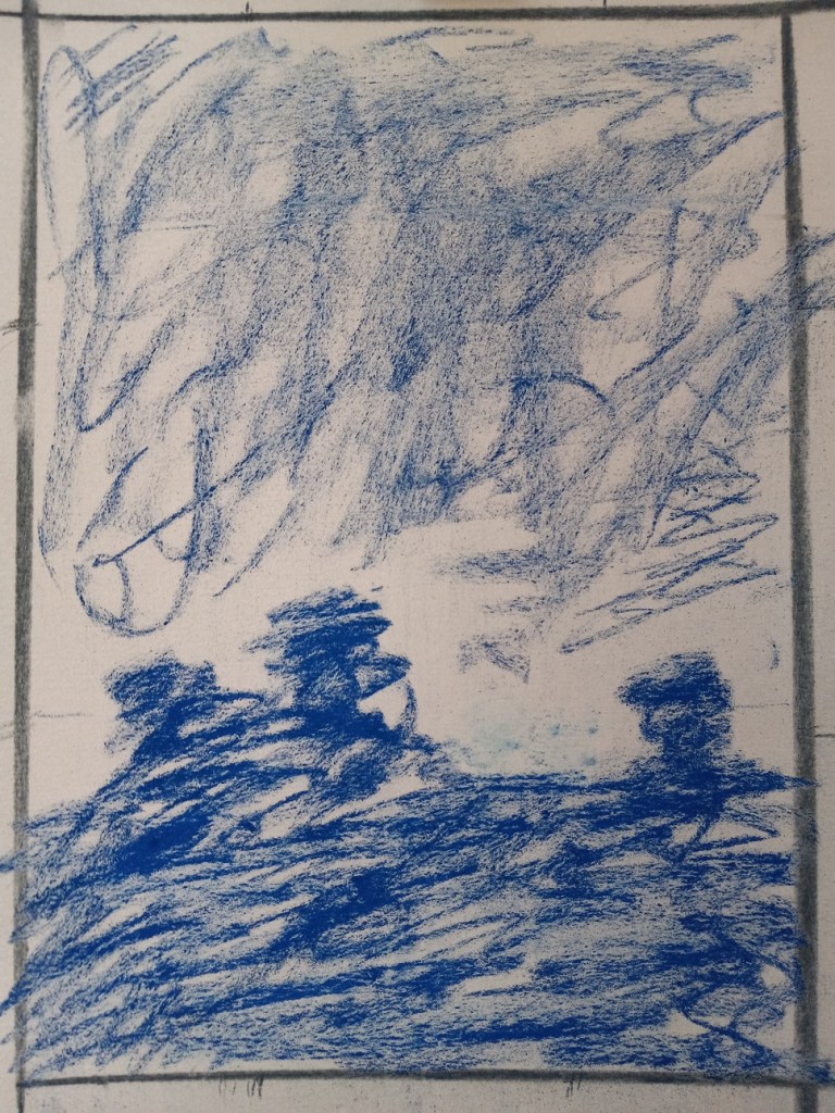
The first thing I did was to draw some thumbnails, using my Vincent Van Gogh brand of hard pastels, and vine charcoal. I decided to go with the vertical thumbnail on the bottom left as the reference for the sunset picture.

The next step was to proportionately size up the thumbnail sketch to the paper being used (Pastel Premier in Clay) and do the value sketch/underpainting. My thumbnail was, luckily, 2-1/2″ x 3-1/2″ so my picture was sized up to 7-1/2″ x 10-1/2″. I used Indigo Blue NuPastel for this part.
Next step was the fun part — choosing the colors!!
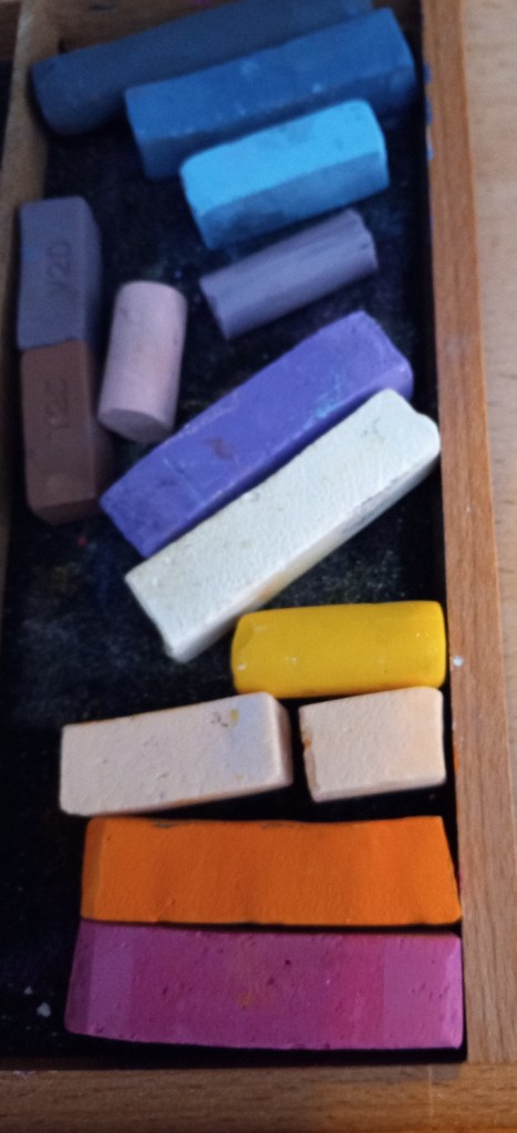
Gorgeous colors! These are almost all Great American, with some Blue Earth, a Terry Ludwig (light blue), and Mount Vision (darkest blue), and Dick Blick Artists’ Soft Pastels. The yellow is one of my Richeson Hand-Rolled yellows.
Here’s the completed study.
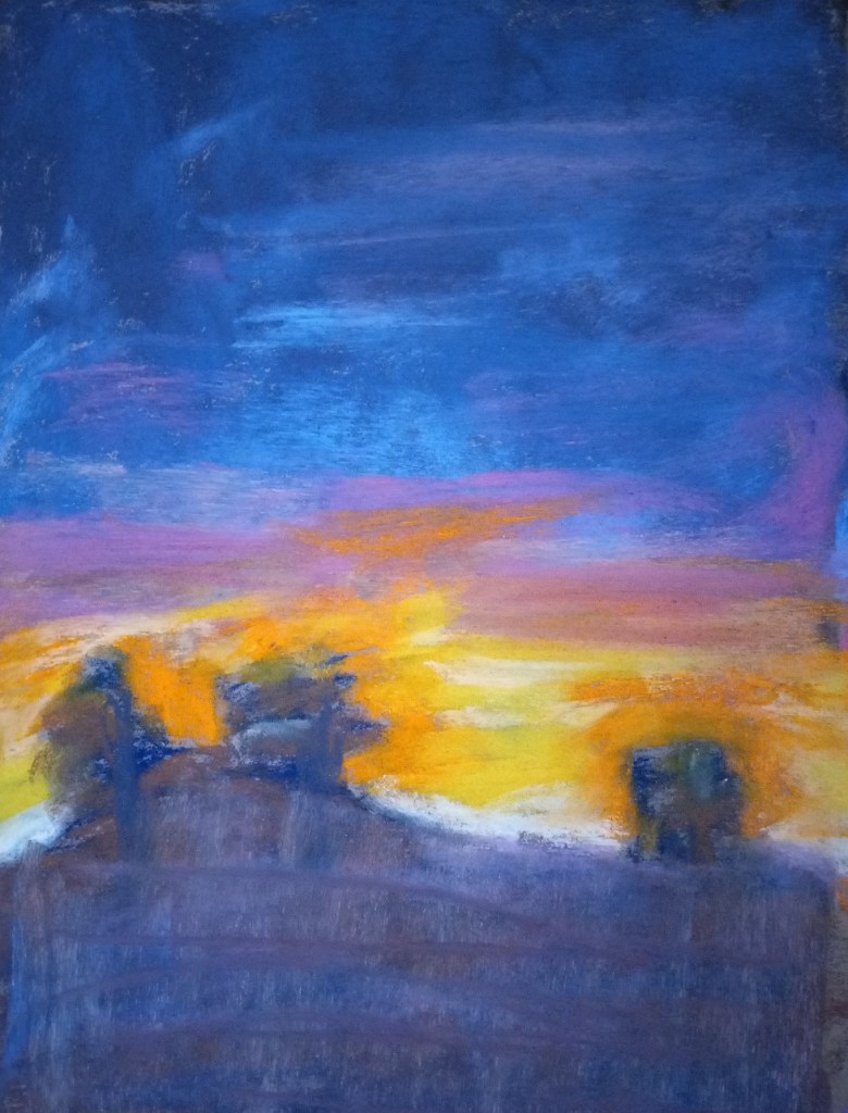
The first thing I have to say is that the photo — taken from my Samsung phone — does not sufficiently pick up the magenta, which is a bummer. It also picks up too much blue from the ground, which may (?) be due to the indigo blue underpainting (and of course the use of some darker blues in the ground area.)
Self-critiquing — I could go on and on. Marla Baggetta has a whole list of questions for us to ask ourselves, the first one being “Were you the director? Or did the piece direct you?” I got carried away laying down color, that’s for sure. It was a blast to use all those bright colors! I completely forgot about my thumbnail, and the idea of putting in a striated sky. And I got “lost” in the ground area, not having planned anything out (a structure like a house? Some telephone poles? Some greenery?) So the foreground is a poorly-thought-out mess.
What was good about this? I loved, loved, loved this paper texture! Totally fun to work with. AND I loved all the pastels I used.
For next time:
- better planning for the foreground
- More sky, less earth.
- Underpainting — use the NuPastels again. but experiment with different colors.