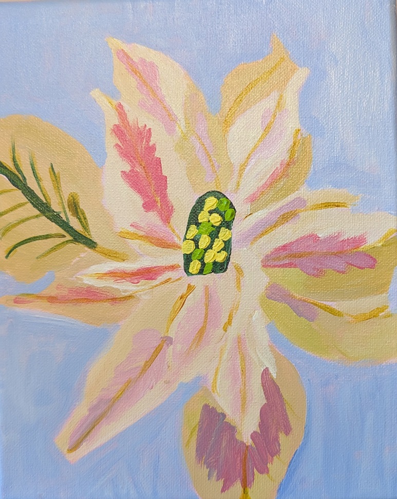
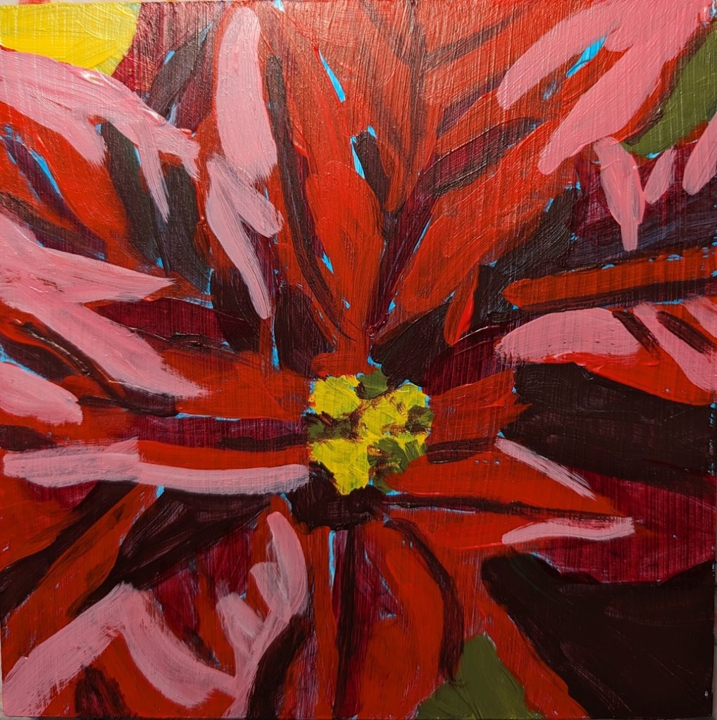
Earlier this year, I painted a red poinsettia based on a painting by Ali Kay. Today I painted a white and pink one (always my favorite live poinsettias) on an 8×10 canvas based on an image by Cindy from Pixabay.
Karen Margulis offered her Patreon members a demo of how to paint shiny objects. Using her reference photo — but modifying it for my own purposes — I did this study on Colourfix Original (Soft Umber color), and used both hard and soft pastels.
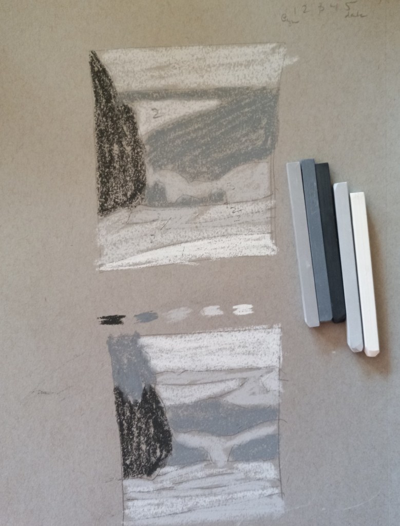
In any case, the first chapter is about shape interpretation, and the first exercise is to “simplify and differentiate with limited values”. Albala has you do a painting in black and white, using 5 values (so the 3 mid-values are grays). He has you to choose a photo, and then put it in grayscale, squint and determine the no more than 5 values (to simplify). So, I used his photo example first without turning the page to see his proposed value study.
Here is my attempt, and then below it is my copy of how he did the 5 values from his photo in the book. The first thing I realized, after looking at his examples and his comments, is that i totally focus on trying to match the photo. The sky in the example photo is fairly overcast and looks like a “2” value (on a scale of 1 to 5, with 1 being the brightest), whereas the ground at the bottom of the photo looks brightest. But in reality the sky should be the lightest brightest value, so you have to adjust the proposed painting and not necessarily match the photo!
This realization also enforces another idea — there’s a reason landscape painters do paintings “en plein air”. If I were outside doing a value study (or painting) from life, it would be obvious that the sky is the lightest value and you don’t want the ground “fighting” the sky! This can be a downside of photographs.
Below that example, I used my own photo — taken in Sonoma County at a winery (I forget which one) — and my attempt at the 5 values the way I would paint it.
ArtTutor.com, the website based in Liverpool, England, where I got most of my drawing training in Phil Davies’ Drawing Essentials course, is shutting down as of the end of March 2022. This is largely due to the pandemic lockdowns, etc.
Many of the courses offered are currently being made available for purchase at a discount to monthly members like myself and at a smaller discount (for a short period of time) to a la carte users of the site.
If you previously bought a course from that site, or if you think you might want to, you have until the end of March to download that course. Downloading can only be done to a laptop or desktop computer, not a mobile phone or a tablet.
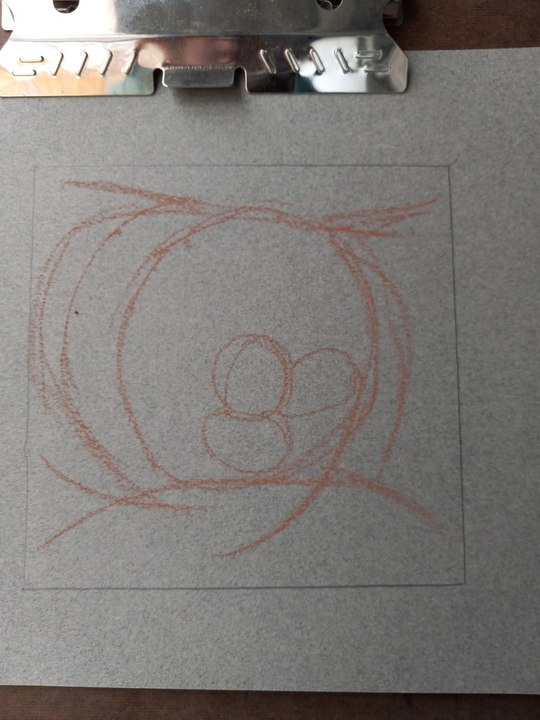
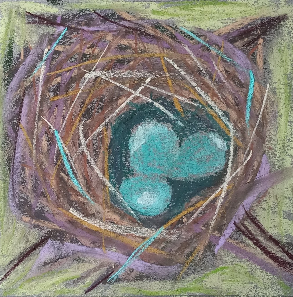
Today I painted a bird’s nest based off of one of Karen Margulis‘ paintings. The step-by-step demo is on her Patreon site and can be accessed here (paywall; subscriber site). All the colors used are based on her work. Karen says in this Patreon post: “I DO give permission for you to share your paintings done from my demos on social media provided that you credit me and link to this Patreon group.“ I did this practice work on a gray-toned sheet of Canson Mi-Teintes.
We had a robin who nested in our persimmon tree this past summer and I took pictures of the babies in the nest, as well as the mother bird sitting on the nest. Now that I have an idea how to paint a bird’s nest in pastel, I’m going to use my own reference photo. We had a robin who nested in our persimmon tree this past summer and I took pictures of the babies in the nest, as well as the mother bird sitting on the nest
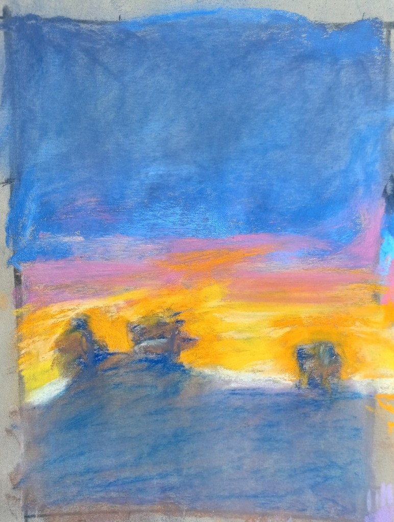
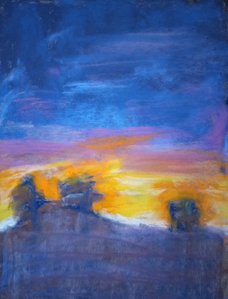
Two of the things I recognized as being at issue with my follow-along painting from Marla Baggetta’sSunsets in Pastel course are: my heavy touch (which led to “mud”) and my poor job at the underpainting. The original picture is below on the right. To counteract the muddiness, I experimented with removing excess pastel in the ground area as well as the upper sky by using an inexpensive bristle brush.
The brush-off showed yet another problem — the underpainting which amounted to nothing more than a scribble. I should have done a wet wash, or a dry wash and not leave the scribbles!
That said, another thing was that I used the Blue Spruce NuPastel on Pastel Premier paper (320 grit); I had difficulty moving the hard pastel around.
So I decided to make a second attempt at the scene, being careful to keep a LIGHT touch.
So, I ended up painting the rest of the pastel board with acrylic paint (Golden’s Fluid Acrylics in the yellow ochre color).
What was interesting is that the performance of the pastel sticks changed. Great America, NuPastel, Blick and Blue Earth skipped all over, and pigment was just falling off the painted paper! On the other hand, the Richeson Hand-Rolled and Sennelier seemed to grip the painted surface acceptably.
So, what have I learned?
I’ll use up my stash of Canson Touch and not buy any more
In the future, I’ll stick with neutral paper colors: either a light beige or a light gray, and skip colors like “Twilight” and Indigo. (Unless I paint a night scene.)
I’m happy with the way the Richeson Hand-rolled pastels performed on the Canson Touch paper, painted or unpainted.
I could use the Canson Touch with charcoal in the future.
I had no trouble with putting the acrylic paint to the Canson Touch paper.
Ugh. This did not turn out as I had wanted. Instead of learning how to make different marks with pastel sticks, I learned about which pastels work on which paper.
This paper was Canson Mi-Teintes Touch in Twilight. Sadly, I have 4 more boards of this stuff — and 5 boards (same size) in Indigo color. I regret buying the stuff and will never buy it again!
The pastels that don’t lay down color well on this paper are NuPastels, the Dick Blick Soft Artist’s sticks, Rembrandts, and Sennelier (at least from the 30 Landscape half-stick collection).
On the other hand, Richeson Hand-Rolled was not too bad! Neither was Blue Earth. The best of all, though, was Great American. (They’re having supply chain issues at the moment, sadly; else I’d buy some more sticks right now!) Willow charcoal is also great — perhaps I’ll do some charcoal work so as not to waste this paper.
Of course, the wildcard in all this is my beginner skill level. Could a pro lay down color better than I? It’s certainly possible. As it was, I was grinding the pastels into the “paper” and losing massive pigment in the process!
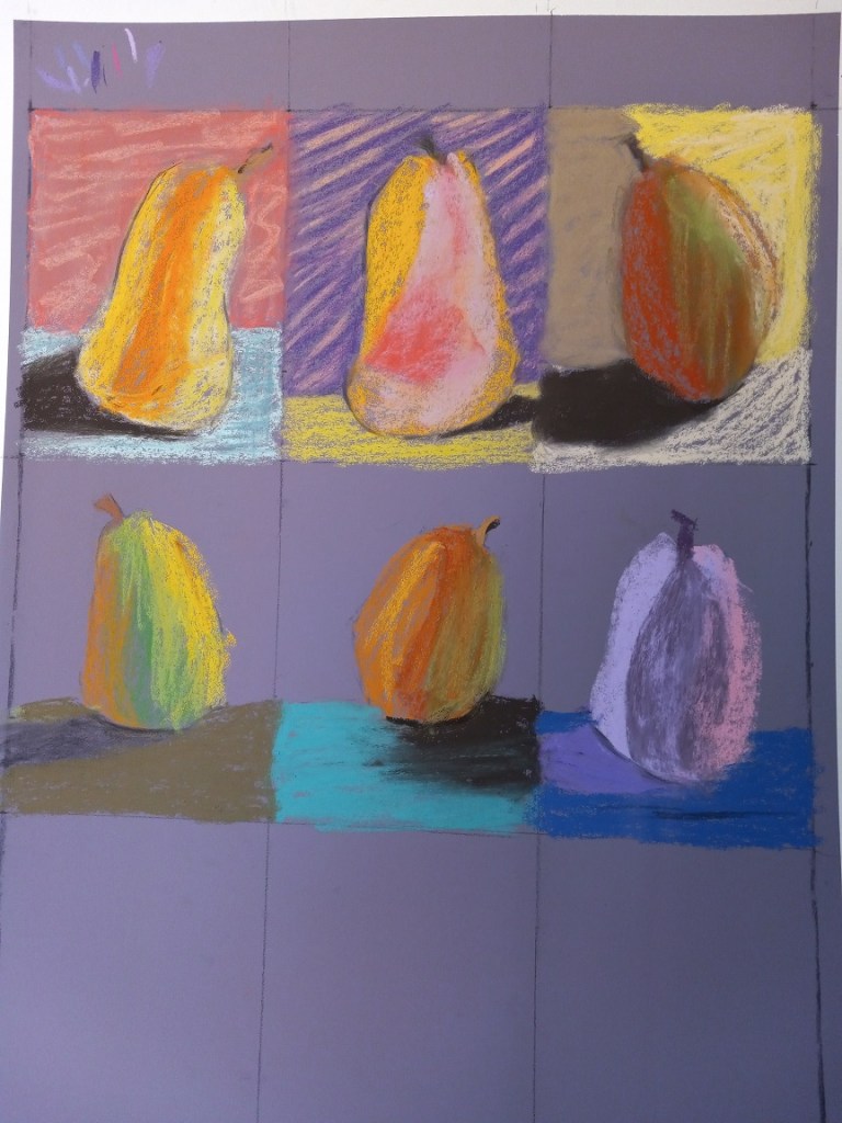
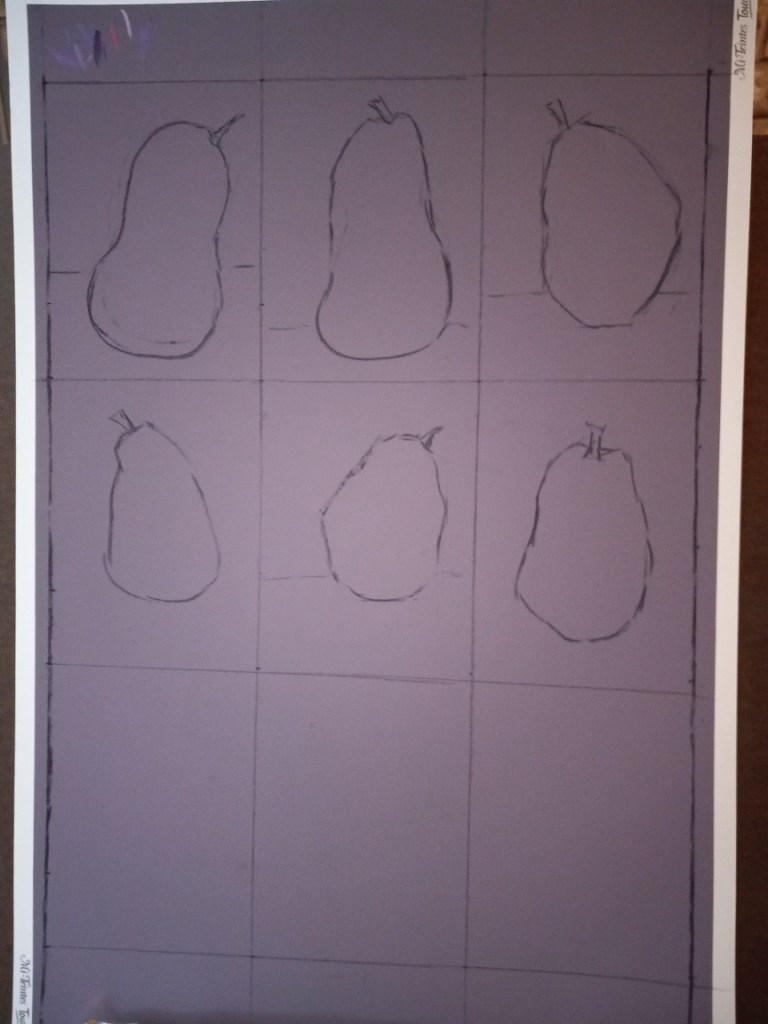
For pear #1, (top left) I stupidly did some blending with my finger of the background. Now it looks worse than before, plus the dust just rolled off. Fortunately, I’m working outside in the patio and have a jerry-rigged dust catcher at the bottom of the easel.
I’ve given up on doing 9 pears on this purple toned paper. What I plan to do for the last three pears is to wash the paper with fluid acrylic in yellow ochre — at least that’s somewhat of a pear color. I’ll let that dry, and try putting pastel on top of that to see what happens.
I spent some time today prepping for the first of two 9 pear studies (from Marla Baggetta’s “Making Your Mark” online workshop).
I’m using Canson Mi-Teintes Touch board in the Twilight color, and each pear study will be 8″ x 6″. I’m drawing the outlines in vine charcoal, and may make further adjustments as some of these pears look more like butternut squashes.
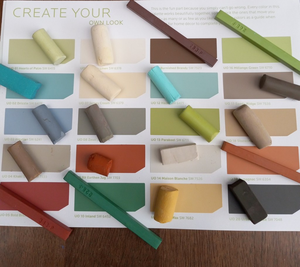
I also chose my palette, based on the “Urban Organic” palette from Sherwin-Williams HGTV back in 2012 (also the palette for the rooms in my house). It looked great as far as matching pastels — although I have nothing particularly close to the green blues — but when I put the pastels in their case, I realized there are too many that are too similar.
So I made adjustments, swapping out some of the creams and browns for magenta and purple. Looking forward to getting started tomorrow!