This sketch was done with Aquarelle pencils, and my new Derwent Inktense watercolor pencils. It’s based off a photo by Paul Wong on Unsplash.


I’ve been enjoying my graphite Aquarelle pencils so well that I bought some watercolor pencils to try them out.
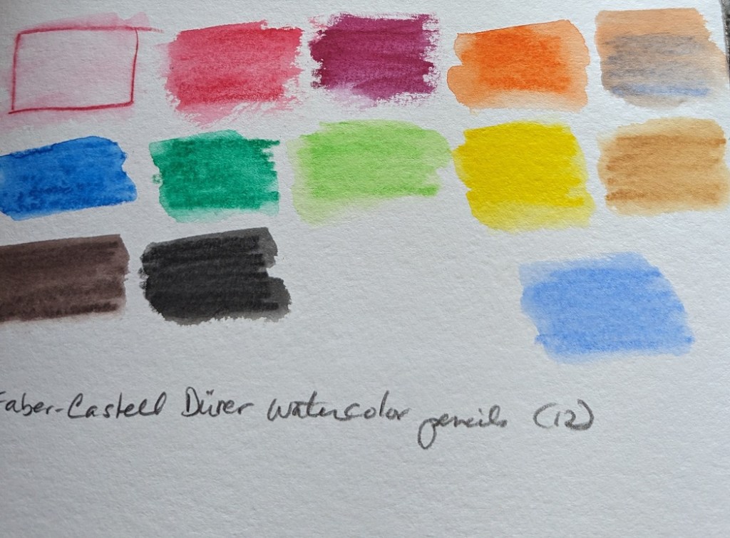
I purchased 3 different sets of 12 pencils: Faber-Castell Albrecht Durer; Caran d’Ache Museum Aquarelle, and Derwent Inktense Pencil Set.
I used the pencils on my 300-lb watercolor paper, applying water afterwards. One thing I noticed is that each 12-pencil set has relatively similar colors. The Albrecht Durer set includes a white pencil which I don’t see a lot of use for — unless you’re using it on toned sketch paper? My initial thought is I was gypped, lol.
The Derwent Inktense pencils, once wetted, are clearly more intense than either the Faber-Castell or Caran d’Ache pencils. On the other hand, the Faber-Castells seem to wash more smoothly (for lack of a better term) in that my back-and-forth pencil lines are less obvious than the Caran d’Ache or the Inktense pencils.
Now I need to try them out on some drawings to see how I really like them.


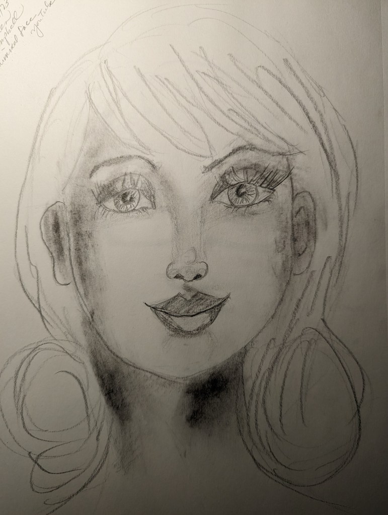
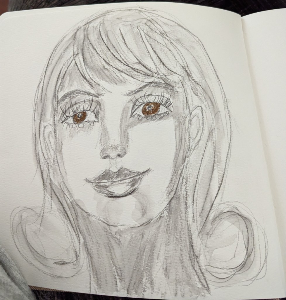
Earlier this year I came across on YouTube a recommendation for a video by Karen Campell. I liked her verve and bubbly “can do” spirit. I drew a couple of faces, but in all honesty, the drawing lessons there are not really what I’m looking for at this time.
The drawing on the left was done using regular graphite; on the right, I used the water-soluble graphite (Staedtler), applied a wash, and then colored her eyes with the Arteza Real Brush in cocoa, I think it was.
I keep trying different media, and then getting bored or frustrated with the tools (soft pastels, watercolor, colored pencils, pastel pencils, etc.)
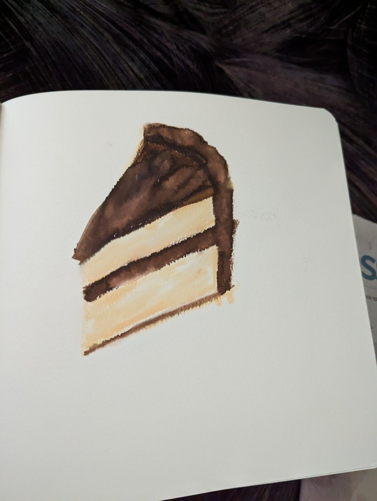
So I bought some Arteza “Real Brush Pens” that can work as markers or brushes (and with water applied, it looks somewhat like watercolor.
I drew this slice of yellow cake in my Arteza Art Journal with those pens earlier this year. Haven’t used the pens since.
I was playing with my new watercolor travel kit and made two color wheels — one Warm, one Cool. The Warm wheel was mixed from French Ultramarine, Cadmium Yellow and Cadmium Red (all Winsor-Newton). I love the orange, but the “purple” and “green” are unappealing. (This was done on 300 lb. paper.)
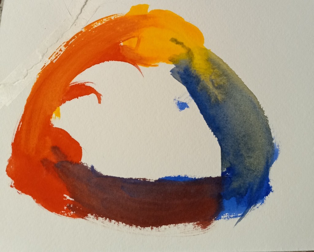
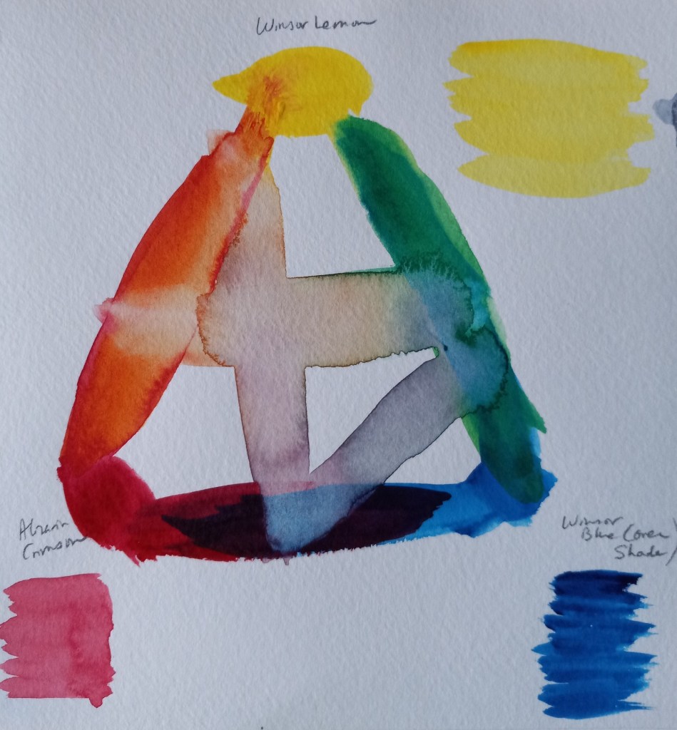
The Cool color wheel was made up of Winsor (Phthalo) Blue (Green Shade), Winsor Lemon and Alizarin Crimson. The “orange” is unappealing to me, but l love the vivid green. The purple is not too bad.