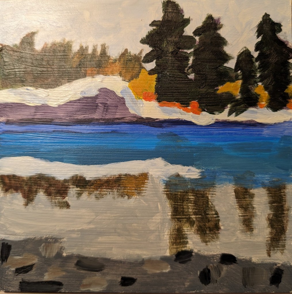
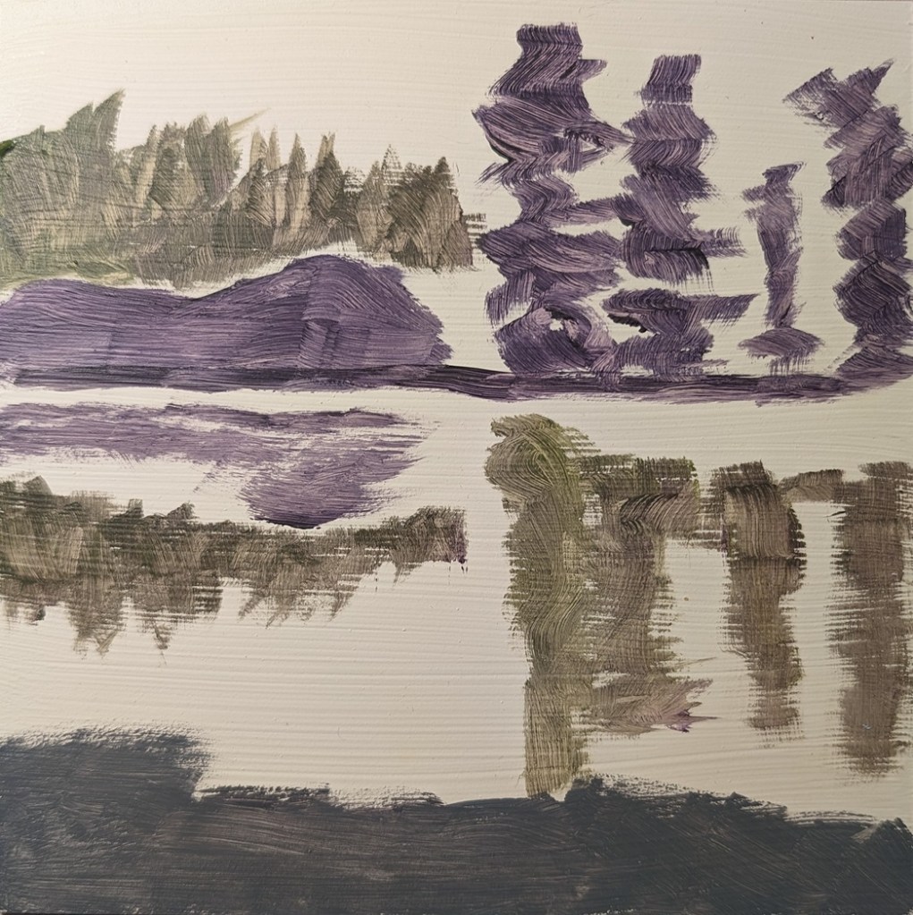
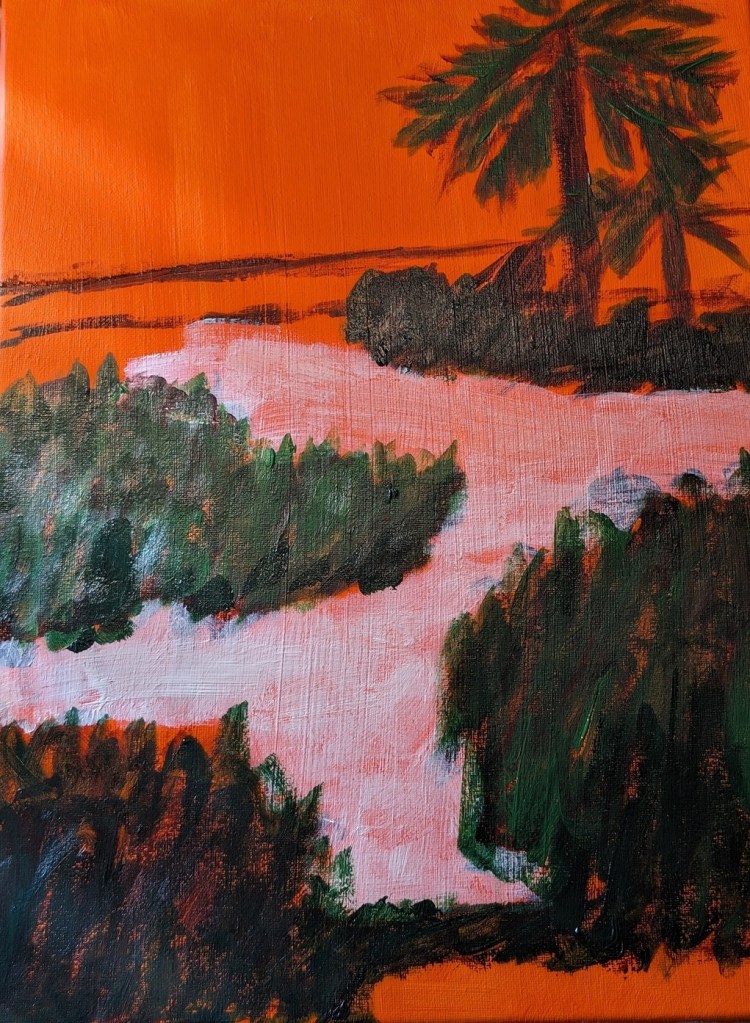
I used an old Ampersand Gessobord panel which I re-gessoed numerous times to reduce the slickness. Unfortunately, that left brushstroke grooves, which are particularly obvious in the reflection of the trees.
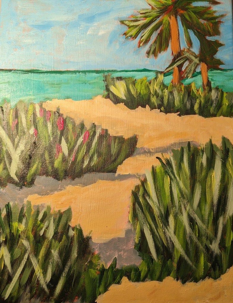
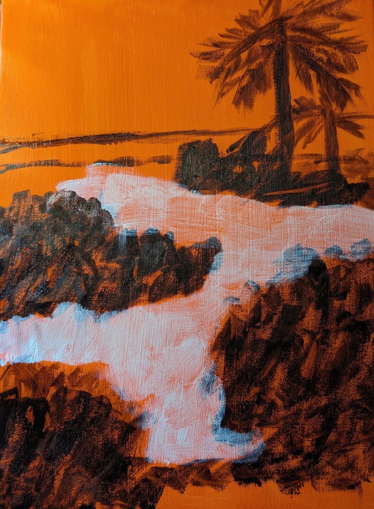
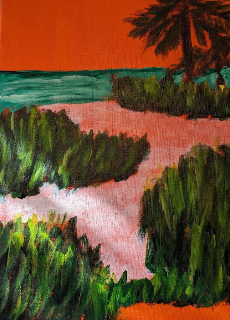
I used Transparent Orange (PO 73) by Chroma Atelier as a background, then Sap Green mixed with Carmine (Amsterdam Acrylic) for blocking out the greenery. For the grasses, I used the Amsterdam’s Sap Green and Yellow Green, as well as Winsor Galeria’s Sap Green (much lighter than Amsterdam’s Sap Green). The sky is Light Blue Permanent by Liquitex Basic; the ocean is Phthalo Green mixed with Titanium White.
The sand has been blocked out with transparent Zinc White. I still need to paint the sand and its shadow colors, and add some color (sunlight and shadows) to the bark of the palm trees.
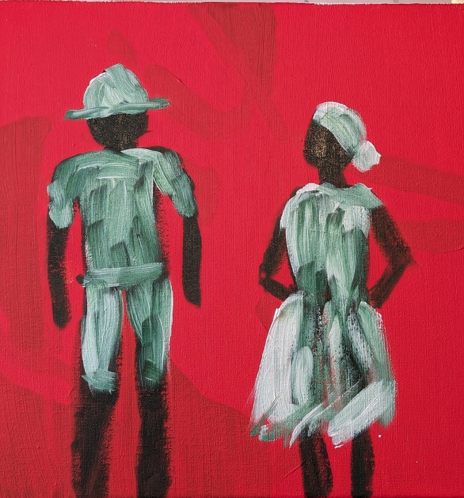
But today I decided to use repurpose an old 12×12 canvas, and paint along with the video I watched last night. It was fun!
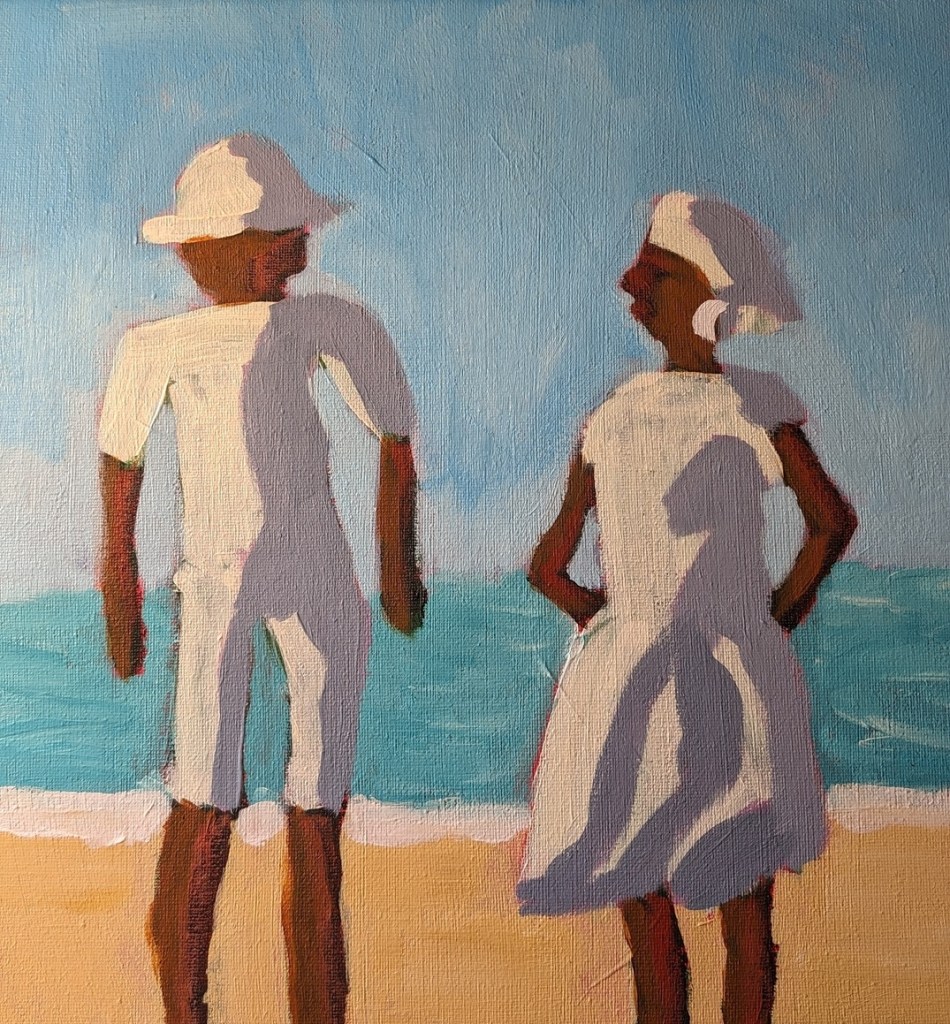
So, Slivka started out with an orangey underpainting, and then painted the forms in either Sap Green (which I used) or Hooker’s Green. For my background, I used Pyrrole Red (PR 254) mixed with Cadmium Yellow Hue (Liquitex Basics). (The blotchy look in the background is from my original unfinished painting.)
Then, while the figures were not yet dry, I followed along, painting their clothing in Titanium White, as Slivka did.
Painting the sky came next. I used Cerulean Blue (Utrecht Fluid brand) with some Titanium White.
Next was the ocean and the sand. Slivka uses some aqua green and Naples Yellow, respectively. I used Liquitex Basics Turquoise Green and created a kind of “Naples Yellow” by mixing Yellow Ochre with Titanium White. The sun-bright clothing was Titanium White softened with Cadmium Yellow Light Hue.
Slivka used Raw Sienna and Cadmium Red for the skin; I used Raw Sienna and Red Oxide. For the clothing shadows, Slivka used a violet with white. I used Liquitex Basics Gray Blue with some white.
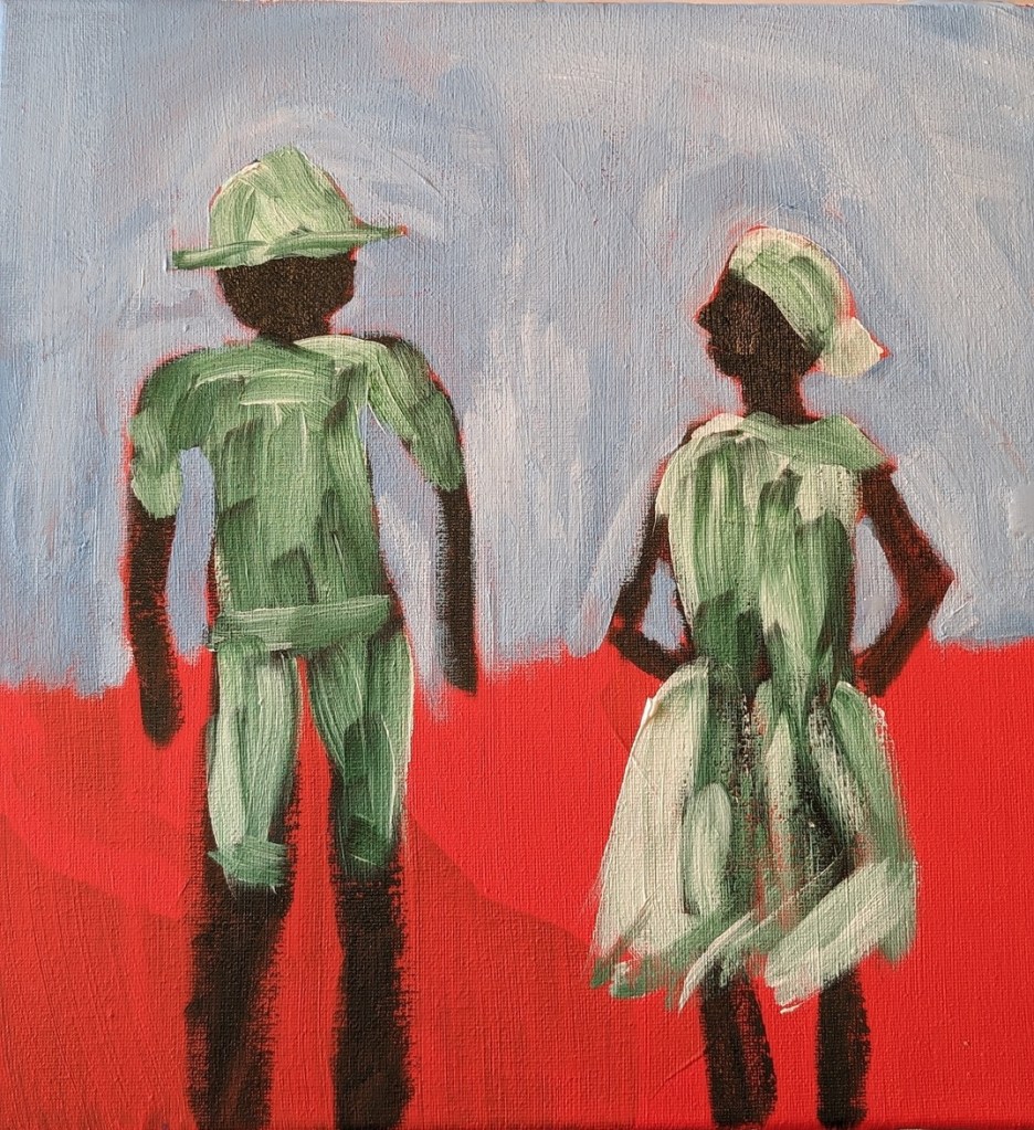
I repainted the sky from Cerulean to Light Blue Permanent (Liquitex brand) mixed with additional Titanium White. I may repaint the ocean, and get the horizon line straighter; regardless, this exercise was just a lot of fun!
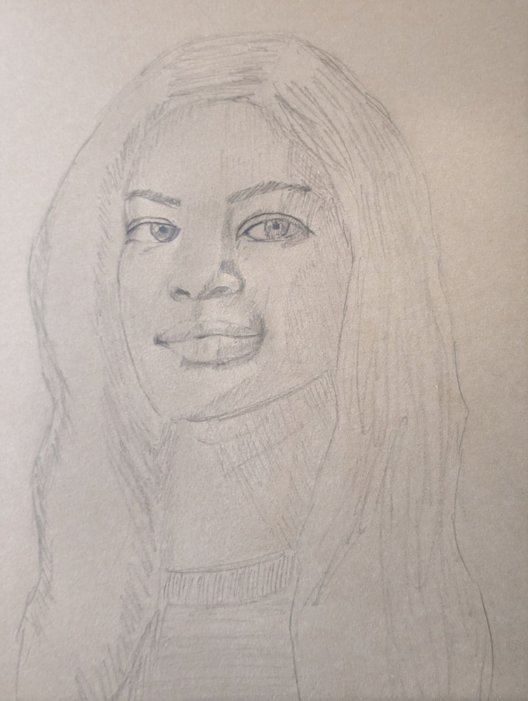
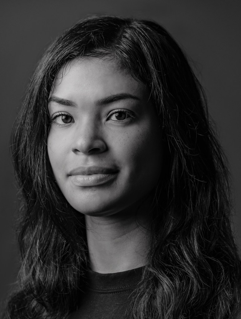
I’m putting aside the paints for the moment to focus on drawing faces (before I try painting them again!). I’ve just signed up for Sktchy’s 30 Faces in 30 Days (which starts in January 2024). I’m also going through the Portrait module of Draw Awesome again for additional practice. Phil Davies of Draw Awesome has some free resources, including “Faces for Artists” which is a curated collection of Unsplash images. One of those Unsplash images is below.
To draw this portrait in graphite, I used a method which Davies calls “modified tracing” where you make small marks to denote the width of the eyes (but not the height), the width of the nose, the width of the mouth, and the width & height of the face. The rest is freehand. I am using 9×12 Kraft paper by Stonehenge.
I have done initial shading, and will need to circle back to shade the hair darker, as well as adding white highlights where appropriate.
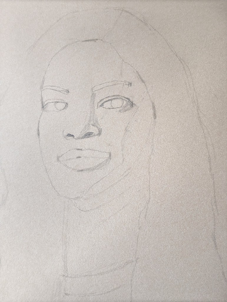
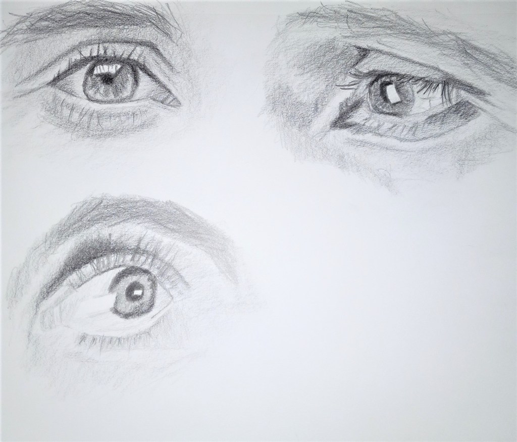
This is classwork for Week 2 of my DrawAwesome course. I used Staedtler Mars Lumograph Black pencils for all three of these drawings. (Reference photos from the class.) I am learning how to layer shading with the graphite.
Today I drew a poppy using willow charcoal, vine charcoal and white “charcoal”. I riffed off the Artists Network Drawing Together episode (102) but mostly just used the reference photo (after grayscaling it). For better or worse, not much following along.
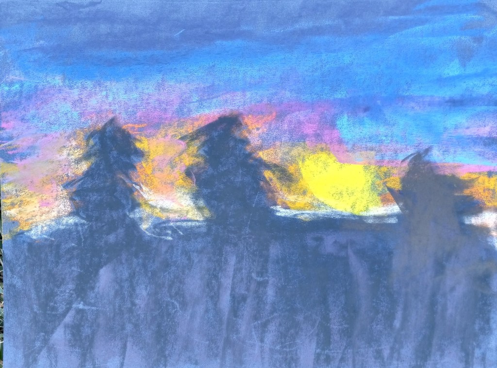
I did the follow-along sunset from Marla Baggetta’s course on the Canson Touch paper and also the Pastelmat paper, without doing any more of the underpainting than the light touch test I did on the papers earlier.