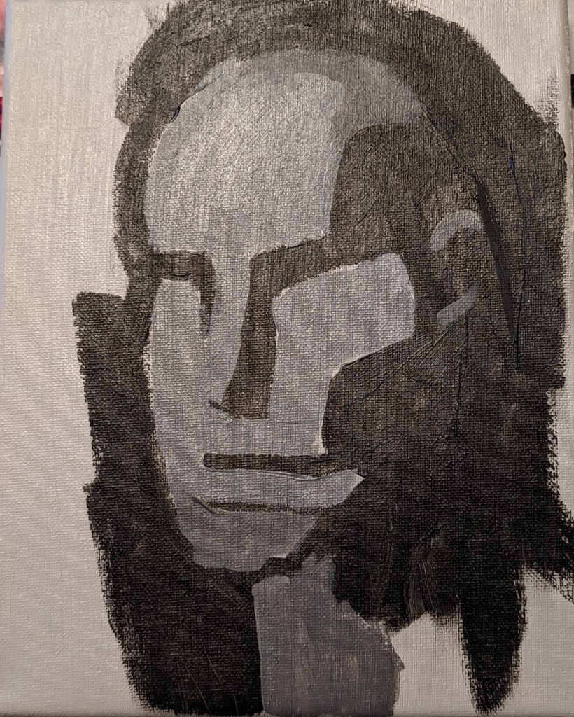
Below is an exercise from PaintCoach’s Patreon page in which you paint from a reference photo of an “Asaro Head“. The idea is to get familiar with the planes of the head, while also serving as a value exercise.
I am not yet finished.

Below is an exercise from PaintCoach’s Patreon page in which you paint from a reference photo of an “Asaro Head“. The idea is to get familiar with the planes of the head, while also serving as a value exercise.
I am not yet finished.
I was inspired by landscape painting books I was reading about value studies, and notans, so I painted this 6×6 study. The idea being that the diagonal line of “posts” makes an otherwise horizontal painting more dynamic.

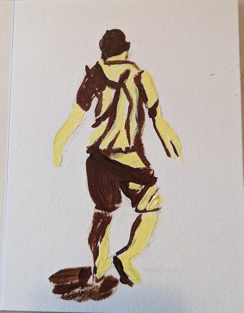
As I mentioned in this post, I’m taking the online course by Peggi Kroll-Roberts, and the assignment is to do 2-value and then 3-value studies painting the figure. In this effort, I am using the figure I sketched out in charcoal here, as prep for a future painting.
I drew out the figure first, using a 6×8 piece of 300-lb watercolor paper. For comparison’s sake, I’ve included the charcoal figure.

Based on an image by sarahbernier3140 from Pixabay
I was playing with my new watercolor travel kit and made two color wheels — one Warm, one Cool. The Warm wheel was mixed from French Ultramarine, Cadmium Yellow and Cadmium Red (all Winsor-Newton). I love the orange, but the “purple” and “green” are unappealing. (This was done on 300 lb. paper.)
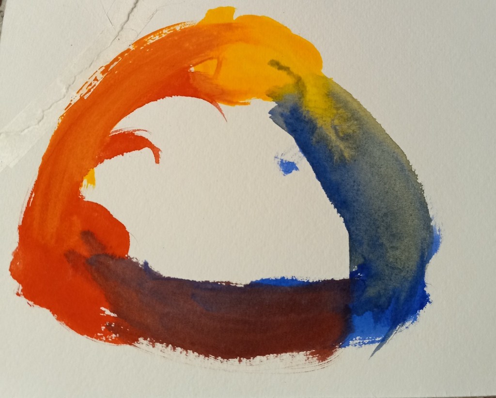
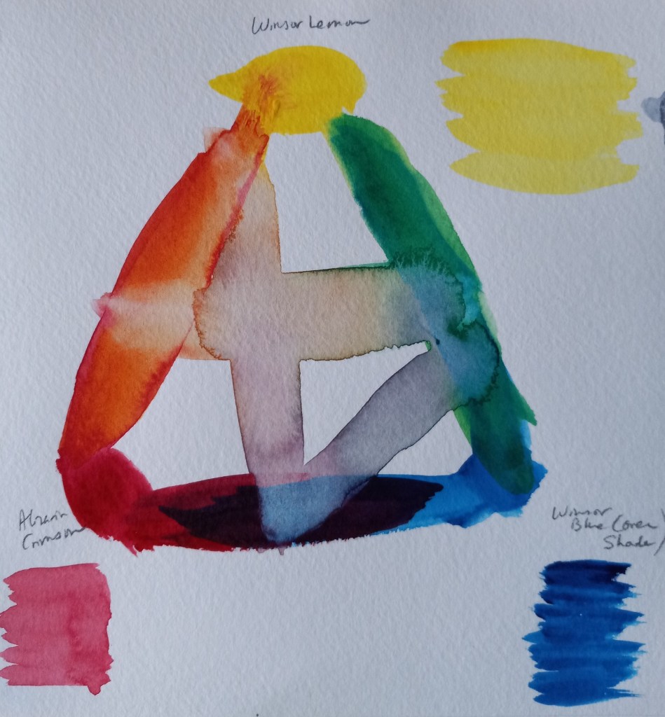
The Cool color wheel was made up of Winsor (Phthalo) Blue (Green Shade), Winsor Lemon and Alizarin Crimson. The “orange” is unappealing to me, but l love the vivid green. The purple is not too bad.
In 1989 I visited Lake Louise, and the reason I took this photo was due to the vivid poppies against the teal blue lake. I would like to paint the poppies and the lake, but I need to do a value study and a color study.
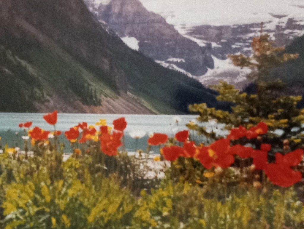
I took a photo of my photo and turned it into grayscale, discovering that the red poppies and the sunlit grass are the same value.
After doing 5 different value studies, I decided to use the lower one of the two, where the number of values is simplified down to three.

I’ve decided to remove the tree at the right — too much clutter, and to remove the snow-covered rocky mountain in the background, making it just (overcast) sky. This is so the flowers will be highlighted.
Below I’ve put together a grouping of colors. The mountains are fairly close to the poppies so I want them dark. I need to adjust the sky color, though, and perhaps make it more of a gray purple.

Today’s pastel painting was done on Rembrandt pastel paper, using 3 NuPastels: Warm Deep Gray, Warm Very Light Gray, and touches of Warm Medium Gray. This was a value study in preparation of a color piece which I’ll be doing on a sample scrap of Sennelier Pastel Card (bought last year as a part of a sampler from Jackson’s Art).
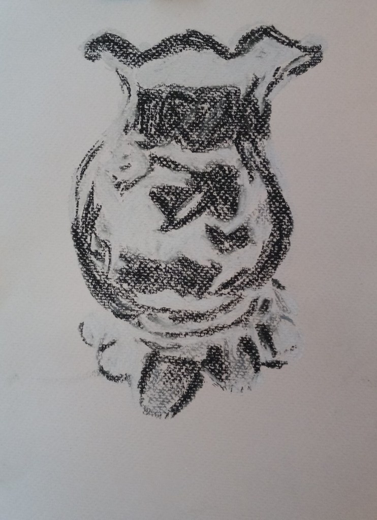
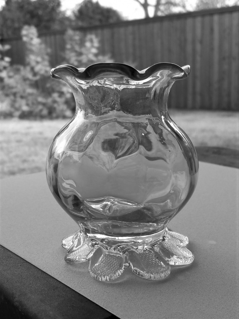
The original picture in color is below. I also downloaded the Android app Color Grab, and played a bit with color choices. While that was fun, I quickly became overwhelmed at the thought of using so many colors for the vase!
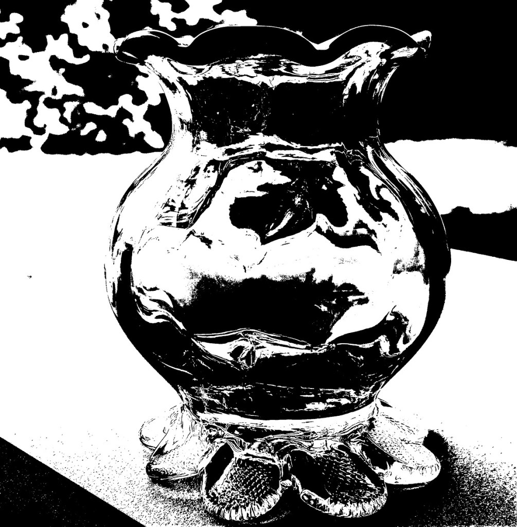
I decided to simplify to an extreme by editing my photo to be grayscale, and then using Adobe Photoshop Elements to posterize the grayscale photo to get the two extremes of values. The posterized version was the reference for my pastel.
I am underwhelmed by the texture of the Rembrandt pastel paper; I do not care for the honeycomb look at all.


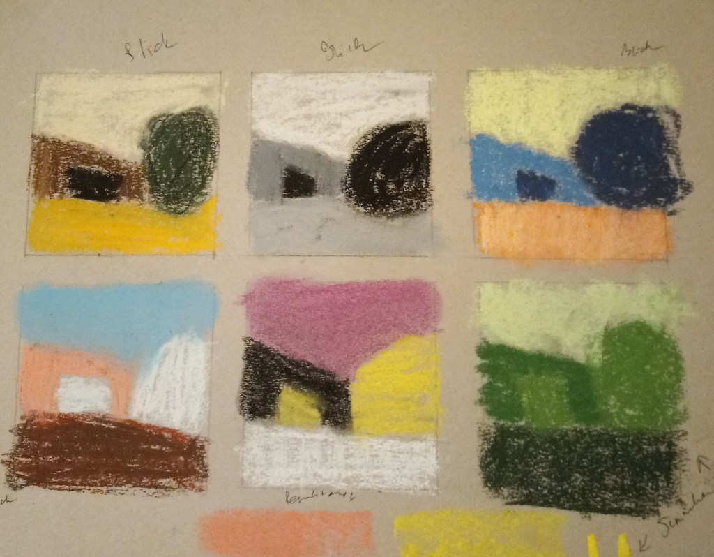
One of the exercises in the beginner online workshop is to get into the habit of making thumbnails, starting first with value thumbnails, before doing any painting.
I practiced creating some thumbnail sketches based on landscape photos.

This exercise in values is from the online workshop for beginning pastel painters.