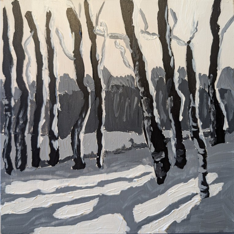
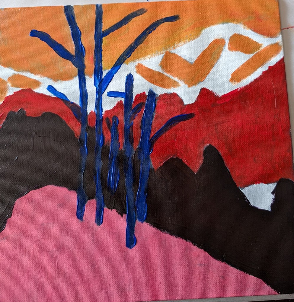
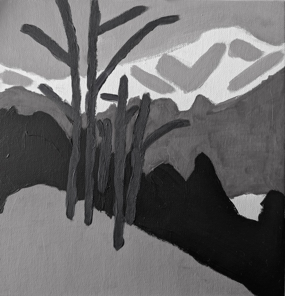
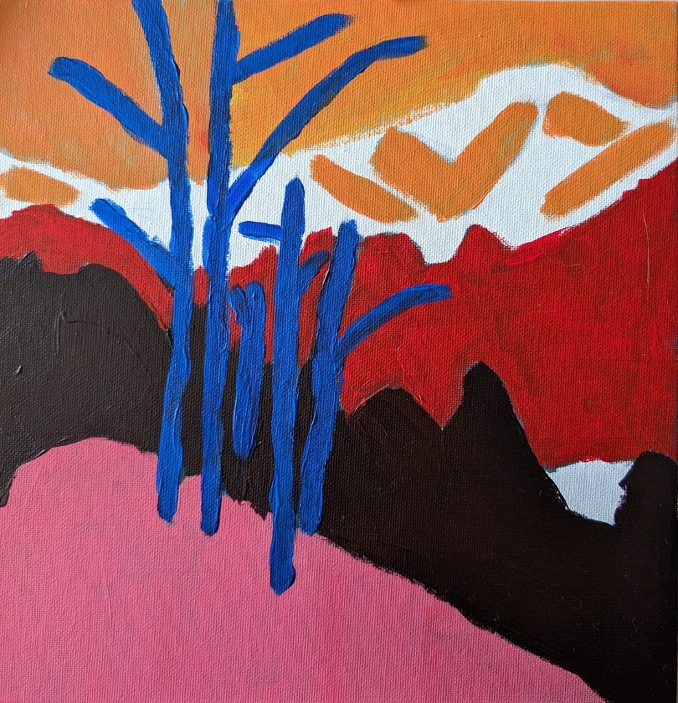
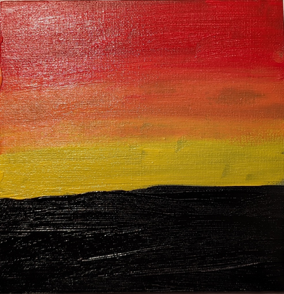
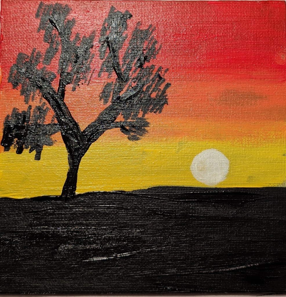
Earlier in January I watched a paint-along by Jed Dorsey of Acrylic University for their Bloom Membership level. He painted this scene from one of his own photos, and his painting was striking in its use of color, reflecting a golden sky from the sun setting behind the trees in the distance.
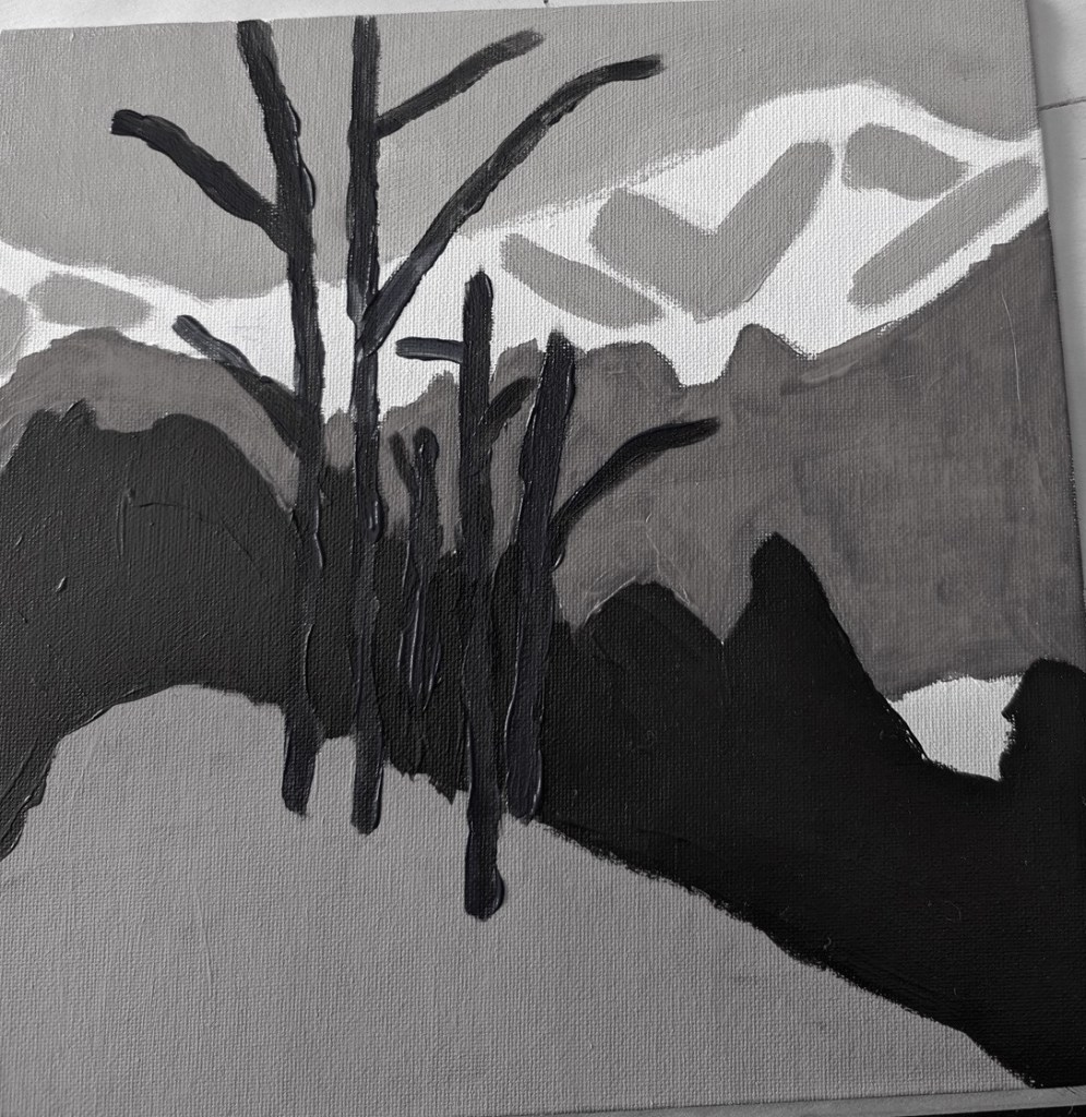
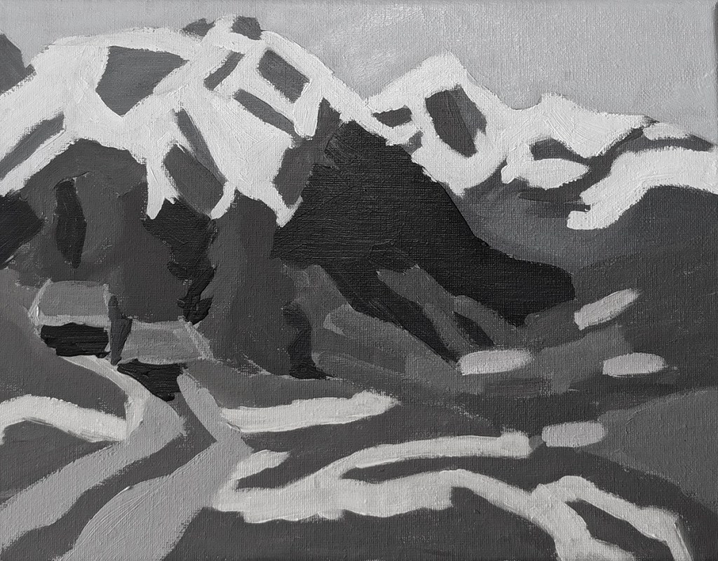
I was all set to try that myself. But when I downloaded the reference photo and a photo of his painting, on a whim, I set the saturation to zero — and found I absolutely LOVED the black and white version. So I decided to try painting it to play with the values.
This was done strictly as a study, on an 8×8 wood panel that I had gessoed a while back. The sky, in fact, is simply the white gesso. (It’s more yellow here in the photo than it is in real life.) I deliberately painted the snow thick just for the heck of it.