
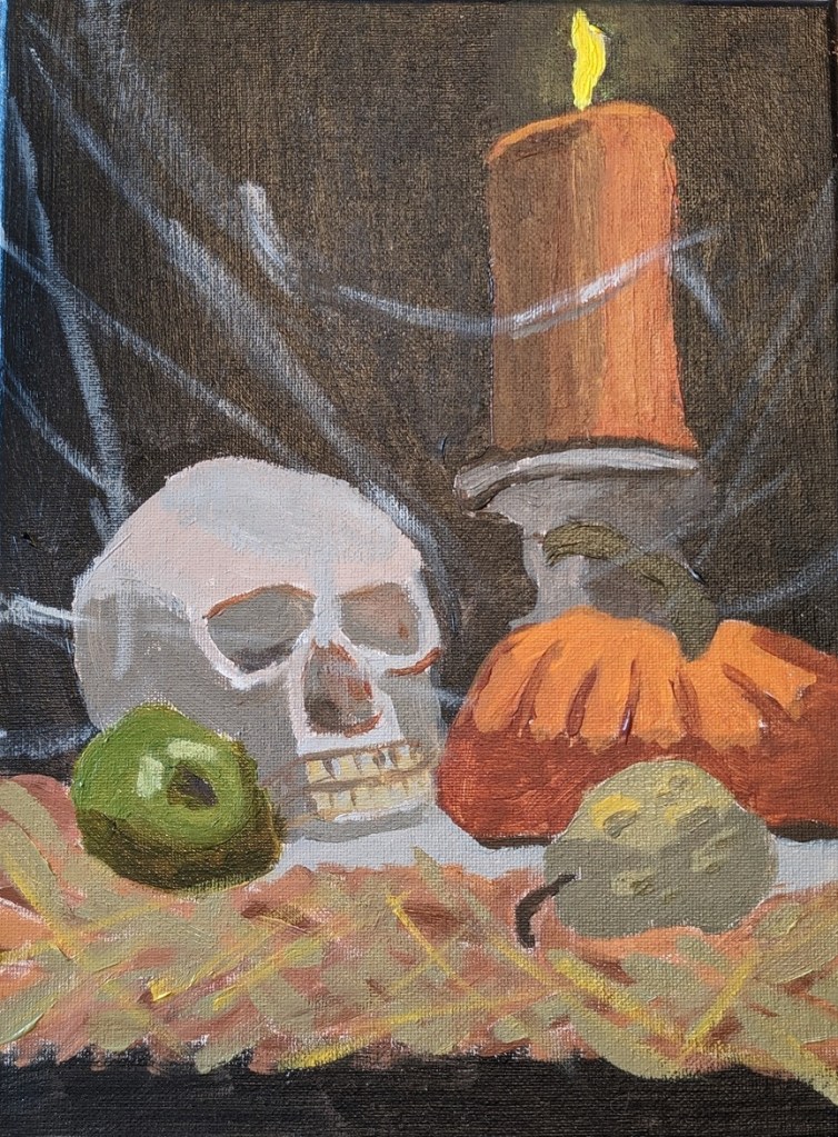
I finished the Halloween-themed works in time for the holiday. I’ve got to get in costume now to greet trick-or-treaters!
Still Life
One Last Halloween Project… Work in Progress
This is based on a new Halloween-themed Patreon post from PaintCoach. I’m using a 9×12 canvas, and I did a tone of Pale Umber (Winsor & Newton Galeria) thinned out with water. As with the skull and pumpkin painting in my previous post, I sketched it out with willow charcoal. The background in this case is Ivory Black rather than a chromatic black of Burnt Sienna and Indanthrene Blue. Near the bottom, I’m using Raw Umber.


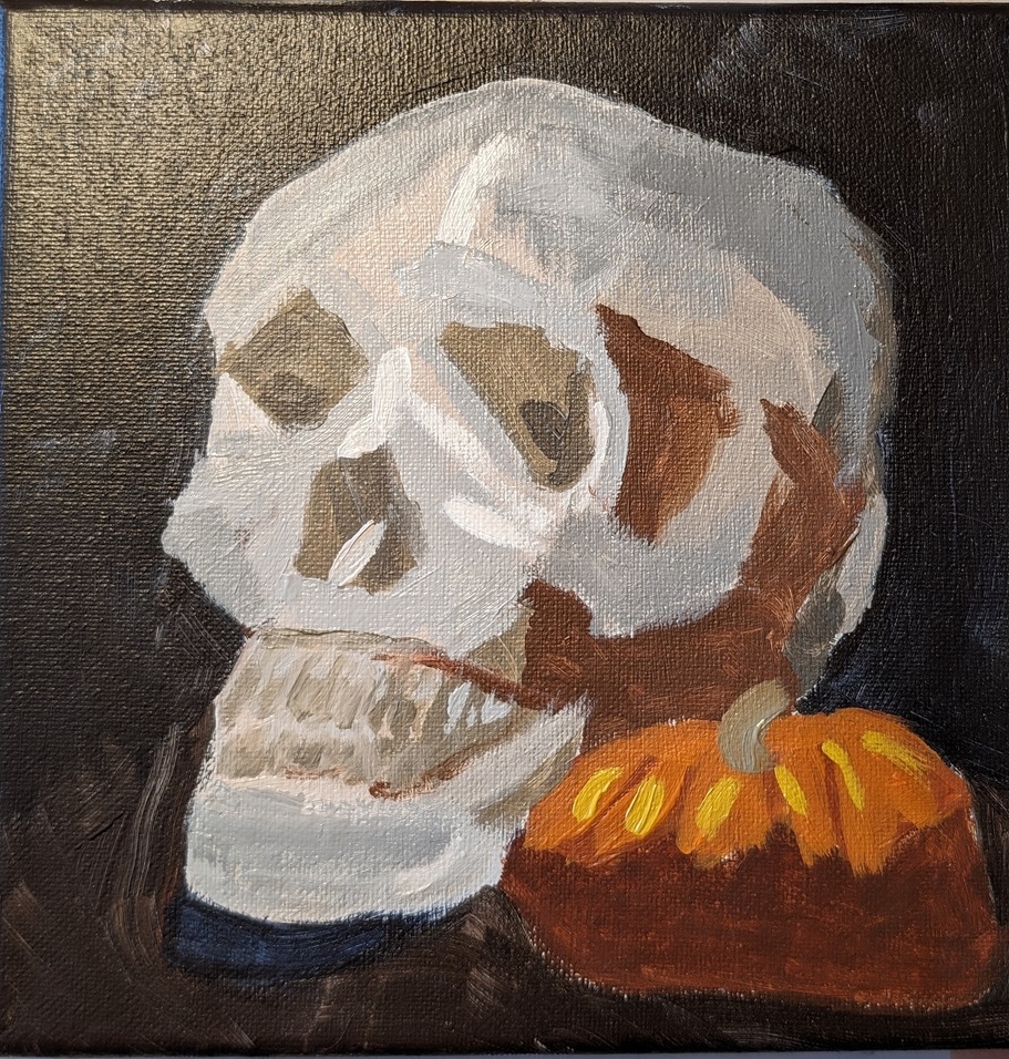
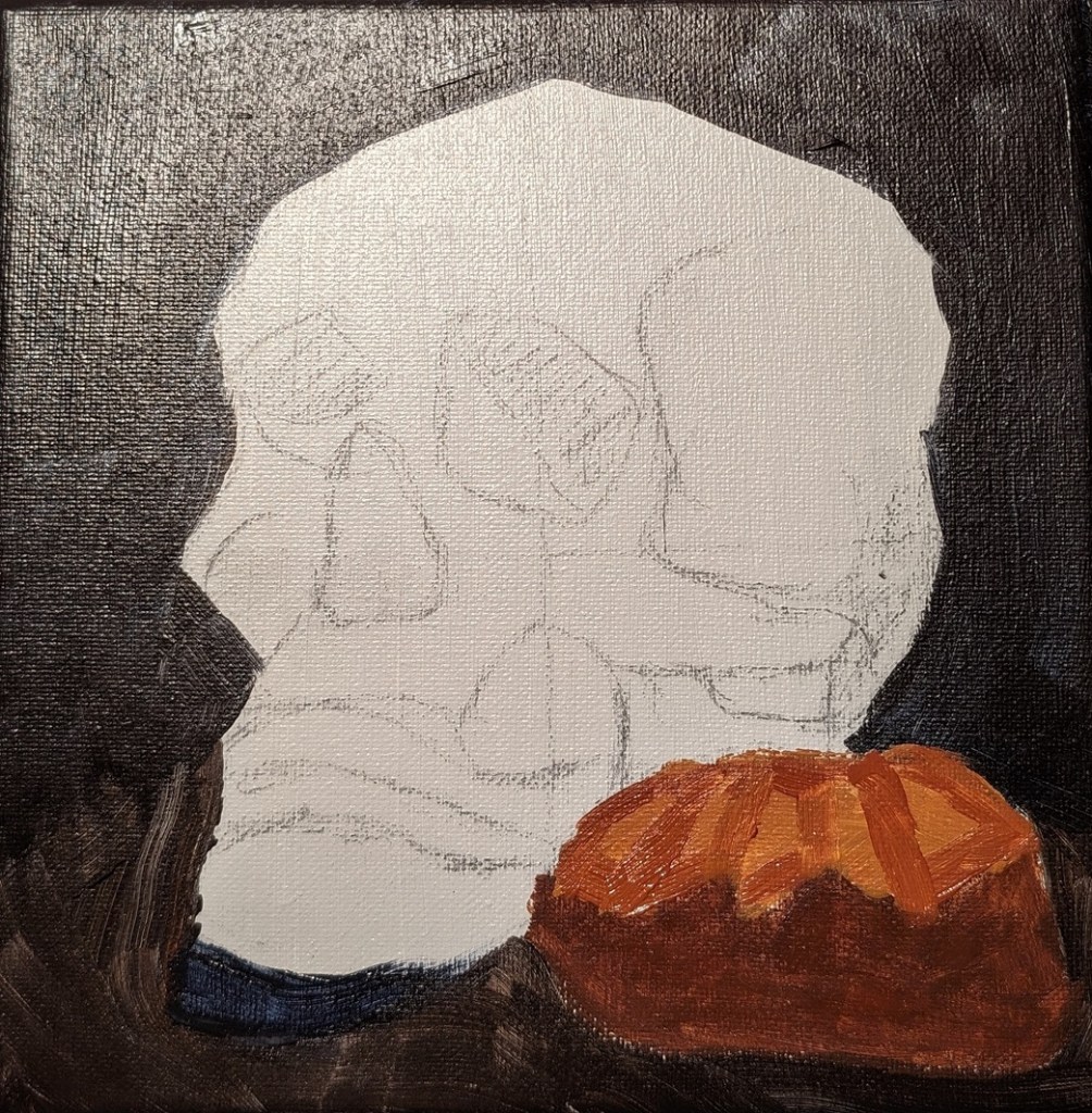
Still on a Roll with the Halloween Theme..
On from pumpkins to skulls… this work-in-progress is from another PaintCoach Patreon post. I’m using an 8×8 canvas; the ground is a Neutral (Gray) 7 mixed with a bit of white. I initially sketched out the image with willow charcoal rather than paint as I’ve been watching the World Series, and it was easier just sketching on the canvas while sitting on the sofa.
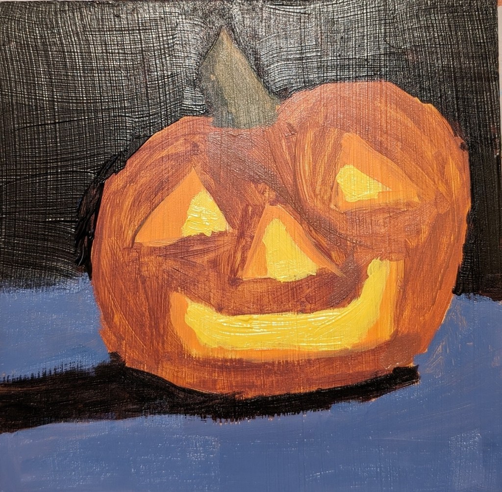
Jack O’Lantern II.. The Re-Do
I mentioned in yesterday’s post that I realized that I needed to use a color closer to Burnt Sienna as my desaturated orange; my desaturated “orange” was simply too brown and yellow.
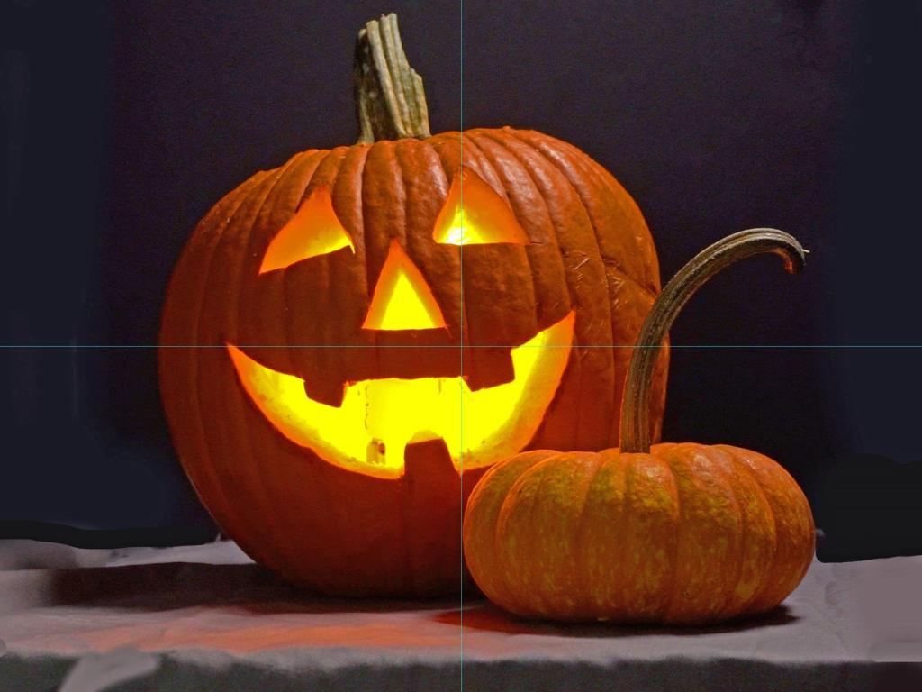
In any case, while it was fresh on my mind, I decided to do a quickie painting of another jack o’lantern, skipping the smaller one and just focusing on getting the colors correct. I used a 6×6 Ampersand Gessoboard that I had toned with yellow ochre several months ago.
The color of the surface the pumpkin sits on is actually a bit more lavender than blue; the photo lighting is a bit off. And I really dislike the slippery Gessoboard!
Jack O’Lantern.. Complete
So I’m done with the jack o’lantern. The overall point was to make the lit-up eyes, nose and mouth “pop” by desaturating the orange. But it feels too desaturated to me, not to mention too yellow. Sigh!

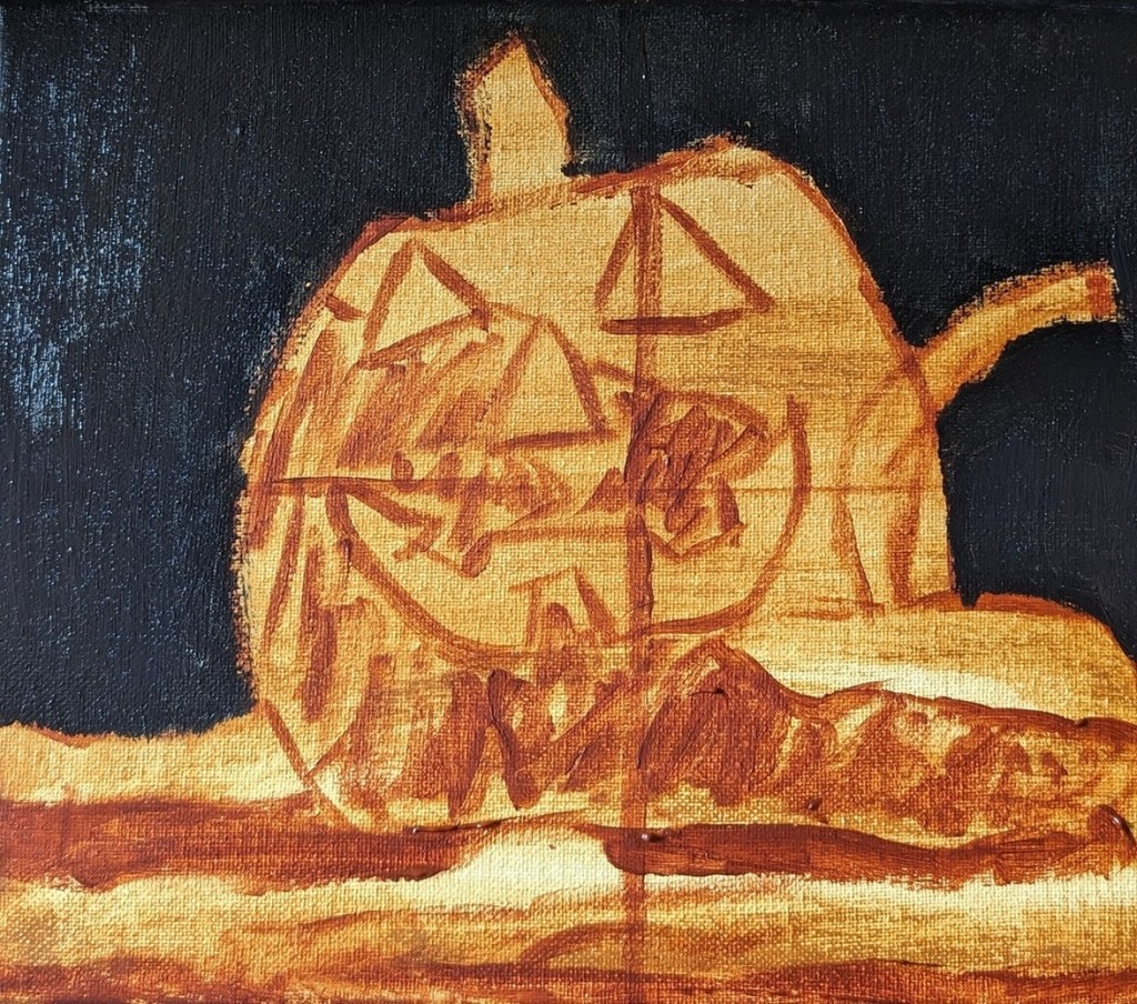
Sure enough, yes, the colors are completely off. Turns out the burnt sienna I used to mark out the value map was really closer to the color I wanted for the big pumpkin! It’s also closer to the color in the photo, as well as the color Chris (the PaintCoach) used.
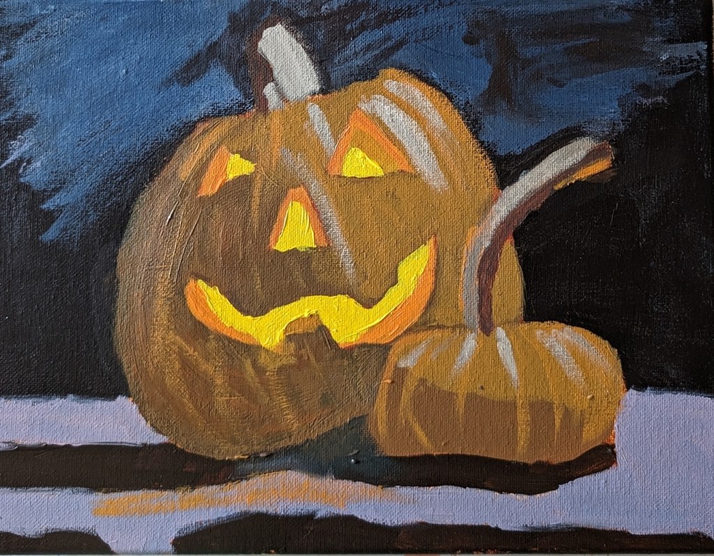
Jack O’Lantern — From Paintcoach Patreon — Work in Progress
Halloween is just a few days away, so I’m putting aside painting the Asaro Head frontal view (my next lesson) to paint this jack o’lantern while it’s still appropriately seasonal.
I’m following along so I’m painting on a 9×12 canvas, but I’m also making small changes. I toned the white canvas with Raw Sienna, and used Burnt Sienna to draw out the shapes. The background is a chromatic black made of Burnt Sienna and Indanthrene Blue (PB60, aka Anthraquinone Blue), a new blue shade I just purchased from Blick by M. Graham (the first time I’ve bought this brand of acrylic paint). I’m tired of using Ultramarine Blue, especially since right now I only have the fluid version.

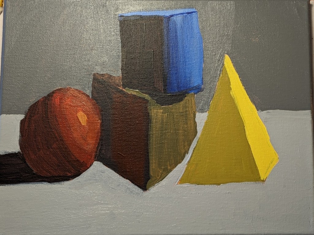
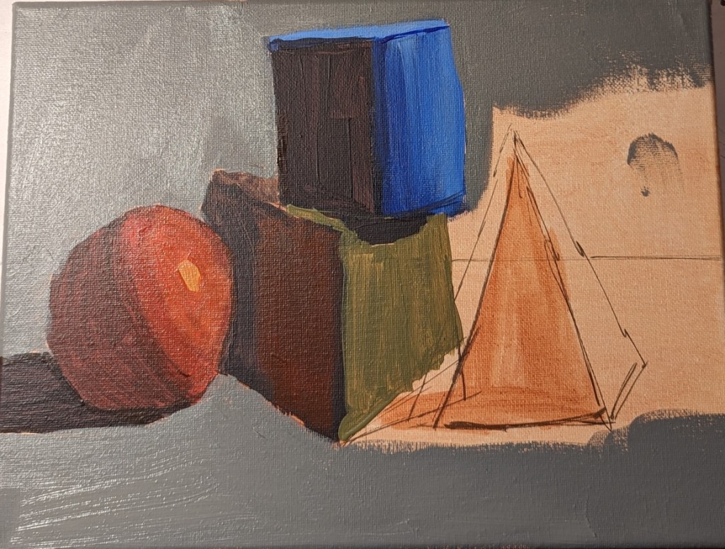
Blocks — an Exercise (Paintcoach Patreon)
This reference photo came from another online lesson at PaintCoach’s Patreon site. I’ve also included a work-in-progress photo, and a photo of my final work.
The most glaring mistakes are that I didn’t get the relationships between the blocks right, especially the yellow pyramid, and I don’t have a shadow for the yellow pyramid! (I could add one, but I want to move on.)
Then there is the issue of color. I didn’t want the super-dark background, but the red sphere is too brown, as is the olive-green square. And in the photo the blue cylinder looks more square in the photo of my painting than it does in real life. Sigh.
Will need to do this exercise again sometime.

Update to the Pink & White Roses
I updated the flowers because I felt like they were too washed out. Still need to update the cloth the vase is sitting on — LATER.
The revised painting is on the left; the former version is on the right.


Sunflower #4

This 6×8 painting of a sunflower is based off the image used for Episode 29 of Artists Network Drawing Together series. What I did differently from the others I’ve painted was that for the shadowed part of the leaves, I mixed my yellow with a touch of Dioxazine Purple to desaturate it (rather than using Yellow Ochre). Ditto for the center of the flower; there’s a lot of the purple mixed in with yellow (although I also used Burnt Sienna and Burnt Umber).
Here’s the work-in-progress.

And here’s the finished piece.

