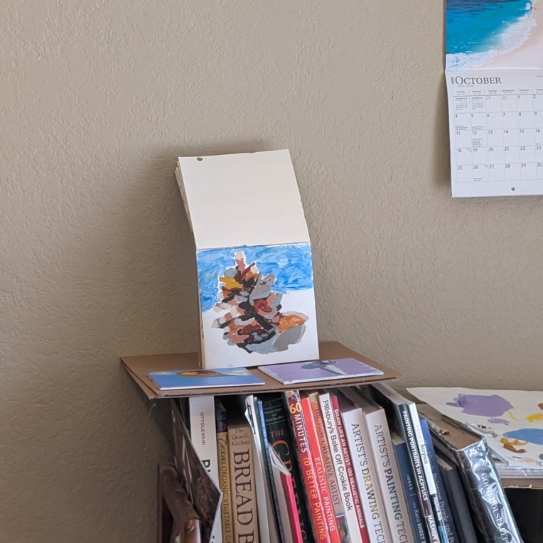
I was inspired by Teddi Parker’s art on Instagram to do a study of a pine cone. Does it look like one to you? I’m not certain it does to me, but it’s better from a distance. I mostly used Burnt & Raw Umber, and Burnt & Raw Sienna, sometimes mixed with white, and then some Buff White (Blick Artist brand). This was painted on 6×6 SoHo Acrylic Canvas Paper.
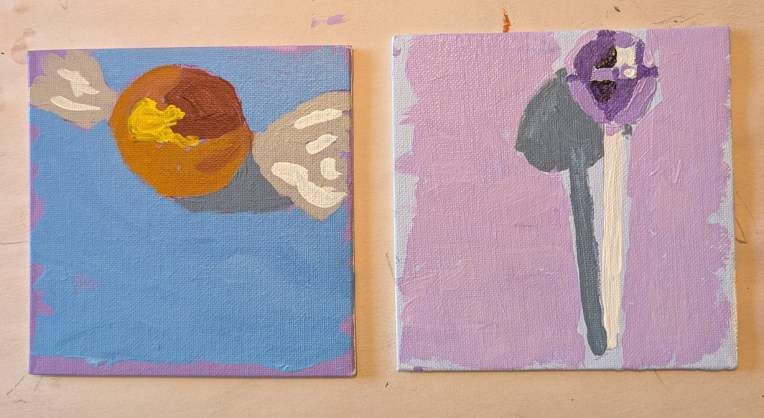
I just discovered this lesson on the Fresh Paint website, and thought I would knock out two of the four items (I’m skipping the barn and the autumn leaf for now) while I decide what to paint next, and draw out anything I need to draw out. Both of these pieces of candy were done on 5×5 canvas panels. The orange candy was done in Burnt Sienna, with Cadmium Yellow Medium added to lighten and then further lighten. The lollipop was done in Dioxazine Purple with Titanium White to lighten consecutively.
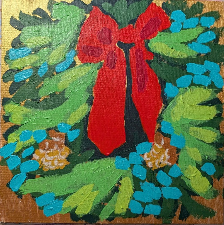
This wreath is based on a photo by Tim Mossholder on Unsplash, but I also referred significantly to the painting that Ali Kay did in the Fresh Paint class. Unfortunately, too many layers when using heavy body paint isn’t so smooth, so ridges do show, which is irritating.
My effort is more impressionistic than even Ali’s so one just gets the sense of green, but not pine boughs and various evergreens. Oh well, moving on, and glad to have put to use this canvas with the gold metallic paint!
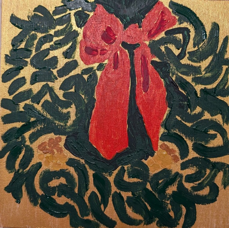
You know how you buy paints you find out you don’t need (or can’t figure out a use for later)? That was me.. I bought Lascaux paints a few years ago: a set of 3 (silver and two shades of gold). So, I’m painting this wreath on a 10×10 canvas panel that I painted first in one of the golds.
The wreath is based on a photo by Tim Mossholder on Unsplash, and also I’m referring to the Fresh Paint video class where Ali Kay paints it. There are many more layers — and shades of green — to come, but as it stands now, it has a certain impressionistic feel.
Well, of course I had to fix the thing because it looked like an infected wound — ugh. I acknowledge that one of my weaknesses as a beginning artist is fixating on following the reference photo too closely. True mark of a beginner, lol.
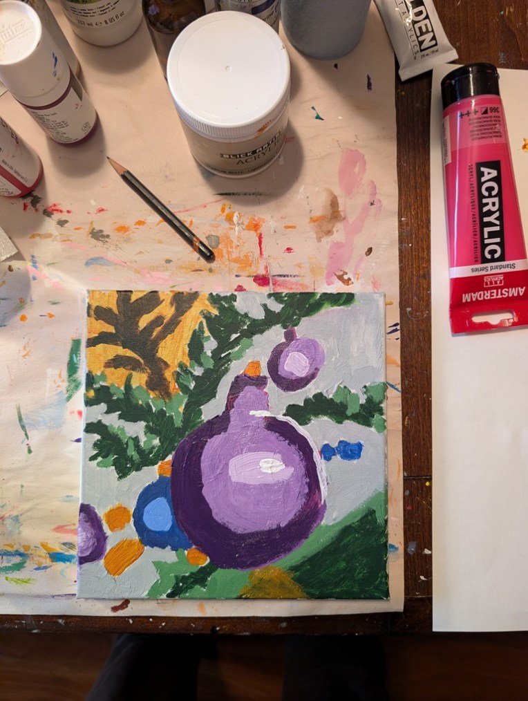
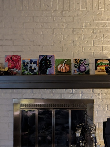
In any case, here is the fixed version, both close up and (currently) among the paintings on my mantel. From where I write this — my “studio” triples as 1) the dining room table, 2) my “office” when I work from home 2 days a week, and 3) my painting area, the ornament painting doesn’t look half bad. (I’m twice as far from my fireplace as from where I took the photo.)
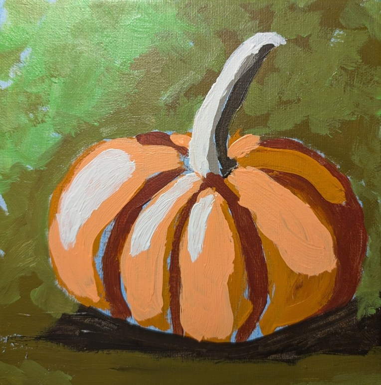
I had a lot of fun painting this one and I’m quite satisfied with the result — although at first, I thought “small pumpkin, ugh, how boring”. This was one of the offerings of Paint Week ’26 that Ali Kay Fresh Paint was offering the last week of September. Mine is not exactly like hers — partly because I don’t want to copy exactly, and partly because she uses Golden Fluid Acrylics. While I have some of those, mostly right now I’m using Liquitex Heavy Body (although I have no particular attachment to any given brand. So, naturally, my colors were different.
The olive gray-green was made from Raw Umber and Cad Yellow Medium; I then lightened it with one of those pre-mixed paints all the brands have (in this case, “Vivid Lime Green”). In the upper left corner, it’s mostly straight Vivid Lime Green (which is a mix of phthalo green, titanium white and the yellow PY97).
My underpainting was cerulean blue; I don’t particularly care for the magenta that Ali uses in a lot of her paintings. It was difficult not to paint over all of it, but I managed, and I’m pleased with how it turned out.
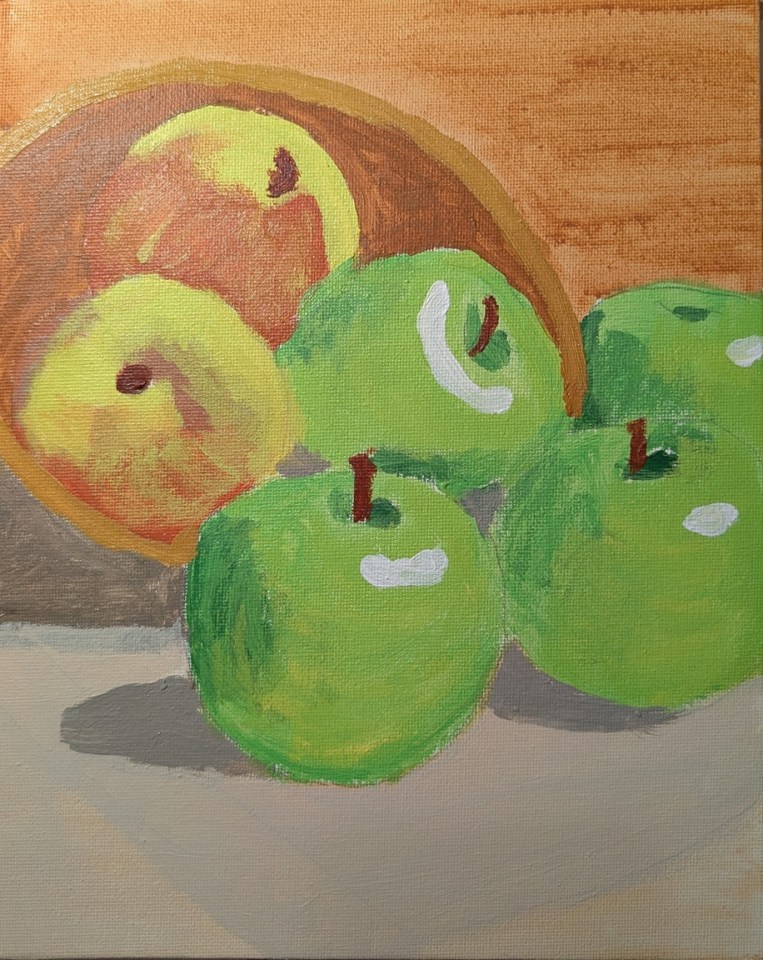
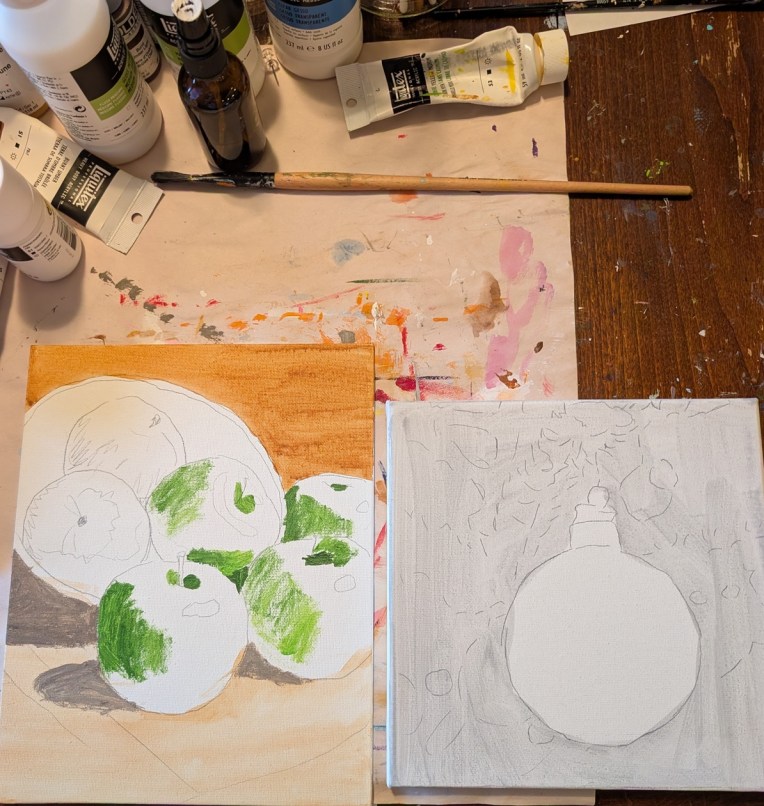
This bowl of apples was painted on a 9×12 linen panel and it’s based on a photo by Robson Melo on Unsplash. I need to adjust the color of the bowl in the middle left; at first I thought it was part of the shadow, but it’s not.
As I reflect on this painting, I think of it as “tight” rather than loose; too static. The red and yellow apples look like they could be peaches instead. And, finally, it looks to me like the paint soaked into the canvas too much — the canvas came pre-gessoed but perhaps I should have added another coat. The other option is to paint at least another layer; however, I got bored painting this one so I’m undecided as to whether I will.
These are a few of the paintings I’m working on, on the side. I’m doing the apples on a 9×12 linen panel. It is based on a photo by Robson Melo on Unsplash. The Christmas ornament is on a 8×8 canvas panel, based on a photo by Markus Spiske on Unsplash.
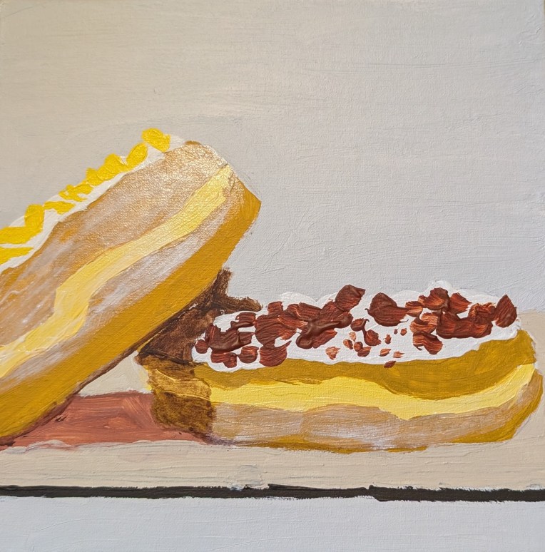
I actually cannot decide if the reference photo showed bacon bits or something like, say, cinnamon crunch. Since bacon bits actually sound more appealing to me (to cut the sweet of the doughnut), I went with that idea. This painting, on an 8×8 canvas panel, is based off a photo by Kivanc Erdirik on Unsplash.