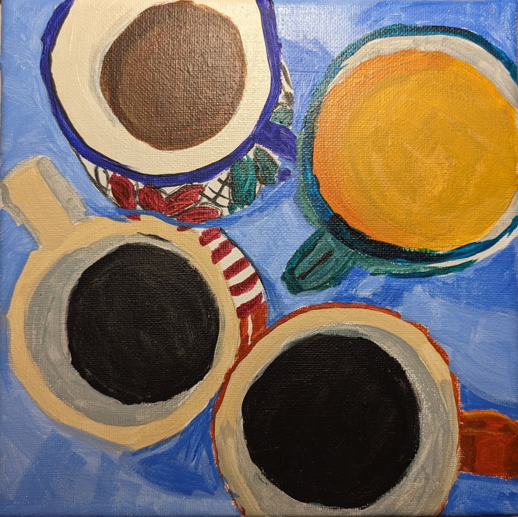
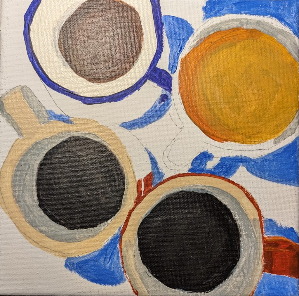
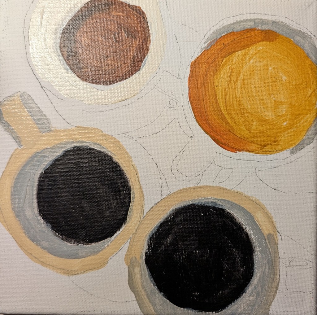
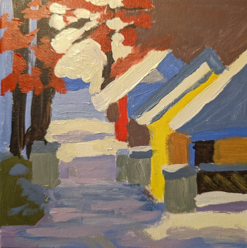
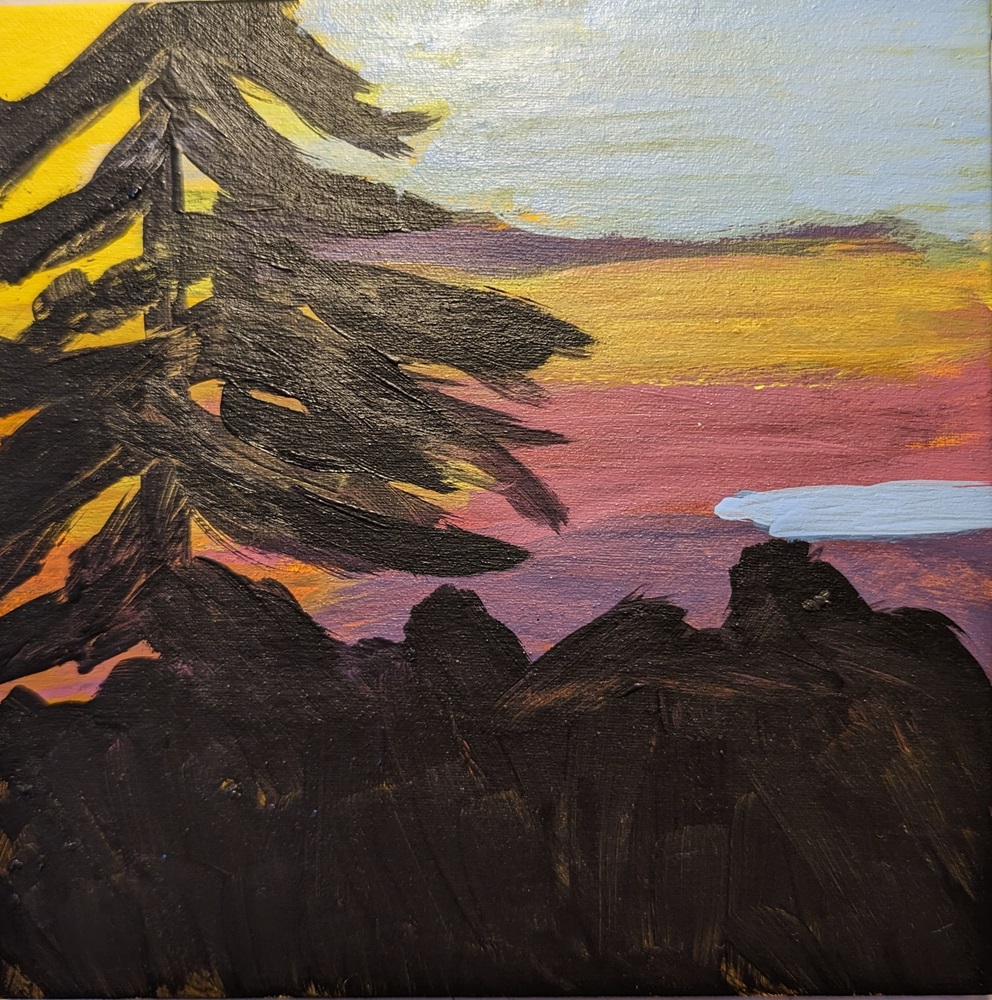
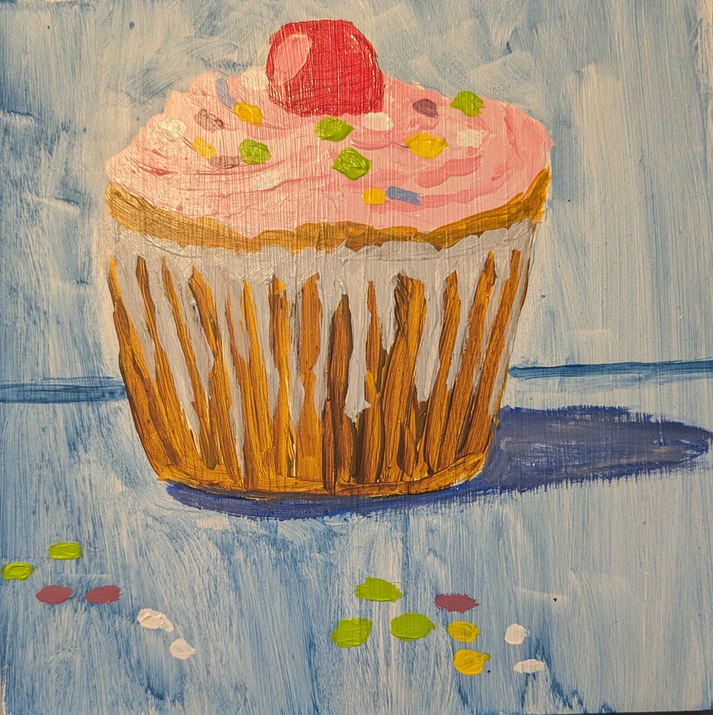
I painted this cup of coffee, based on a photo by Jeremy Yap on Unsplash, on an 8×8 canvas, with cerulean blue as the primary blue.
Small Works
Guacamole.. Done!
I finished the “Guacamole” paint-along from PaintCoach’s Patreon page. The background in this photo is bluer than in reality.

Green Apples…Round 2
So, after making my apples too green (and dark) with mostly Winsor & Newton Sap Green (and some yellow, believe it or not, I tried a “convenience” color (Yellow Green from Amsterdam). That got me closer, but at that point, I was over-painting the original dark green apples. The third try, I got closer to the color I wanted, but I ceased paying attention to the darker shapes in the reference image (including the shadows).
The only thing I’m relatively satisfied with right now is the dark area around the apple stems. AND that I finally got reasonably close to the local color of the apples.
I need to paint this again from scratch, but frankly, I’m temporarily sick of apples! π
Here are the value comparisons between the reference photo and the original painted green apples, and the reference compared to the final painting.
Originally, my lights were too dark, while some darks (the cast shadows) weren’t dark enough. Now my lights are okay but the darks aren’t dark enough. And the apple at the left is misshapen.
Green Apples.. Round One
This is another paint-along from PaintCoach’s Patreon page. I painted what I thought I saw, not what I actually saw. “Green” apples are green, right? Wrong. They’re mostly yellow. The image from Adobe Photoshop Essentials shows the darkest green as being mostly an olive color. (Actually, with photos the way they are, the darkest areas showed up as black, so I “color-picked” the edges of the shadow.)

Anyway, this image testing came AFTER my first attempt here — and the quinacridone magenta wash, and Payne’s gray outline to start did not help anything. Ugh.
Guacamole.. Work in progess
I’m working on “Guacamole” — another paint-along from PaintCoach’s Patreon page. Here’s a few in-progress photos.
Tomatoes.. From Paintcoach Patreon
Today I painted a pair of tomatoes based on a 2021 post at PaintCoach‘s Patreon page. This was done on a 6×8 canvas panel.

52 Mini Paintings Challenge: Week #8
This is the week 8 painting for Jed Dorsey’s Mini Painting Challenge at Acrylic University.βIt’s based on a photo he took near the Tetons in Wyoming. He called it “Late Light Shed”. I enjoyed painting this one. As usual, it’s the 3 primaries, black and white, but I did “cheat” a little by using some of Liquitex Basics Blue Gray Blue “convenience color”.

52 Mini Paintings Challenge: Week #7
This is the week 7 painting for Jed Dorsey’s Mini Painting Challenge at Acrylic University.βIt’s based on a photo of the Swiss Alps.βI painted this on a 6×6 canvas panel, with a toned background of a neutral brown (made with Red Oxide, Cad-free Yellow Medium, and Ultramarine Blue).

Cloud Challenge #8 β Acrylic University
This painting is the final one of Dianna Shyne’s “Cloud Challenge” at Acrylic University.βIt’s called “Silver Lining”.β The sky is a mix of Cerulean Blue (PB35), Ultramarine Blue (PB29) and white.βI find the Cerulean Blue (at least by this brand — Charvin — to be quite transparent, which was unexpected.β6×6 canvas panel.