Persimmon Study

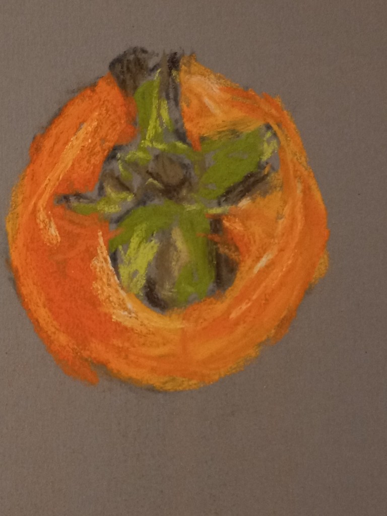
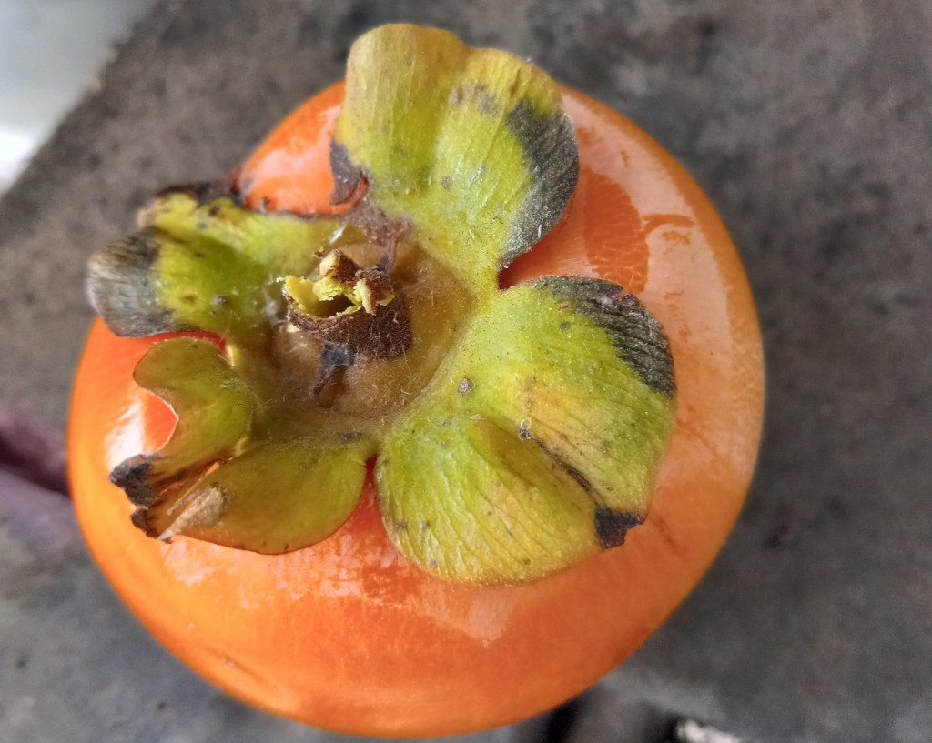
This persimmon is from our tree (which has largely been picked over by now, by my husband harvesting, and by the local blue jays pecking at the fruit).

I held the persimmon in my left hand, looking down at it as I painted with my right hand. My goal was to paint the detail as realistically as possible. The primary pastel I used was one from Great American, called Marigold (585.0) I love the vibrant color — perfect for this fruit!

The photo is of the specific persimmon, but was taken afterward, and is rotated 90 degrees to the viewer’s left relative to the sketch.
Espresso Study

Today I painted my espresso cup.

What I like is my color choices: I think they closely resemble the cup in “life”. I’m especially happy with the crema color(s). I’m somewhat pleased with the actual drawing of the cup. I am least pleased with my mark-making, especially with regard to the crema. Perhaps I would be better off using NuPastels or even pastel pencils to render the detail more finely.

Or, be more impressionistic in my painting, and use blurry strokes instead of trying to match the reference so closely.

Playing with Color — Apple

I don’t recall what pastel paper I used; the pastels here are mostly Blick Artist’s Soft Pastels (half sticks) that are, obviously, brand-new. I had a lot of difficulty laying down color in the way I wanted!

Afterwards, on one of Marla Baggetta’s YouTube demos in which she uses Rembrandt pastels, she mentions that the pastels are new, and she gently abraded them against the sanded paper she was using.

I have some Rembrandt half-stick pastels as well as Blick Artists pastels; they seem similar in look and feel to me. So, I used some scraps of fine sandpaper to abrade some of my Blick pastels. I hope that will help in my next painting!