“50 small Paintings” in Acrylic

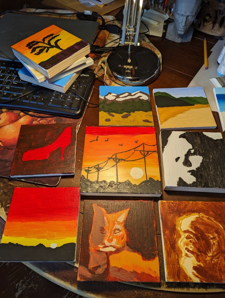
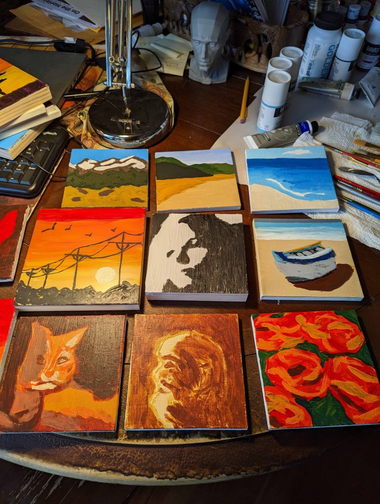
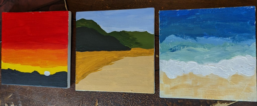
In early February, I found “Learn to Paint in Acrylics in 50 Small Paintings” by Mark Nelson on Amazon, and purchased it. I consider it a mixed bag — you can check out the reviews on Amazon, if you’re interested, about its negative points — all I will say publicly on a blog is that it’s the book that got me to pick up a paintbrush and actually PAINT! (I did NOT do all 50 paintings, but I rolled along on a dozen or so, some of which are shown below.)

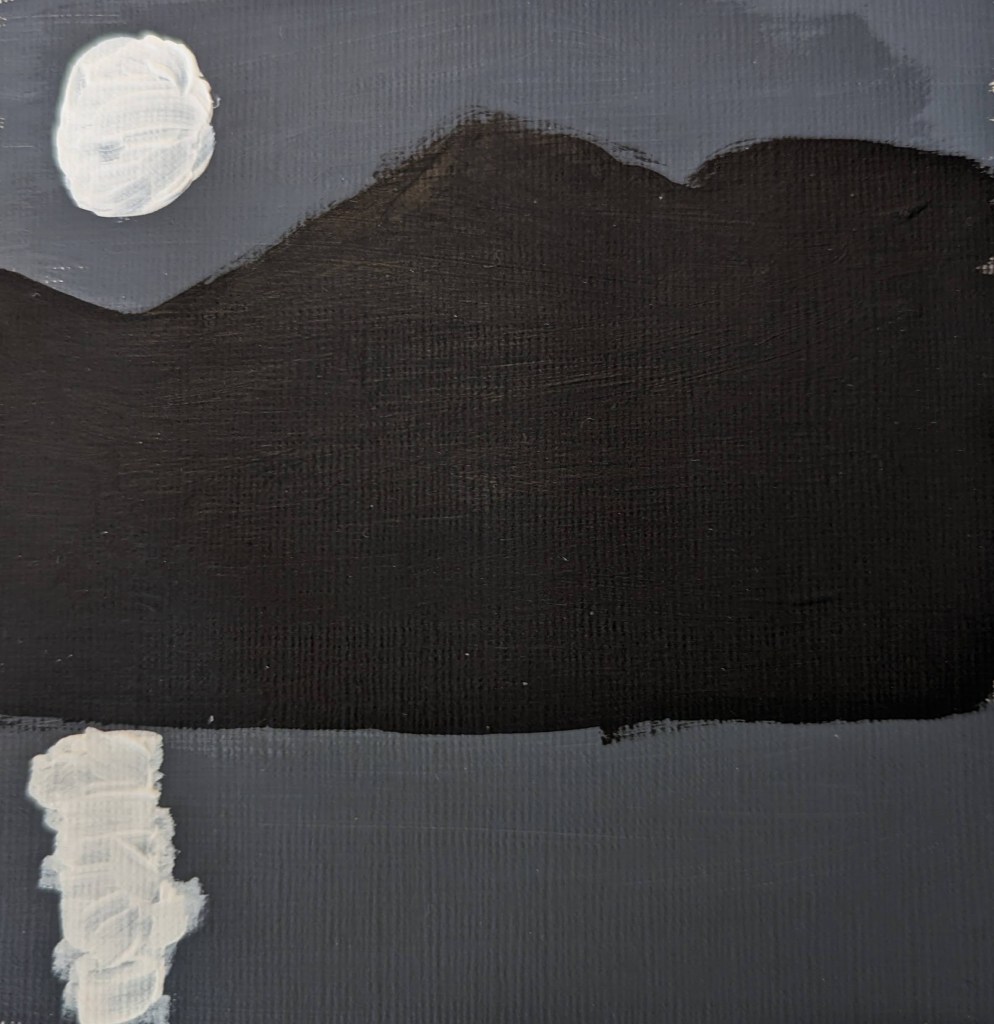
The black, white and gray moonlight painting is the first one I did, following along in the book. As a nocturne of sorts, it is either highly stylized or something only a novice would do. Titanium White and Mars Black are heavily used in almost every painting, something that the typical art teacher suggests you avoid. But, again, this artist may be deliberately stylistic.

Painting of the Day: Glass Vase in Gray Scale

Today’s pastel painting was done on Rembrandt pastel paper, using 3 NuPastels: Warm Deep Gray, Warm Very Light Gray, and touches of Warm Medium Gray. This was a value study in preparation of a color piece which I’ll be doing on a sample scrap of Sennelier Pastel Card (bought last year as a part of a sampler from Jackson’s Art).

The original picture in color is below. I also downloaded the Android app Color Grab, and played a bit with color choices. While that was fun, I quickly became overwhelmed at the thought of using so many colors for the vase!

I decided to simplify to an extreme by editing my photo to be grayscale, and then using Adobe Photoshop Elements to posterize the grayscale photo to get the two extremes of values. The posterized version was the reference for my pastel.

I am underwhelmed by the texture of the Rembrandt pastel paper; I do not care for the honeycomb look at all.

Persimmon Study

This persimmon is from our tree (which has largely been picked over by now, by my husband harvesting, and by the local blue jays pecking at the fruit).

I held the persimmon in my left hand, looking down at it as I painted with my right hand. My goal was to paint the detail as realistically as possible. The primary pastel I used was one from Great American, called Marigold (585.0) I love the vibrant color — perfect for this fruit!

The photo is of the specific persimmon, but was taken afterward, and is rotated 90 degrees to the viewer’s left relative to the sketch.

Espresso Study

Today I painted my espresso cup.

What I like is my color choices: I think they closely resemble the cup in “life”. I’m especially happy with the crema color(s). I’m somewhat pleased with the actual drawing of the cup. I am least pleased with my mark-making, especially with regard to the crema. Perhaps I would be better off using NuPastels or even pastel pencils to render the detail more finely.

Or, be more impressionistic in my painting, and use blurry strokes instead of trying to match the reference so closely.

Playing with Color — Apple

I don’t recall what pastel paper I used; the pastels here are mostly Blick Artist’s Soft Pastels (half sticks) that are, obviously, brand-new. I had a lot of difficulty laying down color in the way I wanted!

Afterwards, on one of Marla Baggetta’s YouTube demos in which she uses Rembrandt pastels, she mentions that the pastels are new, and she gently abraded them against the sanded paper she was using.

I have some Rembrandt half-stick pastels as well as Blick Artists pastels; they seem similar in look and feel to me. So, I used some scraps of fine sandpaper to abrade some of my Blick pastels. I hope that will help in my next painting!