Daffodils.. work in progress… “Bloom with Jed”

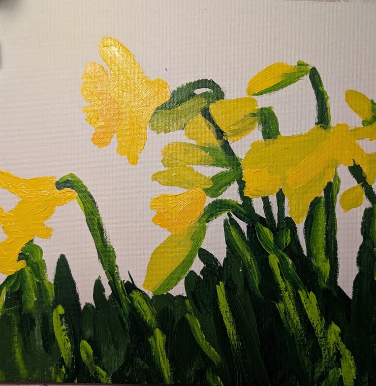
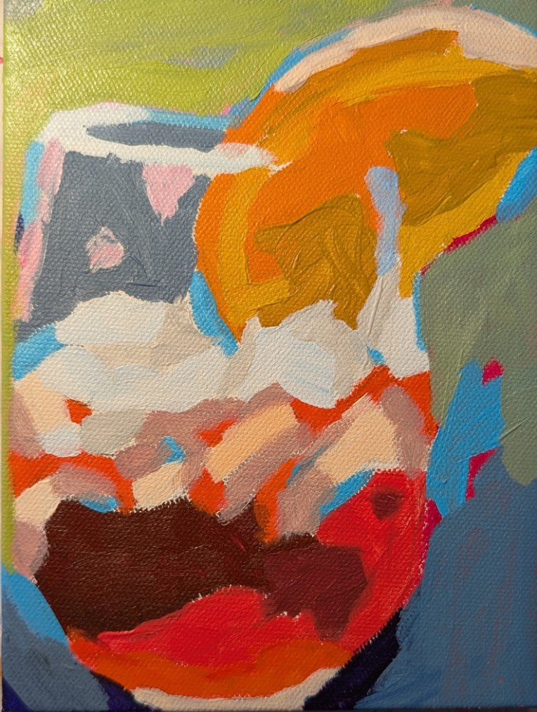
I love daffodils, and this 10×10 painting is based off a reference photo from Acrylic University‘s “Bloom with Jed” paint-along video class.

Still need to do the background, and am undecided how to proceed. Jed tones his canvas black, and then does a kind of gray & brown shadow mosaic — bits of black peeking through — so that it almost looks like a stone wall of a background. But that’s not my speed.

The reference photo was taken by Jed Dorsey.

“Black Labrador”… Based off a Fresh Paint Reference

I started this on a 9×12 canvas, and then my cat bit my right wrist — that’s my painting hand. Ten days of antibiotics got the swelling down, and I pretty much have most of my range of motion back, so I was able to finish this.

The painting is based off a reference photo on Ali Kay‘s Fresh Paint site, and I turned up the saturation on the photo to see colors other than black: dark blue, some deep violet, and some silvery gray.

The photo which looks bluer is actually truer to life, but I made the color more red today (Cadmium Red Hue by Golden) and the new photo looks more washed out.

“Stack of Pancakes”… Based off a Fresh Paint Reference

This painting was done on an 8×10 canvas, and is based off a reference photo on Ali Kay‘s Fresh Paint site. Ali will demo her version of this stack of pancakes and blueberries in a few days; I wanted to do my own version).

I’m happiest with the blueberries, which I painted with Anthraquinone Blue straight from the tube, Ultramarine Blue, and Ultramarine Blue with Titanium White. For the syrup, I used a glazing medium with Liquitex’s Raw Sienna.

Travels Near & Far – Dianna Shyne – Week #7 (mini Painting challenge)

This is Week #7 (called “Boathouses”) of “Travels Near & Far” — a mini painting challenge at Acrylic University, and the artist is Dianna Shyne who also took the reference photo used. As with the week #1 work, the photo is of Prince Edward Island, Canada.

This was painted on a 6×6 canvas panel, and the swirly brushstrokes in green — meant to represent grass! — remind me of some of Van Gogh’s swirly painting (but not in good way, ha-ha!) To the right is supposed to be a boat, but since I painted it in the same colors as the water, it now appears “lost” or, rather, more like a bridge.

The thing is, I’m so focused on painting other things, I don’t care enough to paint it in, say, black and white so that it appears as a boat.


“Lilacs”… Based off a Fresh Paint Reference

I outlined these lilacs on an 8×10 canvas over a year ago (based on a template found on Ali Kay‘s Fresh Paint site.) Finally got around to painting it — using the reference photo Ali Kay provided, and NOT copying her style at all.

Overall, I’m more satisfied with the lilacs — which put me in mind of spring in New England during my college years — than with the daffodils in the vase I did a while back.