I wanted to try a monotonal work; this was done on a 6×8 canvas. The painting is based on an image by experimentMR from Pixabay.
I think it looks better at a distance.

I wanted to try a monotonal work; this was done on a 6×8 canvas. The painting is based on an image by experimentMR from Pixabay.
I think it looks better at a distance.


I did this quick study from memory and on a 6×6 canvas panel based on one of my own photos. I had previously underpainted the panel in an Ultramarine Blue-Titanium White mix, which seriously affected the magenta paint.

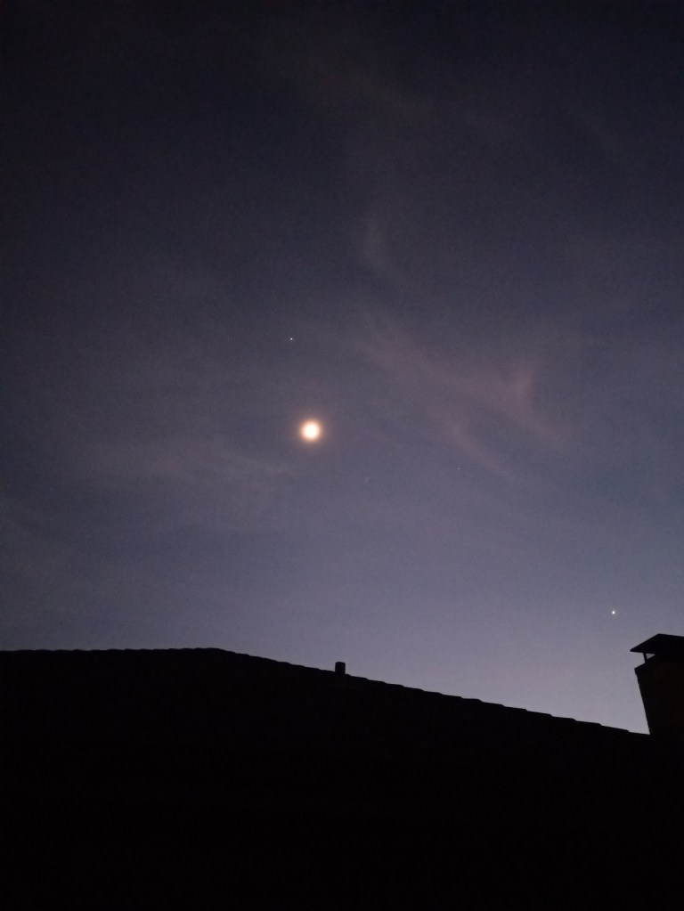
For this study, I used another of my own photos — this one taken one evening in early December of 2021 from my backyard. The Moon was actually a crescent at the time, but I had a cheap smartphone at the time with a lousy camera, so it looks full, and I carried on with that in my painting. Jupiter is shining above the Moon, and Venus is near the silhouette of the chimney.
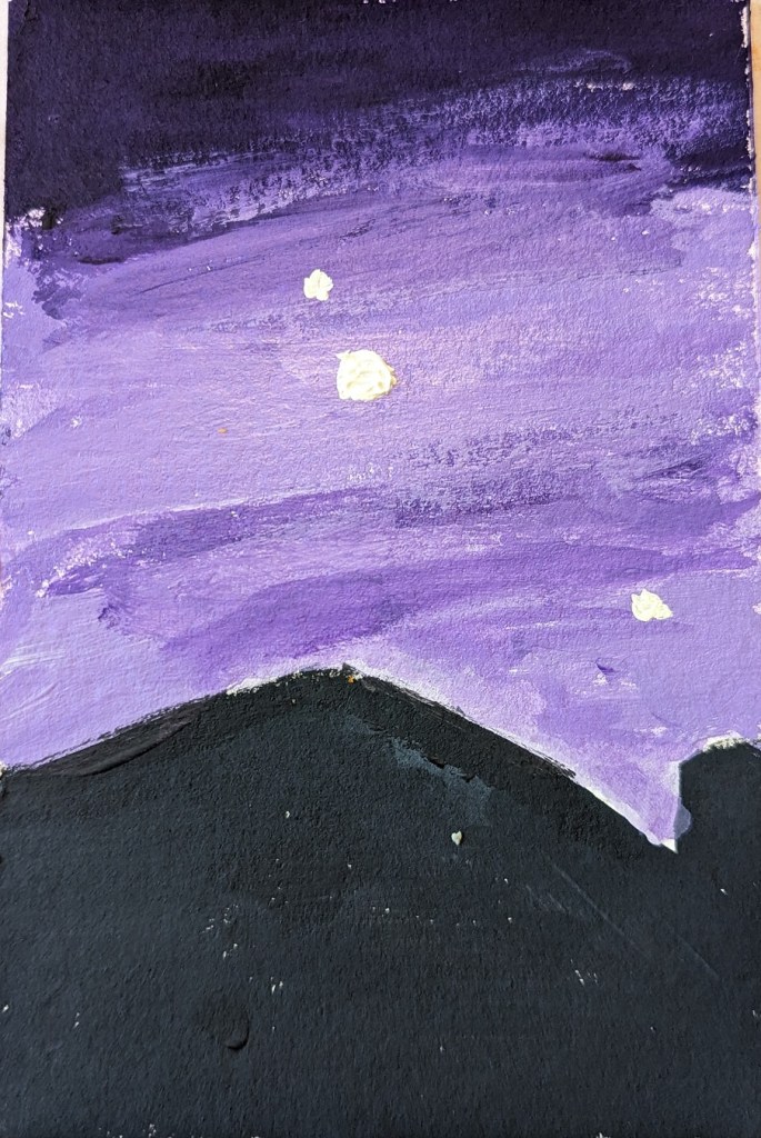
This was done on a 4×6 piece of 300 lb. cold-pressed watercolor paper. The house silhouette is blue-black, and the sky was painted in tints of dioxazine purple. The Moon, Jupiter and Venus are painted in a yellow-white mix.
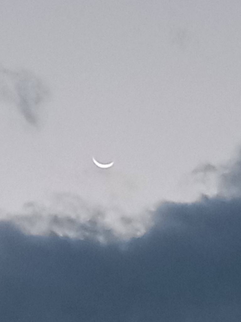
This painting was done in acrylic on a 4×6 piece of 300 lb. cold-pressed watercolor paper. It’s based off of a photo I took of the waning crescent Moon one morning back in November 2021.
I felt the original image of the sky was too gray and blue, so I changed it up at bit. The sky was painted with Liquitex BASICS blue gray; the pink is Cadmium Red Medium Hue from Golden, and the Moon is Titanium White mixed with Hansa Yellow Light (PY 73).

This 4×6 painting in acrylic on 300 lb. cold-pressed watercolor paper is based off a photo I took in Dec 2021 near sunset.
Colors used for the tree and roof silhouette: Chromium Oxide Green, Alizarin Crimson, and a touch of Cerulean Blue
Colors used for the sky: Cerulean Blue, Phthalo Blue, Cad-free Orange, Cad-free Yellow, Titanium White, Blue Gray

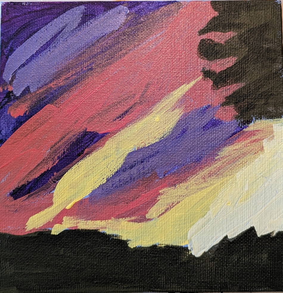
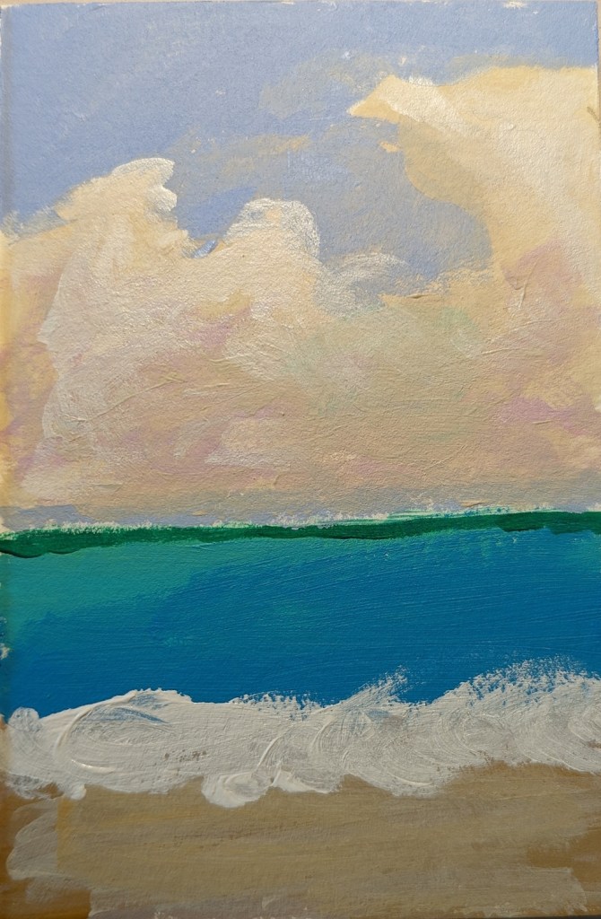
This painting was a quickie, from imagination, after having browsed through images — photos and paintings — of the sea and sky.
My primary focus was the clouds.
This is 4×6 done on 300 lb. cold-pressed watercolor paper, so I could wet my acrylics a bit.
This is my first animal “portrait”, based on an image by Nikki Luijpers from Pixabay.
I love black Labs! Never had one, but a roomie from 40 years ago had a black Lab named Emma, and I just loved that dog! BEST DOG EVER.
This quick study was done on 6×8 gessoboard, which I gessoed again to get rid of the smooth surface, and then painted over with Neutral Gray 5.

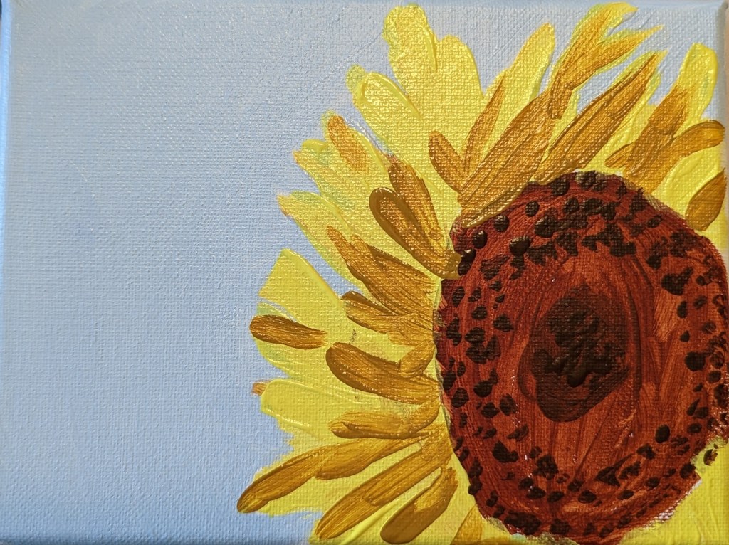
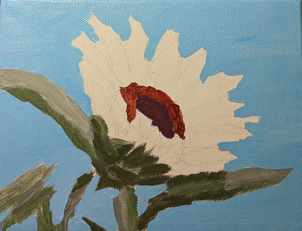
This 6×8 sunflower painting was based on an image by Couleur from Pixabay.
The green I used was one of my favorites — Chromium Oxide Green (PG 17) Liquitex Heavy Body. For the darkest green, I mixed it with Alizarin Crimson. The medium green is straight from the tube. And the lightest silvery green is Liquitex BASICS Green Gray.
This time for the sky I used Phthalo Blue from Golden Fluid, mixing it with the Golden Fluid Titanium White.
This sunflower painting was based on an image by Engin Akyurt from Pixabay. For the sky, I used Utrecht Fluid Cerulean Blue and Golden Fluid Titanium White — which works better for tinting as it doesn’t get so chalky looking as the Heavy Body. My camera doesn’t quite capture the color, but it’s close.
Painted on a 6×8 canvas.