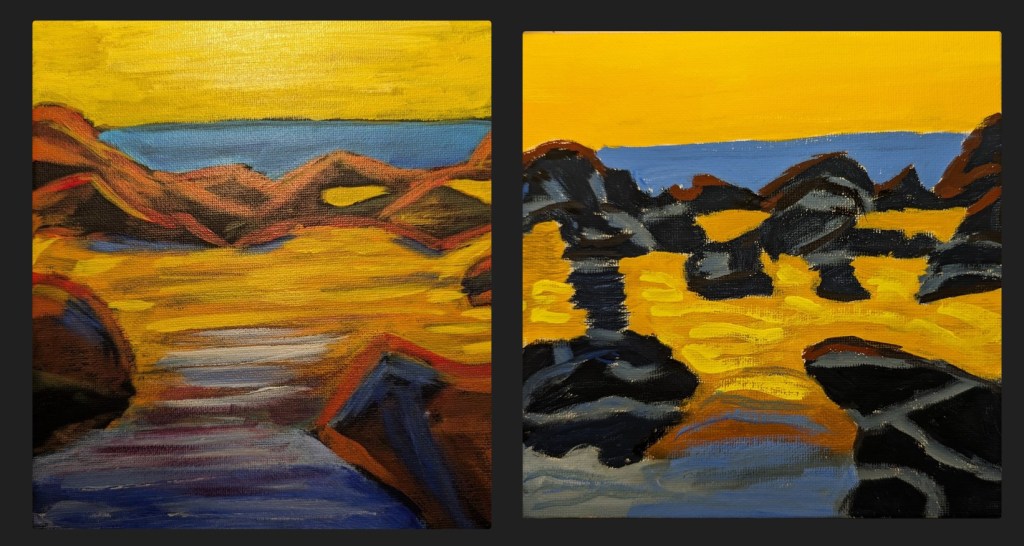
Well, I couldn’t stand that last painting for Jed Dorsey’s Mini Painting Challenge at Acrylic University, so I redid it using a 6×6 white canvas panel, and sketching out the rocks with willow charcoal. Oh, and then I used (for the first time) acrylic gouache (an intro kit from Holbein). I love the matte effect.
The new painting is far from perfect, but on the whole, I consider it an improvement to the original (comparison below).
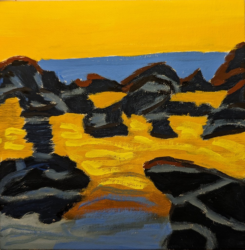
And here’s the comparison: