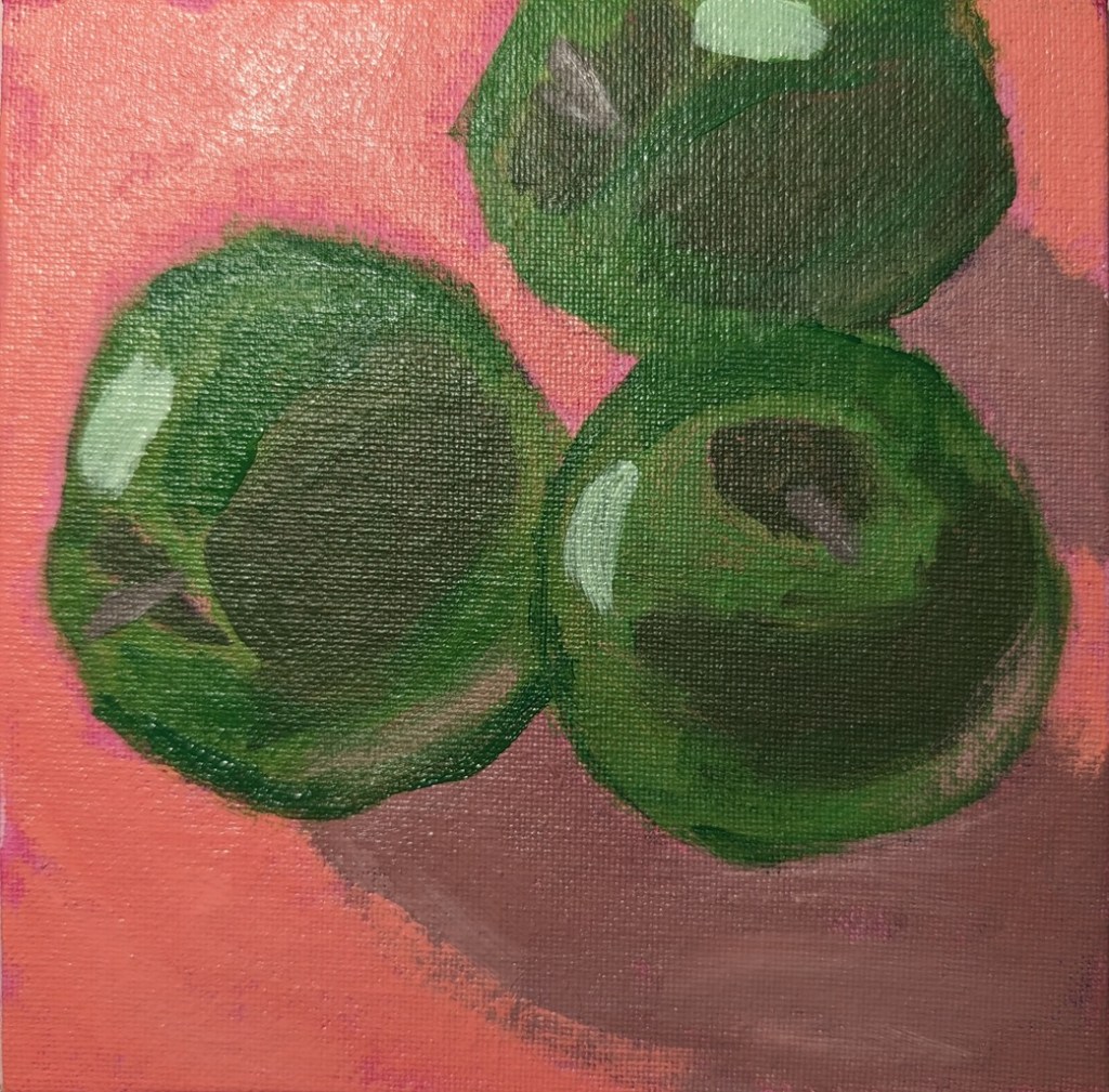
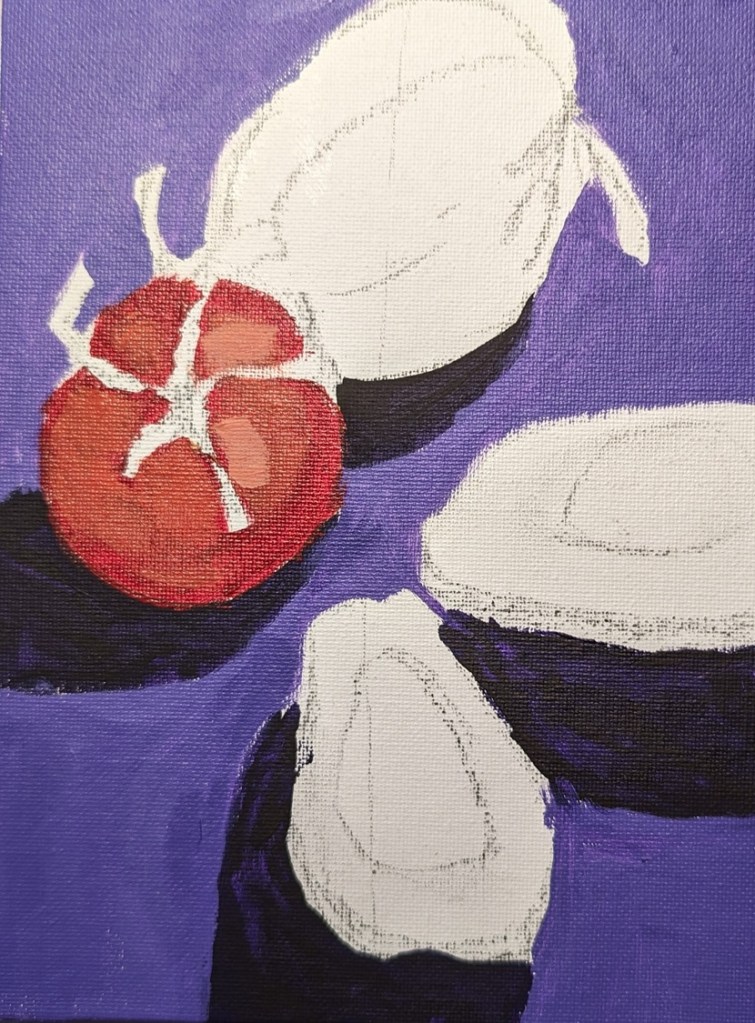
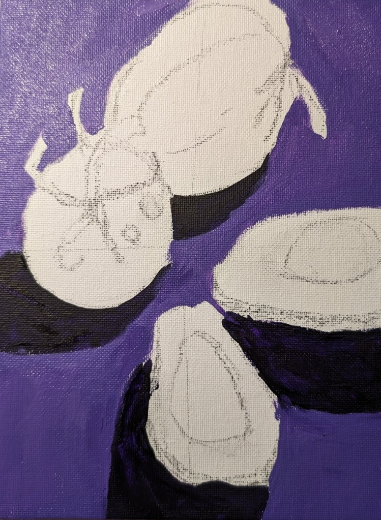
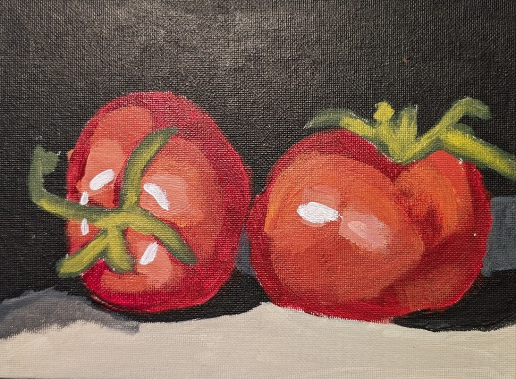
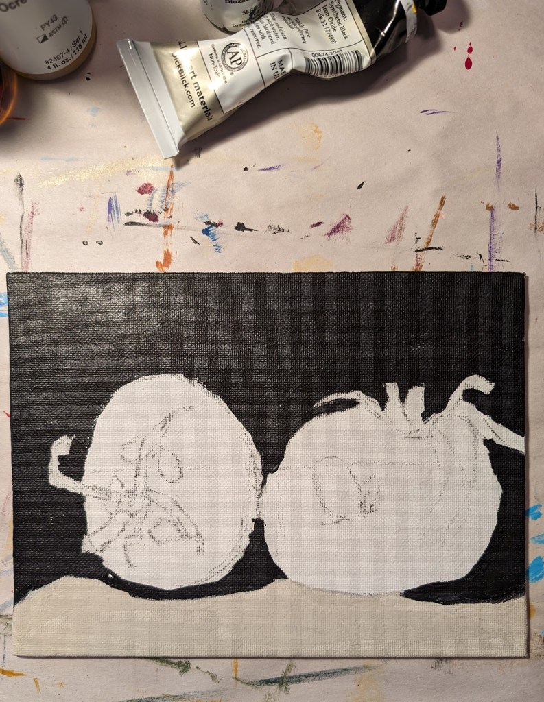
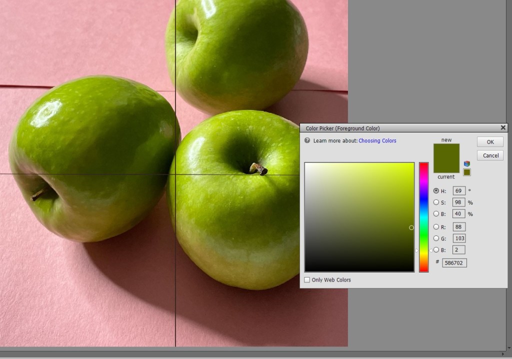
This is another paint-along from PaintCoach’s Patreon page. I painted what I thought I saw, not what I actually saw. “Green” apples are green, right? Wrong. They’re mostly yellow. The image from Adobe Photoshop Essentials shows the darkest green as being mostly an olive color. (Actually, with photos the way they are, the darkest areas showed up as black, so I “color-picked” the edges of the shadow.)
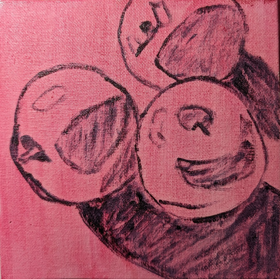
Anyway, this image testing came AFTER my first attempt here — and the quinacridone magenta wash, and Payne’s gray outline to start did not help anything. Ugh.