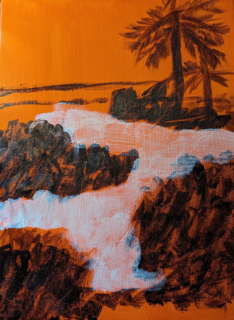
This is the week 6 painting for Jed Dorsey’s Mini Painting Challenge at Acrylic University. It’s based on a photo Dorsey took of a rocky beach at sunset. I used one of my last few 8×8 black canvases because Dorsey paints his version on a black background. (I think I’ve said this before, but I really struggle with a black background; it throws the colors/values off, and you need several coats of paint to hide the black say, against the sky).
I also struggle with beach rocks, and have a couple of PaintCoach Patreon lessons earmarked which focus on beach rocks that I need to do for more practice.
That said, this is my effort, and frankly, it looks quite abstract. Which is not necessarily terrible.
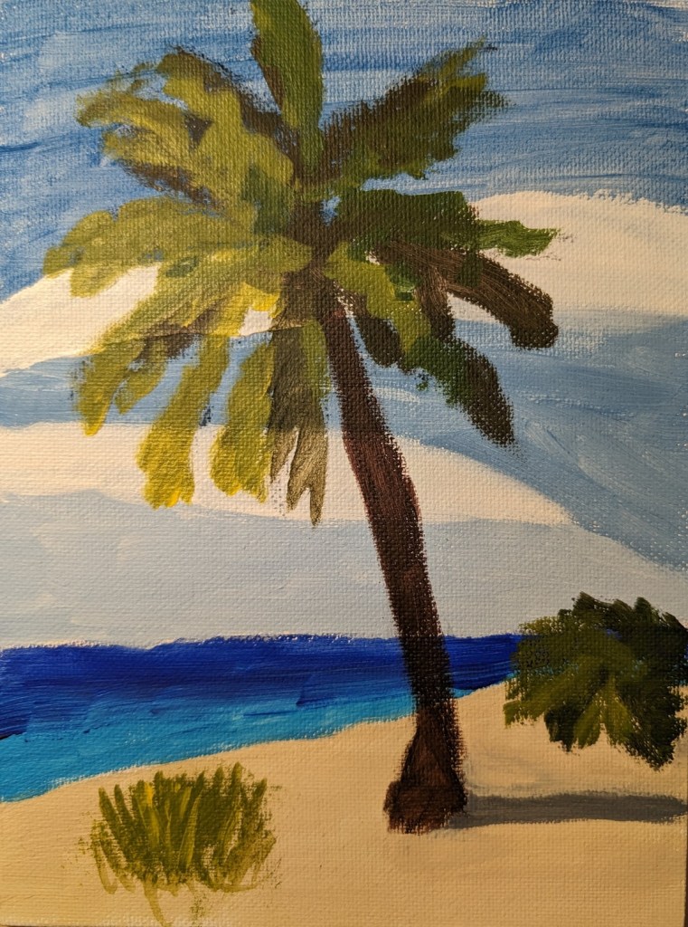
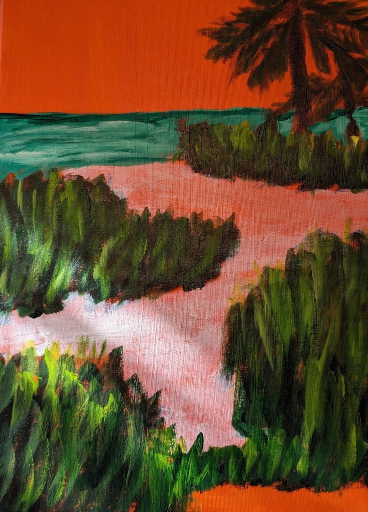
For a brief change of pace, I decided to paint this 6×8 palm tree on the beach which I found on Pixabay months ago. I used a fan brush for the first time to paint the plant at the bottom left. (Hadn’t even realize I bought a fan brush!)
I used Transparent Orange (PO 73) by Chroma Atelier as a background, then Sap Green mixed with Carmine (Amsterdam Acrylic) for blocking out the greenery. For the grasses, I used the Amsterdam’s Sap Green and Yellow Green, as well as Winsor Galeria’s Sap Green (much lighter than Amsterdam’s Sap Green). The sky is Light Blue Permanent by Liquitex Basic; the ocean is Phthalo Green mixed with Titanium White.
The sand has been blocked out with transparent Zinc White. I still need to paint the sand and its shadow colors, and add some color (sunlight and shadows) to the bark of the palm trees.
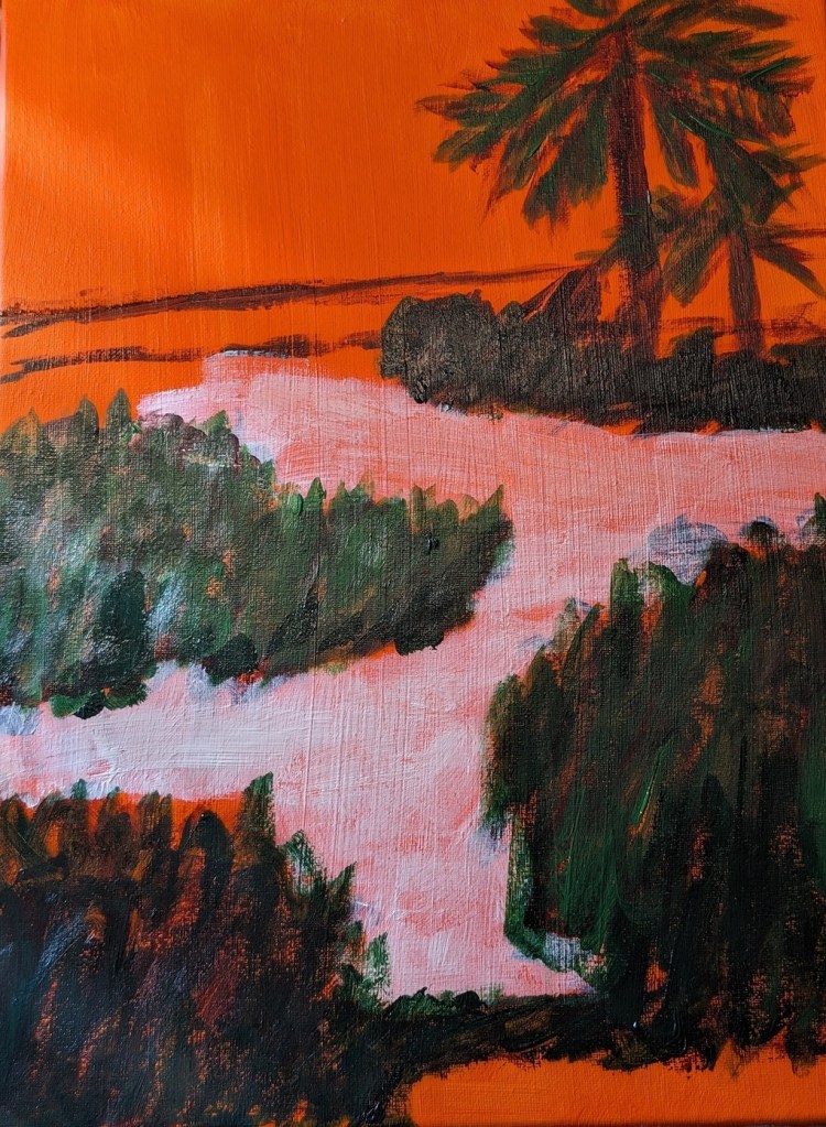
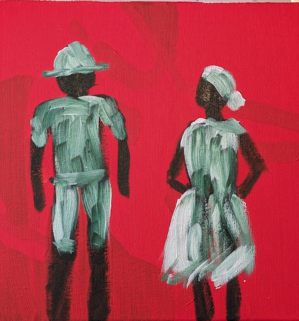
But today I decided to use repurpose an old 12×12 canvas, and paint along with the video I watched last night. It was fun!
So, Slivka started out with an orangey underpainting, and then painted the forms in either Sap Green (which I used) or Hooker’s Green. For my background, I used Pyrrole Red (PR 254) mixed with Cadmium Yellow Hue (Liquitex Basics). (The blotchy look in the background is from my original unfinished painting.)
Then, while the figures were not yet dry, I followed along, painting their clothing in Titanium White, as Slivka did.
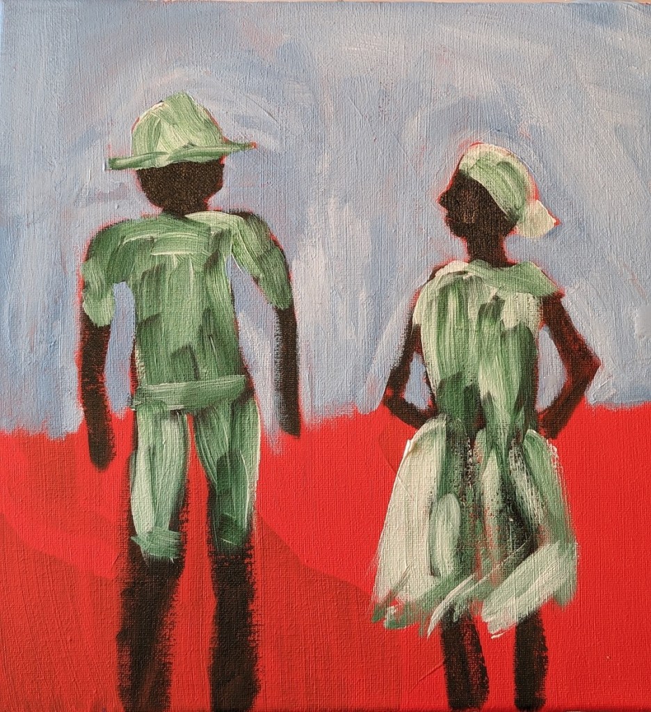
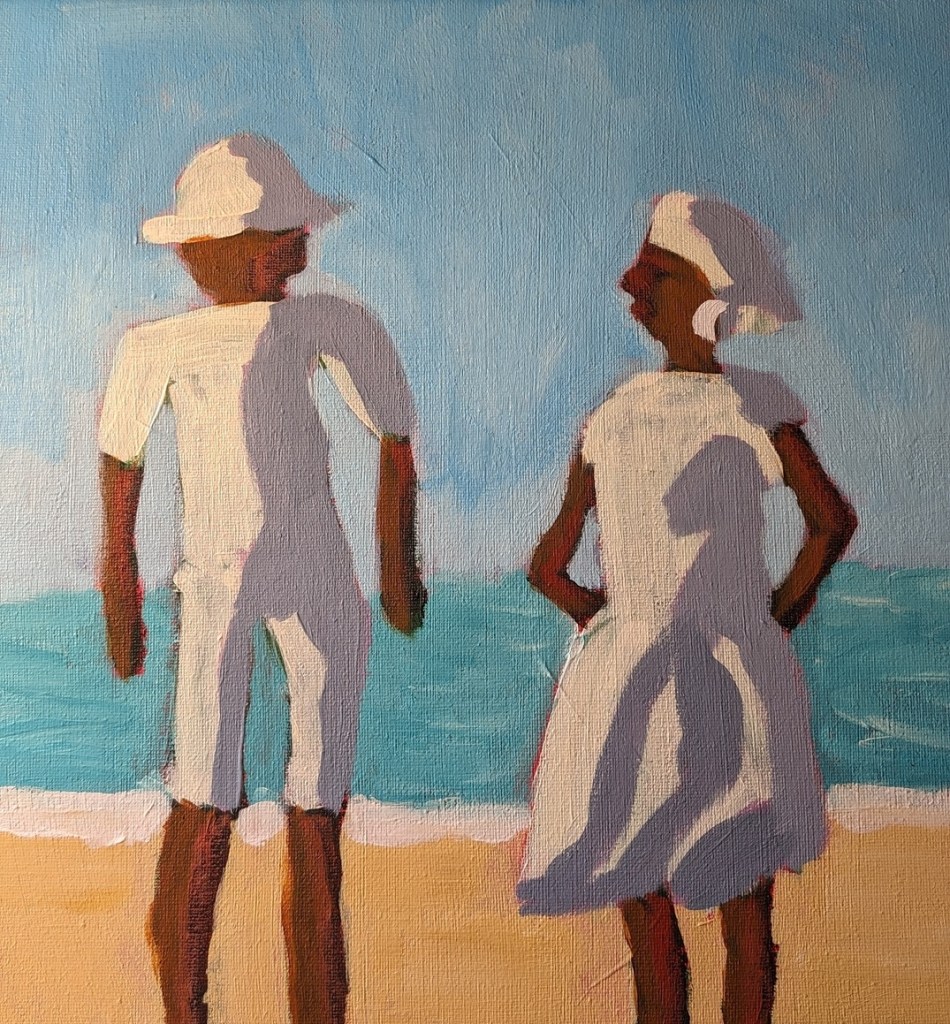
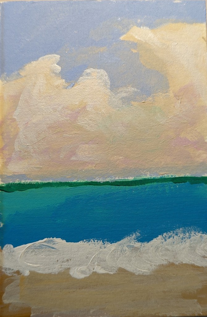
Painting the sky came next. I used Cerulean Blue (Utrecht Fluid brand) with some Titanium White.
Next was the ocean and the sand. Slivka uses some aqua green and Naples Yellow, respectively. I used Liquitex Basics Turquoise Green and created a kind of “Naples Yellow” by mixing Yellow Ochre with Titanium White. The sun-bright clothing was Titanium White softened with Cadmium Yellow Light Hue.
Slivka used Raw Sienna and Cadmium Red for the skin; I used Raw Sienna and Red Oxide. For the clothing shadows, Slivka used a violet with white. I used Liquitex Basics Gray Blue with some white.
I repainted the sky from Cerulean to Light Blue Permanent (Liquitex brand) mixed with additional Titanium White. I may repaint the ocean, and get the horizon line straighter; regardless, this exercise was just a lot of fun!
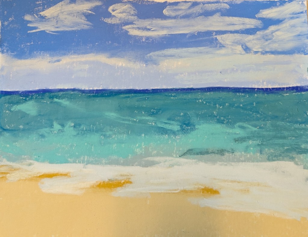
This pastel work, done on an approx. 12×10 scrap of white Pastelmat, was based in part off an image by Somchai Sumnow from Pixabay, but also off of some of my own reference photos of Hawaiian beaches.
Mostly I was interested in the different shades of blue and also how different brands of pastel lay down on the paper. There are some weird diagonal lines, probably creases from the original 19×25 size of the Pastelmat sheet,
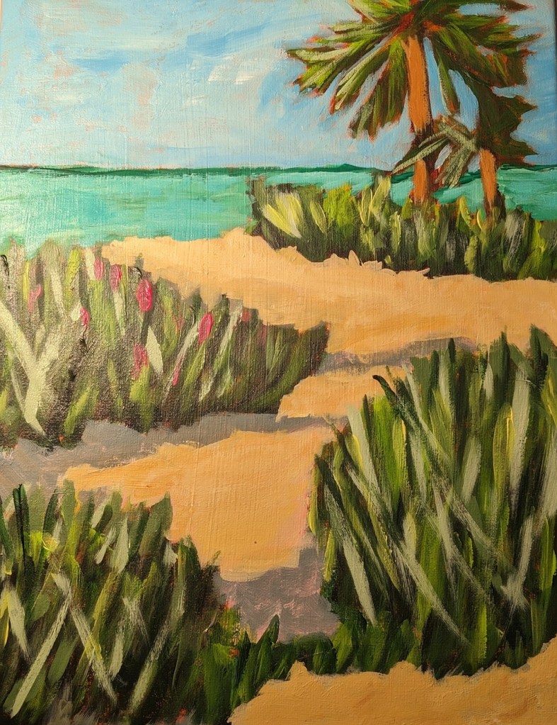
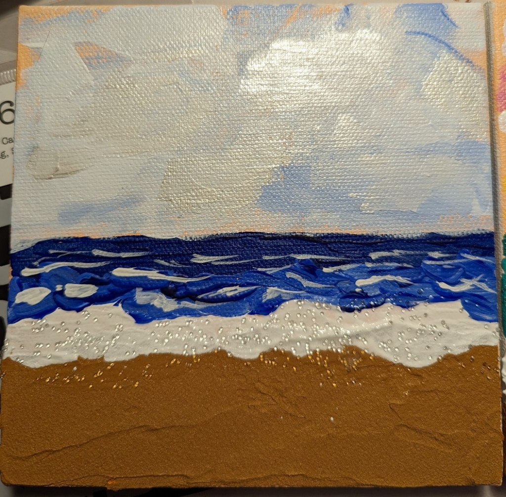
And, just for fun, comparing the above pastel piece with another beach piece I did 3 or 4 months ago with acrylics, sand texture, glass beads, and iridescent paint.