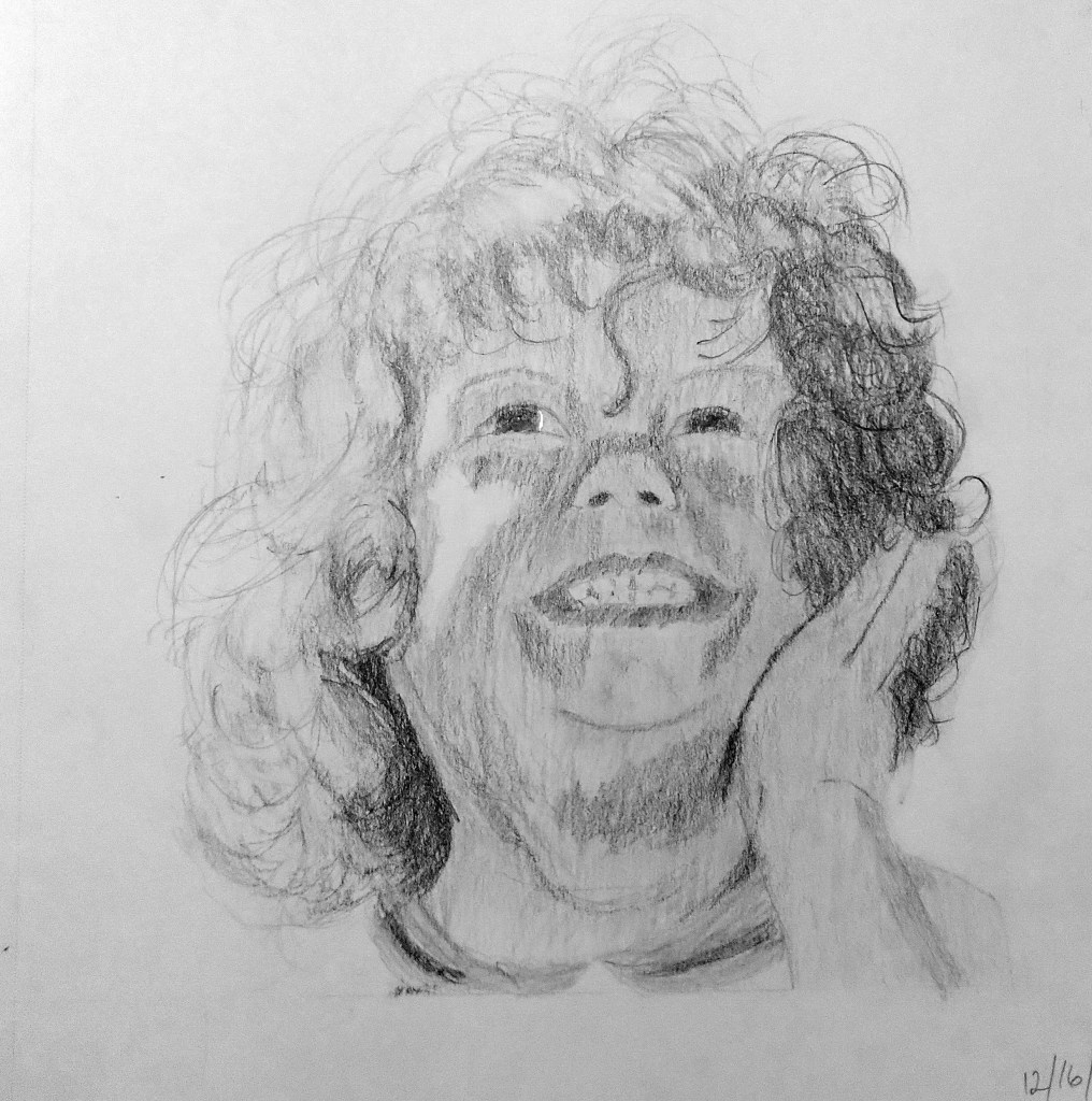
This is my first-ever “portrait”. I did not draw out the head using pencil or charcoal or marker; I just drew “roughly” the so-called Loomis head. This was also an exercise in seeing values.
I will be doing more practice on these heads.

This is my first-ever “portrait”. I did not draw out the head using pencil or charcoal or marker; I just drew “roughly” the so-called Loomis head. This was also an exercise in seeing values.
I will be doing more practice on these heads.

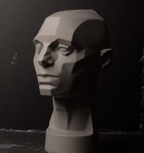
Below is an exercise from PaintCoach’s Patreon page in which you paint from a reference photo of an “Asaro Head“. The idea is to get familiar with the planes of the head, while also serving as a value exercise.
I am not yet finished.
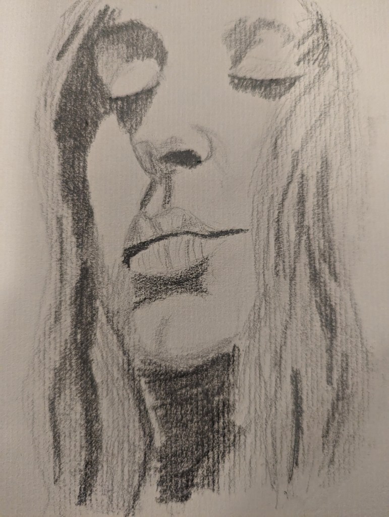
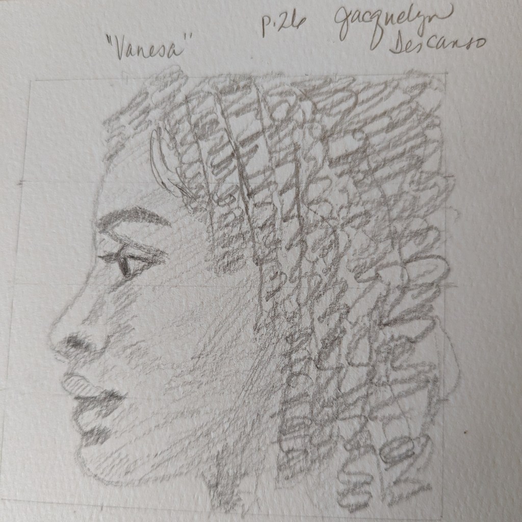
Some time ago I bought the Kindle book Skill-Building for the Beginner Artist: How to Draw the Portrait in Pencil by Jacquelyn Descanso. She does hatching and cross-hatching rather than blending. One of practice exercises early in the book is to copy her graphite portrait of ‘Vanesa”. Below is the result of my drawing of her drawing.
I’ve been away from drawing and painting for a few weeks now… must be the summer heat. Finally picked up my Aquarelle pencils and sketch book to do this quickie face.
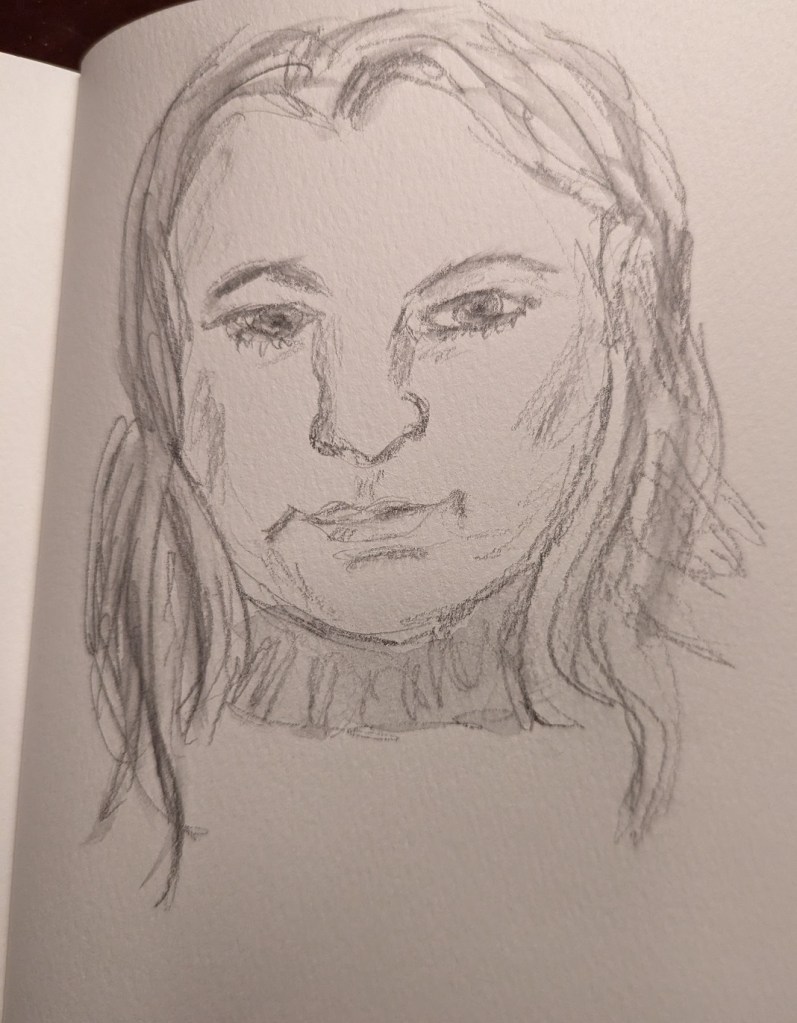
This sketch was done from a reference photo of my own.
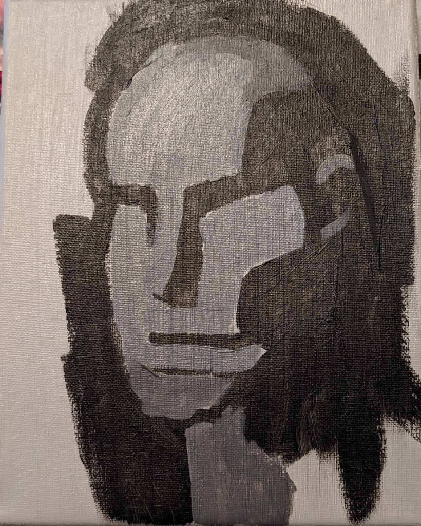
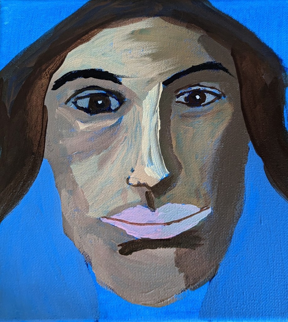
This is another work from Marla Baggetta’s Adventures in Acrylic class I’m taking. I have to say I’m NOT a big fan of phthalo blue, at least as a background. Especially a portrait background! That blue just shines through in an aggravating fashion! And, obviously, it affects the look of the other paint colors used. All in all, she looks greener than I had wanted her to be. Until I get portraits down well, I don’t see the purpose of using wacky colors. 🙂
Anyway, painting a portrait — though this was supposed to be “expressive” and “fun” not an absolute likeness — is one thing, drawing is another. I fiddled with the proportional divider I bought for sketching, and the drawing was pretty decent. But once I started painting over my pencil lines, the drawing went out the window. Ugh!
I AM reasonably satisfied with the facial planes and the shadows — for a first attempt.
Oh well. Tomorrow’s another day!
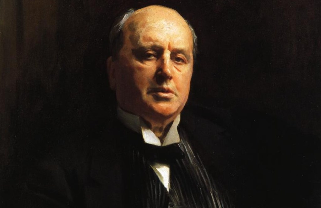
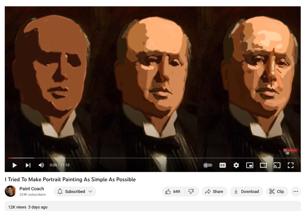
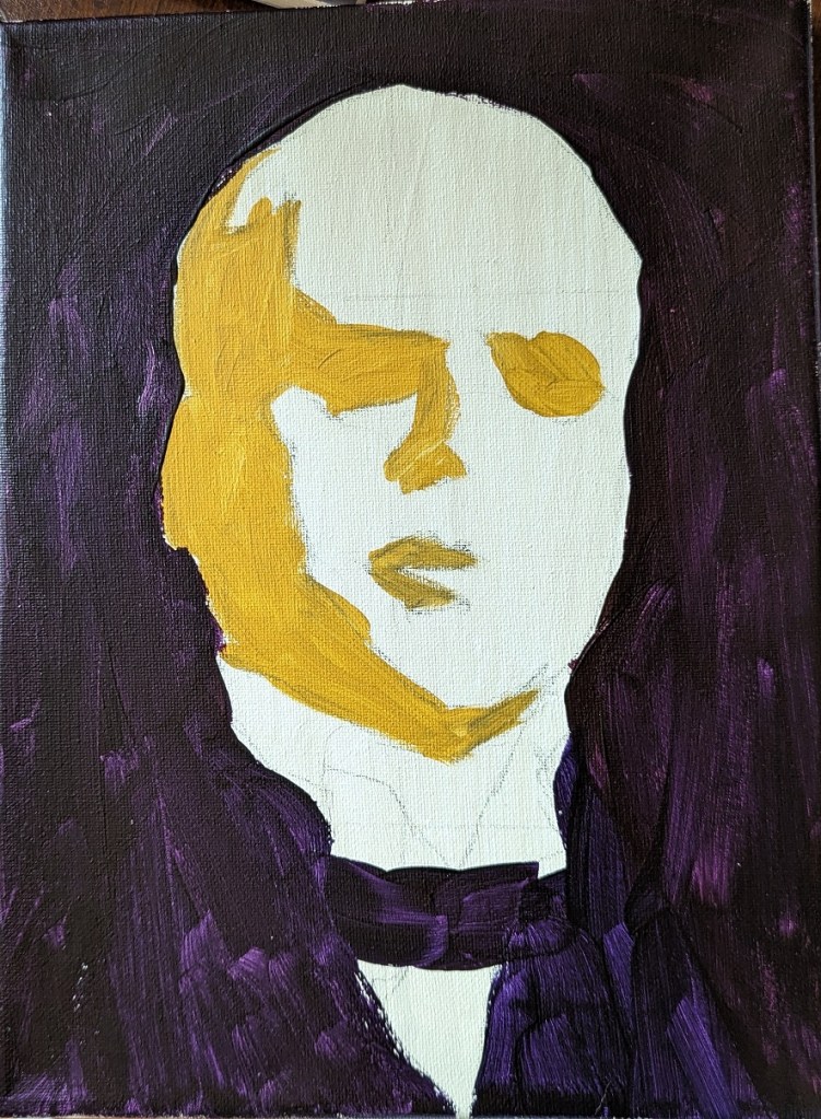
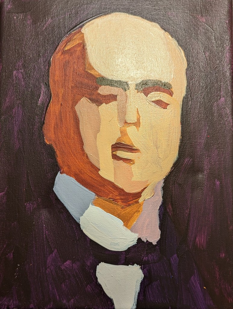
One of the posts on the Paint Coach Patreon page is a portrait-painting tutorial using the portrait of Henry James painted by John Singer Sargent in 1913. The tutorial walks beginning painters through the process of painting the big shapes first, and gradually moving towards smaller and smaller shapes (i.e., more detail).
Chris Fornataro (aka Paint Coach) gives the highlights of that process in a recently posted video on YouTube. A copy of Sargent’s work is on the left; a screen shot from the YouTube video is on the right.
I am not yet finished with my own attempt at copying Sargent, but decided to post my work in progress.
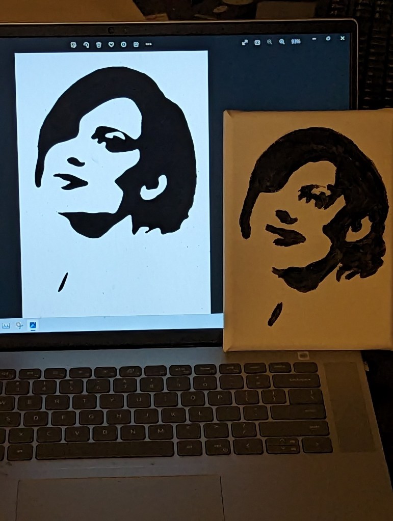
I downloaded a few photos of women’s faces from Pixabay and Unsplash, set them to grayscale, applied the gaussian blur filter, and then posterized the image down to 2 values: black and white.
I used these notans to paint.
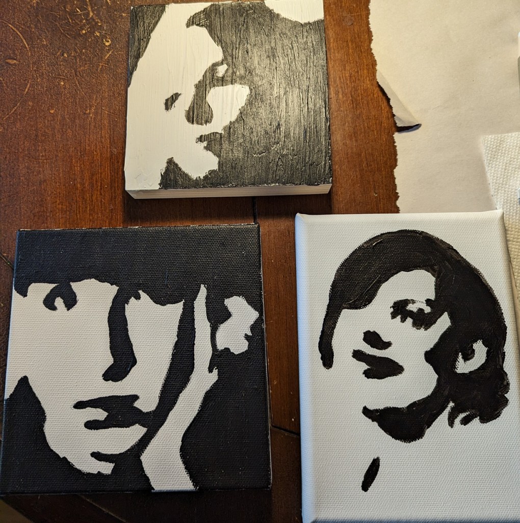
The top-most picture was done on wood covered with gesso painted with an old brush (hence, the ridges.) Some folks say to sand your gesso application, but I didn’t want to hassle with that. Below is a comparison between the actual notan (posterized photo) on the computer screen, and my painted image on the right. Close but not exact.