Getting My Pastels organized

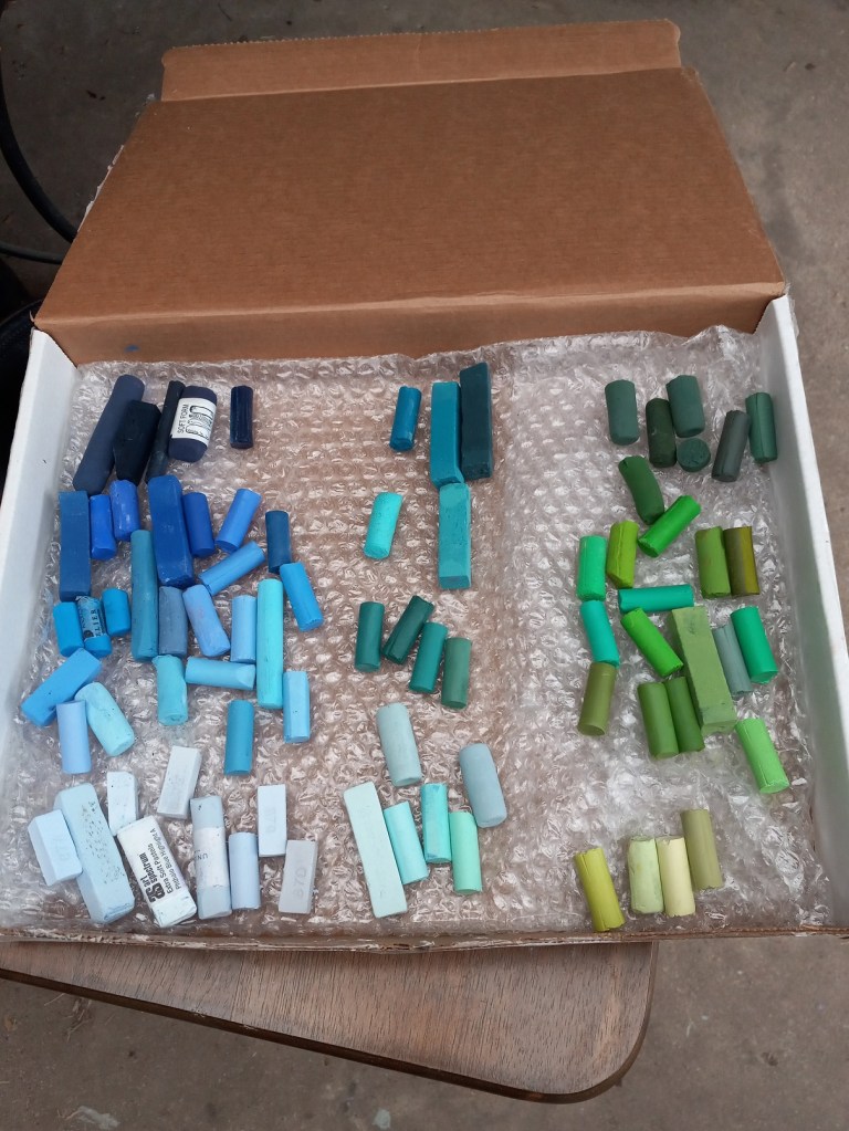
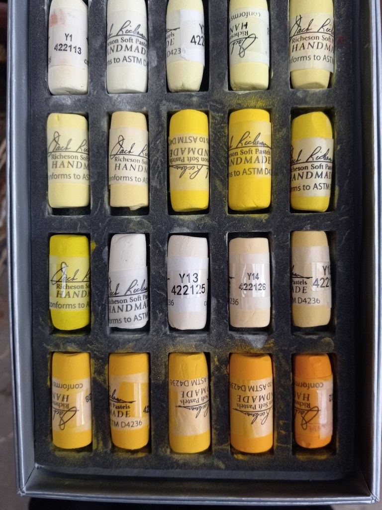
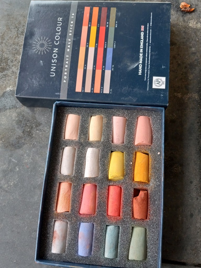
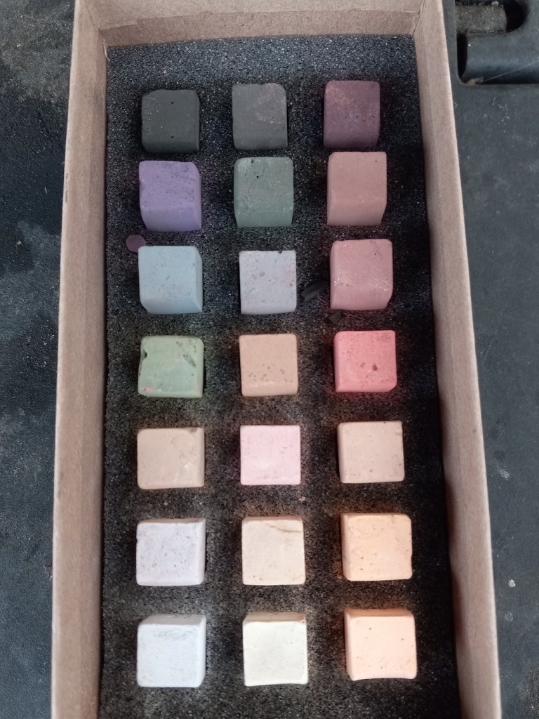
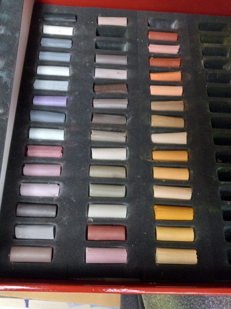
I’ve finally done it… I’ve gotten all my pastels out of their respective boxes, and removed the labels. I don’t have a fancy wooden tray yet, but I did buy from Jerry’s Artarama a 3-drawer wooden storage cabinet. It will hold some but not all of the pastel pieces I have, so I’ll be improvising with cardboard boxes for now.

I’ll post final pictures when I’m done. What I’m finding is that, now that I’m putting the pastels together by hue, it becomes more obvious that one stick should go over with the group of oranges, but another “fits” better with the group of yellows.

I also found that the Great American sticks have a tendency to crumble a bit when removing the wrapper, even though I worked as delicately as I could. And that the wrappers on the Richeson Hand-rolled pastels were, by far, the most difficult to remove as they have an additional layer of tape on the label.

I will trust that the pastelists whose YouTube videos and/or blogs I follow (e.g. Marla Baggetta, Karen Margulis, Alain Picard, Gail Sibley) are correct in saying that you’re better off grouping your sticks by hue and value, with the labels off your pastel sticks (to use the entire stick freely on the paper).

We’ll see. I need all the help I can get!

Painting of the Day: Glass Vase in Gray Scale

Today’s pastel painting was done on Rembrandt pastel paper, using 3 NuPastels: Warm Deep Gray, Warm Very Light Gray, and touches of Warm Medium Gray. This was a value study in preparation of a color piece which I’ll be doing on a sample scrap of Sennelier Pastel Card (bought last year as a part of a sampler from Jackson’s Art).

The original picture in color is below. I also downloaded the Android app Color Grab, and played a bit with color choices. While that was fun, I quickly became overwhelmed at the thought of using so many colors for the vase!

I decided to simplify to an extreme by editing my photo to be grayscale, and then using Adobe Photoshop Elements to posterize the grayscale photo to get the two extremes of values. The posterized version was the reference for my pastel.

I am underwhelmed by the texture of the Rembrandt pastel paper; I do not care for the honeycomb look at all.

Follow-along: Rendering Glass #1

I watched Marla Baggetta‘s video of her painting a blue glass bowl and made my own attempt. I imitated Marla in using the “Blue Spruce” NuPastel to sketch the bowl, but that’s not something I would do again — my own preference would be to sketch in a much lighter color pastel.

I think the pastels are quite “muddy”, and I had an Aha moment later when I realized I lay down the color with a heavy hand. I think I filled up the tooth of the paper.

I also had a difficult time imitating Marla’s strokes; although I used the side of the pastel, either the pastel was too “slippery” or the paper not toothy enough. It felt to me the pastel was “skipping”.

Persimmon Study

This persimmon is from our tree (which has largely been picked over by now, by my husband harvesting, and by the local blue jays pecking at the fruit).

I held the persimmon in my left hand, looking down at it as I painted with my right hand. My goal was to paint the detail as realistically as possible. The primary pastel I used was one from Great American, called Marigold (585.0) I love the vibrant color — perfect for this fruit!

The photo is of the specific persimmon, but was taken afterward, and is rotated 90 degrees to the viewer’s left relative to the sketch.

New Pastels!

Some of the pastels I ordered arrived today — yay! I now have some Blue Earth (21 Portrait), some Unison (16 half-sticks Portrait), Richeson Hand-rolled Yellow #1 – #20, Richeson Hand-rolled Portrait (mid-values), Sennelier Landscape 30 half-sticks, and of course the 120 half-sticks of Blick Artist’s soft pastels.

Pear Study

This study was done on Canson Mi-Tientes Touch paper, one from my Jackson’s Art sampler.

I like the contrast of the blue background with the orangey-yellow highlighted side of the pear. I don’t particularly care for the way the pastel doesn’t “fill in” the paper.

And since I did this study, I’ve learned that the pros often do underpainting for numerous reasons, one of which is coverage and a unified tone. I had thought that using toned paper in itself might be enough. It’s okay but it looks more like a drawing than a painting.