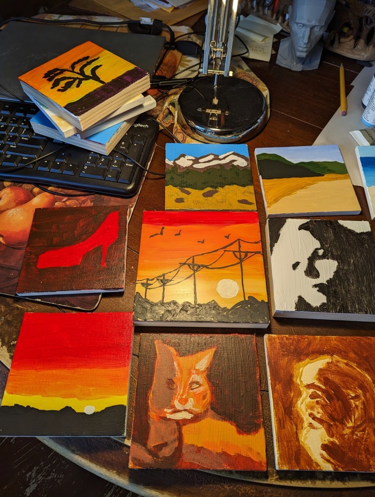
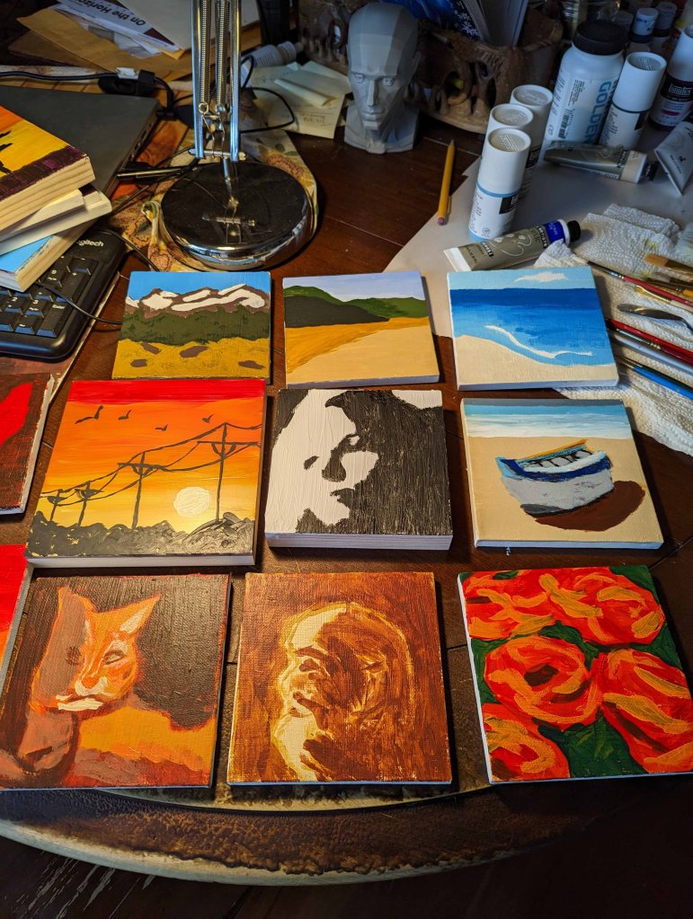
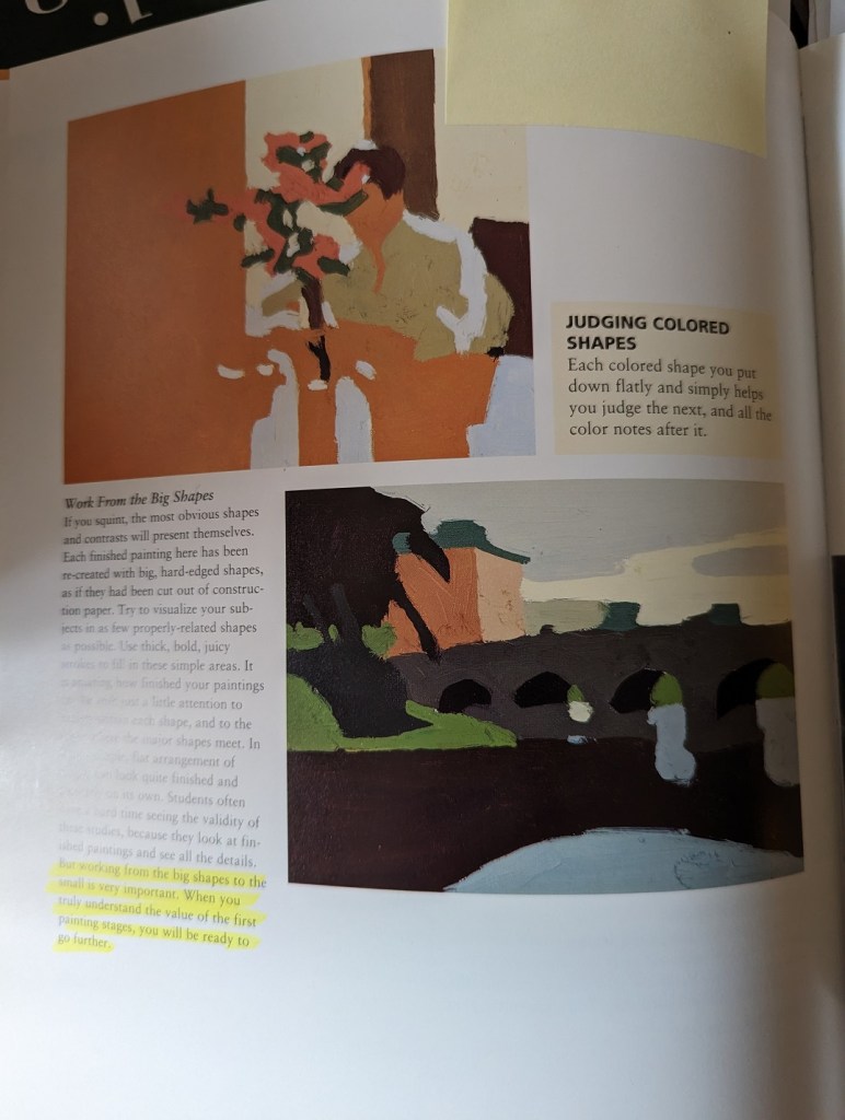
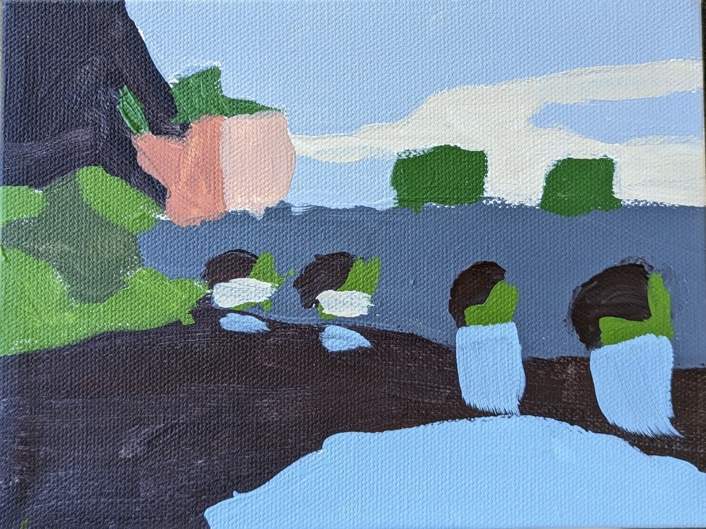
I did a second “big shapes” study today, referring to one from the Kevin MacPherson book mentioned in the last post.
Painting
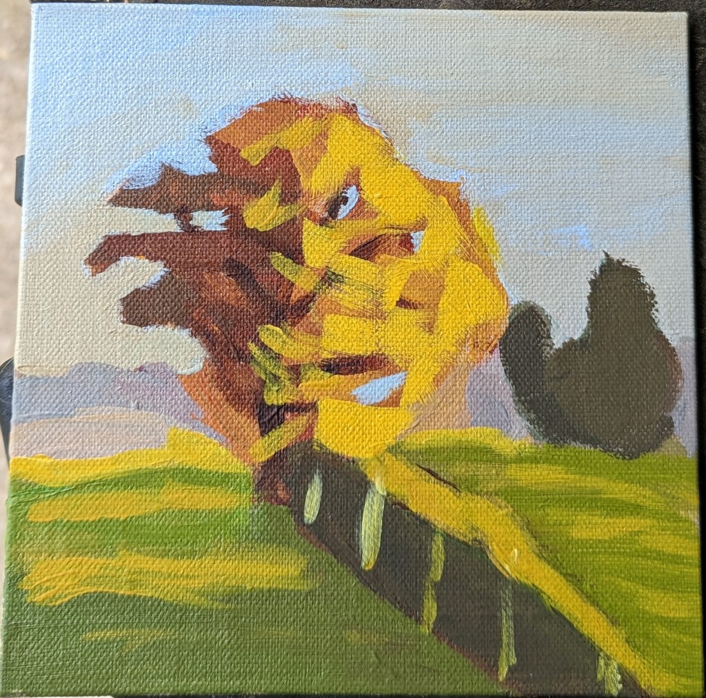
Autumn Tree from #PAINTCOACH Patreon

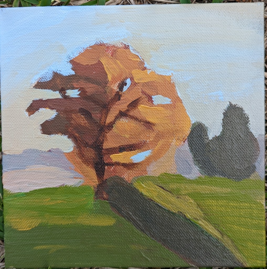
This Autumn Tree exercise was from a PaintCoach post on Patreon. I did it on a 6×6 linen panel in acrylic. Getting the colors even close to correct was a beat-down. I’m discovering I prefer liquid or soft-body acrylics to the heavy-body, at least when I’m trying to imitate painting in oils!
One photo is of the work-in-progress; the other is the “I’m done with this!” version.
I’m most satisfied with the sky. If I were to paint this again, I’d use much less yellow in the tree, and make shorter and less uniform brush strokes.
Redo of “50 Small Paintings”: Mountain Landscape
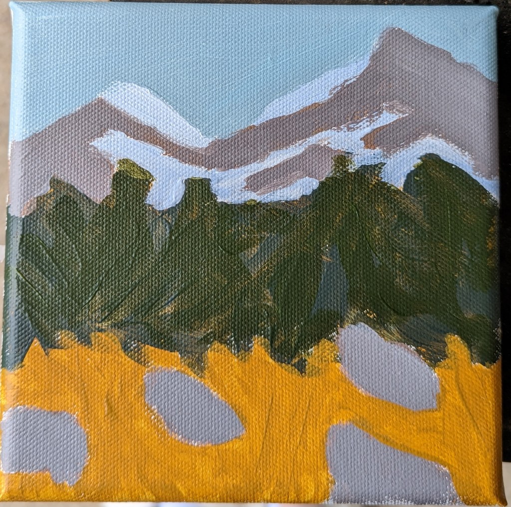
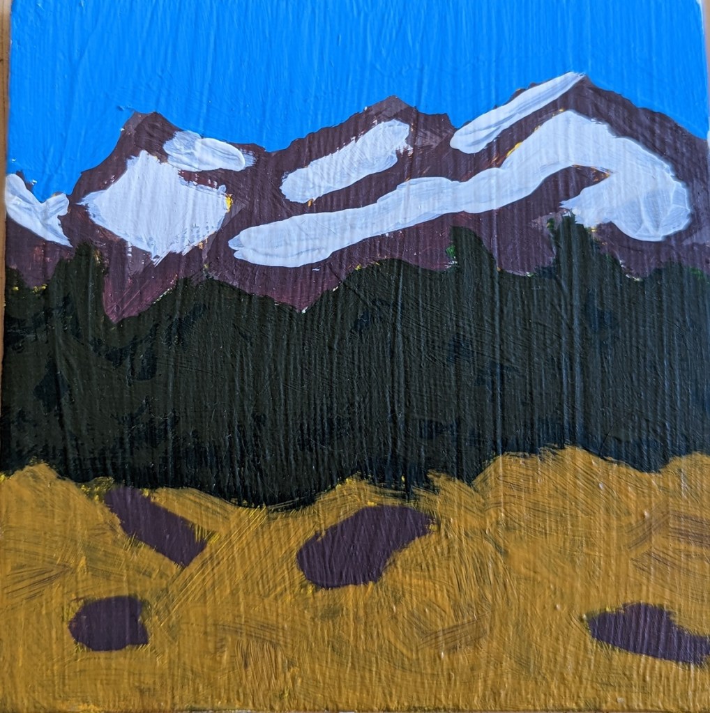
My original 5×5 painting of a mountain landscape, based on Mark Nelson’s “Learn to Paint in Acrylics with 50 Small Paintings: Pick up the skills * Put on the paint * Hang up your art” did not adequately reflect, in my opinion, atmospheric perspective. The mountain was unrealistically brown, the snow was unrealistically white, and the sky unrealistically blue!
So, I’ve tried again. The new version, obviously, is on the left. This was a 6×6 canvas, also painted in acrylics. It’s marginally better.
However, I think if I were to paint it yet a third time (!), I’d leave out the rocks in the foreground, instead adding a path through the meadow to the trees. I’d also work on my brushwork for both the mountain and the snowcap, and would add shadowed shapes to better indicate the form of the mountainside.
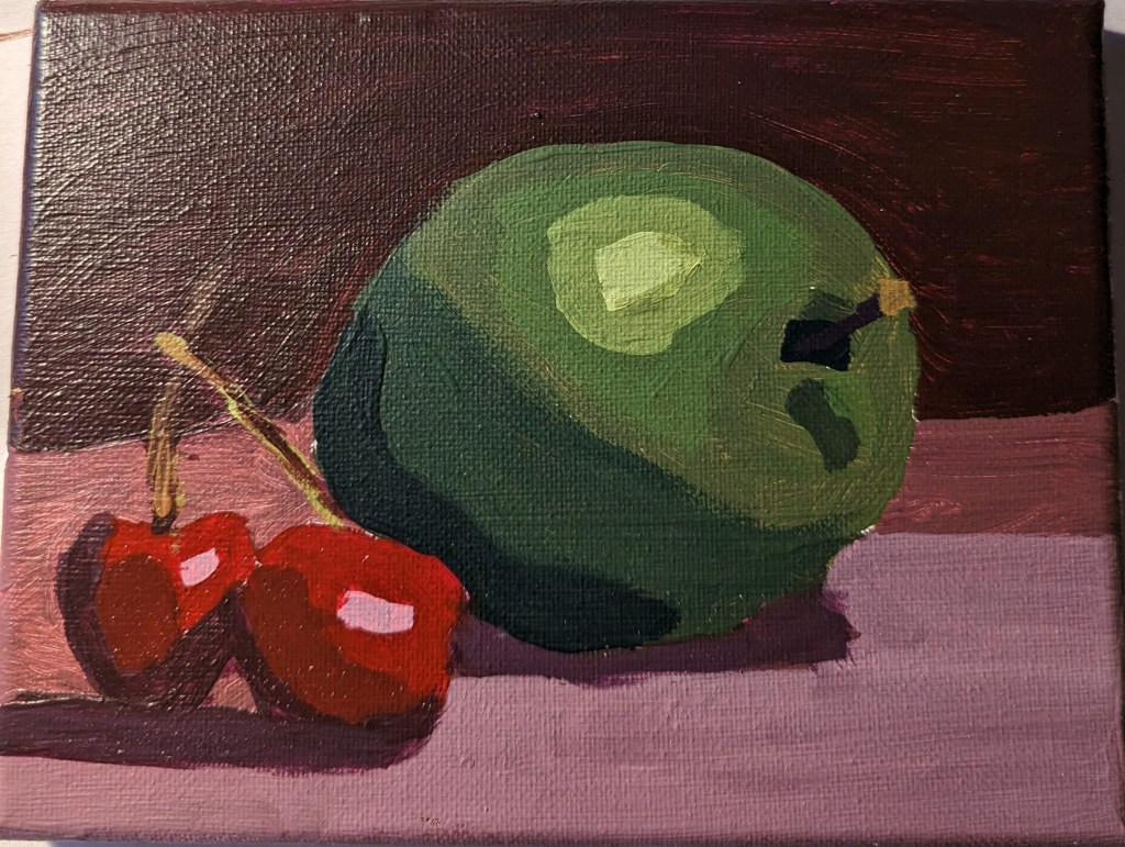
Apple & Cherries from #PAINTWEEK
I signed up to Paintcoach’s PaintWeek class, and did this demo painting of an apple with cherries. Because I was using acrylics and not oils, the gradations between the values are harsher. I didn’t blend; I was layering.
I am more satisfied with the cherries than the apple.
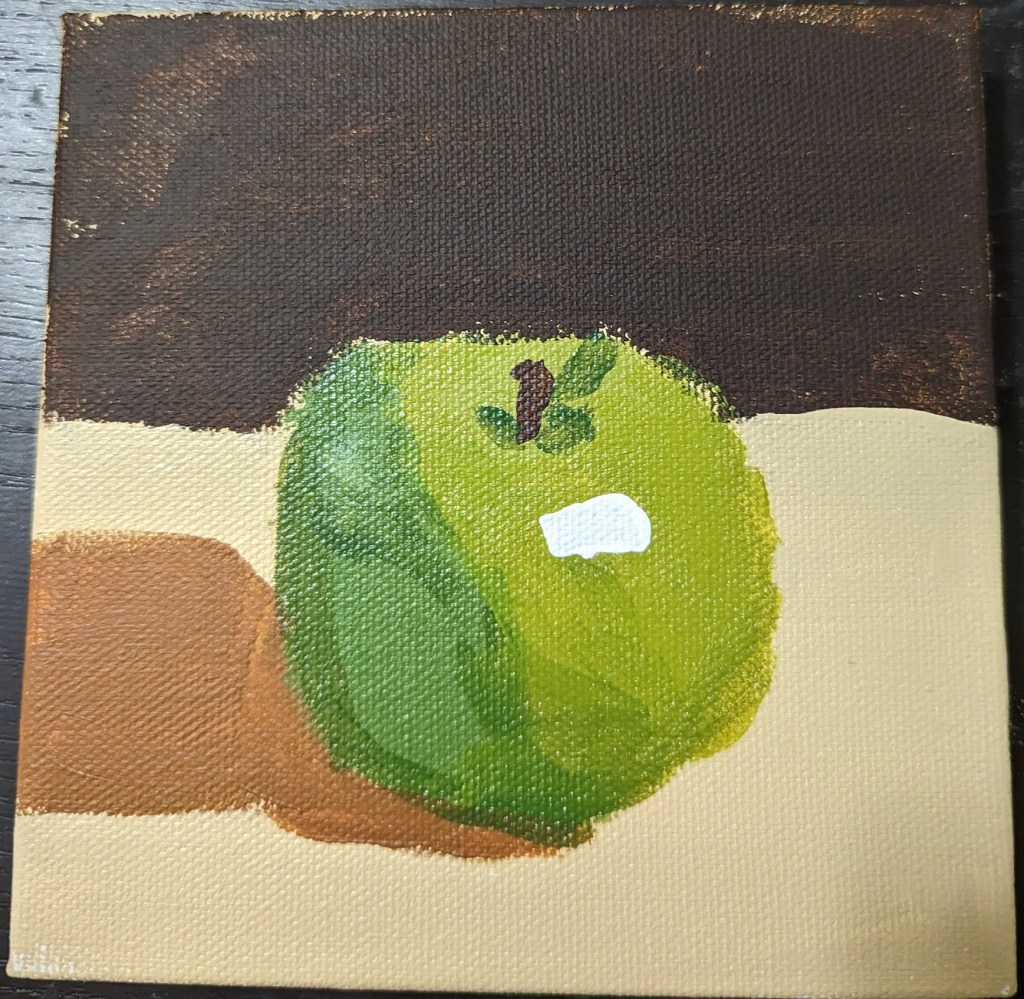
Two Different Apples.. from #PAINTCOACH
These two apples are from YouTube videos by PaintCoach.

Lessons Learned
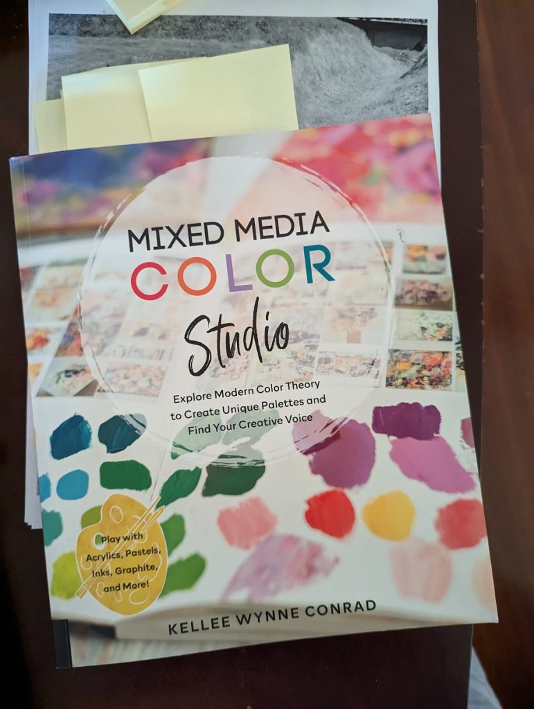
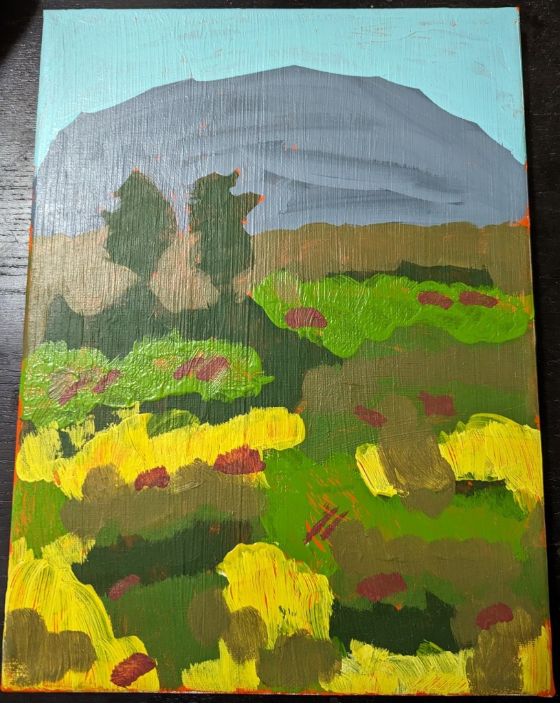
Using a demo project in Mixed Media Color Studio by Kellee Wynne Conrad, I attempted a landscape scene. And unfortunately I used a vivid fluorescent orange paint as background. This was a huge mistake!
The entire landscape became, for me, an exercise in trying to paint over the vivid orange, so I got very sloppy. I also discovered that my yellow paint was entirely too transparent — and that I need to pay attention to how transparent or opaque the paint I’m using is.
I also broke basic landscape rules around atmospheric perspective, in that the more distant the shapes (mountains, trees, etc.) are, the bluer they should be.
Cherry Tree Dropping Blossoms
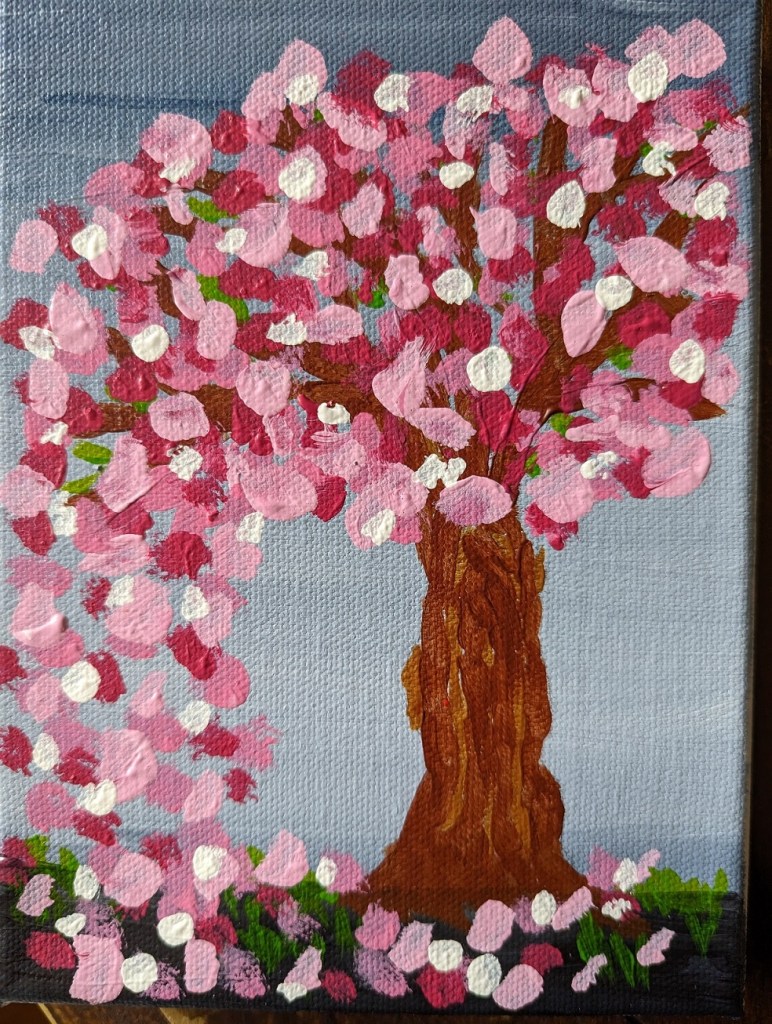
I got the idea for this cherry tree painting from the Feeling Nifty website. I didn’t care for the example of the black/gray background, or the black tree — it looked too much like Halloween to me. (Halloween is a great holiday, but it doesn’t mix with blossoming cherry trees!) Also, I didn’t have Q-tips, nor did I want to use them — it would’ve been too close to copying the artist. I wanted to do things my way.
This was done on a 5×7 canvas; the background is ultramarine blue with black (“Payne’s Gray”). The predominant color of the blossoms is Quinacridone Magenta (pigment color PR 122) dark and tinted with Titanium White, with some Cadmium Red Hue (PR 112).
Notans — Based on Pixabay & Unsplash
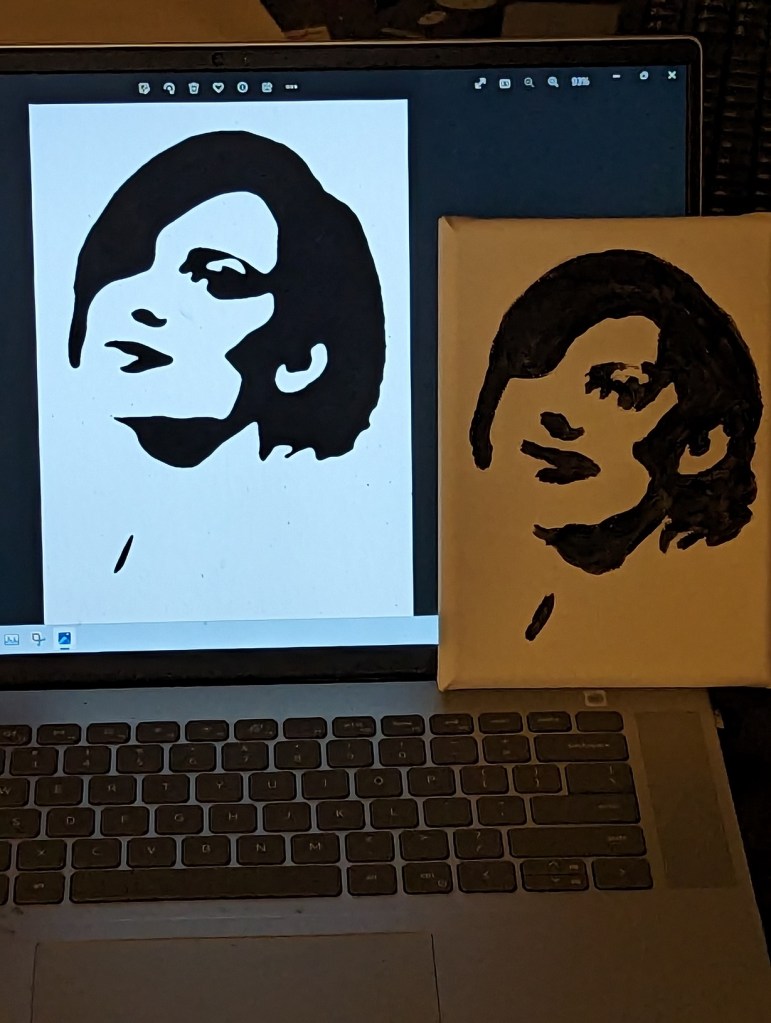
I downloaded a few photos of women’s faces from Pixabay and Unsplash, set them to grayscale, applied the gaussian blur filter, and then posterized the image down to 2 values: black and white.
I used these notans to paint.
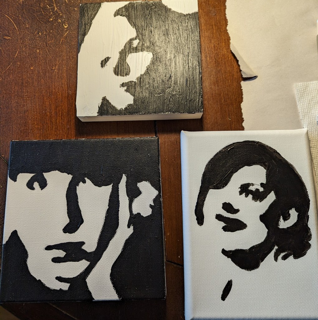
The top-most picture was done on wood covered with gesso painted with an old brush (hence, the ridges.) Some folks say to sand your gesso application, but I didn’t want to hassle with that. Below is a comparison between the actual notan (posterized photo) on the computer screen, and my painted image on the right. Close but not exact.
“50 small Paintings” in Acrylic
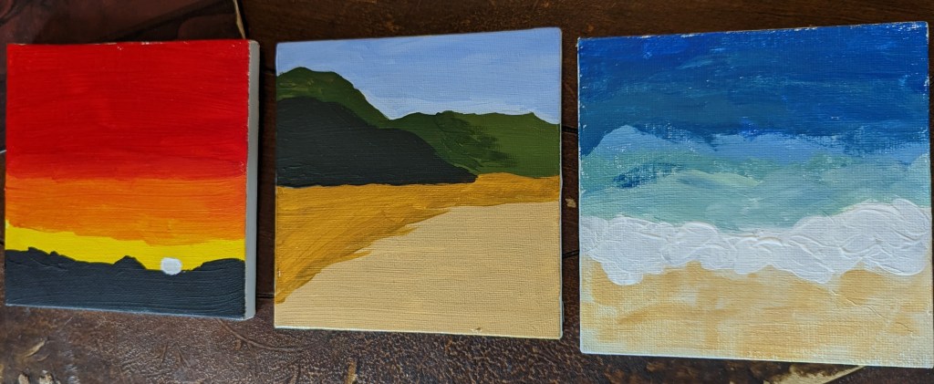
In early February, I found “Learn to Paint in Acrylics in 50 Small Paintings” by Mark Nelson on Amazon, and purchased it. I consider it a mixed bag — you can check out the reviews on Amazon, if you’re interested, about its negative points — all I will say publicly on a blog is that it’s the book that got me to pick up a paintbrush and actually PAINT! (I did NOT do all 50 paintings, but I rolled along on a dozen or so, some of which are shown below.)
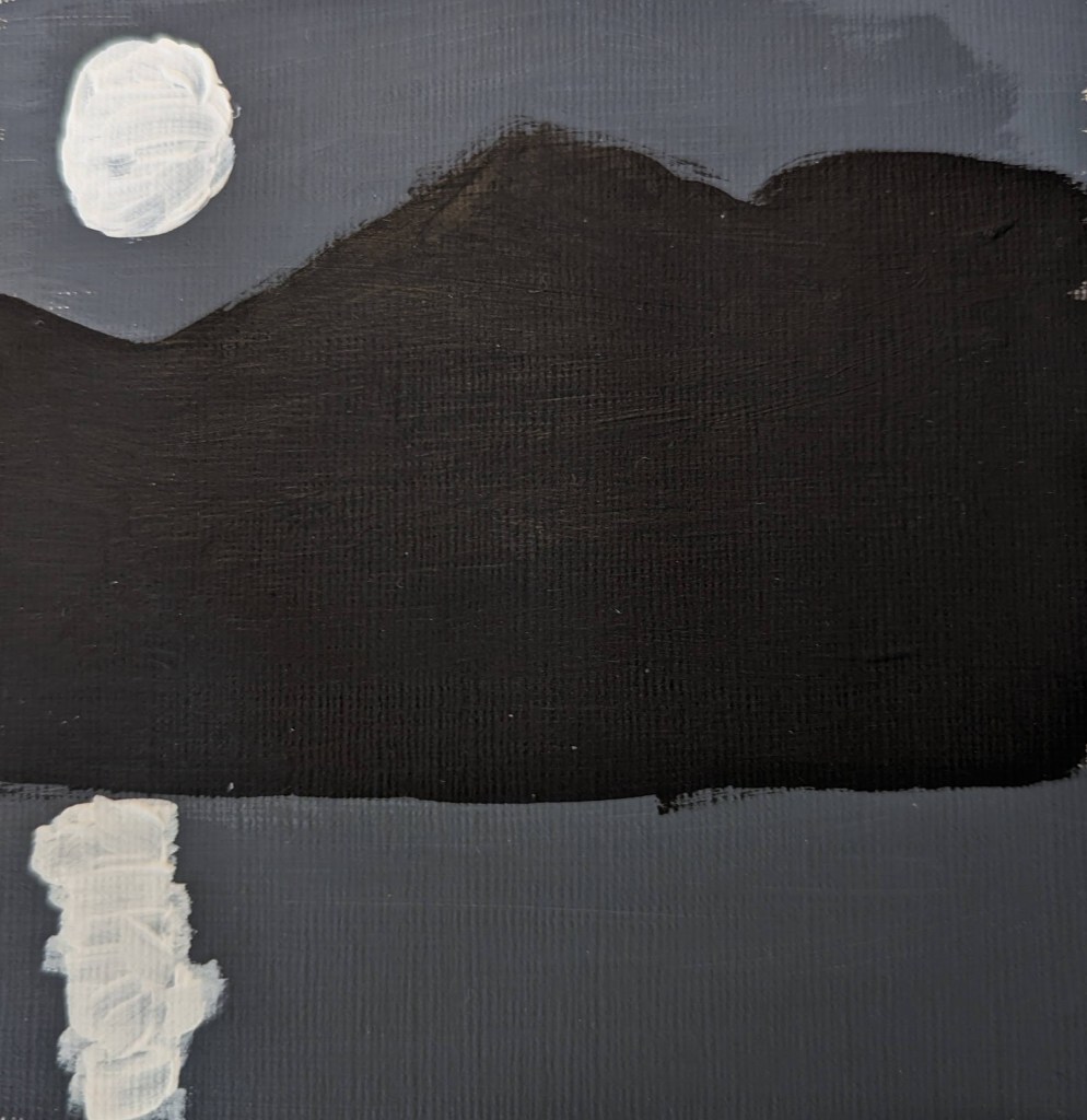
The black, white and gray moonlight painting is the first one I did, following along in the book. As a nocturne of sorts, it is either highly stylized or something only a novice would do. Titanium White and Mars Black are heavily used in almost every painting, something that the typical art teacher suggests you avoid. But, again, this artist may be deliberately stylistic.