“Small Landscape — Big Brush” from Patreon

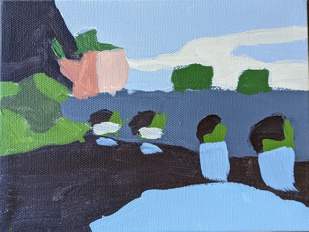
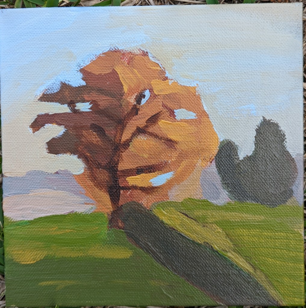
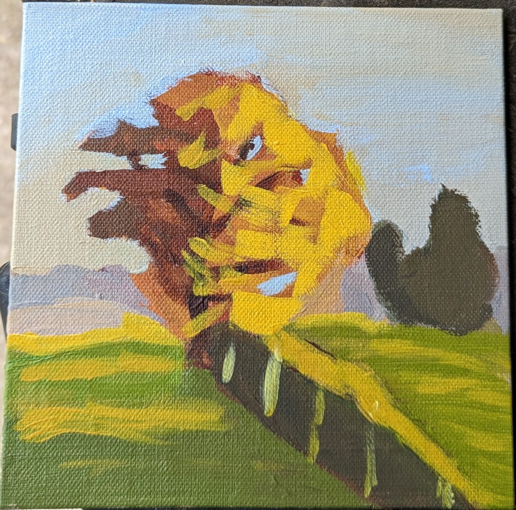
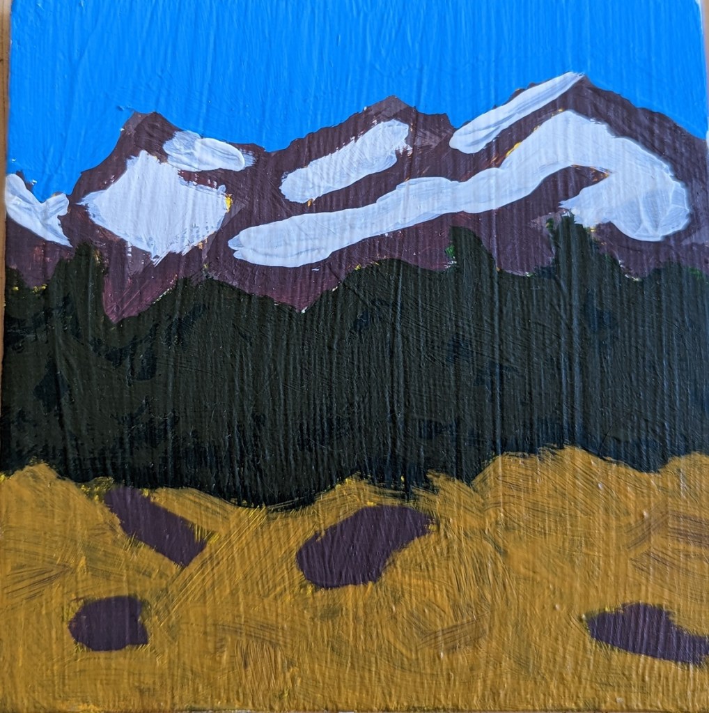
This 6×8 painting is from a tutorial by Paint Coach on Patreon. The idea is that you use a decently large brush (say, 1/2″) so that you are focused on the basic shapes as opposed to detail.

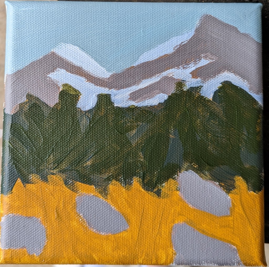
The 6×8 canvas size felt too small to me for all the different landscape “objects” — trees near and far, a stream, a path, mountains, etc. Whew!

Worse, my photo doesn’t adequately capture the colors I see in my own painting; the path is both grayer and more purple than what is shown, even though I fiddled with tint/saturation/brightness, etc. in the Photos app.

Oh well, time to get painting the next thing.

Got Some Oils & some “OPEN” Acrylics

I’m still wanting to try oil paints, but am spooked by how thick they are — and the need to thin them without solvents. Ugh! But the colors are gorgeous! That violet is luscious; however, it took nearly a week to be touch dry.

That said, acrylics can dry so fast, so I’d also like to try Golden’s Open Acrylics to increase the working time.

Still Life — Another Study

The still life of fruit is yet another study from Patti Mollica’s book How to Paint Fast, Loose and Bold: Simple Techniques for Expressive Painting.

As far as my efforts in copying still life demonstrations from various painting teachers, this is one of my better ones in my opinion. I’m most pleased with the dark red (purple) cherry.

That said, all the stems I painted are sloppy — I need to practice painting thin lines. And the brushwork on the red apple is awful. The paint choices as well could be improved — the red is so transparent you can see through to the raw sienna underpainting, and my charcoal pencil outline. Sigh.

Autumn Tree from #PAINTCOACH Patreon

This Autumn Tree exercise was from a PaintCoach post on Patreon. I did it on a 6×6 linen panel in acrylic. Getting the colors even close to correct was a beat-down. I’m discovering I prefer liquid or soft-body acrylics to the heavy-body, at least when I’m trying to imitate painting in oils!

One photo is of the work-in-progress; the other is the “I’m done with this!” version.

I’m most satisfied with the sky. If I were to paint this again, I’d use much less yellow in the tree, and make shorter and less uniform brush strokes.

Redo of “50 Small Paintings”: Mountain Landscape

My original 5×5 painting of a mountain landscape, based on Mark Nelson’s “Learn to Paint in Acrylics with 50 Small Paintings: Pick up the skills * Put on the paint * Hang up your art” did not adequately reflect, in my opinion, atmospheric perspective. The mountain was unrealistically brown, the snow was unrealistically white, and the sky unrealistically blue!

So, I’ve tried again. The new version, obviously, is on the left. This was a 6×6 canvas, also painted in acrylics. It’s marginally better.

However, I think if I were to paint it yet a third time (!), I’d leave out the rocks in the foreground, instead adding a path through the meadow to the trees. I’d also work on my brushwork for both the mountain and the snowcap, and would add shadowed shapes to better indicate the form of the mountainside.