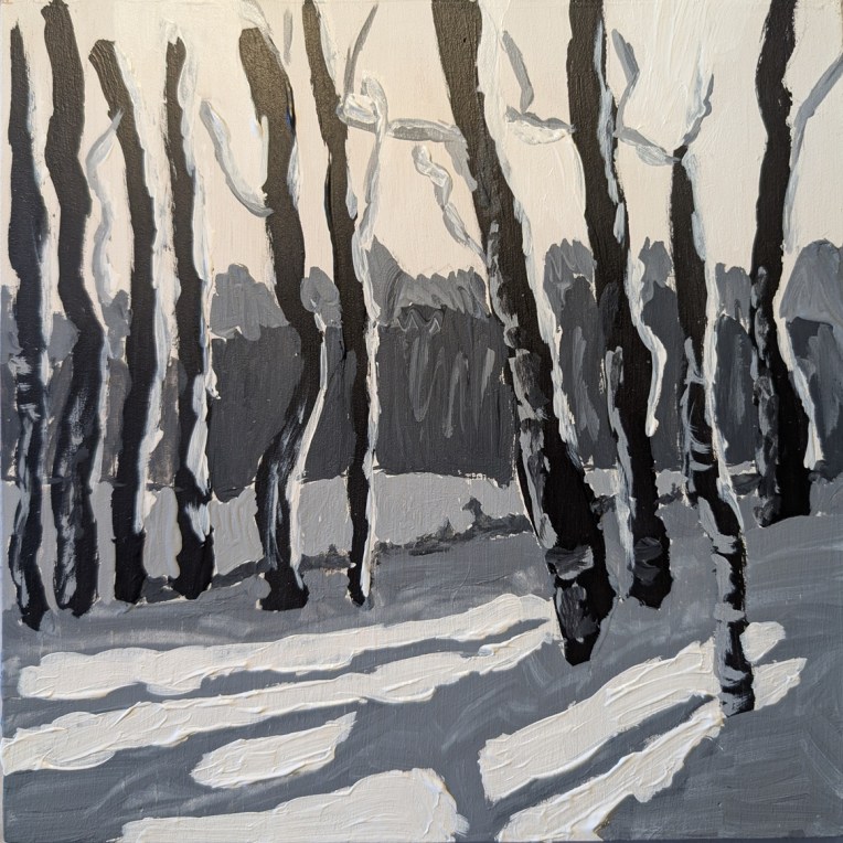
Earlier in January I watched a paint-along by Jed Dorsey of Acrylic University for their Bloom Membership level. He painted this scene from one of his own photos, and his painting was striking in its use of color, reflecting a golden sky from the sun setting behind the trees in the distance.
I was all set to try that myself. But when I downloaded the reference photo and a photo of his painting, on a whim, I set the saturation to zero — and found I absolutely LOVED the black and white version. So I decided to try painting it to play with the values.
This was done strictly as a study, on an 8×8 wood panel that I had gessoed a while back. The sky, in fact, is simply the white gesso. (It’s more yellow here in the photo than it is in real life.) I deliberately painted the snow thick just for the heck of it.
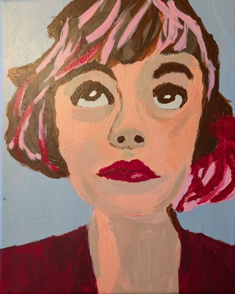
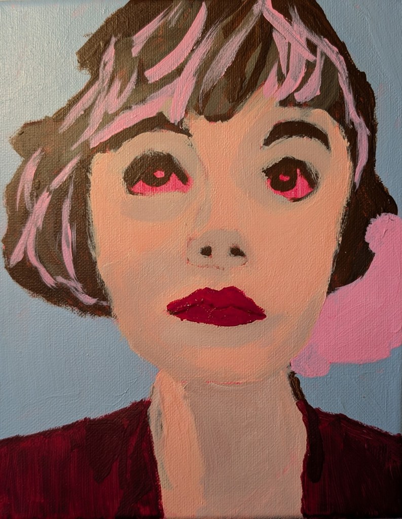
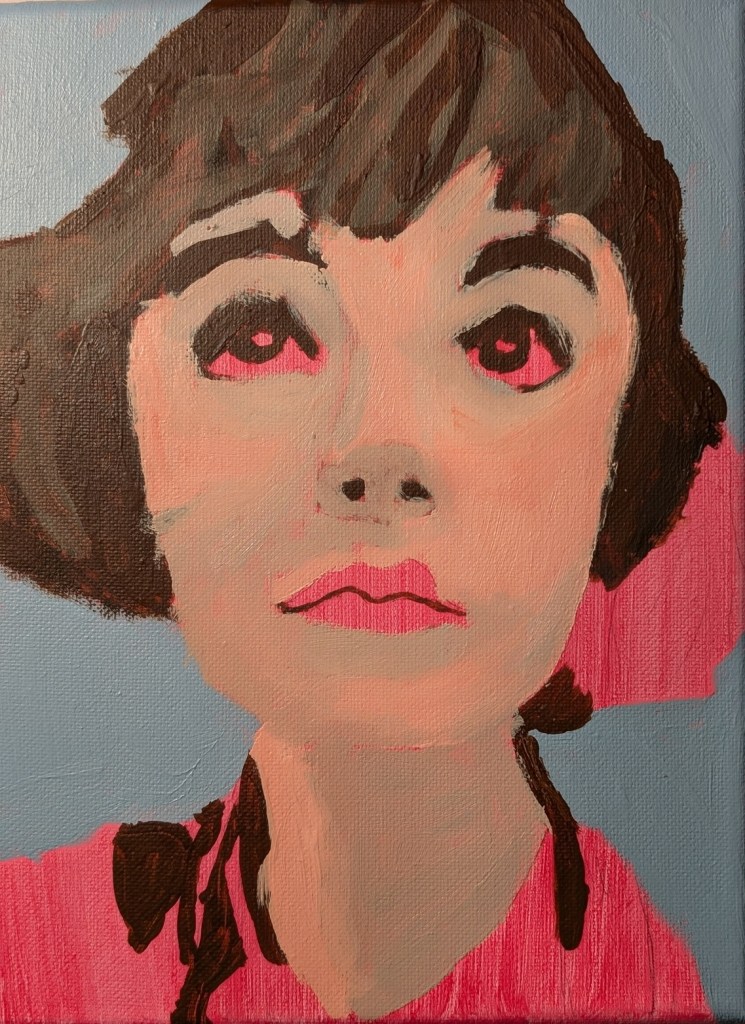
A year ago I signed up for Let’s Face It 2025, a 52-week series of portrait lessons which you can either follow along with or use as inspiration for your own fully original art, but I never did a single exercise. This was Week One and it was taught by Kara Bullock.
I have yet to complete any of the years I bought (2023 through 2025) although I just signed up for the 2026 version, but there are actually only a few weeks in each of the years which interest me, and they’re on my to-do list.
This one was done on an 8×10 canvas toned in quinacridone rose (PV 19), and I don’t have the photo credit information, but am guessing it’s on Unsplash or Pixabay. “In progress” photos are below. I used a lot of Burnt Umber, Raw Umber, Titanium White, and a crimson color (PR 264).
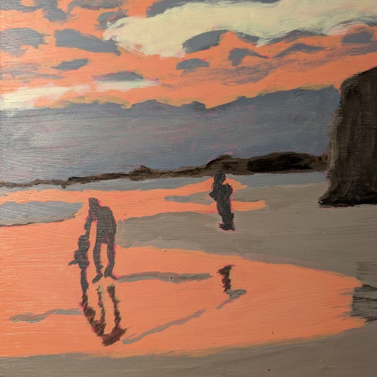
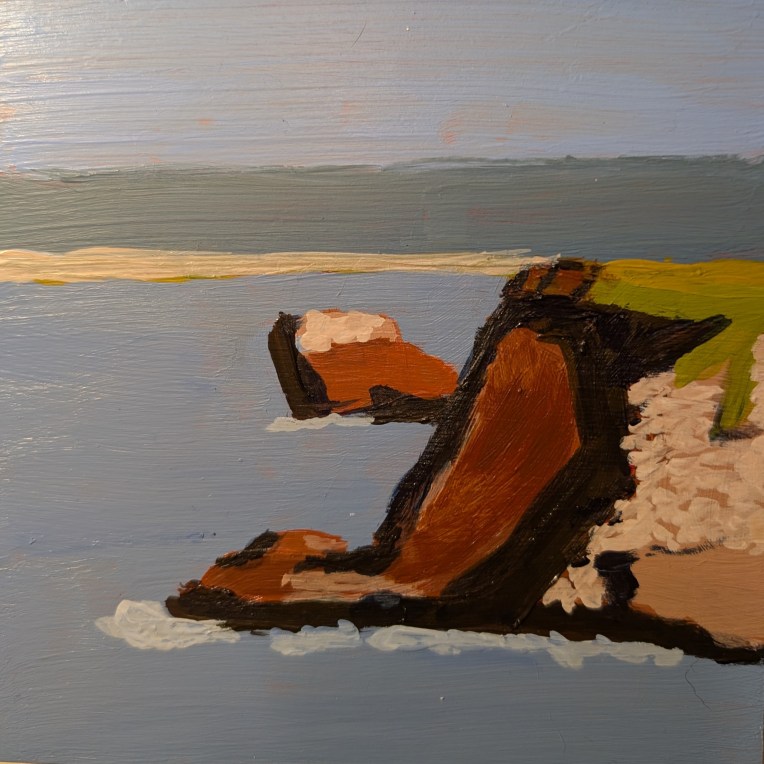
For what it’s worth, I’m done with this painting from Acrylic University‘s 2024 Summer Challenge based off a photo by Doug Greenman of a Puerto Rico beach.
I’m not super excited about it. I don’t like the orange — but come to think of it, I really didn’t like the magenta tone on the board to start with. (Maybe I should’ve started by painting over that!)
One thing I AM happy with is the father and child figures, and their reflection.
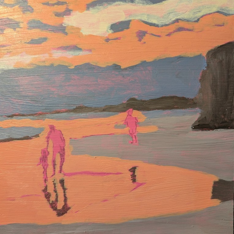
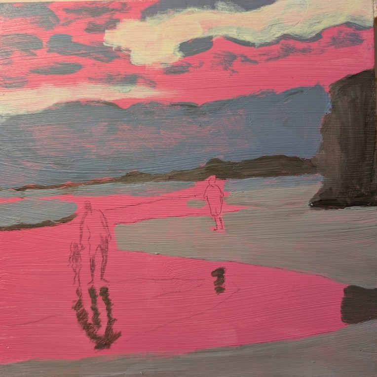
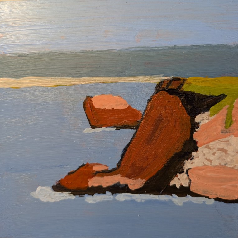
I am working on a painting from Acrylic University‘s 2024 Summer Challenge which Jed Dorsey painted using a photo by Doug Greenman of a Puerto Rico beach.
The first thing I did was crop the reference photo fully square and reduce the contrast significantly, as well as brighten so that the sky and sea look mostly orange.
I am using an 8×8 wooden panel which I had toned in a magenta color months ago, The cliff, the distant shore, and the reflections of the figures are all painted in shades of Raw Umber & Titanium White. Then I added Ultramarine Blue to that mixture to paint the sand, the bank of low dark clouds above the horizon, and the wisps of clouds above. The bright spot is a yellow and white mix; the orange is Naphthol Crimson, Cad-Free Yellow Light (Liquitex) and white.
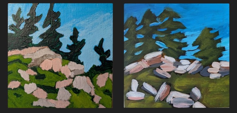
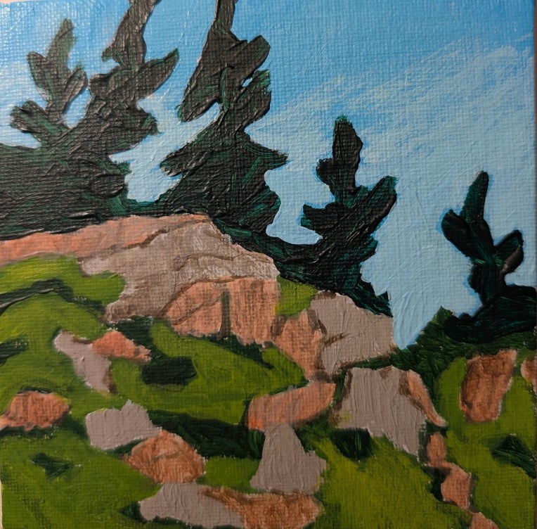
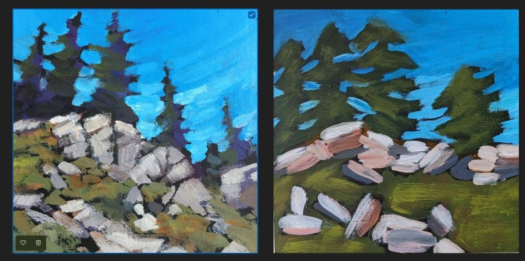
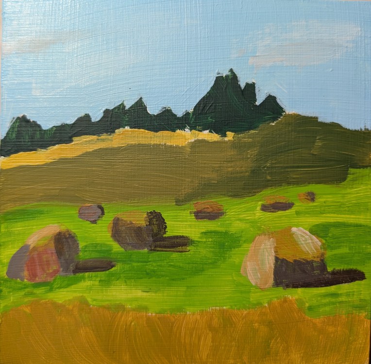
This is a redo of the week 12 painting for Jed Dorsey’s Mini Painting Challenge at Acrylic University, based on my observations of mistakes I made in the original painting. The idea was to get the proportions more accurate, the perspective/distance more accurate, and to convey a better sense of form (namely, that the trees were at the top of and behind a hill).
I painted it on a 5×5 canvas panel. For the sky I used Liquitex Soft Body Light Blue Permanent (PB15, PG7, PW6) and mixed the lower latitudes with more white. The pine trees were painted with Atelier’s Forest Green (PY74, PB15.3, PR101) mixed with Phthalo Green (Blue Shade) and Ultramarine Blue. The darker grass was a mix of Atelier’s Forest Green with Cad-free Yellow Medium by Liquitex, and the lighter grass was a mix of Winsor’s Sap Green (PY74, PG7, PBk7, PW6) and Cad-free Yellow Medium.
Here is a comparison between the original I two years ago, and the one I did today. The newer painting is far from perfect — the trees are still wonky, the paint is gloppy on the trees and I think the grass should be lighter in value — but at least you can tell the trees are on a hill, and the rocks no longer “float”.
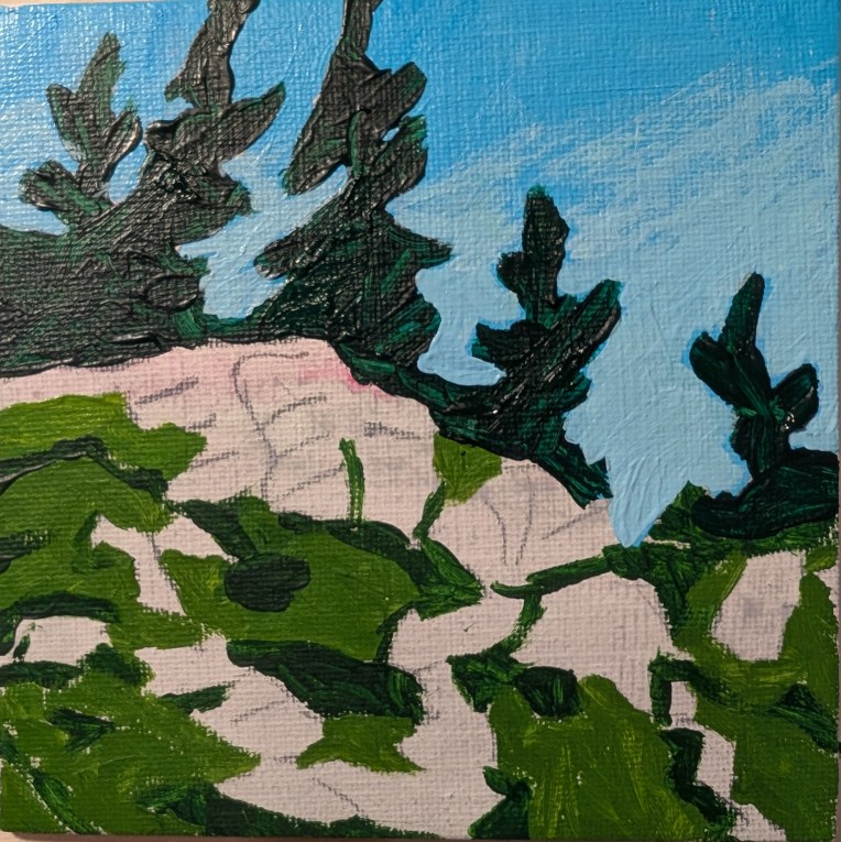
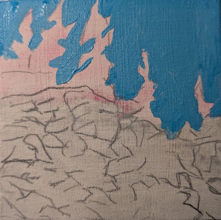
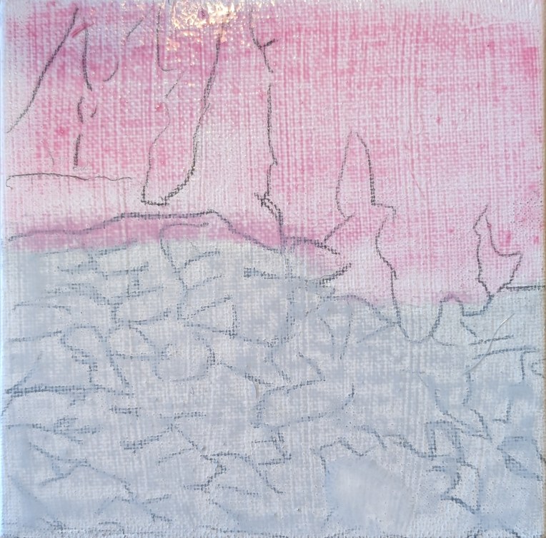
Here are some in-process photos of the redo:
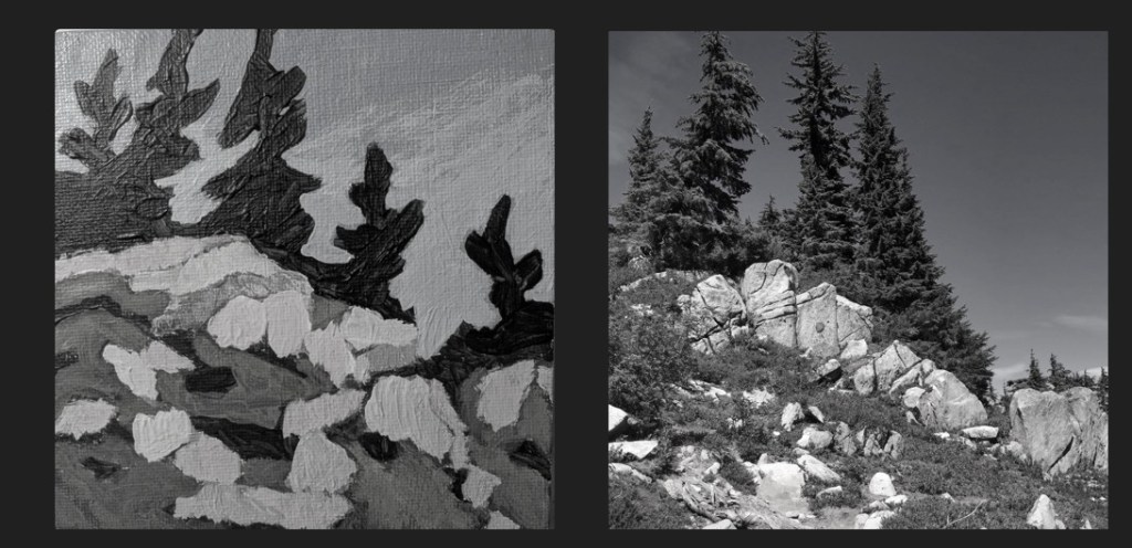
Here’s a value comparison between the reference photo [credit: Mark Hadland] and my painting.
What I see is: 1) a lack of proportion which leads to 2) a lack of perspective. That tree at the right should obviously be smaller as it is farther away, for example. 3) Poor use of brush strokes in conveying form — for the rocks, they should have been vertical rather than horizontal which makes my rocks appear to be “floating” rather than grounded as boulders which comes across in Jed’s painting.
Positioning relative to the picture plane is not ideal in my painting, although in this one — compared to week 15 — my colors are not so saturated and, to my eye, are reasonably close to what Jed used. (Again, I don’t want to copy exactly, necessarily, and I DID go back and make a change to the values as indicated in this post. My first attempt at this painting is here.)
Finally, there is the difference in style between Jed’s and mine, which could just be related to my beginner status. But he has a preference for toning his canvases in black, which I did in this case — and I just can’t stand! I don’t have his painting ability so toning my canvas in black is discombobulating for me. In addition, Jed is gifted at painting the negative spaces, and that is NOT a skill I have at this point.
Also, in so many of these beginner lessons from various different painters I hear about using “big” brushes so that you don’t obsess over detail as many beginners do. I cannot argue with that, but I see in my paintings thus far TOO LITTLE attention to detail! It’s okay to use a smaller brush at times! 🙂
If I were to paint this again, I would stick with a white canvas or one toned a neutral gray, and I would probably trace key lines from his painting to get the proper sense of proportion as well as a sense of the boulders being rooted to the ground and forming the shape of the hill.
I’ve been browsing through the work I did in 2024, and it occurs to me that, for those times I was doing “master copies” of other artists’ work, I had two methods. One was just a straight copy when all I had to look at was the artist’s painting or drawing. The other was copying via the mini challenges at Acrylic University.
What I’ve realized now, in review, is that for the painting lessons, I would refer to the reference photo and the painting, watch the video, then do my own thing (more or less) so that my work is full of flaws. I would focus on the loose and expressive style, but I didn’t have the fundamentals down!
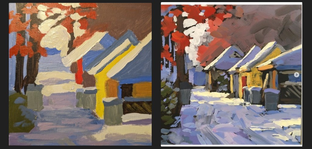
The first thing I see is I do a poor job of conveying form and perspective. Everything is flat and abstract in part because my colors are much too saturated and also because the proportions are all wrong, particularly of the houses.
My painting does not properly reflect perspective; Jed’s alley gets visually narrower in the distance, while mine does not. In addition, his brushstrokes for the alley are vertical relative to the picture plane, which helps move the eye to the end of the alley in the distance. My alley brushtrokes are horizontal which does nothing to convey perspective.
My buildings are out of proportion relative to each other and relative to their roofs, and they do not appear 3-dimensional. In addition, the trash bins near the yellow house appear to float.
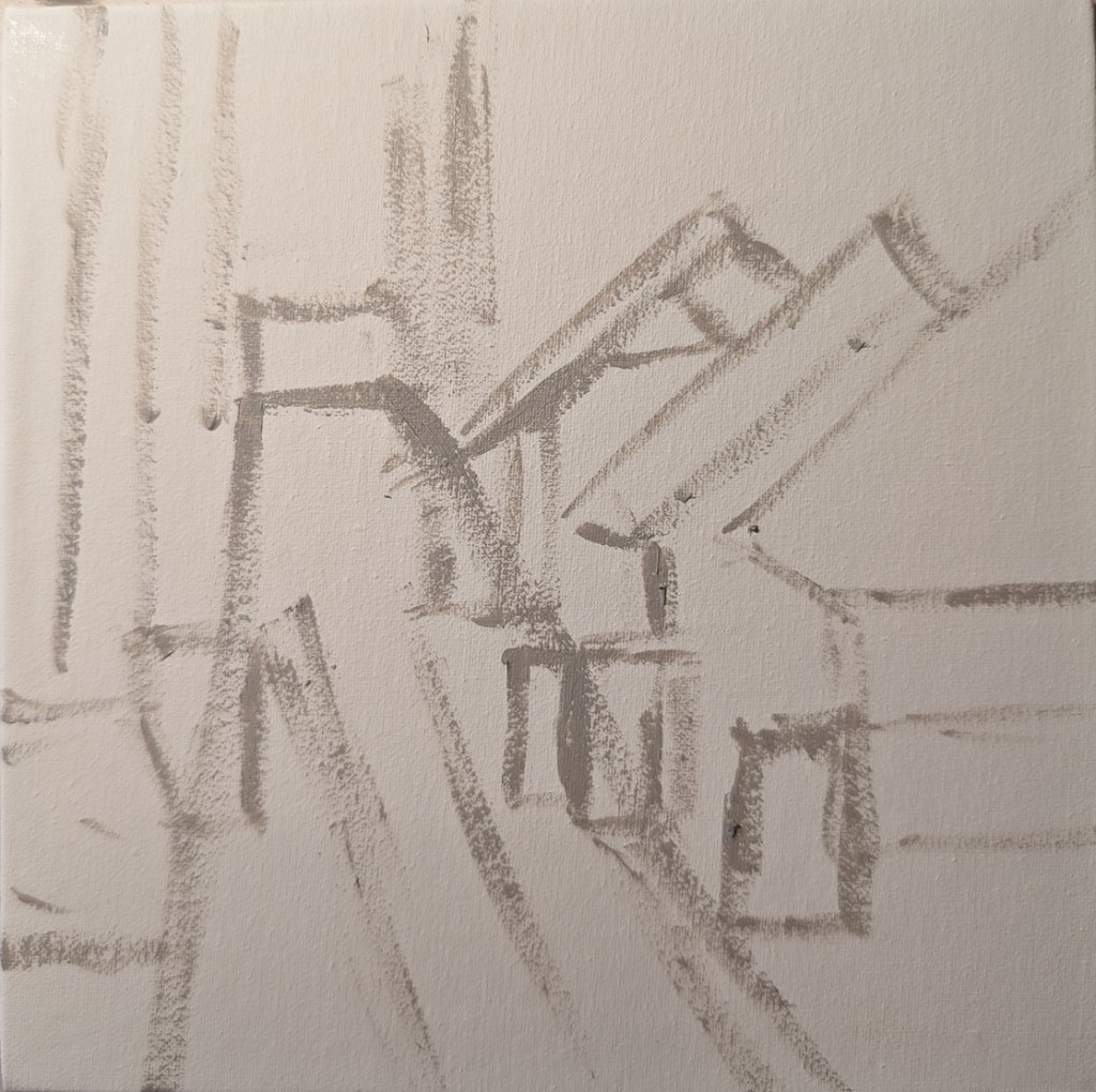
Ironically, in my initial sketch on canvas (below), I seemed to have a slightly better sense of proportion, but I didn’t think about using my brushstrokes to convey form and distance. If I were to do this painting again, I might consider tracing the large shapes of Jed’s painting first, just to get the placement right within the 6×6 panel.
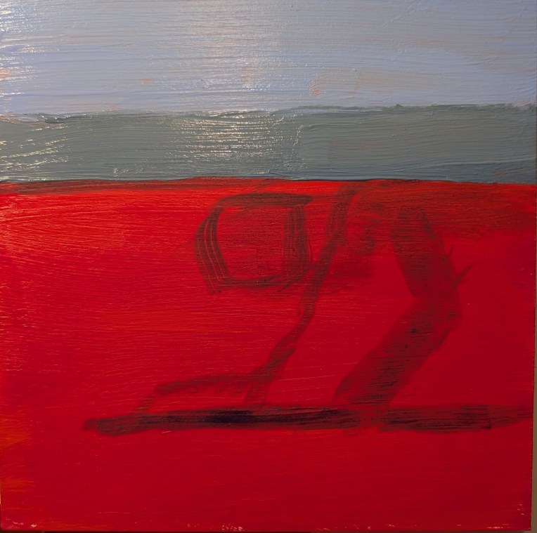
This was painted on a 6×6 wooden panel, which I had toned with naphthol crimson some time ago. I am liking painting on wood. But I dislike the painting itself; the shadow looks fake, and the rock in the background looks more like a slice of chocolate pie! (LOL).
Trouble is, I don’t care enough about cliffs to repaint it. And I need to stop trying to copy Dianna’s style, and focus on the fundamentals.
(Well, I DID modify it a bit after all. The most current view is on the left. A somewhat better painting of cliffs is here.)